
Seaborn
import matplotlib.pyplot as plt
import seaborn as sns
from matplotlib import rc

plt.rcParams['axes.unicode_minus'] = False
rc('font', family='Arial Unicode MS')

# %matplotlib inline
get_ipython().run_line_magic('matplotlib','inline')
seaborn basic
x = np.linspace(0,14,100)
y1 = np.sin(x)
y2 = 2 * np.sin(x + 0.5)
y3 = 3 * np.sin(x + 1.0)
y4 = 4 * np.sin(x + 1.5)

plt.figure(figsize=(10,6))
plt.plot(x, y1, x, y2, x, y3, x, y4)
plt.show()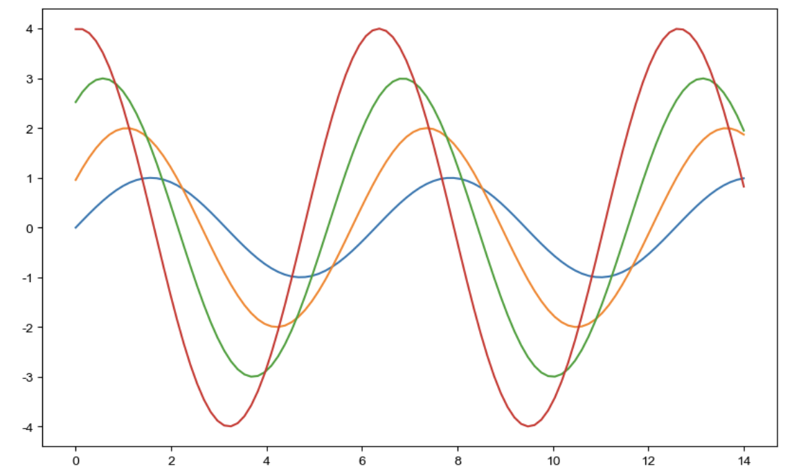
- sns.set_style()
- 'white', 'whitegrid', 'dark', 'darkgrid', 'sti'
sns.set_style('darkgrid')
plt.figure(figsize=(10,6))
plt.plot(x, y1, x, y2, x, y3, x, y4)
plt.show()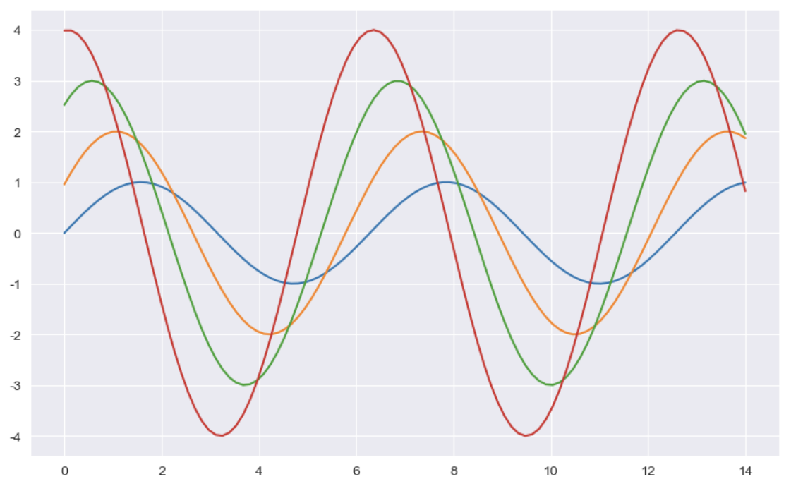
tips data
tips = sns.load_dataset('tips')- boxplot
plt.figure(figsize=(8,6))
sns.boxplot(x=tips['total_bill'])
plt.show()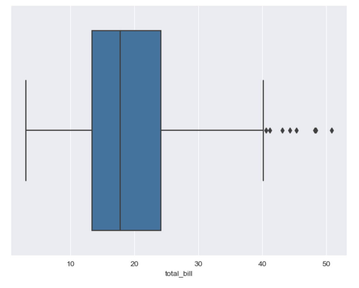
plt.figure(figsize=(8,6))
sns.boxplot(x='day',y=tips['total_bill'], data=tips)
plt.show()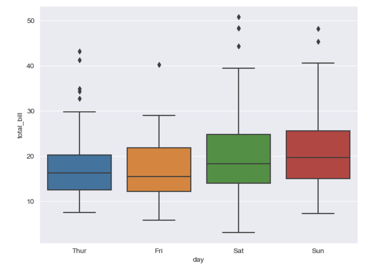
- boxplot hue, palette option
plt.figure(figsize=(8,6))
sns.boxplot(x='day', y='total_bill', data=tips, hue='smoker', palette='Set3') # Set 1-3
plt.show()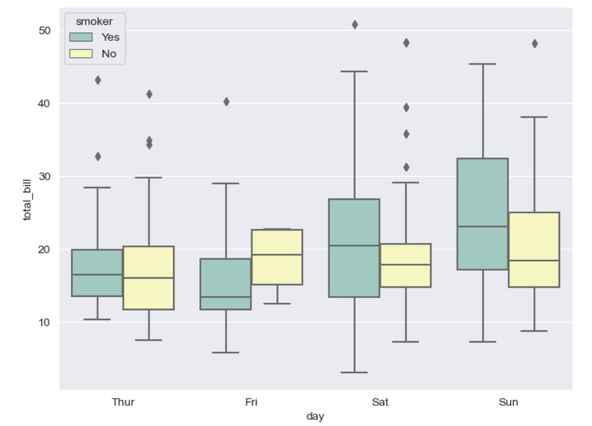
- swarmplot
- color : 0~1 사이 검은색부터 흰색 사이 값을 조절
plt.figure(figsize=(8,6))
sns.swarmplot(x='day', y='total_bill', data=tips, color='0.5')
plt.show()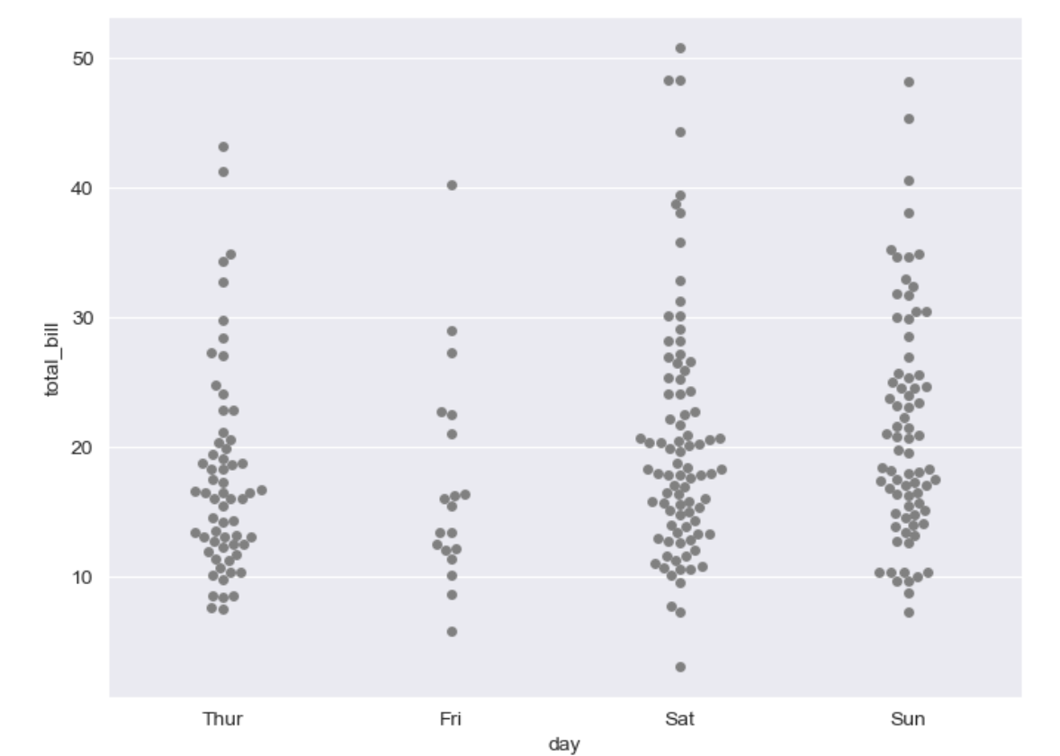
- boxpolt with swarmplot
plt.figure(figsize=(8,6))
sns.boxplot(x='day',y='total_bill', data=tips)
sns.swarmplot(x='day', y='total_bill', data=tips, color='0.25')
plt.show()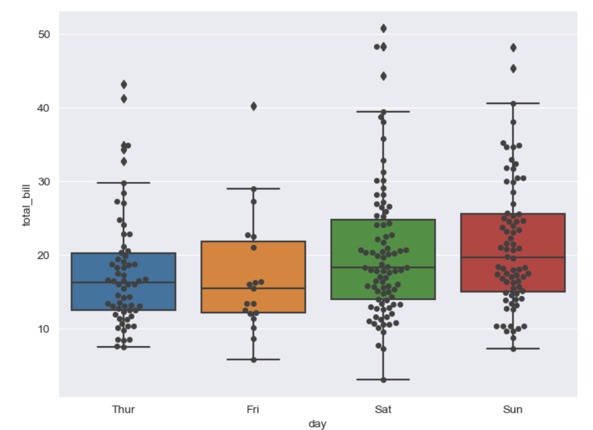
- implot
- total_bill 과 tip 사이 관계 파악
sns.set_style('darkgrid')
sns.lmplot(x='total_bill', y='tip', data=tips, height=7) # size -> height
plt.show()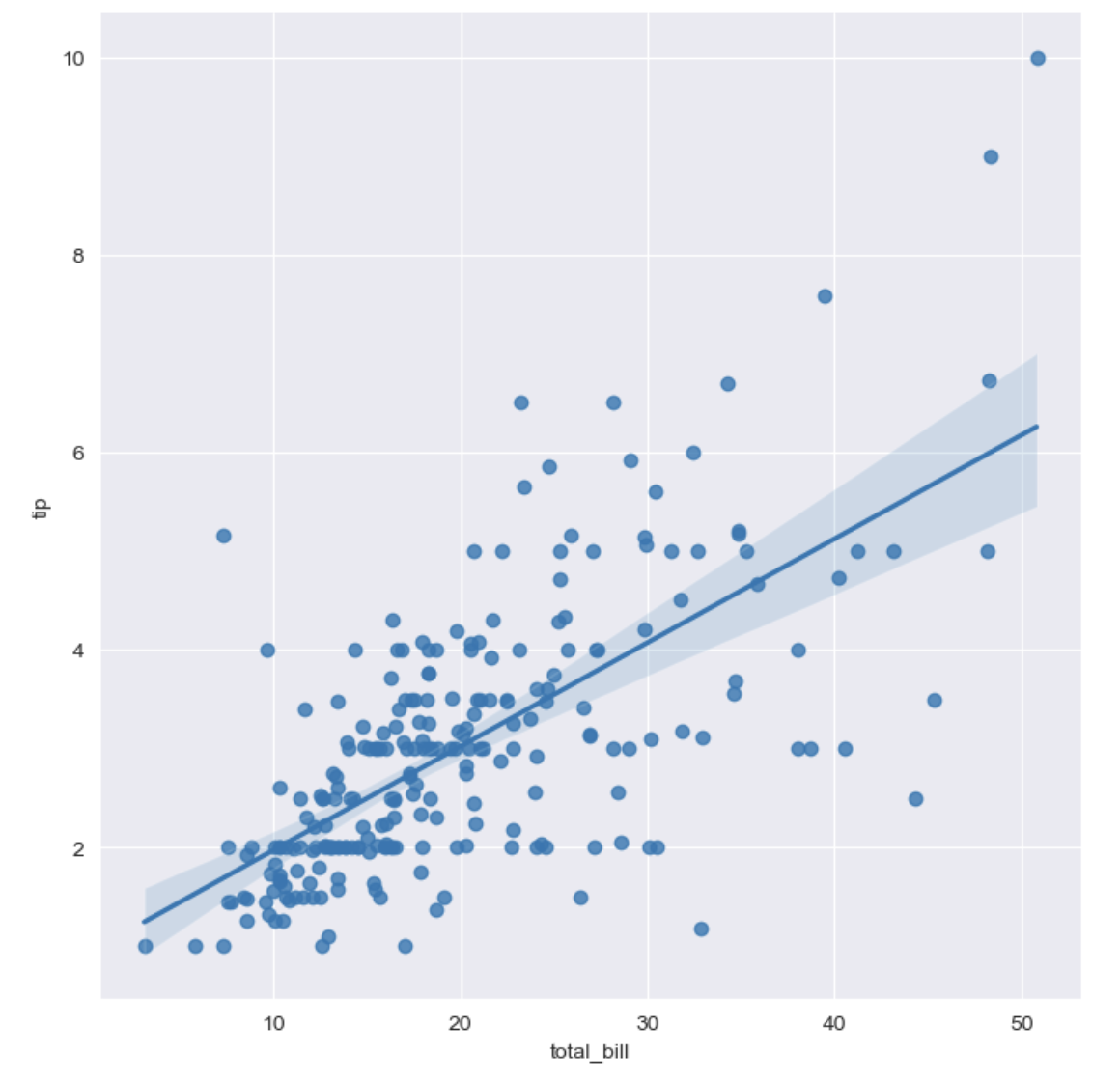
-Implot hue option
sns.set_style('darkgrid')
sns.lmplot(x='total_bill', y='tip', data=tips, height= 7, hue='smoker')
plt.show()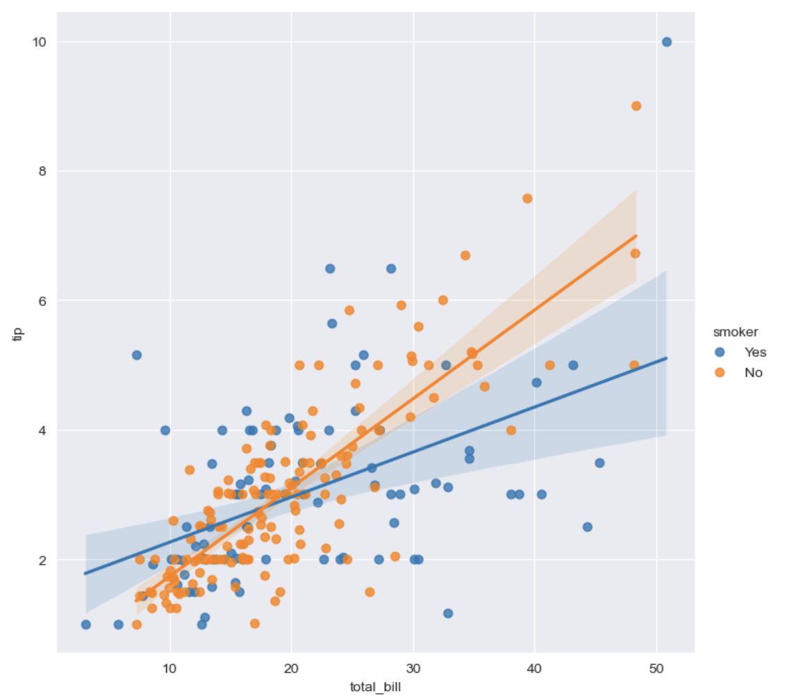
flights data
- heatmap
flights = sns.load_dataset('flights')

# pivot
# index, columns, values
flights = flights.pivot(index='month', columns='year', values='passengers')

plt.figure(figsize=(10,8))
sns.heatmap(data=flights, annot=True, fmt='d') # annot=True 데이터 값 표시, fmt='d' 정수형 표현
plt.show()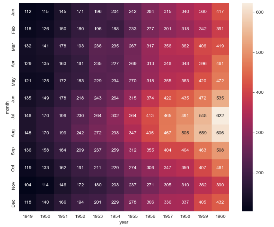
- colormap
plt.figure(figsize=(10,8))
sns.heatmap(flights, annot=True, fmt='d', cmap='YlGnBu')
plt.show()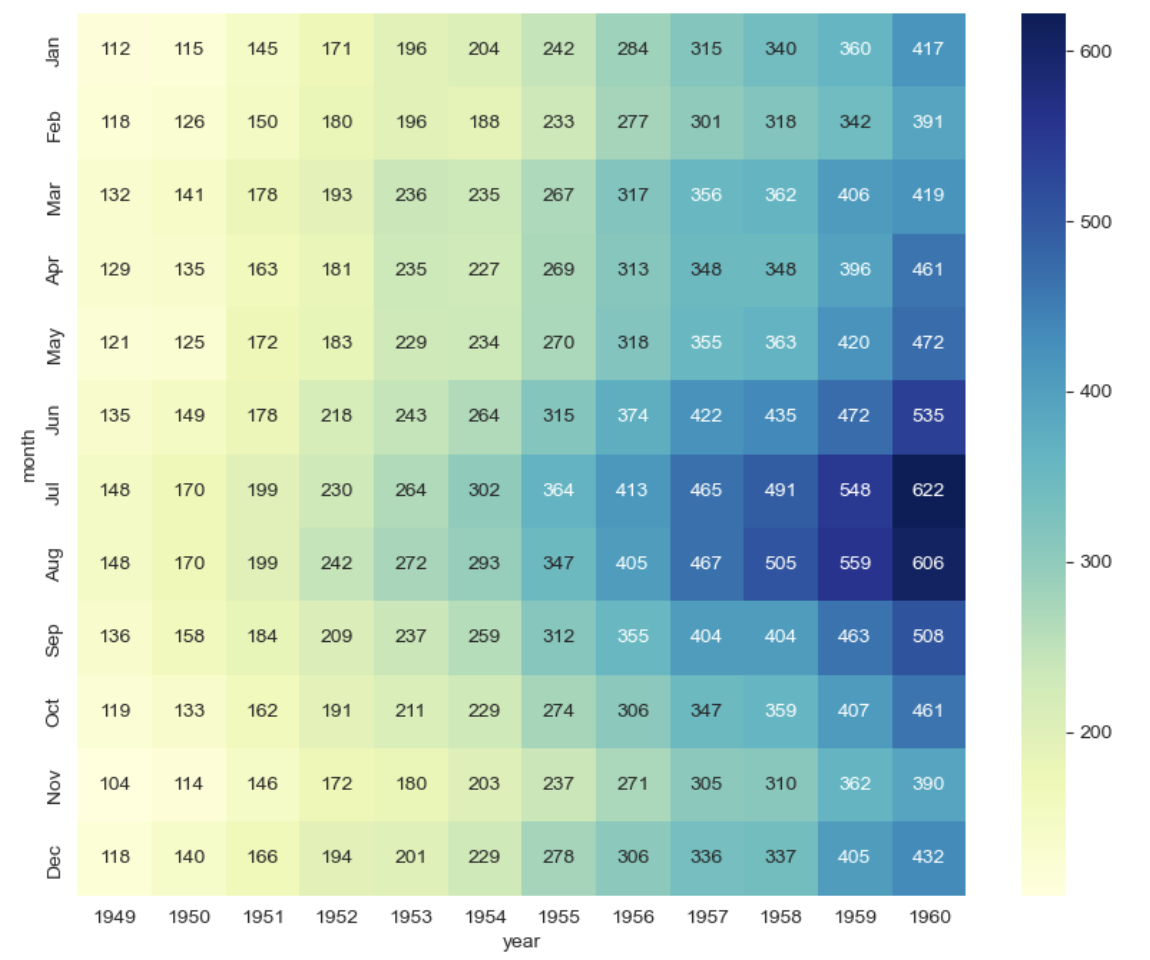
iris data
- pairplot
iris = sns.load_dataset('iris')

sns.set_style('ticks')
sns.pairplot(iris)
plt.show()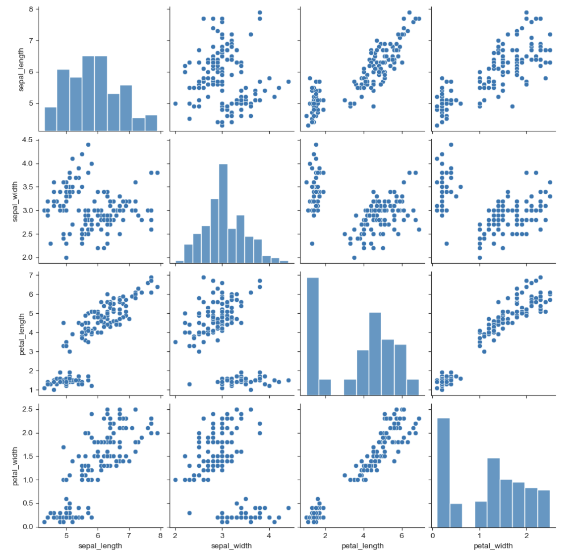
- pairplot hue option
sns.pairplot(iris, hue='species')
plt.show()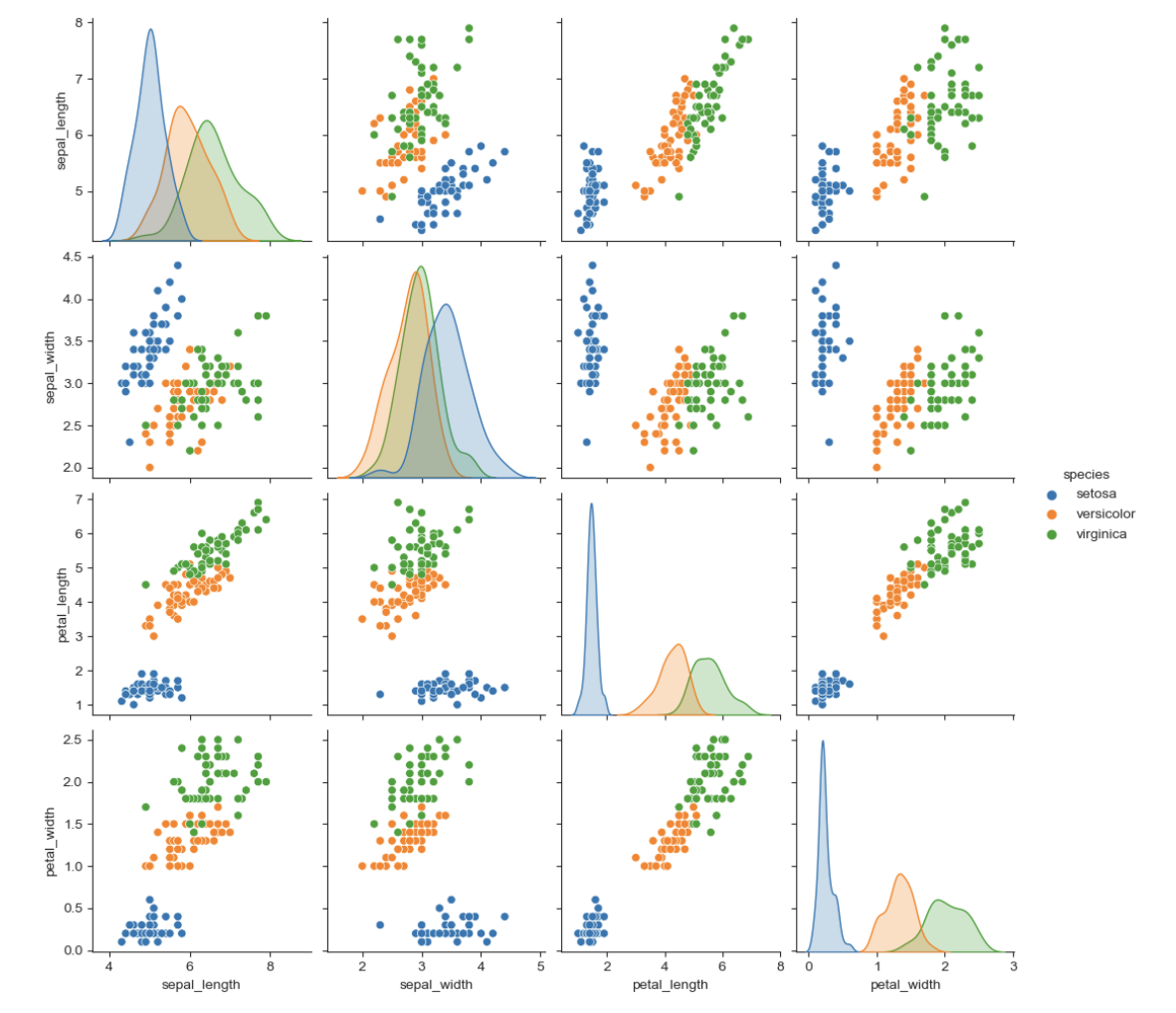
- 원하는 컬럼만 pairplot
sns.pairplot(iris, x_vars=['sepal_width', 'sepal_length'],
                   y_vars=['petal_width', 'petal_length'])
plt.show()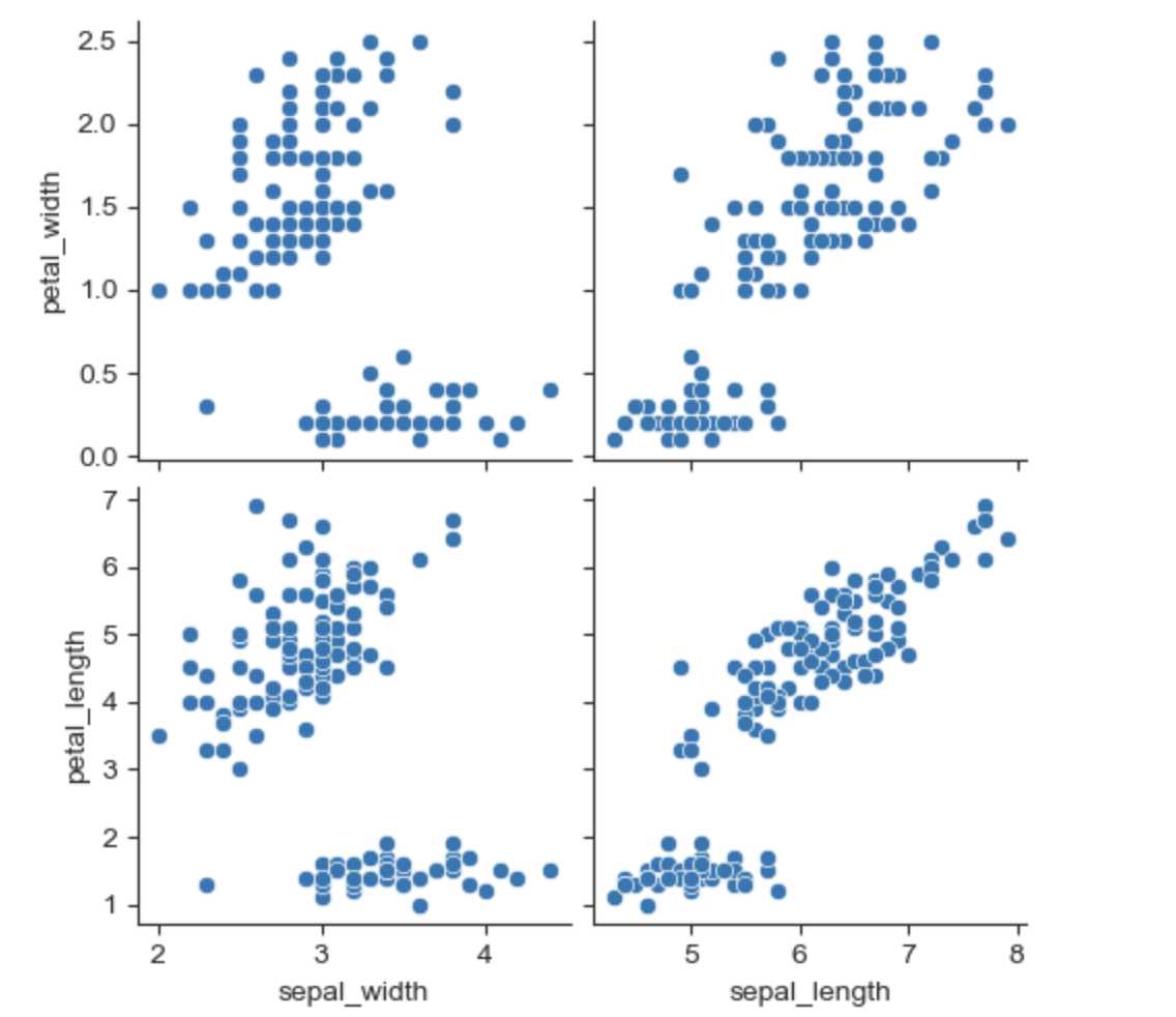
anscombe data
- Implot
anscombe = sns.load_dataset('anscombe')

sns.set_style('darkgrid')
sns.lmplot(x='x', y='y', data=anscombe.query("dataset =='I'"), ci=None, height=7) # ci 신뢰구간 선택
plt.show()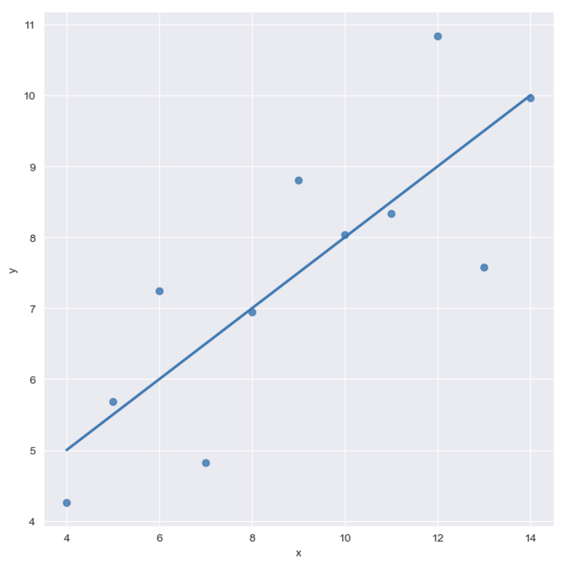
sns.set_style('darkgrid')
sns.lmplot(x='x', y='y', data=anscombe.query("dataset =='I'"), ci=None, height=7, scatter_kws={'s':50})
plt.show()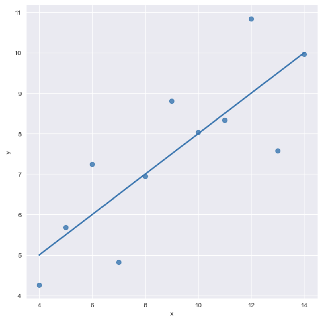
- order option
sns.set_style('darkgrid')
sns.lmplot(x='x',
           y='y',
           data=anscombe.query("dataset =='I'"),
           order = 2,
           ci=None,
           height=7,
          scatter_kws={'s':80})
plt.show()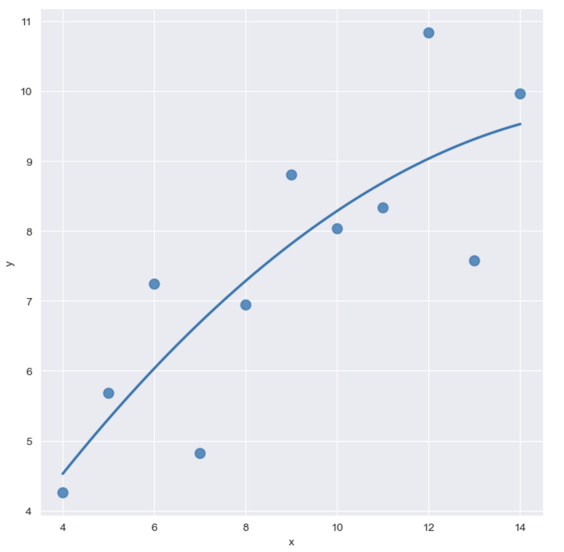
- outlier
sns.set_style('darkgrid')
sns.lmplot(x='x',
           y='y',
           data=anscombe.query("dataset =='III'"),
           ci=None,
           height=7,
          scatter_kws={'s':80})
plt.show()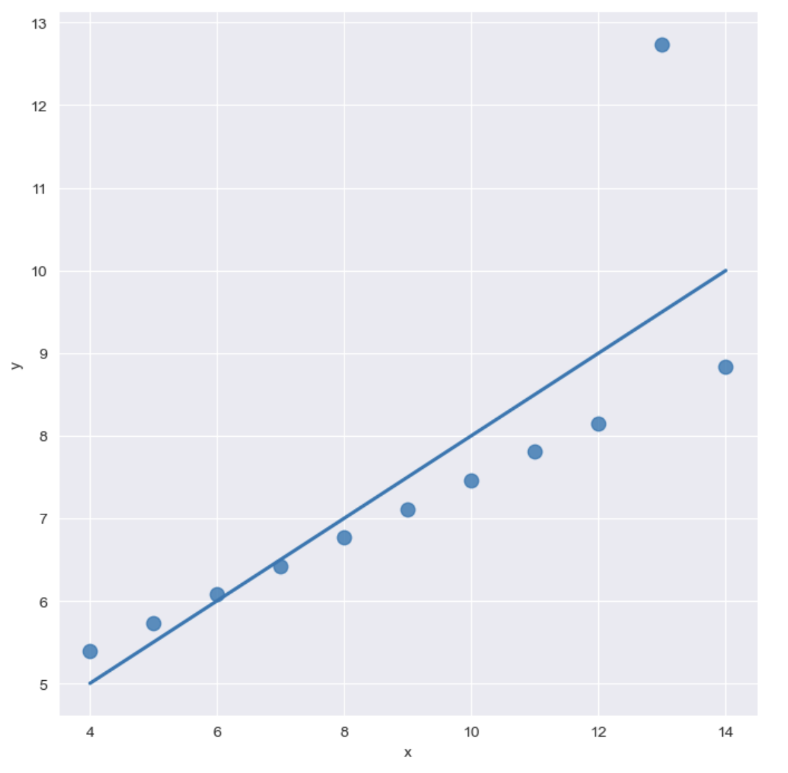
sns.set_style('darkgrid')
sns.lmplot(x='x',
           y='y',
           data=anscombe.query("dataset =='III'"),
           robust=True,
           ci=None,
           height=7,
          scatter_kws={'s':80})
plt.show()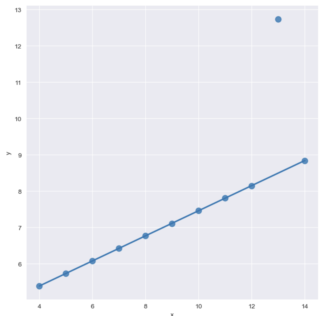

10√2 Data