들어가기전에..
- 프로젝트에서 styled-components를 사용한이유
- 페이지에서 렌더링되는 요소에 맞춰 자동으로 해당 스타일만 삽입, 그때그때 필요한 스타일만 로드한다.
- 스타일에 대한 고유 클래스명을 생성
- 더 이상 사용되지 않는 CSS를 쉽게 삭제할 수 있다. 모든 스타일은 특정 요소와 연결되어 있기 때문에 해당 요소가 삭제되면 스타일도 삭제된다.
- 동적 스타일링이 편해진다. 상태 변수를 공유해 조건부 렌더링을 할 수 있다.
프로젝트에서 사용한 예시
- 아래 사진의 지도홈, 영업중, 심야, 찜콩 버튼을 눌렀을때,
또는 마우스 커서가 올라가서 호버될때 색이 달라지게 스타일링- title과 selected라는 변수를 공유하며 조건부 스타일링했다.
- 그외에도 반응형으로 구현
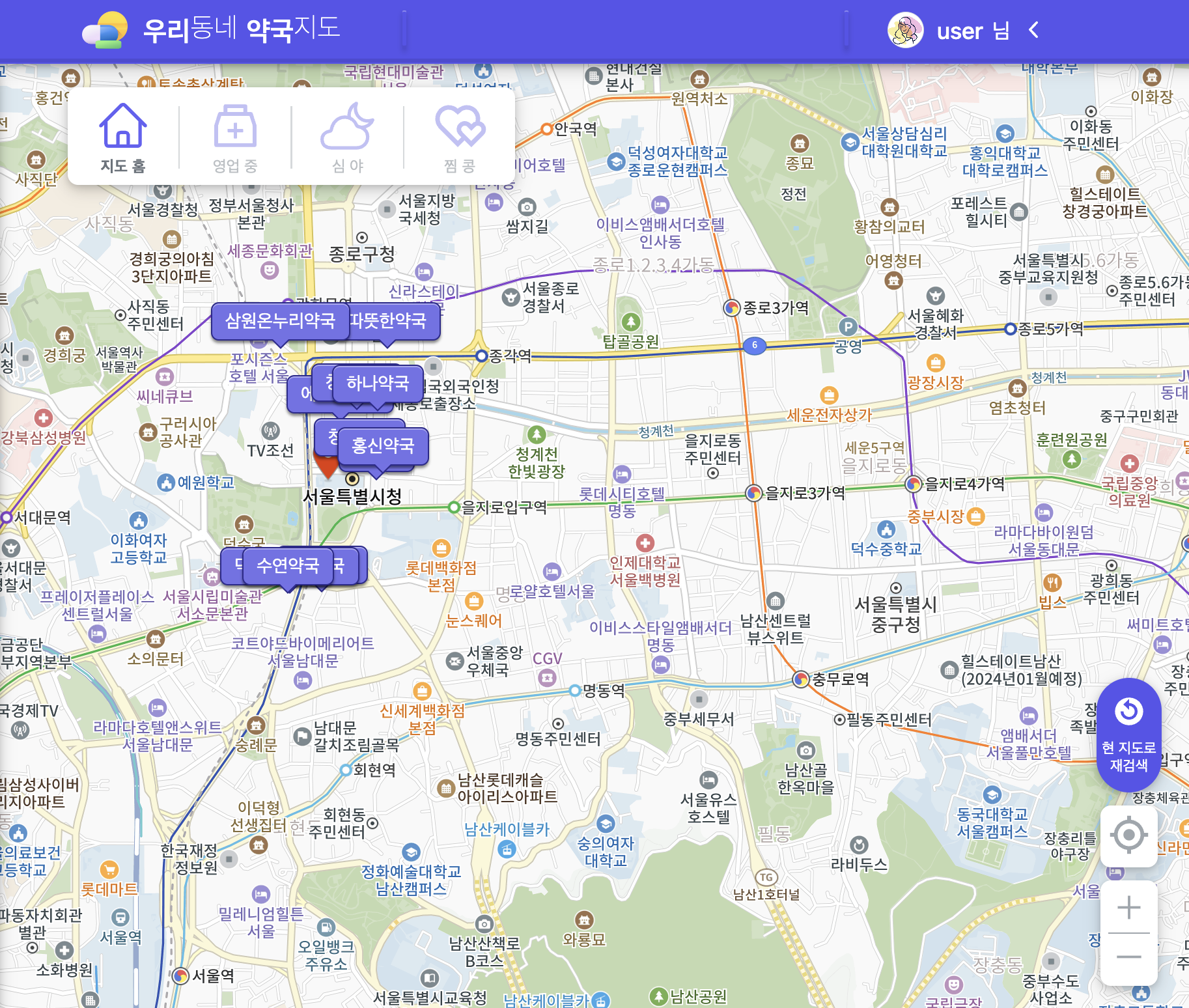
- MapFilter.tsx
import styled from "styled-components";
import { IoCloudyNightOutline } from "react-icons/io5";
import { HiOutlineHome } from "react-icons/hi2";
import { AiOutlineMedicineBox } from "react-icons/ai";
import { RiHeartsLine } from "react-icons/ri";

interface FilterProps {
  selected: string;
  onClickNot?: (e: React.MouseEvent<HTMLSpanElement>) => void;
  onClickOperatingTime?: (e: React.MouseEvent<HTMLSpanElement>) => void;
  onClickNightOperating?: (e: React.MouseEvent<HTMLSpanElement>) => void;
  onClickBookmarks?: (e: React.MouseEvent<HTMLSpanElement>) => void;
}

export default function MapFilter({
  selected,
  onClickNot,
  onClickOperatingTime,
  onClickNightOperating,
  onClickBookmarks,
}: FilterProps) {
  return (
    <ContainerFillter>
      <ButtonFillter title={"not"} selected={selected} onClick={onClickNot}>
        <HiOutlineHome className="icon" />
        <div className="label">지도 홈</div>
      </ButtonFillter>
      <span className="partition" />
      <ButtonFillter title={"operatingTime"} selected={selected} onClick={onClickOperatingTime}>
        <AiOutlineMedicineBox className="icon" />
        <div className="label">영업 중</div>
      </ButtonFillter>
      <span className="partition" />
      <ButtonFillter title={"nightOperating"} selected={selected} onClick={onClickNightOperating}>
        <IoCloudyNightOutline className="icon" />
        <div className="label">심 야</div>
      </ButtonFillter>
      <span className="partition" />
      <ButtonFillter title={"bookmarks"} selected={selected} onClick={onClickBookmarks}>
        <RiHeartsLine className="icon" />
        <div className="label">찜 콩</div>
      </ButtonFillter>
    </ContainerFillter>
  );
}
const ContainerFillter = styled.nav`
  display: flex;
  justify-content: center;
  align-items: center;
  padding: 6px 10px 4px 10px;
  border-radius: 8px;
  background-color: var(--white);
  box-shadow: var(--bs-lg);
  transition: 0.2s;
  .partition {
    width: 1.2px;
    height: 48px;
    margin: 0 10px;
    background-color: var(--black-100);
  }
  @media (max-width: 768px) {
    flex-direction: column;
    padding: 10px 6px 10px 6px;
    transition: 0.2s;
    .partition {
      width: 50px;
      height: 1.2px;
      margin: 10px 0 6px 0;
      background-color: var(--black-100);
    }
  }
`;
const ButtonFillter = styled.button<{ title: string; selected: string }>`
  cursor: pointer;
  display: block;
  width: 65px;
  height: 65px;
  text-align: center;
  border: none;
  background-color: transparent;
  .icon {
    align-items: center;
    font-size: 2.6rem;
    color: ${({ title, selected }) => (title === selected ? "var(--blue-500)" : "var(--blue-200)")};
    transition: 0.2s;
  }
  .label {
    align-items: center;
    font-size: 0.75rem;
    font-weight: ${({ title, selected }) => (title === selected ? "700" : "400")};
    color: ${({ title, selected }) => (title === selected ? "var(--black-500)" : "var(--black-200)")};
    transition: 0.2s;
  }
  &:hover {
    .icon {
      font-size: 2.62rem;
      color: var(--blue-400);
      transition: 0.2s;
    }
    .label {
      font-size: 0.76rem;
      color: var(--black-400);
      transition: 0.2s;
    }
  }
`;
함께 일하는 프론트엔드 개발자 이성은입니다🐥