학습내용
clustering data 생성
from sklearn.datasets import make_blobs

#example1
X1, Y1 = make_blobs(n_features = 2, n_samples = 100, random_state = 4, cluster_std = 2)

#example2
x, y = make_blobs(n_samples = 100, centers = 3, n_features = 2)
df = pd.DataFrame(dict(x = x[:, 0], y = x[:, 1], label = y)) #2개의 feature를 x,y로 설정

colors = {0 : '#eb4d4b', 1 : '#4834d4', 2 : '#6ab04c'}
fig, ax = plt.subplots()
grouped = df.groupby('label')
for key, group in grouped:
    group.plot(ax = ax, kind = 'scatter', x = 'x', y = 'y', label = key, color = colors[key])
    #ax = ax 같은 subplot에 그림그리기, group에는 label에 따른 데이터가 들어감
plt.show()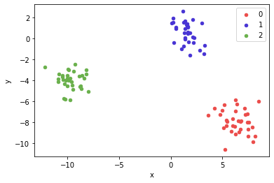
그래프
import matplotlib.pyplot as plt

fig = plt.figure(figsize(100,30))

ax = plt.subplot()

ax.bar
ax.plot

ax.annotate('text', xy=(x좌표, y좌표), xytext=(text 위치 설정),
            fontsize=14, va= 'bottom', ha='center',
            arrowprops=dict(facecolor='black', width=1, shrink=0.1, headwidth=10))
Clustering
- 비지도학습
- 종류
- Hierarchical : 계측적 구조, bottom-up(Agglomerative), Top-down(Divisive)
- Point Assignment : cluster 수를 정한 후, 데이터들을 하나씩 cluster에 배정
- Hard vs Soft : Hard는 데이터 당 하나의 cluster에만 속할 수 있음. soft는 여러개 가능
- similarity
K-Means-Clustering(KNN이랑 다름, 헷갈리지 말기)
과정 :
n-차원의 데이터에 대해서 :
1) k 개의 랜덤한 데이터를 cluster의 중심점으로 설정
2) 해당 cluster에 근접해 있는 데이터를 cluster로 할당
3) 변경된 cluster에 대해서 중심점을 새로 계산
4) cluster에 유의미한 변화가 없을 때 까지 2-3을 반복
#원래 label빼고 StandardScaler()
from sklearn.preprocessing import StandardScaler

df.drop('label', axis =1, inplace = True)

scaler = StandardScaler()

df_scale = scaler.fit_transform(df)
from sklearn.cluster import KMeans
kmeans = KMeans(n_clusters = 2, random_state = 42)
kmeans.fit(df_scale)
labels = kmeans.labels_ #fit_predict로 바로 label 생성 가능#Agglomerative Clustering
from sklearn.cluster import AgglomerativeClustering
import matplotlib.pyplot as plt
import scipy.cluster.hierarchy as shc
Agglomerative = AgglomerativeClustering(n_cluster=2, affinity = 'euclidean', linkage = 'ward') #dissimilarity euclidean으로 계산, cluster 사이거리는 ward로 측정
Agglomerative.fit(df_scale)
Agglomerative.labels_ #clustering 결과#Dendrogram
plt.figure(figsize = (100,30))
plt.title('dendrogram', fontdict={'fontsize' : 70}) #title fontsize 조절 가능
dend = shc.dendrogram(shc.linkage(df_scale, method='ward'))
plt.show()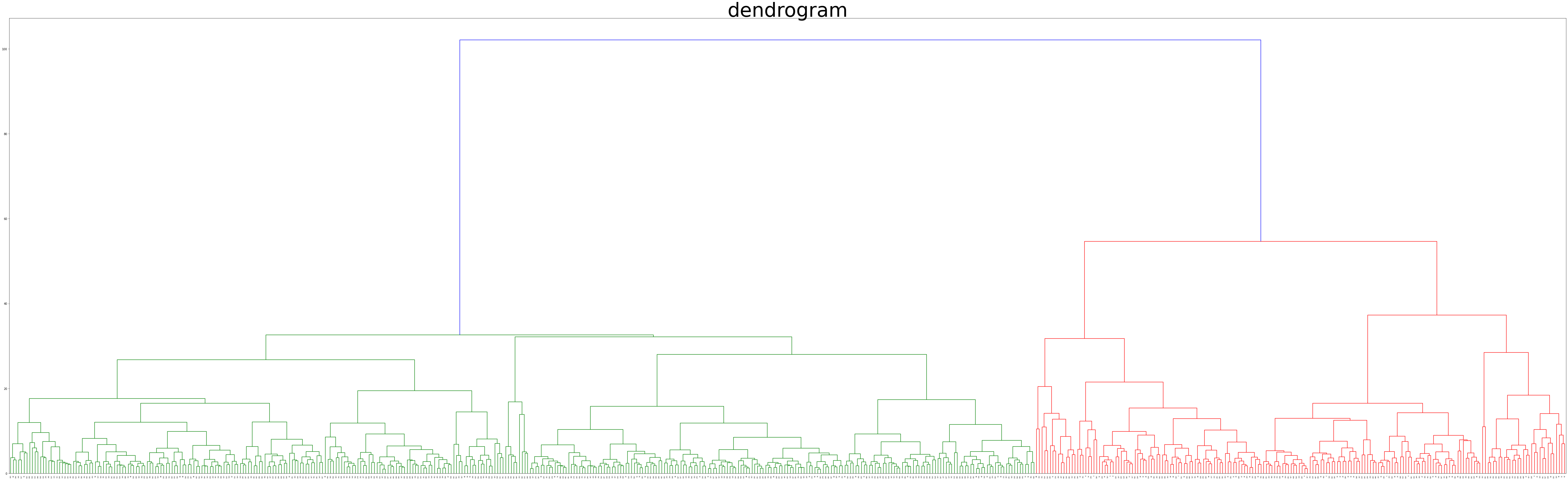
#2차원 scatterplot
#2차원으로 pca가 선행됨

import seaborn as sns

twod = sns.scatterplot(
    x='trans_X',
    y='trans_Y',
    data=df_B,
    hue='label'
);

twod.set_title('2D scatter plot');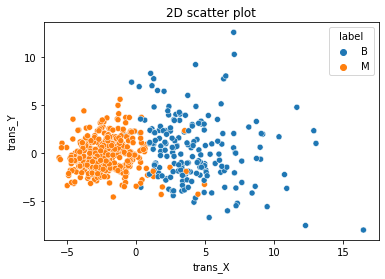
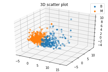
#3차원 PCA
pca3 = PCA(3)

pca3.fit(df_scale)

print('Explained variance ratio', pca3.explained_variance_ratio_)

B3 = pca3.fit_transform(df_scale)

df_B3 = pd.DataFrame(B3, columns = ['trans_X', 'trans_Y', 'trans_Z'])
df_B3['label'] = result_agg

#3차원 scatterplot

threedee = plt.figure().gca(projection='3d')

for i in df_B3['label'].unique():
    threedee.scatter(df_B3[df_B3['label']==i]['trans_X'],df_B3[df_B3['label']==i]['trans_Y'],df_B3[df_B3['label']==i]['trans_Z'])

plt.legend(df_B3['label'].unique())
plt.title('3D scatter plot')
plt.show()