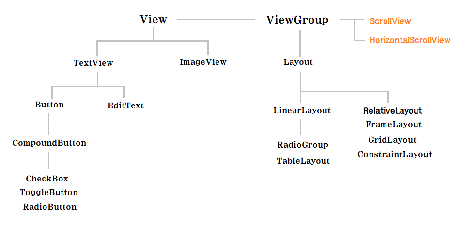
Android
CompoundButton
복합 버튼(Compound Button) 에는 CheckBox, ToggleButton, Switch, RadioButton 등 여러가지 버튼이 있습니다. 앞서 언급한 4가지 정도만 살펴보고 넘어갑시다.
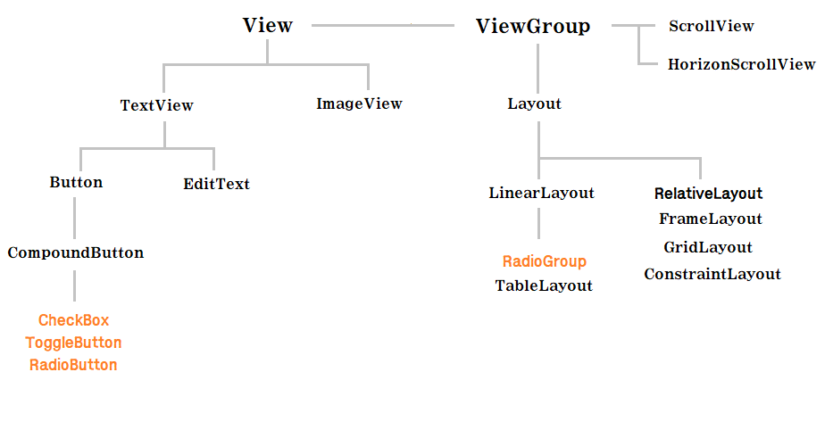
CheckBox
버튼 리스너를 이용한 체크박스 정보 넘기기
----------- activity_main.xml
    <CheckBox
        android:id="@+id/cb01"
        android:layout_width="wrap_content"
        android:layout_height="wrap_content"
        android:text="Apple"/>

    <CheckBox
        android:id="@+id/cb02"
        android:layout_width="wrap_content"
        android:layout_height="wrap_content"
        android:text="Google"/>

    <CheckBox
        android:id="@+id/cb03"
        android:layout_width="wrap_content"
        android:layout_height="wrap_content"
        android:checked="true"
        android:text="Meta"/>

    <Button
        android:id="@+id/btn"
        android:layout_width="match_parent"
        android:layout_height="wrap_content"
        android:layout_marginRight="30dp"
        android:layout_marginLeft="30dp"
        android:text="확인"/>

    <TextView
        android:id="@+id/tv"
        android:layout_width="match_parent"
        android:layout_height="wrap_content"
        android:textColor="#000000"
        android:textStyle="bold"
        android:layout_margin="30dp"/>
지금까지 만들어왔던 뷰와 큰 차이가 없습니다. CheckBox 를 사용하고 싶다면 똑같이 <CheckBox ... /> 를 이용하여 뷰를 생성해주면 됩니다. 다만, 체크박스의 크기는 wrap_content 으로 지정되어있습니다. 사람 손가락에 맞춰진 크기라고 합니다. 또한 보통 체크박스의 경우 한 가지는 선택이 되어있는 경우가 많습니다. 그럴때는 checked = "true" 속성을 지정해줍시다.
그리고 이렇게 만들어진 체크박스 뷰들을 가지고 체크된 체크박스의 글자를 텍스트 뷰에 글자를 뿌려줍시다.
----------- MainActivity.java
public class MainActivity extends AppCompatActivity {

    CheckBox cb01,cb02,cb03;
    Button btn;
    TextView tv;

    @Override
    protected void onCreate(Bundle savedInstanceState) {
        super.onCreate(savedInstanceState);
        setContentView(R.layout.activity_main);

        cb01 = findViewById(R.id.cb01);
        cb02 = findViewById(R.id.cb02);
        cb03 = findViewById(R.id.cb03);
        btn = findViewById(R.id.btn);
        tv = findViewById(R.id.tv);

        btn.setOnClickListener(new View.OnClickListener() {
            @Override
            public void onClick(View view) {
                String s = "";
                if(cb01.isChecked()) s += cb01.getText().toString() + "\n";
                if(cb02.isChecked()) s += cb02.getText().toString() + "\n";
                if(cb03.isChecked()) s += cb03.getText().toString() + "\n";
                tv.setText(s);
            }
        });

    }
}
isChecked() 메서드를 이용하면 체크박스의 체크여부를 판별할 수 있습니다. 그리 어렵지 않으니 넘어갑시다.
체크박스 리스너를 이용한 체크박스 정보 넘기기
이번에는 버튼을 이용하여 정보를 넘겨주는게 아니라, 체크박스를 체크할 때 바로 넘겨주도록 합시다. 체크박스 또한 버튼과 비슷하게 리스너를 설정할 수 있습니다. 이 리스너를 통해 체크박스를 체크할 때의 동작을 설정할 수 있습니다.
public class MainActivity extends AppCompatActivity {

    CheckBox cb01,cb02,cb03;
    Button btn;
    TextView tv;

    @Override
    protected void onCreate(Bundle savedInstanceState) {
        super.onCreate(savedInstanceState);
        setContentView(R.layout.activity_main);

        cb01 = findViewById(R.id.cb01);
        cb02 = findViewById(R.id.cb02);
        cb03 = findViewById(R.id.cb03);
        btn = findViewById(R.id.btn);
        tv = findViewById(R.id.tv);

        cb01.setOnCheckedChangeListener(checkedChangeListener);
        cb02.setOnCheckedChangeListener(checkedChangeListener);
        cb03.setOnCheckedChangeListener(checkedChangeListener);

    }
    CompoundButton.OnCheckedChangeListener checkedChangeListener = new CompoundButton.OnCheckedChangeListener() {
        @Override
        public void onCheckedChanged(CompoundButton compoundButton, boolean b) {
            String s = "";
            if(compoundButton.isChecked()) s += compoundButton.getText().toString();
            tv.setText(s);
        }
    };
}
OncheckedChangeListener 의 onCheckedChanged() 메서드를 통해 체크박스가 체크될 때 텍스트 값을 가져와서 텍스트 뷰에 뿌려주는 코드 입니다.
ToggleButton(Switch)
이번에는 토글 버튼 입니다. 이것 또한 앞선 뷰들과 크게 다를게 없기 때문에 이렇게 만드는구나 정도로만 익히고 넘어갑시다.
    <ToggleButton
        android:id="@+id/tb"
        android:layout_width="wrap_content"
        android:layout_height="wrap_content"
        android:textOn="켜짐"
android:textOff="꺼짐"/>tb.setOnCheckedChangeListener(new CompoundButton.OnCheckedChangeListener() {
@Override
public void onCheckedChanged(CompoundButton compoundButton, boolean b) {
tv.setText("체크상태 : " + b);
}
});버튼 객체는 compoundButton 으로 , 체크 상태값은 b 로 처리합니다.
다만, 토글버튼 보다는 스위치가 디자인적으로 이쁘기 때문에 스위치 사용빈도가 압도적입니다. 만들어 봅시다.
    <Switch
        android:layout_width="wrap_content"
        android:layout_height="wrap_content"
        android:text="사운드"/>
스위치 역시 토글과 마찬가지로 리스너를 통해 동작 설정이 가능합니다.
RadioButton
이번에는 라디오 버튼 입니다. 라디오 버튼은 다른 CompoundButton 과 조금 다릅니다. 어떻게 다른지 일단 코드부터 살펴봅시다.
<RadioGroup
    android:id="@+id/rg"
    android:layout_width="wrap_content"
    android:layout_height="wrap_content"
    android:orientation="horizontal">

    <RadioButton
        android:id="@+id/rg1"
        android:layout_width="wrap_content"
        android:layout_height="wrap_content"
        android:text="USA"
        android:checked="true"
        android:layout_marginRight="20dp"/>
    <RadioButton
        android:id="@+id/rg2"
        android:layout_width="wrap_content"
        android:layout_height="wrap_content"
        android:text="Japan"
        android:layout_marginRight="20dp"/>
    <RadioButton
        android:id="@+id/rg3"
        android:layout_width="wrap_content"
        android:layout_height="wrap_content"
        android:text="England"
        android:layout_marginRight="20dp"/>
</RadioGroup>
다른 CompoundButton 이 단독으로 사용하는것과 다르게 라디오 버튼은 RadioGroup 이 필요합니다. 이 라디오 그룹을 통해 라디오 버튼 중 하나만 선택이 가능해집니다. 다만 이때 라디오 버튼의 id 값을 모두 지정해주어야 합니다. (그렇지 않으면 이상해집니다..)
라디오 버튼 역시 리스너를 통해 제어가 가능합니다.
public class MainActivity extends AppCompatActivity {
    RadioGroup rg;
    TextView tv;

    @Override
    protected void onCreate(Bundle savedInstanceState) {
        super.onCreate(savedInstanceState);
        setContentView(R.layout.activity_main);

        rg = findViewById(R.id.rg);
        tv = findViewById(R.id.tv);

        rg.setOnCheckedChangeListener(new RadioGroup.OnCheckedChangeListener() {
            @Override
            public void onCheckedChanged(RadioGroup radioGroup, int i) {
                RadioButton rb = findViewById(i);
                tv.setText(rb.getText().toString());
            }
        });
    }
}
라디오 버튼의 체크 상태가 변경될 때마다 반응하는 리스너는 버튼에 리스너를 붙이는것이 아니라 버튼 그룹에 리스너를 붙여서 상태를 체크해야 합니다.
setOnCheckedChangeListener 의 onCheckedChanged() 메서드를 통해 변경 상태에 대한 동작을 정의할 수 있습니다. 두번째 파라미터 i 는 선택된 라디오 버튼의 ID 값 입니다.
Layout
지금까지 우리는 수직 혹은 수평으로 뷰들을 배치해왔습니다. 또한 우리가 사용했던 리니어레이아웃의 경우 뷰들을 겹치게 배치할 수 없다는게 특징이었습니다. 그렇다보니 리니어 레이아웃 만으로는 뷰들을 자유자재로 배치하는것에는 분명한 한계가 있었습니다. 그래서 우리에게는 조금 더 효율적으로 사용할 수 있는 레이아웃이 필요합니다.
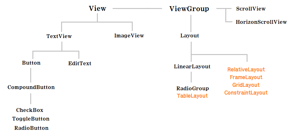
RelativeLayout
RelativeLayout, 번역하자면 상대 레이아웃입니다. 앞선 리니어 레이아웃에서는 뷰들간의 관계보다 뷰 자체의 속성들이 더 중요했다면, 상대레이아웃에서는 뷰들간의 관계를 중심으로 화면을 배치합니다. 예를 들면, 어떤 뷰가 다른 뷰 밑에 혹은 옆에 있게 해줘! 라는 식으로 화면을 배치하게 됩니다. 그렇기 때문에 각 뷰들을 식별할 수 있는 식별자, 즉, 뷰의 ID 값이 필요합니다. 말로만 할게 아니라 직접 코드를 봅시다.
align 속성
RelativeLayout 은 align 속성을 가집니다. 말 그대로 정렬하는 속성인데요, 아래 코드와 그림을 보면 쉽게 알 수 있습니다.
<Button
    android:id="@+id/btn1"
    android:layout_width="wrap_content"
    android:layout_height="wrap_content"
    android:text="첫번째 버튼"/>

<Button
    android:id="@+id/btn2"
    android:layout_width="wrap_content"
    android:layout_height="wrap_content"
    android:text="두번째 버튼"
    android:layout_alignParentBottom="true" />

<Button
    android:id="@+id/btn3"
    android:layout_width="wrap_content"
    android:layout_height="wrap_content"
    android:text="세번째 버튼"
    android:layout_alignParentRight="true"/>

<Button
    android:id="@+id/btn4"
    android:layout_width="wrap_content"
    android:layout_height="wrap_content"
    android:text="네번째 버튼"
    android:layout_alignParentBottom="true"
    android:layout_alignParentRight="true"/>
layout_alignParent[Right,Left,Top,Bottom] 은 부모 레이아웃의 오른쪽, 왼쪽, 위, 아래에 뷰를 맞추는 속성입니다. RelativeLayout 은 기본적으로 왼쪽 위에 뷰가 배치됩니다. 그 이후에 align 속성을 주면 각 속성에 맞게 배치됩니다. 예를 들어 위 코드에서 세번째 버튼의 경우 alignParentRight 의 속성에 true 를 설정했기 때문에 부모 레이아웃의 오른쪽에 뷰가 맞춰져 있음을 알 수 있습니다.
이와 같은 개념이지만 부모 레이아웃이 아닌 다른 뷰를 기준으로 align 속성을 지정할 수도 있습니다.
    <Button
        android:layout_width="wrap_content"
        android:layout_height="wrap_content"
        android:text="버튼5"
        android:layout_alignParentTop="true"
        android:layout_alignRight="@id/btn5"/>


    <Button
        android:layout_width="wrap_content"
        android:layout_height="wrap_content"
        android:text="버튼5"
        android:layout_alignParentBottom="true"
        android:layout_alignLeft="@id/btn5"/>
위 코드와 그림에서 볼 수 있듯, layout_align[Right, Left, Top, Bottom] 은 각각 다른 뷰의 오른편, 왼편, 위, 아래에 맞추는 속성입니다. 위 그림에서 버튼 5는 각각 중앙의 다섯번째 버튼에 오른편과 왼편에 정렬하고 있음을 알 수 있습니다.
centerInParent / centerHorizontal / centerVertical
속성의 이름에서 알 수 있듯, 뭔가 중앙 정렬을 할거같은 속성입니다. 코드와 그림부터 봅시다.
<Button
    android:id="@+id/btn1"
    android:layout_width="wrap_content"
    android:layout_height="wrap_content"
    android:layout_centerInParent="true"
    android:text="첫번째 버튼"/>

<Button
    android:id="@+id/btn2"
    android:layout_width="wrap_content"
    android:layout_height="wrap_content"
    android:layout_centerHorizontal="true"
    android:text="두번째 버튼"/>


<Button
    android:id="@+id/btn3"
    android:layout_width="wrap_content"
    android:layout_height="wrap_content"
    android:layout_centerVertical="true"
    android:text="세번째 버튼"/>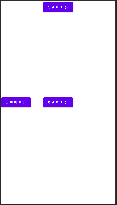
centerInParent 속성은 첫번째 버튼으로, 부모 레이아웃의 중앙에 정렬되었습니다. 두번째 버튼은 centerHorizontal 속성으로 행을 기준으로 중앙 정렬하였습니다. 세번째 버튼은 centerVertical 속성이고 열을 기준으로 중앙 정렬합니다. RelativeLayout 은 왼쪽위의 위치가 뷰의 기본 위치 이므로 두번째와 세번째 버튼은 그 위치를 기준으로 열과 행이 결정된다는것도 참고합시다.
below / above / toRightOf / toLeftOf
align 과 비슷한듯 하면서도 전혀 다른 속성입니다. 그림과 코드를 잘 보고 헷갈리지 않도록 합시다.
<Button
    android:id="@+id/btn1"
    android:layout_width="wrap_content"
    android:layout_height="wrap_content"
    android:layout_below="@id/btn5"
    android:text="첫번째 버튼"/>

<Button
    android:id="@+id/btn2"
    android:layout_width="wrap_content"
    android:layout_height="wrap_content"
    android:layout_above="@id/btn5"
    android:text="두번째 버튼"/>


<Button
    android:id="@+id/btn3"
    android:layout_width="wrap_content"
    android:layout_height="wrap_content"
    android:layout_toRightOf="@id/btn5"
    android:text="세번째 버튼"/>

<Button
    android:id="@+id/btn4"
    android:layout_width="wrap_content"
    android:layout_height="wrap_content"
    android:layout_toLeftOf="@id/btn5"
    android:text="네번째 버튼"/>

<Button
    android:id="@+id/btn5"
    android:layout_width="wrap_content"
    android:layout_height="wrap_content"
    android:layout_centerInParent="true"
    android:text="다섯번째 버튼"/>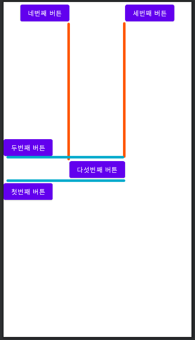
첫번째 버튼은 layout_below 속성이 적용되었고, 다섯번째 버튼의 밑쪽에 위치하게 됩니다. 다만, 바로 밑이 아닌 다섯번째 버튼의 아래 영역 정도로 해석합시다. 두번째 버튼은 layout_above 로, 다섯번째 버튼의 위쪽에 배치됩니다. 세번째와 네번째 버튼은 각각 layout_toRightOf , layout_toLeftOf 속성입니다. 각각 다섯번째 버튼의 오른쪽, 왼쪽에 위치합니다.
ConstraintLayout
앞서 RelativeLayout 을 사용하다 보니, 조금 걸리는 부분이 있습니다. align 속성을 이용해서 부모 레이아웃 혹은 다른 뷰를 기준으로 배치하는건 좋은데 배치할 뷰의 어느쪽이 부모레이아웃 혹은 다른 뷰의 어느쪽에 붙어야 할지 명확하지 않다는 것입니다. 그래서 만들어진 레이아웃이 ConstraintLayout 입니다. 이 레이아웃은 배치할 뷰의의 어떠한 부분을 , 기준이 되는 뷰의 어느쪽으로 붙일지 설정이 가능합니다. 생각보다 어렵지 않으니 간단한 예시와 유용한 속성 하나만 보고 넘어갑시다.
layout_constraint[Right,Left,Top,Bottom]_to[Right,Left,Top,Bottom]Of
<Button
    android:id="@+id/b1"
    android:layout_width="wrap_content"
    android:layout_height="wrap_content"
    app:layout_constraintRight_toLeftOf="@id/b5"
    app:layout_constraintBottom_toBottomOf="parent"
    app:layout_constraintTop_toTopOf="parent"
    android:text="A"/>

<Button
    android:id="@+id/b2"
    android:layout_width="wrap_content"
    android:layout_height="wrap_content"
    android:text="B"
    app:layout_constraintLeft_toRightOf="@id/b5"
    app:layout_constraintBottom_toBottomOf="parent"
    app:layout_constraintTop_toTopOf="parent"/>

<Button
    android:id="@+id/b3"
    android:layout_width="wrap_content"
    android:layout_height="wrap_content"
    android:text="C"
    app:layout_constraintBottom_toTopOf="@id/b5"
    app:layout_constraintLeft_toLeftOf="parent"
    app:layout_constraintRight_toRightOf="parent"/>

<Button
    android:id="@+id/b4"
    android:layout_width="wrap_content"
    android:layout_height="wrap_content"
    android:text="D"
    app:layout_constraintTop_toBottomOf="@id/b5"
    app:layout_constraintLeft_toLeftOf="parent"
    app:layout_constraintRight_toRightOf="parent"
    />

<Button
    android:id="@+id/b5"
    android:layout_width="wrap_content"
    android:layout_height="wrap_content"
    app:layout_constraintLeft_toLeftOf="parent"
    app:layout_constraintRight_toRightOf="parent"
    app:layout_constraintTop_toTopOf="parent"
    app:layout_constraintBottom_toBottomOf="parent"
    android:text="CENTER"/>
ConstraintLayout 에서 중앙 정렬을 하기 위해서는 약간 특이한 방법을 사용해야 합니다. 예를 들어, 수직을 기준으로 중앙 정렬하고 싶다면, 정렬하고자 하는 뷰의 위쪽을 부모 레이아웃의 위쪽과 연결하고, 아래쪽을 부모 레이아웃의 아래쪽과 연결하면 수직으로 중앙정렬이 가능합니다. 수평도 마찬가지 이며, 레이아웃의 중앙에 정렬하고 싶다면 수직과 수평으로 중앙정렬을 해주면 됩니다.
위 그림에서는 CENTER 버튼을 기준으로 각각의 버튼들을 붙여 보았습니다. RelativeLayout 의 좀 더 상세한 버전이라고 생각하면 될것 같습니다.
layout_constraint[Horizontal, Vertical]_bias
ConstraintLayout 에는 다른 레이아웃에 없는 특이한 속성 하나가 있는데, 바로 bias 속성입니다. 이 속성은 수직과 수평을 기준으로 얼마만큼의 비율로 위치할지 설정할 수 있습니다. 바로 코드부터 봅시다.
<Button
    android:layout_width="wrap_content"
    android:layout_height="wrap_content"
    android:text="BIAS"
    app:layout_constraintLeft_toLeftOf="parent"
    app:layout_constraintRight_toRightOf="parent"
    app:layout_constraintHorizontal_bias="0.2" />

<Button
    android:layout_width="wrap_content"
    android:layout_height="wrap_content"
    android:text="BIAS2"
    app:layout_constraintBottom_toBottomOf="parent"
    app:layout_constraintTop_toTopOf="parent"
    app:layout_constraintVertical_bias="0.2" />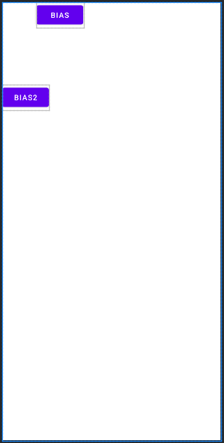
각 버튼들은 행과 열을 기준으로 중앙정렬이 되어있는 상태 였습니다. 그 상황에서 bias 속성을 이용하면 위치를 행과 열을 기준한 상황에서 임의로 지정할 수 있습니다. 속성값이 0.5 라면 중앙에 위치하게 되며, 그 보다 낮으면 왼쪽과 위쪽으로 설정되고 크면 오른쪽과 아래쪽으로 설정됩니다.
FrameLayout
프레임 레이아웃은 '액자 레이아웃' 으로 생각해도 좋습니다. 액자에 사진을 끼워 보듯, 프레임 레이아웃에도 뷰들을 끼워 볼 수 있는 구조 입니다. 액자에서 새로운 사진을 끼우면 기존의 사진이 가려지듯, 프레임 레이아웃에서도 나중에 끼워진 사진이 맨 위로 올라오게 됩니다.

이러한 특성때문에 보통 프레임 레이아웃은 화면 전환의 용도로 많이 사용됩니다. setVisibility 속성을 이용하여 상황에 따라 뷰들을 전환시켜 화면 전환의 효과를 주는것입니다. 아래 예제를 봅시다.
<LinearLayout
android:layout_width="match_parent"
android:layout_height="wrap_content"
android:orientation="horizontal"
android:weightSum="3">
    <Button
        android:id="@+id/newyork"
        android:layout_width="wrap_content"
        android:layout_height="wrap_content"
        android:text="new York"
        android:layout_weight="1"
        android:layout_margin="2dp"/>

    <Button
        android:id="@+id/paris"
        android:layout_width="wrap_content"
        android:layout_height="wrap_content"
        android:text="paris"
        android:layout_weight="1"
        android:layout_margin="2dp"/>
</LinearLayout>

<FrameLayout
    android:layout_width="match_parent"
    android:layout_height="match_parent">
    <!--        첫번째 화면 레이아웃 -->
    <LinearLayout
        android:id="@+id/layout01"
        android:layout_width="match_parent"
        android:layout_height="match_parent"
        android:orientation="vertical"
        android:gravity="center"
        android:weightSum="3">

        <ImageView
            android:layout_width="wrap_content"
            android:layout_height="0dp"
            android:src="@drawable/newyork"
            android:layout_weight="2"/>

        <TextView
            android:layout_width="match_parent"
            android:layout_height="wrap_content"
            android:gravity="center_horizontal"
            android:layout_weight="1"
            android:text="New York"
            android:textSize="24sp"
            android:textStyle="bold"/>
    </LinearLayout>
    <!--        두번째 화면 레이아웃 -->
    <LinearLayout
        android:id="@+id/layout02"
        android:layout_width="match_parent"
        android:layout_height="match_parent"
        android:orientation="vertical"
        android:gravity="center"
        android:weightSum="3"
        android:visibility="gone">

        <ImageView
            android:layout_width="wrap_content"
            android:layout_height="0dp"
            android:src="@drawable/paris"
            android:layout_weight="2"/>

        <TextView
            android:layout_width="match_parent"
            android:layout_height="wrap_content"
            android:gravity="center_horizontal"
            android:layout_weight="1"
            android:text="Paris"
            android:textSize="24sp"
            android:textStyle="bold"/>
    </LinearLayout>

</FrameLayout>
public class MainActivity extends AppCompatActivity {
Button btn1, btn2;
LinearLayout layout1,layout2;
@Override
protected void onCreate(Bundle savedInstanceState) {
super.onCreate(savedInstanceState);
setContentView(R.layout.activity_main);
btn1 = findViewById(R.id.newyork);
btn2 = findViewById(R.id.paris);
layout1 = findViewById(R.id.layout01);
layout2 = findViewById(R.id.layout02);
btn1.setOnClickListener(listener);
btn2.setOnClickListener(listener);
}
View.OnClickListener listener = new View.OnClickListener() {
@Override
public void onClick(View view) {
layout1.setVisibility(View.GONE);
layout2.setVisibility(View.GONE);
int id = view.getId();
if( id == R.id.newyork) layout1.setVisibility(View.VISIBLE);
else if( id == R.id.paris) layout2.setVisibility(View.VISIBLE);
}
};
}각각의 버튼을 누르면 각 프레임 레이아웃안에 있는 뷰들이 보였다 안보였다를 반복하면서 각 사진을 보여주는 예제 입니다. 이런식으로 FrameLayout 은 화면 전환의 효과를 위해 많이 사용됨을 알고 넘어갑시다.
GridLayout ( feat.TableLayout )
TableLayout
GridLayout 이 나오기 전에는 TableLayout 이 사용되었습니다. 엑셀과 비슷하게 행과 열을 기준으로 뷰들을 배치할 수 있습니다.
<TableLayout
    android:layout_width="match_parent"
    android:layout_height="150dp">

    <TableRow>
        <Button/>
        <Button/>
        <Button/>
        <Button/>
    </TableRow>
    <TableRow>
        <Button/>
        <Button/>
        <Button/>
        <Button/>
    </TableRow>
</TableLayout>
테이블 레이아웃의 특징은 뷰들의 필수 속성인 width 와 height 을 자동으로 지정해준다는 점입니다. 그래서 한결 코드가 간편해지는 장점이 있습니다만, 세로 병합이 불가하며 TableRow 를 이용한 중첩구조가 있기에 결국 코드가 지저분 해지며 그에 따라 성능 또한 좋지 못합니다. 그래서 GridLayout 이 나오게 됩니다.
GridLayout
테이블 레이아웃의 단점을 보완한 격자배치 구조의 GridLayout 입니다. 테이블 레이아웃의 보완책인 레이아웃이므로 width 와 height 역시 자동으로 생성이 가능합니다. 또한 열 위치와 행 위치도 지정이 가능하며 열 병합과 행 병합 또한 가능합니다. 각각의 특성을 코드를 통해 알아봅시다.
<GridLayout
    android:layout_width="wrap_content"
    android:layout_height="wrap_content"
    android:orientation="horizontal"
    android:columnCount="3">

    <Button android:text="1"/>
    <Button android:text="2"/>
    <Button android:text="3"/>
    <Button android:text="4"/>
    <Button android:text="5"/>
    <Button android:text="6"/>

    <!--  열 위치 지정가능  -->
    <Button android:text="7" android:layout_column="1"/>

    <!--  행 위치 지정가능  -->
    <Button android:text="8" android:layout_row="3"/>

    <!--  행과 열을 지정하여 겹치게 배치도 가능 -->
    <Button android:text="9" android:layout_row="0" android:layout_column="0"/>

    <!--  열 병합 : 사이즈는 같이 커지지 않고 그만큼의 공간만 차지함.  -->
    <Button android:text="10" android:layout_row="4" android:layout_columnSpan="2" android:layout_gravity="fill"/>

    <!--  행 병합  -->
    <Button android:text="11" android:layout_row="2" android:layout_column="0" android:layout_rowSpan="2" android:layout_gravity="fill"/>

</GridLayout>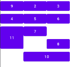
layout_column 으로 열의 위치 지정이 가능합니다. 열과 행의 위치는 0부터 시작하기 때문에 속성값으로 1을 넣으면 2번째 열의 위치에 배치 됩니다. layout_row 의 속성값은 마찬가지로 행의 위치 입니다. 행과 열을 동시에 지정할 수도 있으며, 기존의 뷰 위에 중첩으로 배치도 가능합니다.
열 병합과 행 병합 또한 가능합니다. columnSpan = "2" 의 경우 2개의 열을 병합하는 속성이며, rowSpan = "2" 는 2개의 행을 병합하는 속성입니다. 다만, 뷰의 사이즈는 같이 커지지 않고 병합된 만큼의 공간만 차지하게 됩니다. gravity 속성으로 fill 값을 넣어주면 차지된 공간만큼 뷰가 채워지게 됩니다.
<GridLayout
    android:layout_width="match_parent"
    android:layout_height="200dp"
    android:layout_alignParentBottom="true"
    android:orientation="horizontal"
    android:columnCount="3">

    <Button android:layout_columnWeight="1"/>
    <Button android:layout_columnWeight="1"/>
    <Button android:layout_columnWeight="1"/>

    <Button android:layout_columnWeight="1"/>
    <Button android:layout_columnWeight="1"/>
    <Button android:layout_columnWeight="1"/>
</GridLayout>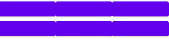
columnWeight 속성을 이용하면 뷰들의 열 너비를 동일하게 맞출 수 있습니다.
ScrollView
우리는 화면을 만들 때, 한정된 화면 안에서 뷰들을 알맞게 배치해야 합니다. 그런데 화면을 만들다보면 어쩔수 없이 화면을 꽉 채우고 넘어가야하는 상황이 발생할 수도 있습니다. 이러한 상황에서 우리는 물론이고 사용자 또한 당연히 스크롤을 이용하여 넘어간 화면의 정보를 얻을 수 있을것이라 예상합니다. 그래서 우리는 그 상황을 예측하여 스크롤 뷰를 사용해주어야 합니다.
ScrollView
<ScrollView
    android:layout_width="match_parent"
    android:layout_height="100dp">

    <!--  스크롤뷰에 자식뷰를 배치할 때 절대규칙 2가지  -->
    <!--  1. 스크롤뷰 안에 자식뷰는 오직 1개만 배치가 가능하다.  -->
    <!--  2. 높이값은 무조건 wrap_content  , 사이즈 지정과는 무관하게 설정된다.  즉, 자식뷰의 높이는 wrap_content 이다.  -->
    <LinearLayout
        android:layout_width="match_parent"
        android:layout_height="wrap_content"
        android:orientation="vertical">

        <TextView
            android:layout_width="match_parent"
            android:layout_height="260dp"
            android:background="#AF0000"/>

        <TextView
            android:layout_width="match_parent"
            android:layout_height="260dp"
            android:background="#00AF00" />

        <TextView
            android:layout_width="match_parent"
            android:layout_height="260dp"
            android:background="#0000AF"/>

    </LinearLayout>

</ScrollView>
세로 스크롤 뷰에 자식 뷰를 배치할 때에는 절대적인 규칙이 2가지 있습니다.
- 스크롤 뷰 안에 자식뷰는 오직 1개만 배치합니다.
- 높이값은 무조건 wrap_content 입니다.
높이값의 경우 사이즈 지정과는 무관하게 wrap_content 로 설정됩니다. 이렇게 스크롤 뷰를 이용하면 안쪽 자식 뷰인 LinearLayout 은 스크롤이 가능한 형태로 화면에 표시됩니다.
HorizontalScrollView
기본 스크롤 뷰의 경우 세로로만 스크롤이 가능한 형태입니다. 가로의 스크롤을 추가하기 위해서는 HorizontalScrollView 가 필요합니다. 사용하는 방법은 스크롤 뷰와 동일합니다.
<HorizontalScrollView
    android:layout_width="match_parent"
    android:layout_height="100dp"
    android:layout_marginTop="16dp">

    <!--  자식뷰 1개만 가능, 너비가 무조건 wrap_content  -->
    <LinearLayout
        android:layout_width="wrap_content"
        android:layout_height="match_parent"
        android:orientation="horizontal">

        <TextView
            android:layout_width="250dp"
            android:layout_height="match_parent"
            android:background="#AF0000"/>

        <TextView
            android:layout_width="250dp"
            android:layout_height="match_parent"
            android:background="#00AF00" />

        <TextView
            android:layout_width="250dp"
            android:layout_height="match_parent"
            android:background="#0000AF"/>
    </LinearLayout>
</HorizontalScrollView>
중첩 스크롤 뷰
가로 스크롤과 세로 스크롤 모두 사용하고 싶다면, ScrollView 와 HorizontalScrollView 를 모두 사용해주면 됩니다. 스크롤 뷰로 가로 스크롤 뷰를 감싸던지, 가로 스크롤 뷰로 스크롤 뷰를 감싸던지 그 순서는 상관 없습니다.
<ScrollView
    android:id="@+id/sv"
    android:layout_width="200dp"
    android:layout_height="200dp"
    android:layout_marginTop="16dp">

    <HorizontalScrollView
        android:layout_width="match_parent"
        android:layout_height="wrap_content">

        <ImageView
            android:layout_width="wrap_content"
            android:layout_height="wrap_content"
            android:src="@drawable/koala"/>
    </HorizontalScrollView>
</ScrollView>