
유동적인 레이아웃을 쉽게 만들어보자!
container와 item들이 부모 자식 관계일 때, container에 display:flex 속성을 주면 flexbox 레이아웃으로 변한다.
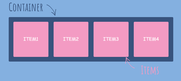
flex container 속성
display
.container{
	display:flex; /*inline-flex*/
}- 레이아웃을 설정하기 위한 기본적인 속성
- 속성 적용 후에는 자식 요소들이 inline화 된다.
- 주의할 점! 이 속성은 직계 자손에게만 적용된다.
- display: inline-flex; -> container영역이 item에 맞게 줄어든다.
flex-direction
.container{
	display:flex;
    flex-direction:row; /*row-reverse, column, column-reverse*/
}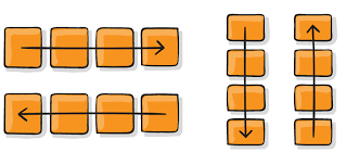
- container안에서 item들의 ! 정렬과 배치 방향 ! 을 설정하는 속성.
- row; 내부 왼쪽 정렬
- row-reverse; 내부 오른쪽 정렬(순서 뒤바뀜)
- column; item들은 한줄을 모두 차지, block 속성값을 갖는 것 처럼 열방향 배치
- column-reverse; container아래부터 위로 채워지고 배치순서가 아래에서 위로 바뀐다.
flex-wrap
.container{
	display:flex;
    flex-wrap:nowrap /*wrap, wrap-reverse*/
}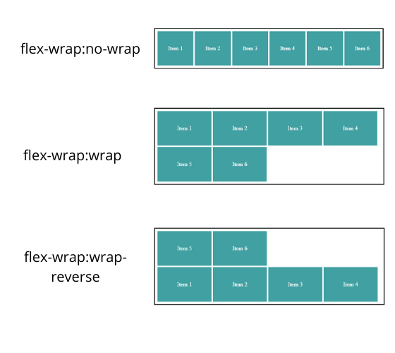
- item들의 너비 합이 container의 너비를 초과할 때, 처리해주는 속성 ( = 줄바꿈 속성 )
- wrap; 너비를 초과한 item들을 줄바꿈하여 다음 줄로 넘긴다.
- wrap-reverse; 아래쪽에서 위쪽으로 배치
- 반응형 웹에서 pc환경에선 메뉴가 사이드로 표시되지만 모바일에서는 아래로 길게 늘어뜨려지는 경우!
flex-flow
.container{
	display:flex;
    flex-flow: row wrap /*flex-direction과 flex-wrap의 조합*/
}
justify-content
.container{
	display:flex;
    justify-content: flex-start; /*flex-end, center, space-between, space-around*/
}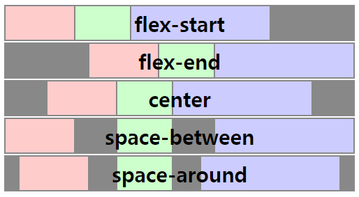
- 이 속성은 container의 display:inline-flex;라면 소용이 없다
- item과 container 간에 여백이 없어지기 때문
align-content
.container{
	display:flex;
    align-content: flex-start; /*flex-end, center, space-between, space-around, stretch*/
}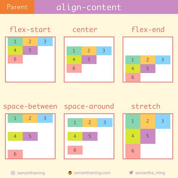
- item들이 넘쳐서 다음줄로 넘겨졌을 때, 줄 사이의 여백을 결정한다.
- 이 속성은 flex-wrap:wrap;이 설정되어야 제대로 작동한다.
- justify-content가 수평방향, align-content는 수직방향으로 여백 설정

후롱트엥드 개발자