Light & Dark 테마 적용해 보기
Singleton Pattern(싱글톤 패턴)
Value Listenable 살펴보기
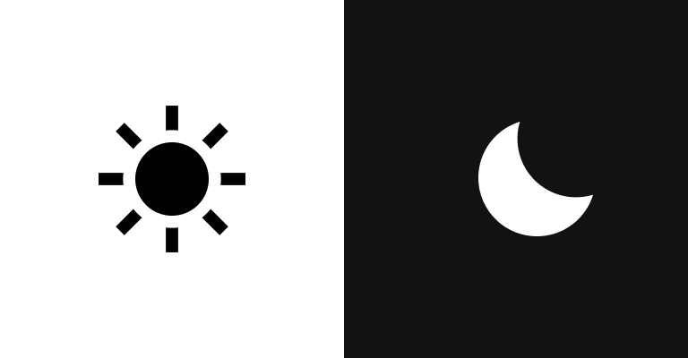
이번 글에서는 Flutter로 앱 개발을 할 때에 라이트 모드와 다크 모드를 적용하는 방법에 대해서 살펴보도록 하겠다.
라이트 모드와 다크 모드는 어렵지 않은 기능이지만, 생각보다 손이 많이 가는 작업 중 하나이다.
Flutter Theme 위젯을 그대로 사용하는 경우에는 문제가 되지 않지만, UI 요소를 직접 만들어서 생성할 때에는 설정해줘야 하는 작업이 많다.
앱을 실행 중 상태에서 모드를 변경하여 한 번에 적용할 수 있는 방법에 대해서도 개발을 해보자.
Flutter
신규 프로젝트를 생성해서 테마를 하나씩 적용하기전 어떻게 모드에 따라 Theme을 적용할 수 있는지 간단한 테스트를 해보도록 하자.
MaterialApp에서 darkTheme, theme 옵션이 있는데, darkTheme에는 다크모드에 적용되는 ThemeData를 생성해주고, theme에는 라이트 모드에 적용되는 ThemeData를 생성해주면 된다.
themeMode는 enum 클래스로, dark, light, system 이렇게 3가지의 속성이 있다.
void main() {
runApp(const MyApp());
}
class MyApp extends StatelessWidget {
const MyApp({super.key});
Widget build(BuildContext context) {
CustomTheme();
return MaterialApp(
darkTheme: ThemeData(
appBarTheme: AppBarTheme(backgroundColor: Colors.cyan),
),
theme: ThemeData(
appBarTheme: AppBarTheme(backgroundColor: Colors.red),
),
themeMode: ThemeMode.light,
home: const MainPage(),
);
}
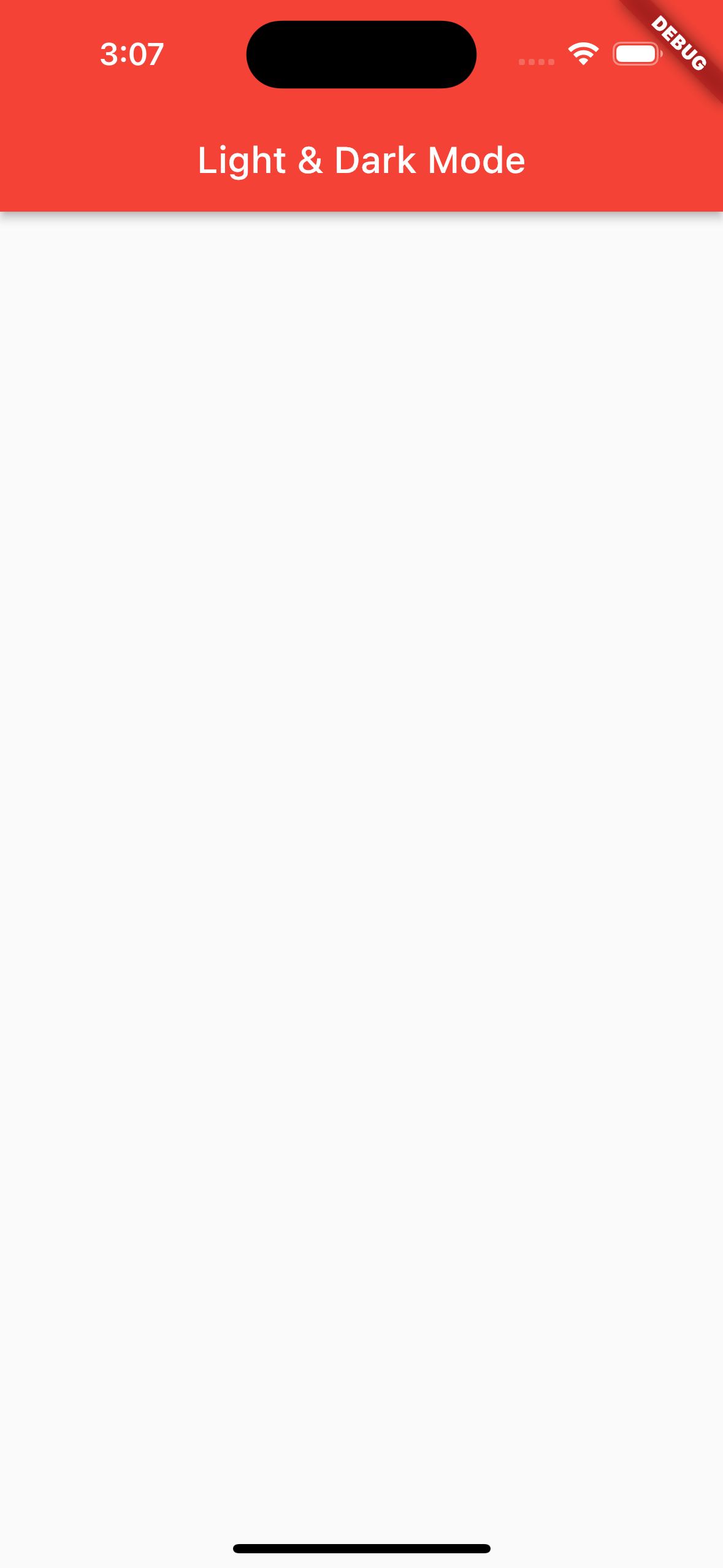
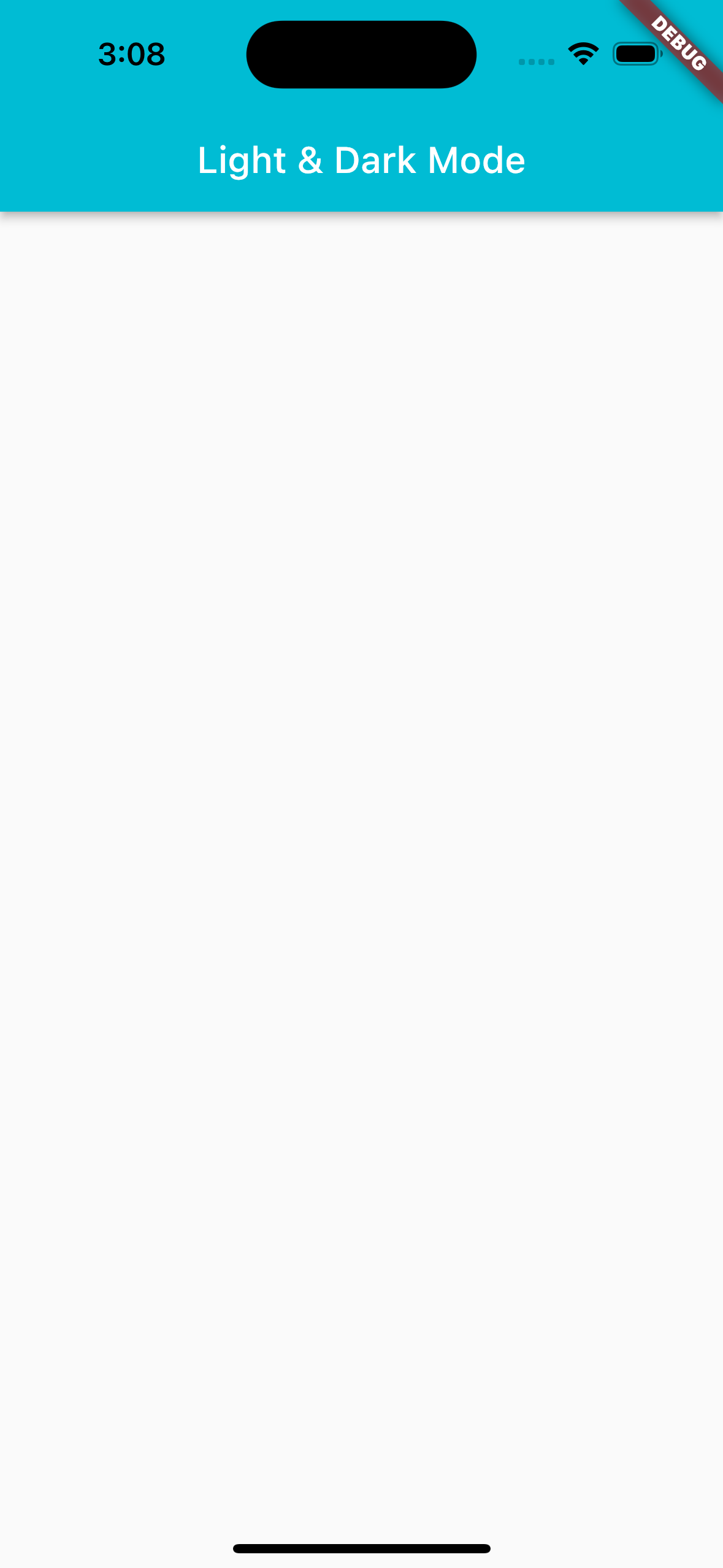
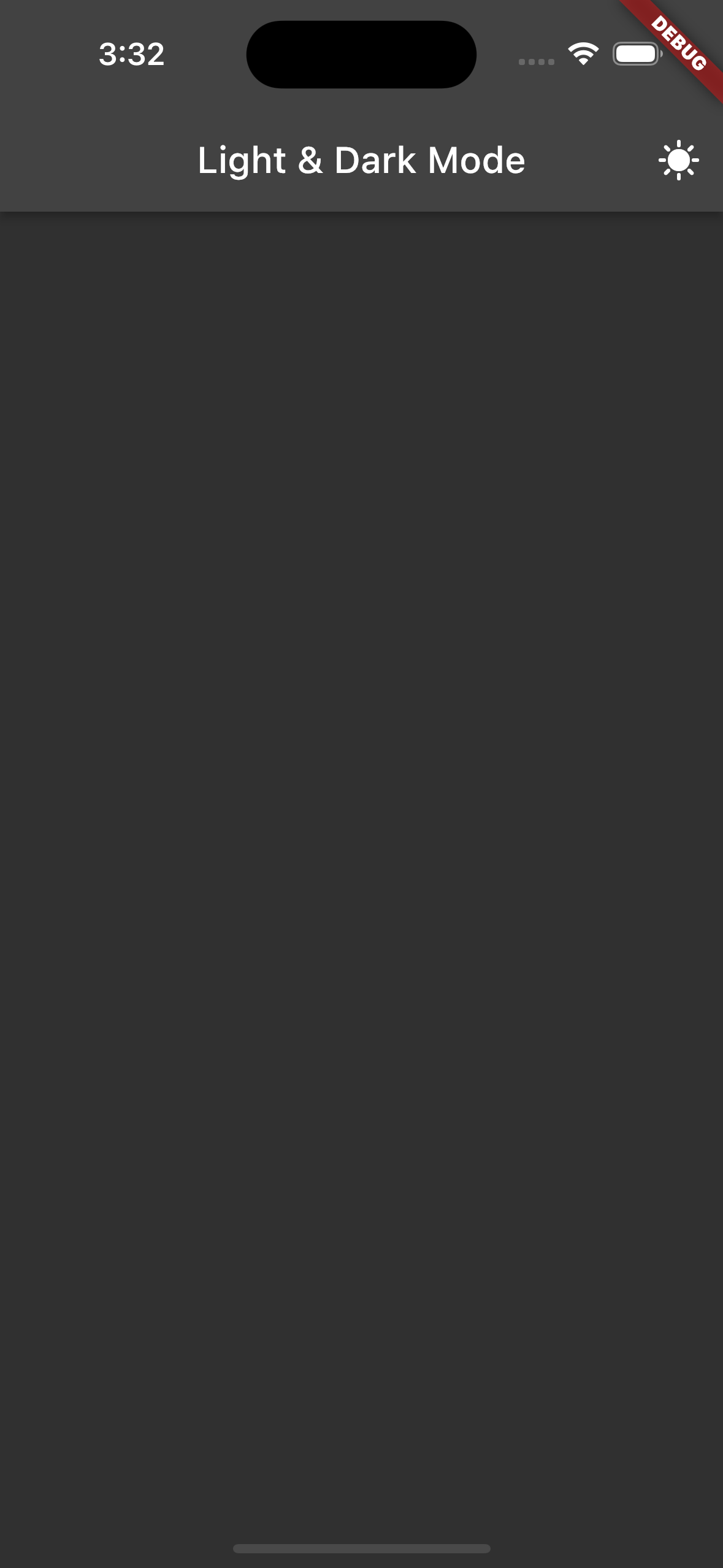
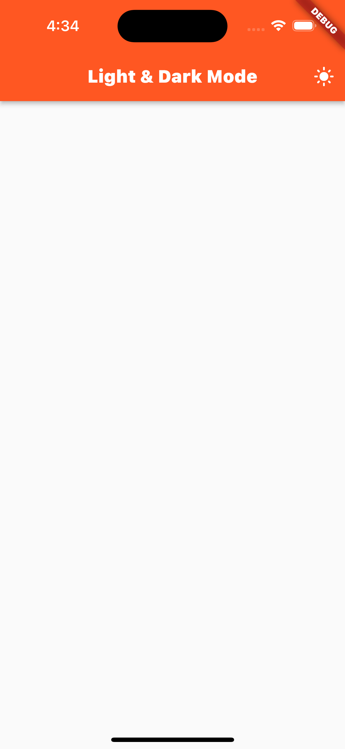
}themeMode를 ThemeMode.light와 .dark로 변경해서 ReStart를 해보자.
정상적으로 앱바에 테마가 적용되는 것을 확인할 수 있다.
 |  |
|---|
Flutter는 기본적으로 라이트 & 다크 모드를 지원하고 있어서, 아래와 같이 사용하여 적용할 수도 있지만, Theme 별로 색상을 커스텀하고 싶다면 아래 방법으로는 적용하시면 안된다.
MaterialApp(
	darkTheme: ThemeData.dark(),
	theme: ThemeData.light(),
	themeMode: mode,
	home: const MainPage(),
) |  |
|---|
CustomThemeMode
앱이 실행되던 중에 Theme을 변경하기 위해 상태를 관리하여야 하는데, 상태 관리를 사용해도 되지만, 저는 싱글톤 패턴 + ValueListenableBuilder를 사용해서 적용을 해보도록 하겠다.
테마를 적용하여 한 번에 관리하기는 쉽지 않다. 아이콘을 생성하는 부분에 있어서도 테마로 적용할 수 없고, 이미지 등도 테마로 넣을 수가 없기에, 현재 모드가 어느 모드인지에 대한 상태를 수시로 접근해야 한다.
이럴 경우의 인스턴스 생성을 제한하여 최대한 리소스를 줄일 수 있는 방법이 바로 싱글톤 패턴이다.
앱 내에서 실행 중인 상태에서 Theme을 변경하는 경우 앱 전체가 랜더링 과정을 다시 수행하기에 이에 따른 리소스는 어느 정도 고려하여 적용을 해야 한다.
우선 싱글톤 패턴의 기본 구조를 생성하자.
class CustomThemeMode {
  static final CustomThemeMode instance = CustomThemeMode._internal();
  factory CustomThemeMode() => instance;
  CustomThemeMode._internal();
}
ValueListenerBuilder를 사용해서 모드를 변경해줄 것익기 때문에, 싱글톤 객체안에 ValueNotifier를 생성해 주어야 한다.
초기 모드로는 light 모드로 생성하였다.
class CustomThemeMode {
  static final CustomThemeMode instance = CustomThemeMode._internal();

  static ValueNotifier<ThemeMode> themeMode = ValueNotifier(ThemeMode.light);

  factory CustomThemeMode() => instance;

  CustomThemeMode._internal();
}
change 함수를 생성하여 모드를 변경할 수 있도록 해주자. 그 다음에 현재 모드를 쉽게 가져오기 위해 current 불리언 속성을 추가해 주었다.
class CustomThemeMode {
  static final CustomThemeMode instance = CustomThemeMode._internal();
  static ValueNotifier<ThemeMode> themeMode = ValueNotifier(ThemeMode.light);
  static ValueNotifier<bool> current = ValueNotifier(true);
  factory CustomThemeMode() => instance;

  static void change() {
    switch (themeMode.value) {
      case ThemeMode.light:
        themeMode.value = ThemeMode.dark;
        current.value = false;
        break;
      case ThemeMode.dark:
        themeMode.value = ThemeMode.light;
        current.value = true;
        break;
      default:
    }
  }

  CustomThemeMode._internal();
}
main에서 인스턴스를 생성해 주었다.
void main() {
  CustomThemeMode.instance;
  runApp(const MyApp());
}
CustomTheme
ThemeData를 관리하는 객체를 생성하여 light, dark 모드에 사용할 ThemeData를 지정해주면 된다.
TextTheme도 관리를 해야하기 때문에, 추가해서 사용하시면 된다.
class CustomThemeData {
  static final ThemeData light = ThemeData();
  static final ThemeData dark = ThemeData();
  static final TextTheme textTheme = TextTheme();
}
먼저, 앱바에 원하는 테마를 적용해 보자.
class CustomThemeData {
  static final ThemeData light = ThemeData(
    textTheme: textTheme,
    appBarTheme: AppBarTheme(
      backgroundColor: Colors.deepOrange,
      titleTextStyle: textTheme.headline1?.copyWith(color: Colors.white),
    ),
  );
  static final ThemeData dark = ThemeData(
    textTheme: textTheme,
    scaffoldBackgroundColor: const Color.fromRGBO(31, 31, 31, 1),
    appBarTheme: AppBarTheme(
        backgroundColor: Color.fromRGBO(51, 51, 51, 1),
        titleTextStyle: textTheme.headline1?.copyWith(color: Colors.deepOrange),
        iconTheme: IconThemeData(color: Colors.deepOrange)),
  );

  static final TextTheme textTheme = TextTheme(
    headline1: TextStyle(fontWeight: FontWeight.w900, fontSize: 20),
  );
}
Main
이제 MaterialApp에 Theme을 넣어주도록 하자.
MaterialApp(
	darkTheme: CustomThemeData.dark,
	theme: CustomThemeData.light,
	themeMode: CustomThemeMode.themeMode,
	home: const MainPage(),
);
MainPage
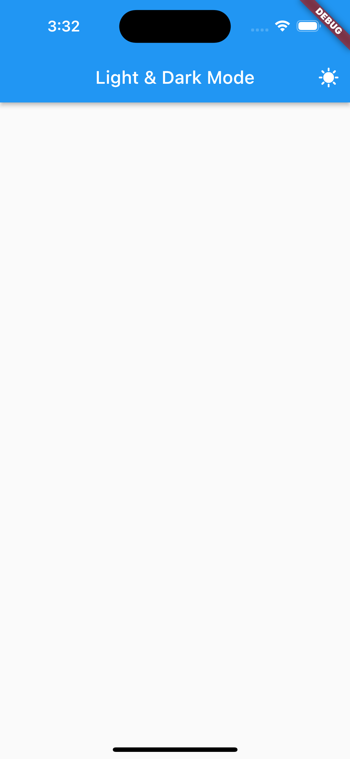
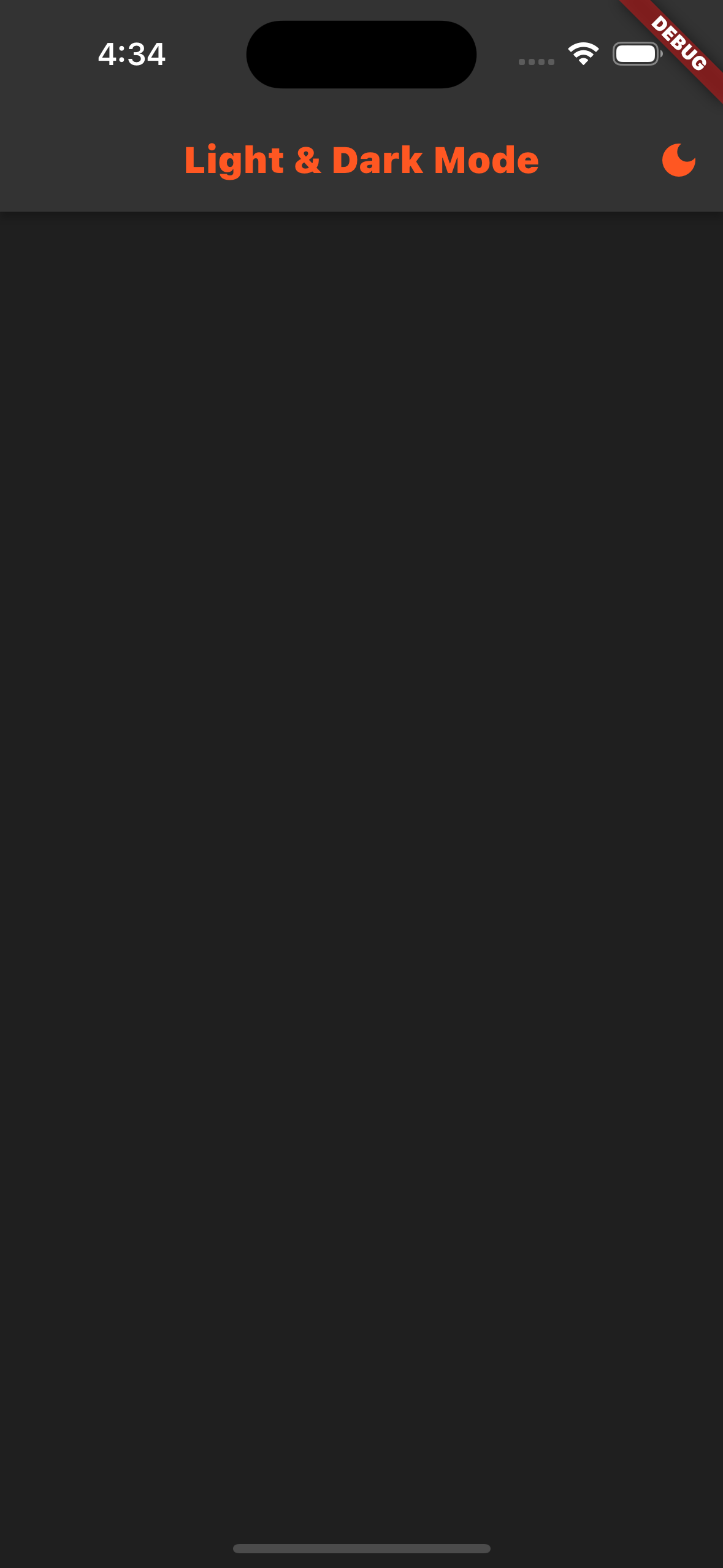
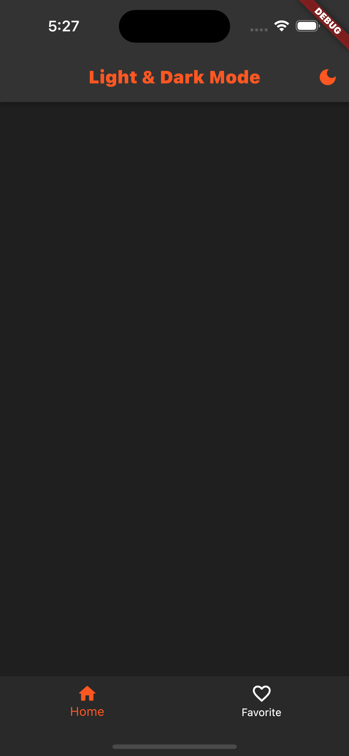
MainPage를 생성하여 실행하고 앱바의 액션 아이콘을 클릭하여 모드가 변경이되는지 확인해보자.
변경되지 않았을 것이다. ValueNotifier에 리스너를 연결해야 정상적으로 실행이 된다.
class MainPage extends StatelessWidget {
const MainPage({super.key});
Widget build(BuildContext context) {
return Scaffold(
appBar: AppBar(
title: const Text("Light & Dark Mode"),
actions: [
IconButton(
onPressed: () {
HapticFeedback.mediumImpact();
CustomThemeMode.change();
},
icon: Icon(
CustomThemeMode.current ? Icons.light_mode : Icons.dark_mode,
),
),
],
),
);
}
}ValueListenableBuilder
ValueListenableBuilder로 ThemeMode를 변경해 주도록 하자.
다시 실행해보면, 정상적으로 테마가 변경이 되는 것을 확인할 수 있다. 하지만 여전히 앱바의 아이콘이 변경되지 않았을 것이다.
ValueListenableBuilder<ThemeMode>(
        valueListenable: CustomThemeMode.themeMode,
        builder: (context, mode, child) {
          return MaterialApp(
            darkTheme: CustomThemeData.dark,
            theme: CustomThemeData.light,
            themeMode: mode,
            home: const MainPage(),
          );
        });
이번에는 불리언 속성으로 생성한 current 값을 사용해서 아이콘을 변경해 주자.
ValueListenableBuilder<bool>(
	valueListenable: CustomThemeMode.current,
	builder: (BuildContext context, bool value, Widget? child) {
		return IconButton(
			onPressed: () {
				HapticFeedback.mediumImpact();
				CustomThemeMode.change();
                 },
            icon: Icon(value
                        ? Icons.light_mode
                        : Icons.dark_mode,
                  ),
                );
}), |  |
|---|
이제 제가 사용하는 파일 구조를 어느 정도 이해 하셨을테니, 이제 전체 코드를 작성하지 않도록 하겠다.
전체 코드는 Git에서 확인할 수 있습니다.
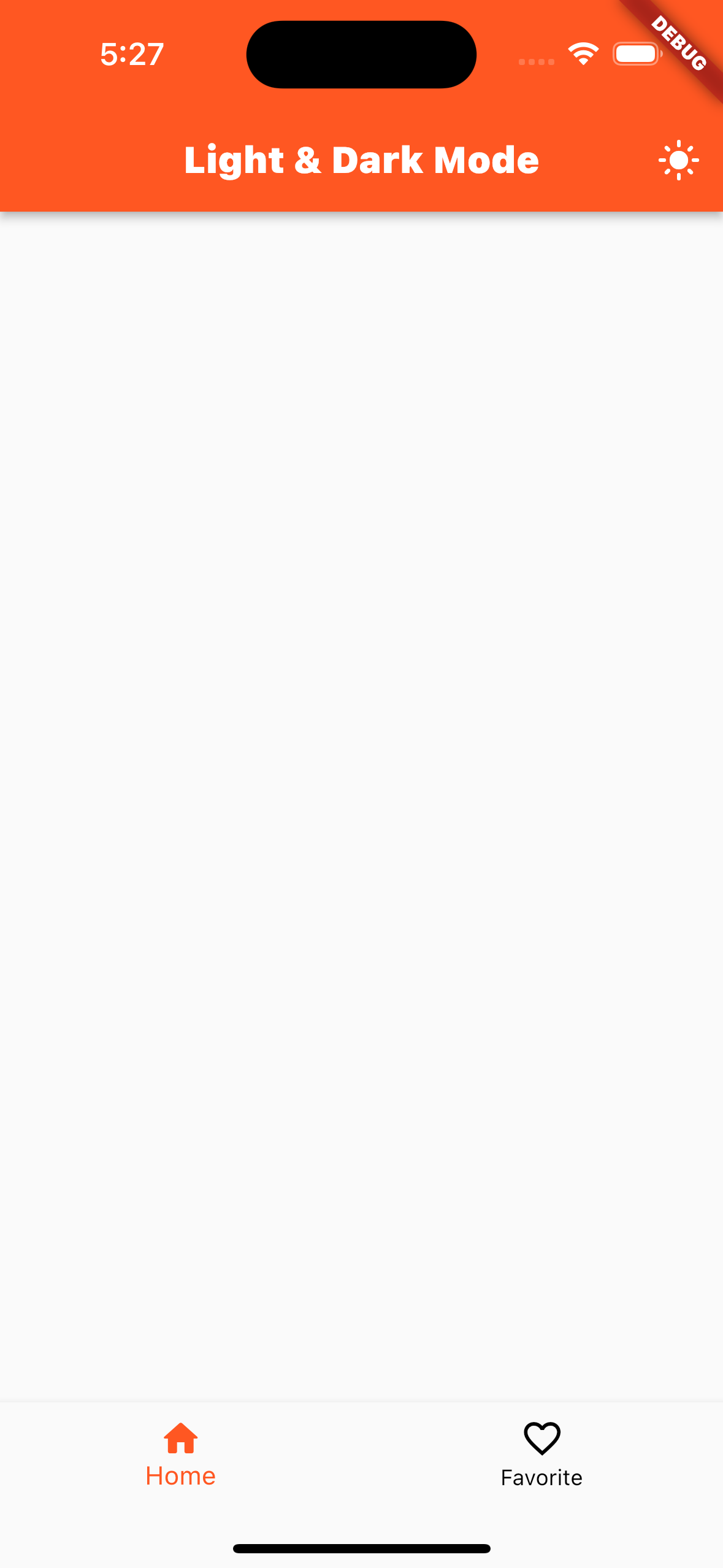
BottomNavigationBar
BottomNavigationBar에도 Theme 설정을 하였다.
Light
bottomNavigationBarTheme: const BottomNavigationBarThemeData(
      selectedItemColor: Colors.deepOrange,
      unselectedItemColor: Colors.black,
    ),
Dark
bottomNavigationBarTheme: const BottomNavigationBarThemeData(
      backgroundColor: Color.fromRGBO(41, 41, 41, 1),
      selectedItemColor: Colors.deepOrange,
      unselectedItemColor: Colors.white,
), |  |
|---|
ProgressIndicator
로딩 인디케이터 테마를 적용해 보자.
Light
progressIndicatorTheme: ProgressIndicatorThemeData(
      color: Colors.deepOrange,
    ),
Dark
progressIndicatorTheme: ProgressIndicatorThemeData(
      color: Colors.white,
),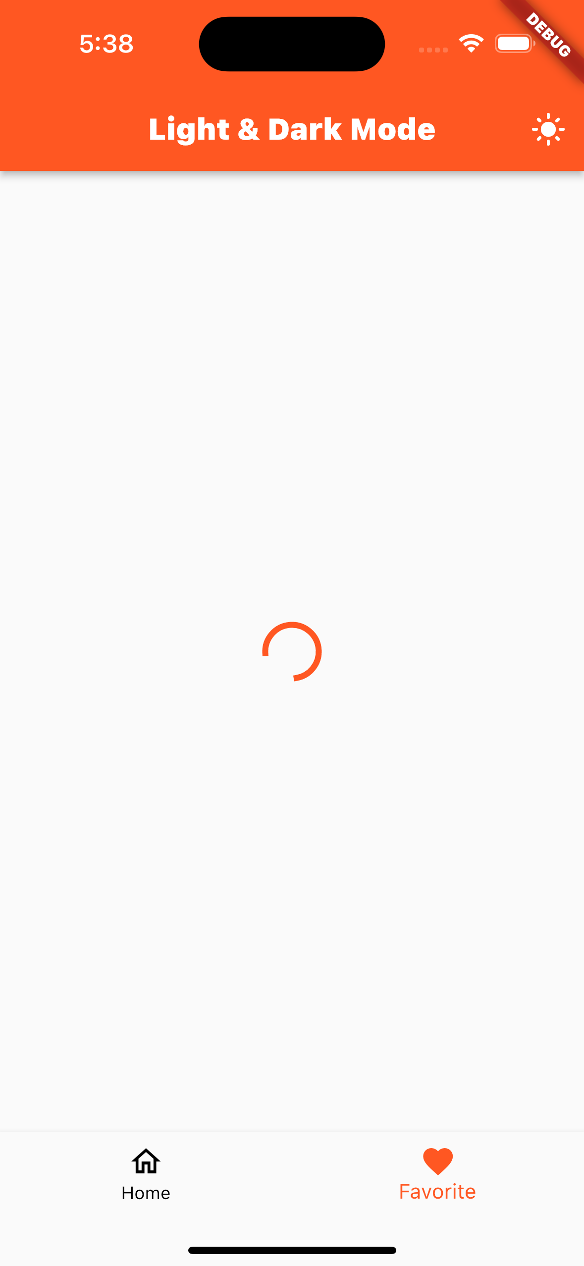 | 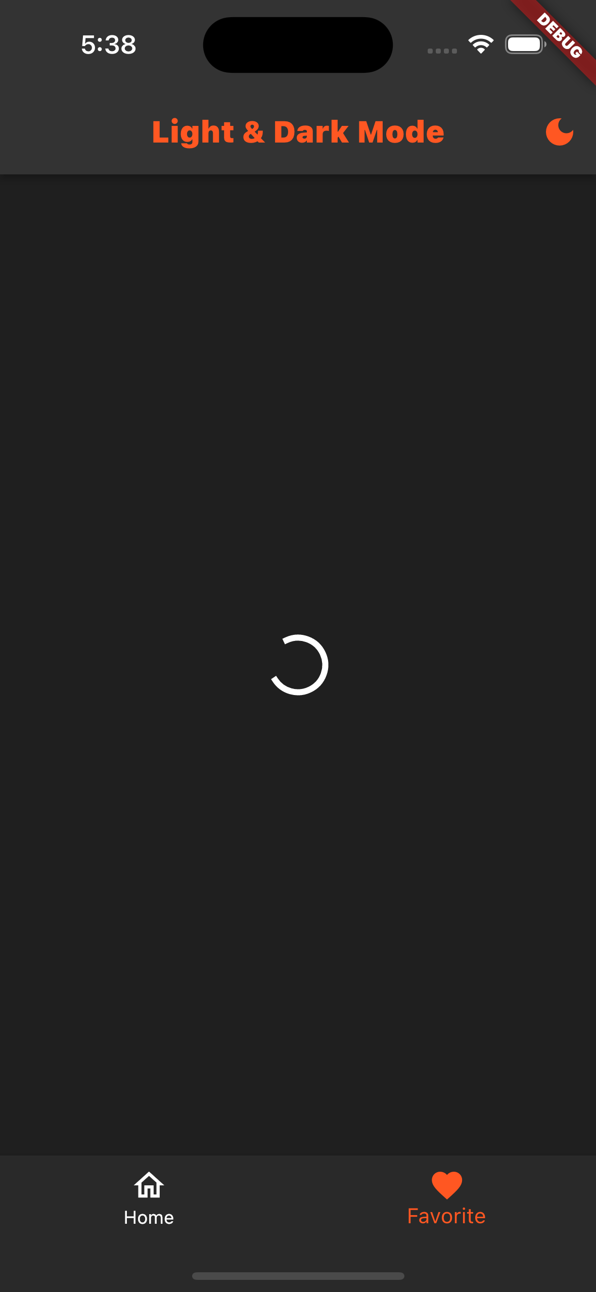 |
|---|
TextFormField
이번에는 TextFormField에 Theme을 적용해 보자.
기본적으로 텍스트 필드의 보더 형태를 Theme으로 설정하여 사용할 수 있다.
Light
inputDecorationTheme: const InputDecorationTheme(
      enabledBorder: OutlineInputBorder(
          borderSide: BorderSide(color: Colors.black, width: 4)),
      focusedBorder: OutlineInputBorder(
          borderSide: BorderSide(color: Colors.deepOrange, width: 4)),
    ),
Dark
inputDecorationTheme: const InputDecorationTheme(
      enabledBorder: OutlineInputBorder(
          borderSide: BorderSide(color: Colors.white, width: 4)),
      focusedBorder: OutlineInputBorder(
          borderSide: BorderSide(color: Colors.deepOrange, width: 4)),
    ),
텍스트 필드의 다른 속성들도 변경해 보자.
CursorColor
textSelectionTheme: const TextSelectionThemeData(
      cursorColor: Colors.white,
    ),
FontColor
입력된 텍스트의 색상을 변경하려면, 우선 textTheme에 subtitle1의 값을 지정해주어야 한다.
subtitle1: TextStyle(fontWeight: FontWeight.bold, color: Colors.black)이렇게 해주면 딥오렌지 색상의 텍스트로 변경된다.
textTheme: textTheme.copyWith(
subtitle1: textTheme.subtitle1?.copyWith(color: Colors.deepOrange)),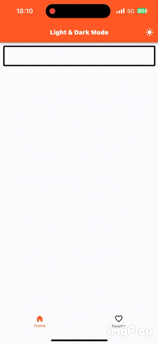 | 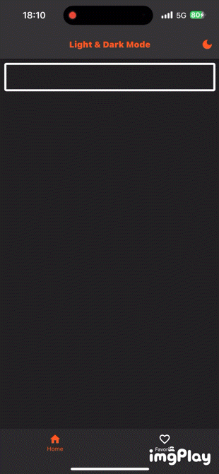 |
|---|
Git
마무리
Light & Dark Mode를 적용하고, 변경하는 방법에 대해서 살펴보았는데, 여기서는 기본적인 사용법만 다룬 것이고, 실제 프로젝트를 만들어 갈때에는 더 고려해야될 사항이 많다.
참고 사항으로 보시면 좋을 것 같다.
Flutter 위젯의 거의 대부분의 속성은 ThemeData에서 지정할 수 있기 때문에, 해당 ThemeData 객체를 활용해 보도록 하자.