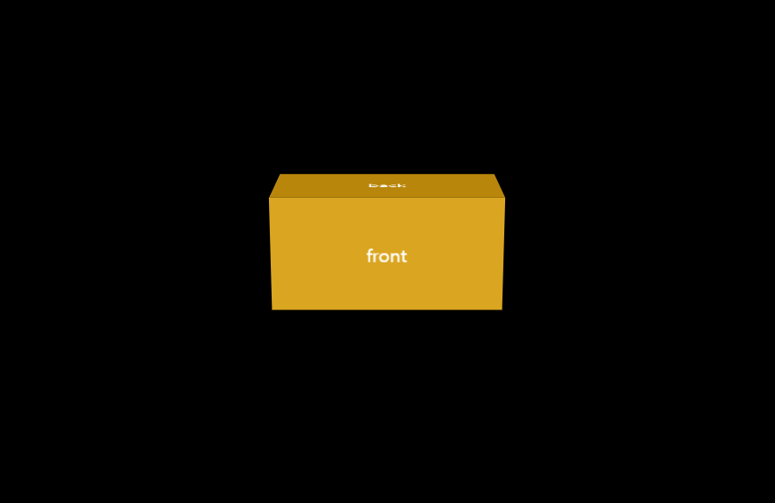
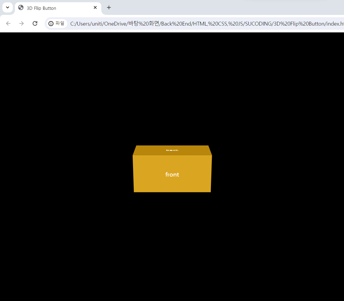
1. html 코드
<!DOCTYPE html>
<html lang="ko">
<head>
    <meta charset="UTF-8">
    <meta name="viewport" content="width=device-width, initial-scale=1.0">
    <title>3D Flip Button</title>
    <link href="style.css" rel="stylesheet">
</head>
<body>
    <div class="container">
        <div class="flip-btn">
            <div class="front">front</div>
            <div class="back">back</div>
        </div>
    </div>
</body>
</html>
2. css 코드
*{
    margin:0;
    padding:0;
    box-sizing: border-box;
}
body{
    background-color: black;
}
.container{
    position: absolute;
    left:50%;
    top:50%;
    transform: translate(-50%, -50%);
    perspective: 1000px;
}
.flip-btn{
    width:200px;
    height: 100px;
    color:white;
    text-align: center;
    line-height: 100px;
    transform-style: preserve-3d;
    transition: .5s;
    cursor: pointer;
}
.flip-btn:hover{
    transform: rotateX(-90deg);
}
.front{
    background-color: goldenrod;
    height: 100px;
    transform: translateZ(50px);
}
.back{
    background-color: darkgoldenrod;
    height: 100px;
    transform: rotateX(90deg) translateZ(150px);
}
3. 결과

블로그 이전했습니다 -> https://young-code.tistory.com