1. align-content & justify-content
• 플렉스 박스 방식과 유사헥 사용합니다.
• 그리드 컨테이너의 수직축과 수평축에서의 아이템 정렬 방식을 결정합니다.
• 컨테이너에 여유 공간이 있을 때 사용할 수 있습니다.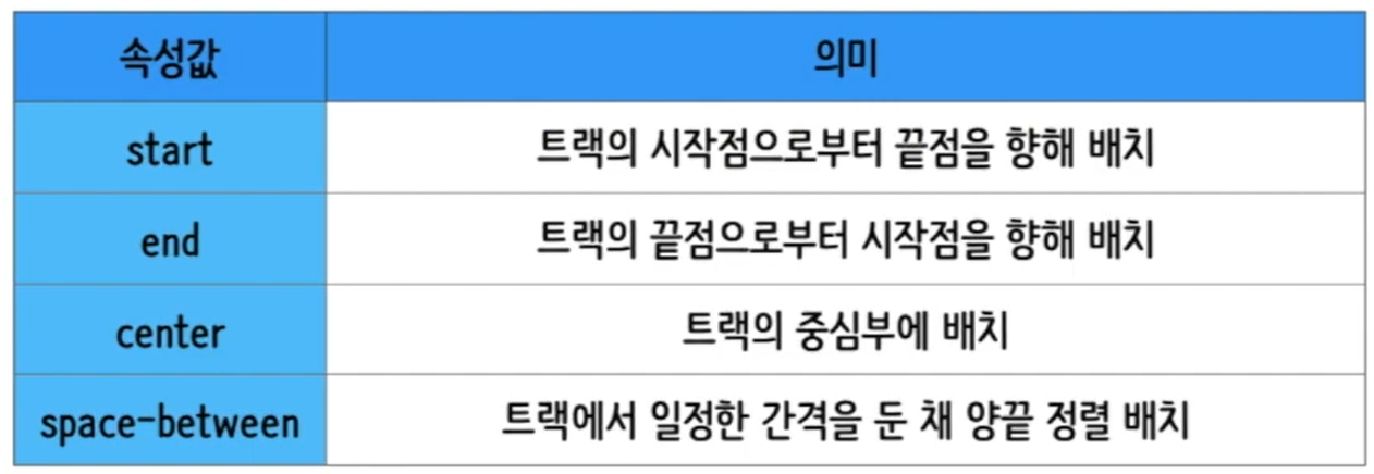
2. 실습
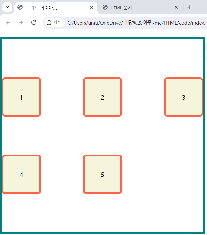
1) html 코드
<!DOCTYPE html>
<html lang="en">
    <head>
        <meta charset="UTF-8">
        <meta http-equiv="X-UA-Compatible" content="IE-edge">
        <meta name="viewport" content="width=device-width, inital-scale=1">
        <title>그리드 레이아웃</title>
        <link href="./style.css" rel="stylesheet">
    </head>
    <body>

        <ul class="container">
            <li class="item">1</li>
            <li class="item">2</li>
            <li class="item">3</li>
            <li class="item">4</li>
            <li class="item">5</li>
        </ul>

    </body>
</html>
2) css 코드
*{
    box-sizing:border-box;
}

body{
    margin:0;
}

ul{
    padding:0;
    list-style-type: none;
    border:5px solid teal;
}

li{
    display:flex;
    justify-content: center;
    align-items: center;
    background-color: beige;
    border:5px solid tomato;
    border-radius:8px;
}

.container{
    display:grid;
    height:500px;

    grid-template-columns: repeat(3,100px);
    grid-template-rows: repeat(2,100px);

    align-content: space-evenly;
    justify-content: space-between;
}
3) 결과

블로그 이전했습니다 -> https://young-code.tistory.com