1. align-items
• 플렉스 박스 방식에서와 유사한 역할을 한다.
• 그리드 컨테이너 행 트랙의 높이를 기준으로 그리드 아이템의 배치를 결정한다.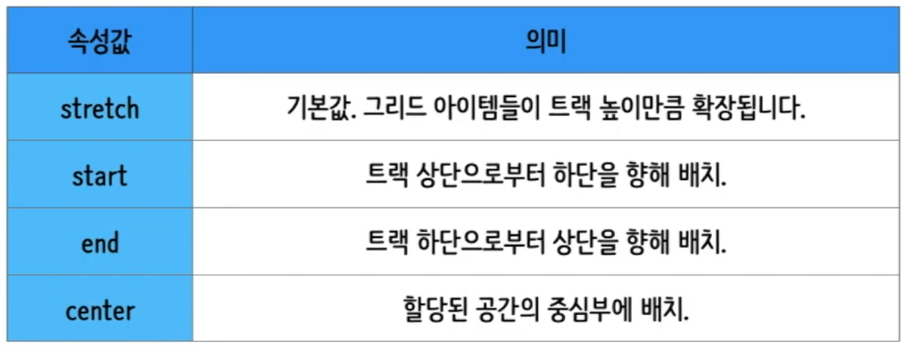
2. align-self
• 각각의 그리드 아이템이 어떤 식으로 배치될 것인지를 스스로 결정한다.
3. justify-items
• 수평축(행)을 따라 그리드 아이템을 정렬하고자 할 때 사용할 수 있는 속성으로, 그리드 컨테이너에
  지정한다.
• 아이템에 할당된 열 방향 너비가 기준이 된다.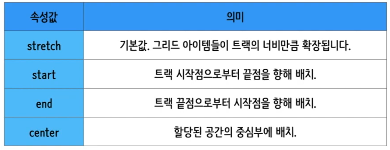
4. justify-self
• 수평축(행)을 따라 그리드 아이템을 정렬하고자 할 때 사용할 수 있는 속성으로, 각각의 그리드 아이템에
  지정한다.
• align-items & align-self의 관계와 유사
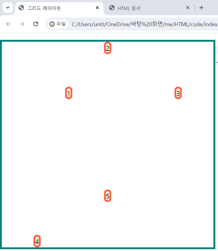
5. 실습
1) html 코드
<!DOCTYPE html>
<html lang="en">
    <head>
        <meta charset="UTF-8">
        <meta http-equiv="X-UA-Compatible" content="IE-edge">
        <meta name="viewport" content="width=device-width, inital-scale=1">
        <title>그리드 레이아웃</title>
        <link href="./style.css" rel="stylesheet">
    </head>
    <body>

        <ul class="container">
            <li class="item">1</li>
            <li class="item">2</li>
            <li class="item">3</li>
            <li class="item">4</li>
            <li class="item">5</li>
        </ul>

    </body>
</html>
2) css 코드
*{
    box-sizing:border-box;
}

body{
    margin:0;
}

ul{
    padding:0;
    list-style-type: none;
    border:5px solid teal;
}

li{
    display:flex;
    justify-content: center;
    align-items: center;
    background-color: beige;
    border:5px solid tomato;
    border-radius:8px;
}

.container{
    display:grid;
    height:500px;

    grid-template-columns: repeat(3,1fr);
    grid-template-rows: repeat(2,1fr);

    align-items:center;
    justify-items: center;
}

li:nth-child(1){ justify-self: end; }
li:nth-child(2){ align-self: start; }
li:nth-child(3){ }
li:nth-child(4){  align-self: end; }
li:nth-child(5){ align-self: center; }
3) 결과

블로그 이전했습니다 -> https://young-code.tistory.com