1. flexbox
• flexbox란 박스 내 요소 간의 공간 배분과 정렬 기능을 제공하기 위한 1차원 레이아웃 모델이다.
• flexbox를 1차원 모델이라 부르는 이유는, 레이아웃을 다룰 때 한 번에 하나의 차원(행이나 열)
  만을 다룬다는 특성 때문이다.
• flexbox를 flex컨테이너라고도 한다 (요스들을 포함하기 때문)
• flex 컨테이너를 만들기 위해서는 컨테이너에 display:flex;를 적용해야 한다.

ex) <div style="display: flex;">
		<div class="item">하나</div>
        <div class="item">둘</div>
        <div class="item">셋</div>
    </div>
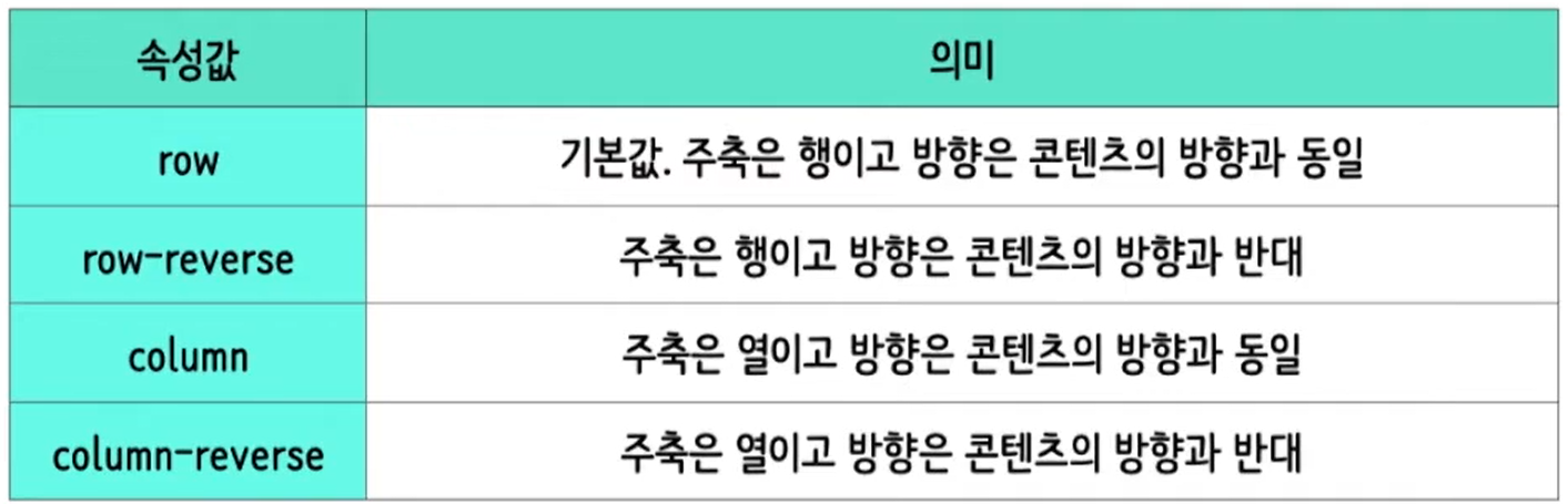
2. flex-direction
• flexbox에는 '주축'과 '교차축'이 있다.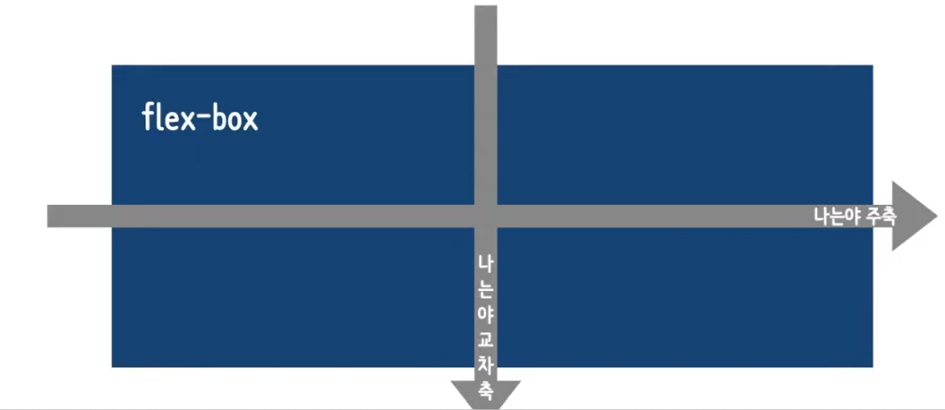
• flex-direction 속성은 flexbox 내 요소를 배치할 때 사용할 주축 및 방향(정방향, 역방향)을
  지정한다.
3. 실습
<!DOCTYPE html>
<html>
    <head>
        <meta charset="UTF-8">
        <title>HTML 문서</title>
        <style>
            .container{
                display:flex;
                flex-direction: row-reverse;
                /* flex-direction: column; */
            }
            .item{
                width:80px; height:80px;
                background-color:orange;
            }
        </style>
    </head>
    <body>
        <div class="container">
            <div class="item">1</div>
            <div class="item">2</div>
            <div class="item">3</div>
        </div>
    </body>
</html>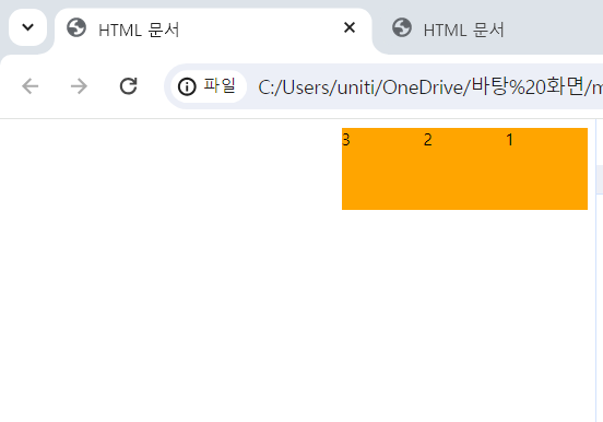
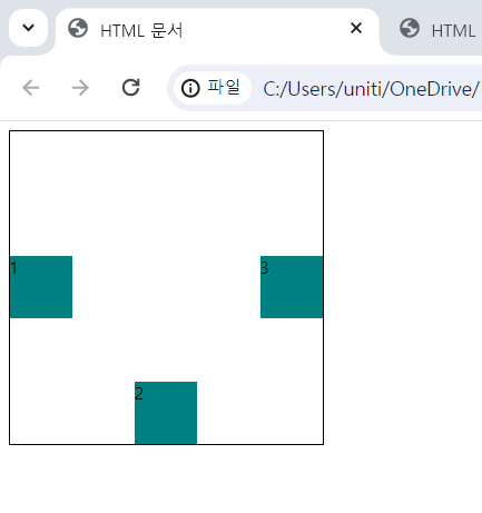
4. flex 다루기
flexbox를 다루기 위해 다음과 같은 속성들을 사용할 수 있다.

• 주축 배치 방법 : justify-content
• 교차축 배치 방법 : align-items
• 교차축 개별요소 배치 방법 : align-self
• 줄 바꿈 여부 : flex-wrap
5. 실습
1) justify-content/align-items/align-self<!DOCTYPE html>
<html lang="en">
<head>
<meta charset="UTF-8">
<title>HTML 문서</title>
<style>
.container{
display: flex;
width:300px; height:300px;
border: 2px solid black;
justify-content:space-between;
align-items:center;
}
.self{
align-self:flex-end;
}
.item{
width:60px; height:60px;
background-color:teal;
}
</style>
</head>
<body>
<div class="container">
<div class="item">1</div>
<div class="item self">2</div>
<div class="item">3</div>
</div>
</body>
</html>
2) flex-wrap<!DOCTYPE html>
<html lang="en">
<head>
<meta charset="UTF-8">
<title>HTML 문서</title>
<style>
.container{
display: flex;
width:300px; height:300px;
border: 2px solid black;
flex-wrap: wrap-reverse;
}
.item{
width:120px; height:60px;
background-color:teal;
}
.self{
}
</style>
</head>
<body>
<div class="container">
<div class="item">1</div>
<div class="item self">2</div>
<div class="item">3</div>
</div>
</body>
</html>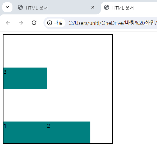

블로그 이전했습니다 -> https://young-code.tistory.com