Item 계열 컴포넌트
Item
- 가장 기본적인 UI 컴포넌트
- 위치/크기 등 기본 property
Rectangle
- Item을 상속받아 만들어짐
- 간단한 직사각형
- border, radius, color 등 지원
Text
- text: property 사용
- 폰트, 크기, 색상, wrapMode(NoWrap, WordWrap, WrapAnywhere 등) 지원
Image
- source를 통해 이미지 표시
- State 값을 통해 이미지 로딩 수준 표시 가능
Button
- onclicked: 를 통해 클릭 이벤트 발생 (vanila JS 문법)
ListView
- 목록 형태 데이터 표현
- model과 delegate 설정이 핵심
- 방향 설정 property(Qt.Horizontal, Qt.Vertical / Qt.LeftToRight, Qt.RightToLeft 등) 제공
Slider
- 범위 내 값 선택이 가능한 Slider
- Snap 기능 지원 (눈금별 Snap)
Switch
- 토글 스위치 사용
- onCheckedChanged: 이벤트 지원
- signal ↔ slot 개념. signal에서 slot으로만 보낼 수 있음 (이벤트 / 핸들러)
TextField
- placeholderText: property 제공
ProgressBar
- value 값을 통해 진행률 표시 가능
- 진행의 끝을 알 수 없으면 inderterminate: true; 프로퍼티 사용
ScrollView
- 내용이 많을 때 스크롤뷰에 내용을 넣으면 스크롤하며 내용을 확인할 수 있음
- QT QML의 스크롤뷰에 기본적으로 bouncing 효과(스크롤 끝에 도달하면 overscroll되며 튕기는 효과)가 적용되어 있는데, 이를 비활성화시키는 방법은 다음과 같다.
ScrollView {
    id: root
    ...
	Component.onCompleted: {
        root.contentItem.boundsBehavior = Flickable.StopAtBounds
    }
}

버전에 따라 지원되지 않는 경우도 있다는데, 그 때는 아래 방법을 사용해본다.

ScrollView {
	...
    Binding {
		target: scrollView.contentItem
		property: "boundsBehaviour"
 		value: Flickable.StopAtBounds
	}
}
Window 계열 컴포넌트
Window
- 독립적인 윈도우
- 자체적인 렌더링 컨텍스트 소유
- modal : 다른 창 조작 금지 유무
- flags : 윈도우 flag (https://doc.qt.io/archives/qt-5.15/qt.html#WindowType-enum)
Window {
	visible: true
    width: 300
    height: 2200
    title: "Custom Window"

    flags: Qt.FramelessWindowHint |
    	Qt.WindowStaysOnTopHint

    Text {
      text: "This window has custom flags!"
      anchors.centerIn: parent
    }
}
ApplicationWindow
- 메뉴 바, footer, header 등의 윈도우 구성 요소 제공
- Window를 상속받아 만들어짐
ApplicationWindow {
  visible: true
  width: 640
  height: 480
  title: "My Application"

  Text {
    text: "Hello, World!"
    anchors.centerIn: parent
  }
}
Tooltip
- Button 등에서 지원
Button {
  text: "Hover me"
  // 마우스 커서가 버튼 위에 올라와 있는 상태일 때 Tooltip 표시

  ToolTip.visible: hovered
  ToolTip.text: "This is a tooltip!"
}
Popup
- 사용자에게 추가 입력을 요청할 때 등에 임시 UI로 사용
Popup {
  id: myPopup
  width: 200
  height: 200
  modal: true
  focus: true
  Rectangle {
    color: "white"
    border.color: "black"
    anchors.fill: parent
    Text {
      text: "This is a popup"
      anchors.centerIn: parent
    }
  }
}
Button {
  text: "Show Popup"
  onClicked: myPopup.open()
}
Position
Manual Position
- x, y, z를 통해 부모 컴포넌트의 좌표계에 어디에 위치할지 결정 (좌상단 기준)
- 같은 z값(depth)에 있는 컴포넌트를 sibling으로 명칭함
- 수동으로 위치를 조정하는 것이기 때문에 반응형과 같은 디자인에서 적합하지 않고 디버깅이 어려움.
Anchor
-
한 요소의 한 측면(상/하/좌/우)을 다른 요소의 특정 측면에 고정함
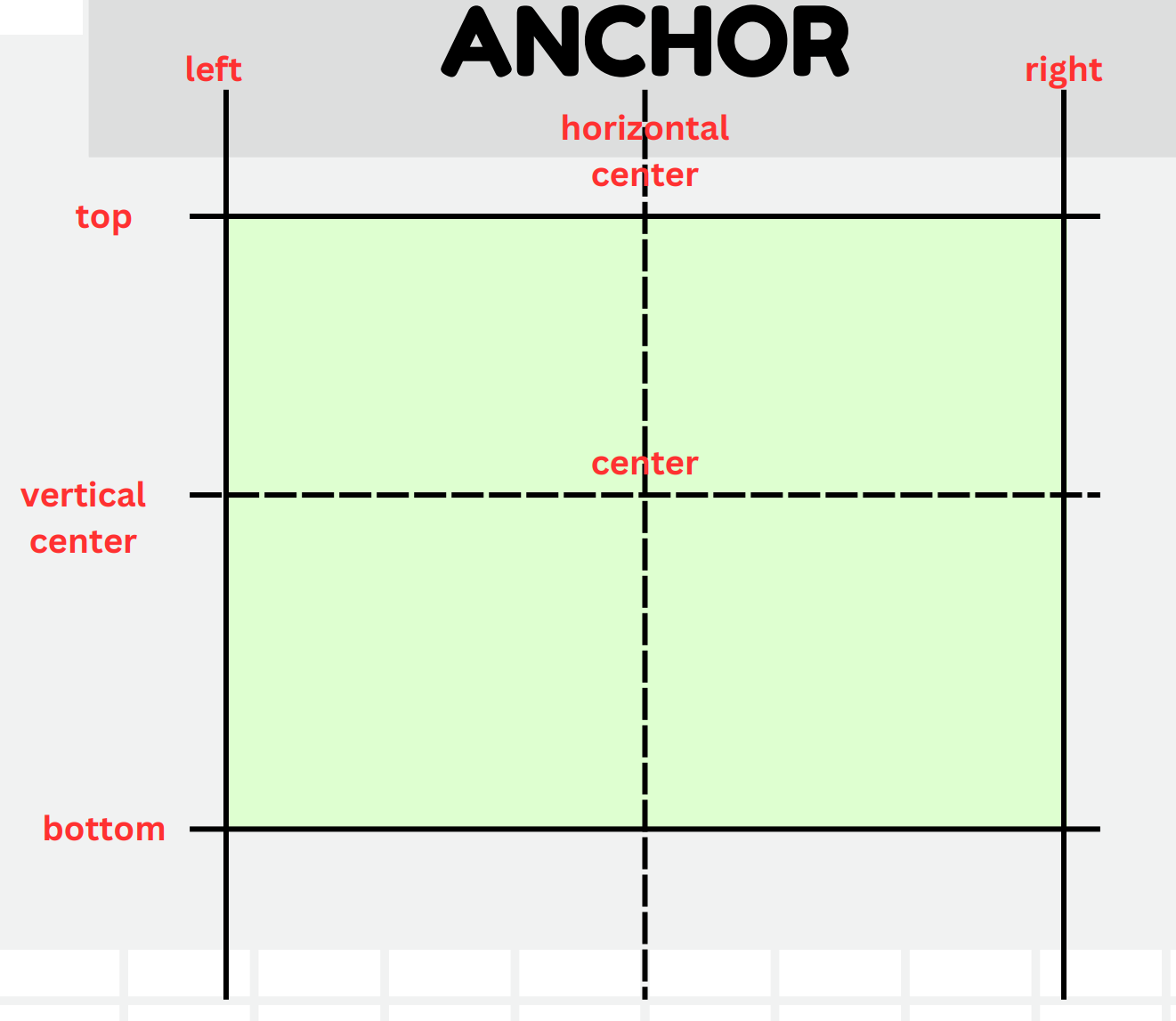
-
anchors.centerIn을 통해 요소의 정가운데에 위치 가능
anchors {
	horizontalCenter : parent.horizontalCenter
	verticalCenter: parent.verticalCenter
}

anchors.centerIn : parent //정 가운데

anchors.fill: parent //부모의 요소를 가득 채움
- 서로 충돌하는 앵커를 설정하면 안됨. ex) anchors.left와 anchors.right를 동시에 설정
- col, row, grid layout 등에서는 anchor가 설정이 되지 않음.
Column / Row
- Row는 자식 요소를 수평 방향으로 일렬로 정렬하고, 내부적으로 크기와 위치를 유지함.
- Column은 수직 방향으로 일렬 정렬, Row와 마찬가지로 자식들의 크기와 위치를 유지함.
- spacing을 통해 자식 요소간 간격 설정이 가능함.
Flow
- 자식 요소들을 수평으로 배치하고, 공간이 부족해지면 (부모 요소의 크기가 작아지면) 다음 줄로 넘어가는 방식으로 정렬
- 컨테이너 크기에 따라 자식 요소를 동적으로 재배치해주는 것
- anchor의 지정이 필요함
Flow {
	anchors.fill: parent
	spacing: 10
	width: 300
}
GridLayout
- 자식을 그리드 형태로 정렬해줌
- Flow와 다르게 컨테이너의 크기를 줄어들어도 개행이 일어나지는 않음.
GridLayout {
    anchors.fill: parent
    columns: 3

    //default Spacing값 = 5
    rowSpacing: 10
    columnSpacing: 10

    //첫 번째 행
    Rectangle {
        color: "red"
        width: 100
        height: 100
        Layout.row: 0
        Layout.column: 0
    }
    Rectangle {
        color: "green"
        width: 100
        height: 100
        Layout.row: 0
        Layout.column: 1
    }
    Rectangle {
        color: "blue"
        width: 100
        height: 100
        Layout.row: 0
        Layout.column: 2
    }

    //두 번째 행
    Rectangle {
        color: "black"
        width: 100
        height: 100
        Layout.row: 1
        Layout.column: 0
    }
    Rectangle {
        color: "lightpink"
        width: 100
        height: 100
        Layout.row: 1
        Layout.column: 1
    }
    Rectangle {
        color: "lightblue"
        width: 100
        height: 100
        Layout.row: 1
        Layout.column: 2
    }
}
StackLayout
- 여러 컴포넌트를 쌓아 놓고, 각 시점에 하나의 컴포넌트만 보여줌. (사용자가 여러 페이지나 뷰를 전환할 수 있음)
- currentIndex 속성을 통해 현재 활성화된 자식 컴포넌트를 제어
StackLayout {
	id: stackLayout
	width: 300
	height: 300

	Rectangle {
		color: "lightblue"
		width: parent.width
		height: parent.height
	}

	Rectangle {
		color: "yellow"
		width: parent.width
		height: parent.height
	}
}

Button {
	text: "Newt Page"
	onClicked: {
		stackLayout.currentIndex =
    		(stackLayout.currentIndex + 1) % stackLayout.children.length
	}
}
Mouse Event
MouseArea
-
마우스 Area에 클릭/커서 위치 변경/드래그 등 다양한 마우스 이벤트를 캡쳐해서 행동 생성 가능
-
각종 이벤트
MouseArea
{
    anchors.fill: parent
    onClicked: {
        console.log("Mouse Clicked at: ", mouse.x, ".", mouse.y)
    }

    onDoubleClicked: {

    }

    onEntered: {

    }

    onExited: {

    }

    onPositionChanged: {

    }
}- Drag & Drop
Rectangle {
    id: draggableRect
    width: 100
    height: 100
    color: "lightpink"
    x: 10
    y: 10
    z: 1

    MouseArea
    {
        id: dragArea
        anchors.fill: parent
        drag.target: draggableRect

        onReleased: {
            if (dropRect.contains(mapToItem(dropRect, dragArea.mouseX, dragArea.mouseY)))
            {
                dropRect.color = "black"
                dropRect.name = "Dropped Here"
            }
        }
    }
}

Rectangle {
    id: dropRect
    width: 200
    height: 200
    color: "lightgray"
    anchors.centerIn: parent
    property string name: "Drop Here"

    Text {
        id: dropText
        text: dropRect.name
        color: "green"
        anchors.centerIn: parent
    }
}
TapHandler
- 터치도 함께 인식함
Rectangle {
    width: 100
    height: 100
    color: "lightpink"

    TapHandler {
        onTapped: console.log("Rect Tappedd");
        onDoubleTapped: console.log("Rect double Tapped");
		onLongPressed:  console.log("Rect long Pressed");
    }
}
HoverHandler
- 마우스 호버 이벤트 처리
Rectangle {
    width: 100
    height: 100
    color: "lightpink"

    Text {
        id: rectText
        text: "Hover me"
        anchors.fill: parent
        font.pointSize: 14
    }

    HoverHandler {
        id: hoverHandler
        acceptedDevices: PointerDevice.Mouse
        cursorShape: Qt.PointingHandCursor
    }
}
QML Function
- function 키워드를 통해 함수 작성 가능
- 함수는 컴포넌트 내에서 로컬 범위로 접근
- 슬롯이나 속성 바인딩에서 호출될 수 있음
Rectangle {
    id: rectangle
    //width: 200
    //height: 200
    anchors.fill: parent

    //vanila js 문법 사용
    function calculateArea(width, height)
    {
        return width * height
    }

    Text {
        id: areaText
        //property에 함수 바인딩
        text: "Area: " + rectangle.calculateArea(rectangle.width, rectangle.height)
    }
}- *.js 파일에 함수 별도 정의
/* mathFunctions.js */

.pragma library

function add(x, y) {
    return x+y;
}

function multiply(x, y) {
    return x*y;
}
/* main.qml */
import "mathFunctions.js" as MathFunc //as 별칭은 대문자로 시작
Window {
width: 640
height: 480
visible: true
title: qsTr("Example")
Item {
Component.onCompleted: {
// 해당하는 UI 컴포넌트가 생성되었을 때, 수행할 액션 정의
console.log("3+5 =", MathFunc.add(3, 5))
console.log("3*5 =", MathFunc.multiply(3, 5))
}
}
}Signal ↔ Slot
-
Signal: 어떤 이벤트가 발생했을 때 발송되는 메세지
-
Slot: Signal을 수신하여 특정 동작을 수행하는 함수
-
1Depth 예시
Item {
    anchors.fill: parent

    Rectangle {
        width: 200; height: 100;
        color: "lightblue"

        signal buttonClicked(string msg) // msg : string

        onButtonClicked: (msg) => {
            console.log(msg)
        }

        Button {
            text: "Click me"
            anchors.centerIn: parent
            onClicked: {
                parent.buttonClicked("Button was clicked")
            }
        }
    }
}- 2Depth 예시
Item {
    anchors.fill: parent

    Rectangle {
        id: parentRect
        width: 300; height: 200;
        color: "lightblue"

        signal parentSignal(string msg)

        onParentSignal: (msg) => {
                            console.log("Received in parent:", msg) // 4) 부모 시그널 수신
                        }

        Rectangle {
            id: childRect
            width: 200; height: 100
            color: "lightpink"
            anchors.centerIn: parent

            signal childSignal(string msg)

            onChildSignal: (msg) => {
                               console.log("Received in child:", msg) // 2) 자식 시그널 수신
                               parentRect.parentSignal("Parent received child's signal") // 3) 부모 시그널 발생
                           }

            MouseArea {
                anchors.fill: parent
                onClicked: childRect.childSignal("Child was clicked") // 1) 자식 시그널 발생
            }
        }
    }
}
Custom QML Component
- Custom Button 예시
/* CustomButton.qml */

import QtQuick 2.15

Rectangle {
    id: root
    width: 100
    height: 40
    color: "lightpink"
    radius: 10

    signal clicked() //onClicked 동작 순서 (2)

    Text {
        text: "Click Button"
        anchors.centerIn: parent
    }

    MouseArea {
        anchors.fill: parent
        onClicked: { //onClicked 동작 순서 (1)
            root.clicked()
            root.color = "cyan"
        }
    }
}
/* main.qml */

CustomButton {
    anchors.centerIn: parent
    onClicked: { //onClicked 동작 순서 (3)
        console.log("Button Clicked")
    }
}- State 관리를 가진 Advanced Button 예시
/* AdvancedButton.qml */

Rectangle {
    id: root
    width: 100; height: 40
    color: "lightpink"
    radius: 4
    border.color: "black"

    property string label: "Clicked Me"

    Text {
        text: root.label
        anchors.centerIn: parent
    }

    MouseArea {
        anchors.fill: parent
        onClicked: root.state = ((root.state === "pressed") ? "default" : "pressed")
    }

    state: "default"
    states: [
        State {
            name: "default"
            PropertyChanges {
                target: root
                color: "lightpink"
                border.color: "black"
            }
        },
        State {
            name: "pressed"
            PropertyChanges {
                target: root
                color: "black"
                border.color: "yellow"
            }
        }
    ]
}

//Animation Transition
transitions: [
    Transition {
        from: "default"
        to: "pressed"


        ColorAnimation {
            target: root
            property: "color"
            duration: 200
        }
    },
    Transition {
        from: "pressed"
        to: "default"


        ColorAnimation {
            target: root
            property: "color"
            duration: 100
        }
    }
]