보통은 View의 attribute값을 직접 지정해서 View를 디자인한다. 하지만 여러 뷰에게 공통적으로 쓰이는 속성들은 따로 모아놓고 재활용을 하면 코드의 중복도 줄어들고 편리해진다.
stylex.xml에 따로 모아놓는다. (예전에는 theme도 styles 파일에 있었는데 지금은 themes.xml로 변경되고 styles.xml은 따로 생성해줘야 한다.)
공식문서
Style
하나의 뷰를 나타내기 위한 attribute들의 모음이다.
예를 들어 버튼 하나에 대한 폰트컬러, 폰트 크기, 배경색등은 다른 화면에서 쓰는 버튼에도 동일하게 사용될 가능성이 높다. 이를 모아놓은 것이 스타일이다.
Theme
앱 전체, 액티비티, 또는 뷰계층 전체에 적용되는 attribute들의 모음
예를 들어 다크테마의 경우 라이트테마에서 쓰던 색깔들보다는 좀 더 어두운 컬러를 쓸 것이다. 이는 앱 전체에 대해서 변경되기 때문에 다른 테마로 만드는 것
액티비티 하나에 적용되는 경우는 스플래시나 로딩화면을 예로 들 수 있다.
스플래시나 로딩화면의 경우는 상태바의 색깔이 다르거나 아예 안보이게 하거나 배경색이 다를 수 있다. 이럴 경우는 특정 액티비티를 위한 테마를 따로 만들어서 적용할 수 있다.
테마는 실제 resource 이름에 대한 semantic name을 붙여서 (ex. ColorPrimary) 내부적으로 이를 가리키는 resource가 변경되어도 theme이 나타내는 부분은 영향이 없도록 하였다.
- 예를 들어 theme의 semantic name으로 버튼 컬러를 적용해놓았다면 dark, light에 따라서 내부적인 실제 컬러가 @color/primary 에서 @color/primary_dark로 변경되었어도 button의 style은 변경하지 않아도 되는 것이다.
ThemeOverlay
-
ThemeOverlay는 보통 Material Design Component를 커스텀할 때 많이 봤을 것이다.
Material Design이란?? 공식 사이트
UI의 가이드라인과 이를 따르는 Components나 Tool을 제공하는 사이트
Android뿐만 아니라 iOS, WEB에 대한 가이드라인도 존재하며 Android는 Android Studio에서 프로젝트를 생성하면 기본적으로 Material Design Components들이 dependency에 추가되어 있어서 바로 사용할 수 있다. -
ThemeOverlay는 이름에서도 알 수 있다시피 Theme을 Override한 거다.
버튼을 Theming한다면, m2 사이트
<style name="Theme.App" parent="Theme.MaterialComponents.*">
    ...
    <item name="colorPrimary">@color/shrine_pink_100</item>
    <item name="colorOnPrimary">@color/shrine_pink_900</item>
    <item name="textAppearanceButton">@style/TextAppearance.App.Button</item>
    <item name="shapeAppearanceSmallComponent">@style/ShapeAppearance.App.SmallComponent</item>
</style>

<style name="TextAppearance.App.Button" parent="TextAppearance.MaterialComponents.Button">
    <item name="fontFamily">@font/rubik</item>
    <item name="android:fontFamily">@font/rubik</item>
</style>

<style name="ShapeAppearance.App.SmallComponent" parent="ShapeAppearance.MaterialComponents.SmallComponent">
    <item name="cornerFamily">cut</item>
    <item name="cornerSize">4dp</item>
</style>
다음과 같이 전체 앱에 적용되는 Theme.App에 textAppearanceButton, shapeAppearanceSmallComponent (MaterialButton은 small component에 속한다) 의 속성을 하나씩 설정해줄수 있다.
이 경우는 앱 전체에서 사용하는 모든 버튼뿐만 아니라 shapeAppearanceSmallComponent attribute를 사용하는 다른 component들도 다 해당값이 적용된다는 의미이다.
하지만, ThemeOverlay를 사용한다면,
<style name="Theme.App" parent="Theme.MaterialComponents.*">
    ...
    <item name="materialButtonStyle">@style/Widget.App.Button</item>
</style>

<style name="Widget.App.Button" parent="Widget.MaterialComponents.Button">
    <item name="materialThemeOverlay">@style/ThemeOverlay.App.Button</item>
    <item name="android:textAppearance">@style/TextAppearance.App.Button</item>
    <item name="shapeAppearance">@style/ShapeAppearance.App.SmallComponent</item>
</style>

<style name="ThemeOverlay.App.Button" parent="">
    <item name="colorPrimary">@color/shrine_pink_100</item>
    <item name="colorOnPrimary">@color/shrine_pink_900</item>
</style>
다음과 같이 materialButtonStyle처럼 테마에 적용해서 앱 전체에 모든 버튼에는 테마가 적용이 되지만 다른 component들은 영향을 받지 않게 된다.
style, theme 적용하기
<TextView
    style="@style/GreenText"
    ... />
다음과 같이 적용하고 싶은 style을 style attribute에 적용해주면 된다. 하지만 style attribute는 해당 TextView가 만약 ViewGroup이라서 자식 뷰가 있으면 자식 뷰에는 적용이 되지 않는다.
자식뷰에도 적용하고 싶으면 theme="@style/GreenText"로 theme attribute를 사용해야한다.
fontFamily vs android:fontFamily
style을 만들다보면 동일한 attribute에 대해서 android:가 붙은 거라 아닌게 둘 다 있는 경우가 많다.
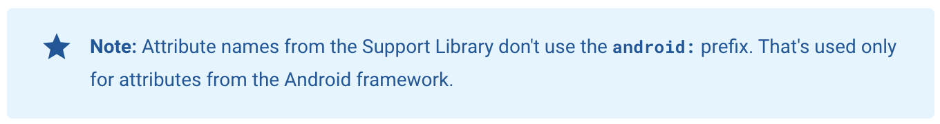
위 사진을 보면 android: 는 Android framework가 제공하는 것, 없는 것은 support library, jetpack, material에서 제공하는 attribute값을 사용하는 경우에 사용하는 것이다. (앞에 app:이 생략되어있는 것)
그럼 fontFamily와 android:FontFamily 중 어느것을 사용해야할까?
기본적으로는 Font는 안드로이드 framework가 제공하므로 android:fontFamily를 사용해야한다.
하지만 app:fontFamily 공식문서 를 보면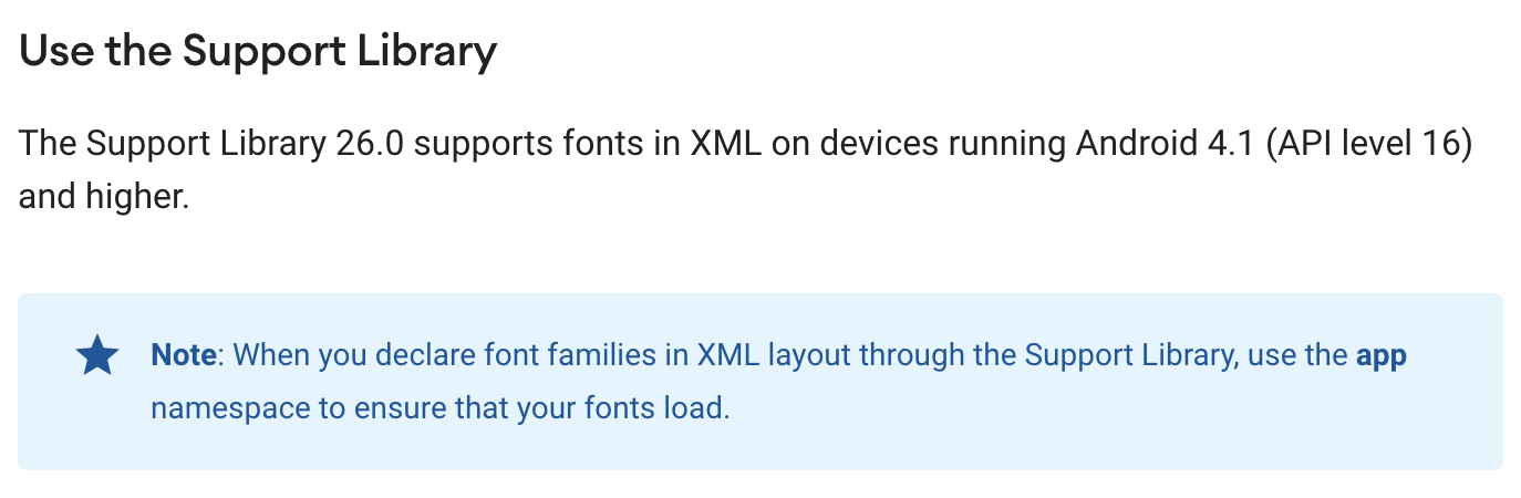
API 16이상부터는 Support Library가 font를 지원하기 때문에 app:fontFamily를 사용해야한다.
현재 보통 최소 API를 21로 하니까 fontFamily로 설정해줘도 되는 것!