시각화(matplotlib)
matplotlib : 파이썬의 대표 시각화 도구
주피터에서 새로운 창에서 그래프를 보는 것이 아니라 셀에 나타내기 위해서 %matplotlib inline 옵션 사용
pyplot : matlab에 있는 시각화 기능들, 전체를 불러올 때는 mpl로 함
plt.rcParams["axes.unicode_minus"] = False : 마이너스 부호 때문에 한글깨지는거 방지
import matplotlib.pyplot as plt
#import matplotlib as mpl
from matplotlib import rc
rc('font',family='Malgun Gothic')
%matplotlib inline
get_ipython().run_line_magic("matplotlib","inline")
plt.rcParams["axes.unicode_minus"] = False
plt.figure()로 열고 plt.show()로 닫음
-
plt.figure() : 기본 도화지 설정
-
plt.show() : 그래프 표시
plt.figure(figsize=(10,6))   #figure에 대한 속성, 여기선 사이즈
plt.plot([0,1,2],[4,5,6])  # 앞은 x좌표 뒤는 y좌표
plt.show()
그래프를 그리는 코드를 함수로 따로 작성, 나중에 별도의 셀에서 그림만 나타내기 위해!
- grid() : 그래프의 격자 완성
- legned() : 달아놨던 라벨 범례를 빈공간에 자동 표시, legend(['label1', 'label2']) 마냥 사용 가능
legend(loc="upper right") 같이 위치 지정도 가능 - xlabel() : x축 제목 지정
- title() : 그래프의 제목 표현
t = np.arange( 0, 12, 0.01 )
def drawGraph() :
    plt.figure(figsize=( 10, 6 ))
    plt.plot( t, np.sin(t), label='sin')
    plt.plot( t, np.cos(t), label='cos')
    plt.grid()
    plt.legend()
    plt.xlabel("time")
    plt.ylabel("Amplitude")
    plt.title("Example of sinewave")
    plt.show()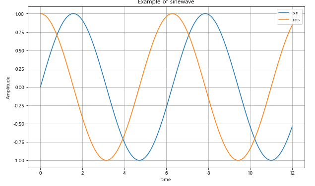
그래프의 다양한 옵션 지정
t = np.arange(0, 5, 0.5)

def drawGraph():
    plt.figure(figsize=(10, 6))
    plt.plot(t, t, "r--")   #red로 점선 형태로 그려라
    plt.plot(t, t ** 2, "bs")   #bluesquare
    plt.plot(t, t ** 3, "g^")   #green으로 위로 뾰족한 삼각형
plt.show()- xlim([a, b]) : x축 범위 지정
- ylim([a, b]) : y축 범위 지정
t = [0, 1, 2, 3, 4, 5, 6]
y = [1, 4, 5, 8, 9, 5, 3]
def drawGraph():
    plt.figure(figsize=(10, 6))
    plt.plot(
    t,
    y,
    color="green",
    linestyle="dashed", #점선
    marker="o", #마커 모양 동그라미
    markerfacecolor="blue",
    markersize=12,
    )
    plt.xlim([-0.5, 6.5])
    plt.ylim([0.5, 9.5])
plt.show()-
scatter : 점만 그리는 함수
colormap : 마커 안의 컬러지정
t = np.array([0, 1, 2, 3, 4, 5, 6, 7, 8, 9])
y = np.array([9, 8, 7, 9, 8, 3, 2, 4, 3, 4])
def drawGraph():
    plt.figure(figsize=(10, 6))
    plt.scatter(t, y)
    plt.show()

color mpa = t
def drawGraph():
    plt.figure(figsize=(10, 6))
    plt.scatter(t, y, s=50, c=colormap, marker=">")  # s: size
    plt.colorbar()
    plt.show()
pandas에서 plot 그리기
- matplotlib에서 가져와서 사용함
- 변수명.plot(kind = '종류', figsize=(x, y))// bar : 세로그래프, barh : 가로그래프
#예시
data.plot(kind='bar',figsize=(10, 10))
CCTV 데이터 시각화
CCTV 데이터 그래프 표현
#소계 컬럼 시각화
data_result["소계"].plot(kind='barh', grid=True, figsize=(10, 10))- 데이터가 많은 경우 정렬한 후 그리는 것이 효과적임
def drawGraph():
    data_result["소계"].sort_values().plot(
        kind='barh',
        grid=True,
        figsize=(10, 10),
        title="가장 CCTV가 많은 구"
)- 전체 경향을 함께 봐야 데이터를 제대로 이해할 수 있음
Linear Regression 을 통한 Trend 파악
- Numpy를 이용한 1차 직선 만들기
- np.polyfit(x, y, deg) : 직선을 구성하기 위한 계수 계산(y절편, 기울기)
- np.poly1d : polyfit으로 찾은 계수를 사용해 파이썬에서 함수로 만들어줌
- np.linspace(a, b, n) : a부터 b까지 n개의 등간격 데이터 생성
fp1 = np.polyfit(data_result["인구수"],data_result["소계"], 1)
f1 = np.poly1d(fp1)
fx = np.linspace(100000, 700000, 100)
def drawGraph():
    plt.figure(figsize=(14, 10))
    plt.scatter(data_result["인구수"],data_result["소계"],s=50)
    plt.plot(fx, f1(fx), ls='dashed', lw=3, color='g' )  #lw : 선 굵기
    plt.xlabel("인구수")
    plt.ylabel("CCTV")
    plt.grid()
    plt.show()
경향에서 벗어난 데이터 강조
- 경향과의 오차 생성
data_result['오차'] = data_result['소계'] - f1(data_result['인구수'])

# 경향과 비교해서 데이터의 오차가 너무 나는 데이터 계산
df_sort_f = data_result.sort_values(by='오차',ascending=False)
df_sort_t = data_result.sort_values(by='오차',ascending=True)

from matplotlib.colors import ListedColormap
color_step = ['#e74c3c', '#2ecc71', '#95a9a6', '#2ecc71', '#3498db', '#3498db']
mycmap = ListedColormap(color_step)- 그래프에 텍스트 추가하기
# 마커 안가리려고 1.02처럼 위치 조정
for n in range(5):
    		plt.text(
                df_sort_f["인구수"][n] * 1.02,
                df_sort_f["소계"][n] * 0.98,
                df_sort_f.index[n],
                fontsize=15)
def drawGraph():
plt.figure(figsize=(14, 10))
plt.scatter(data_result["인구수"],data_result["소계"],s=50, c=data_result['오차'], cmap=mycmap)
plt.plot(fx, f1(fx), ls='dashed', lw=3, color='g' ) #lw : 선 굵기
for n in range(5):
plt.text(
df_sort_f["인구수"][n] * 1.02,
df_sort_f["소계"][n] * 0.98,
df_sort_f.index[n],
fontsize=15)
plt.text(
df_sort_t["인구수"][n] * 1.02,
df_sort_t["소계"][n] * 0.98,
df_sort_t.index[n],
fontsize=15)
plt.xlabel("인구수")
plt.ylabel("CCTV")
plt.grid()
plt.colorbar()
plt.show()