(실습) 버튼 UI 만들기
지금까지 배운 transform, transition, animation, perspective 속성 등으로 버튼 만들기 실습을 했다.
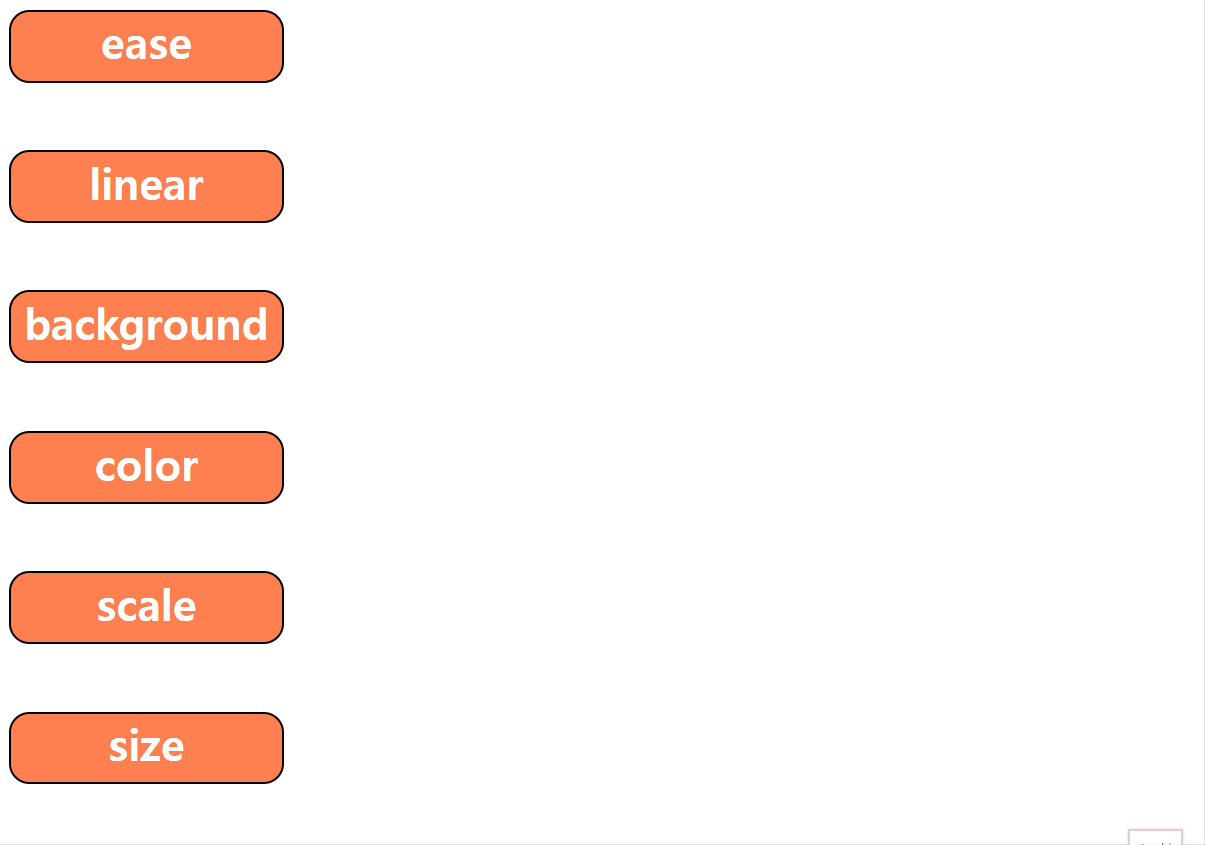
예시 버튼
기본적으로 준 속성
        div {
            width: 200px;
            height: 50px;
            background-color: coral;
            border: 2px solid black;
            border-radius: 15px;
            margin-bottom: 50px;
            transition: all 1s;
            color: white;
            text-align: center;
            font-weight: bold;
            font-size: 32px;
            /* 나중에 가상요소를 주기 위함 */
            position: relative;
            overflow: hidden;
        }
      /* ease-in, ease-out, ease-in-out은 자주 쓰지 않는다.  */
      /* ease */
       .c1:hover {
            transform: translateX(100px);
            transition-timing-function: ease;
        }

        /* linear */
        .c2:hover {
            transform: translateX(100px);
            transition-timing-function: linear;
        }


        /* background */
        .c3:hover {
            background-color: violet;

        }

        /*  color */
        .c4:hover {
            background-color: violet;
            color: black;
        }

        /*  scale*/
        .c5:hover {
            background-color: violet;
            color: black;
            transform: scaleY(1.2);
        }

        /* size */
        .c6:hover {
            width: 1000px;
            height: 100px;
        }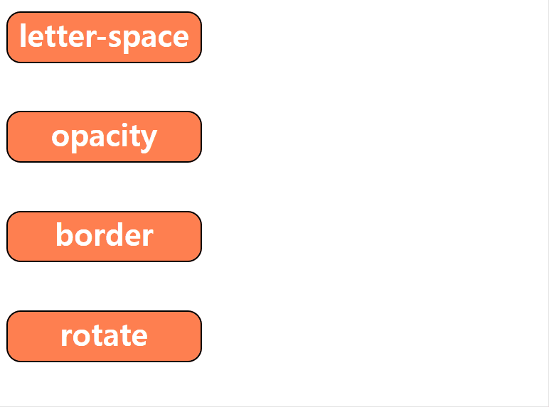
        /* letter-space*/
        .c7:hover {
            letter-spacing: 20px;
            width: 500px;
        }

        /* opacity*/
        .c8:hover {
            opacity: 0.3;
        }

        /* border */
        .c9:hover {
            border-color: hotpink;
            border-width: 20px;
        }

        /* rotate */
        .c10:hover {
            transform: rotate(20deg);
        }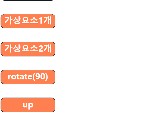
        /* 가상요소 1개 */
        .c15::before {
            content: '';
            display: block;
            position: absolute;
            background-color: white;
            width: 200px;
            height: 5px;
            bottom:0;

            /* width,height를 주지 않고도, 상하좌우 0을 주면 쫙 펼쳐지게 됨 */
            /* top:0;
            left:0;
            right: 0;
            bottom: 0; */
            transform: translateX(-300px);
            transition: all 1s ease;
        }
        .c15:hover::before {
            transform: translateX(0);
        }


        /* 가상요소 2개 */
        .c16::before {
            content: '';
            display: block;
            position: absolute;
            background-color: white;
            width: 200px;
            height: 5px;
            bottom:0;
            transform: translateX(-300px);
            transition: all 1s ease;
        }
        .c16:hover::before {
            transform: translateX(0);
        }
        .c16:after {
            content:'';
            display: block;
            position: absolute;
            background-color: white;
            width: 200px;
            height: 5px;
            top:0;
            transform: translateX(300px);
            transition: all 1s ease;
        }
        .c16:hover::after {
            transform: translateX(0)
        }


        /* rotate */
        .c17:before {
            content: '';
            position: absolute;
            top:0;
            left:0;
            width: 100%;
            height: 100%;
            background-color: yellowgreen;
            transition: all .5s;
            /* 두께가 없는 면이 세로로 서있는 모양-> 눈에 안 보임 */
            transform: rotateX(90deg);
            /* z-index: -1; */
        }
        .c17:hover::before {
            transform: rotateX(0);
            z-index: -1;
        }
        .c17:after{
            content: '';
            position: absolute;
            top:0;
            left:0;
            width: 100%;
            height: 100%;
            background-color: white;
            transition: all .5s;
            transform: rotateY(90deg);
            /* z-index: -1; */
        }
        .c17:hover::after {
            transform: rotateY(0);
            z-index:-1;
        }
        .c17:hover {
            color:tomato;
            /* 글자 보이게 하려고..! */
            z-index: 1;
        }


        /* up */
        .c18::before {
            content: 'hello world';
            color:white;
            background-color: black;
            display: block;
            top:0;
            left:0;
            width: 100%;
            height: 100%;
            transform: translateY(100%);
            transition: all 1s ease;
            /* 이게 없으면 up글자가 안 보임 */
            position: absolute;
        }
        .c18:hover::before {
            transform: translateY(0)
        }
실습 결과물
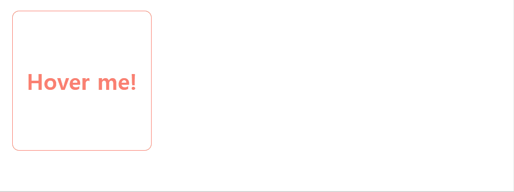
번뜩이는 아이디어가 잘 떠오르지도 않고,,
그래서 그냥 내 마음을 투영해서 만들어 보았다.

'힘들어요... 살려주세요...😭'.btn
안녕히계세요 여러분~! 전 이 세상의 모든 속박과 굴레를 벗어던지고 행복을 찾아 떠납니다~! 행복~~ 하세요~~~!!! bye🖐 .btn
미디어쿼리(Media query)
미디어쿼리란?
특정 조건(단말기의 유형, 화면 해상도, 뷰포트 너비 등)에서 특정 스타일만 적용되도록 만들어주는 기능이다.
/* @media 논리연산자 미디어타입 논리연산자 ( 조건 ) 논리연산자 { 적용할 스타일 } */
@media screen and (max-width: 420px) {}
미디어쿼리 유형
all
: 모든 장치를 대상으로 한다.
print
: 인쇄 결과물 및 출력 미리보기 화면에 표시하는 경우이다.
<abbr title="world wide web consortium">w3c</abbr>@media print {
abbr::after {
/* attr() : css 속성 함수입니다. */
content: ' ('attr(title)')'
}
}screen
: 모니터나 스크린이 있는 디바이스를 의미한다.
미디어쿼리 적용 화면
코드를 다음과 같이 작성하였다.
<!DOCTYPE html>
<html lang="ko">
  <head>
    <meta charset="UTF-8" />
    <meta http-equiv="X-UA-Compatible" content="IE=edge" />
    <meta name="viewport" content="width=device-width, initial-scale=1.0" />
    <title>2</title>
    <style>
      body {
        background-color: wheat;
      }
      .container {
        display: flex;
        flex-wrap: wrap;
        justify-content: space-around;
        box-sizing: border-box;
        border: 10px solid red;
        height: 500px;
        width: 100%;
        background-color: yellowgreen;
      }
      .item {
        margin: 50px;
        width: 500px;
        background-color: yellow;
      }
      @media screen and (max-width: 1000px) {
        body {
          background-color: tomato;
        }
        .container {
          border: 10px solid blue;
          height: 800px;
          background-color: violet;
        }
      }
      @media screen and (max-width: 600px) {
        body {
          background-color: yellow;
        }
      }
    </style>
  </head>
  <body>
    <div class="container">
      <div class="item">
        Lorem ipsum dolor sit amet consectetur adipisicing elit. Quam impedit,
        repellat facere reprehenderit dignissimos eius commodi culpa, debitis in
        quos recusandae modi, at architecto veniam. Nesciunt maxime beatae
        libero nisi?
      </div>
      <div class="item">
        Lorem ipsum dolor sit amet consectetur adipisicing elit. Quo aut in sit
        rerum minima dolore voluptas. Ad, vero nostrum facilis eaque labore
        voluptatem ratione voluptatibus debitis ab ipsam a. Voluptatibus!
      </div>
    </div>
  </body>
</html>

노란색 item 박스가 좌우정렬에서 상하정렬로 바뀌는 것은, 부모 container의 flex속성 때문.

뷰포트가 1000px 이하가 되자, body와 container의 backgroud-color 값이 바뀌었다
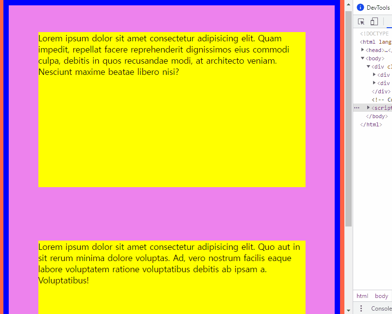
뷰포트가 600px 이하가 되자, body의 background-color가 바뀌었다.
📢 오늘의 회고
오늘은 실습 시간이 매우 길었다. 버튼 만들기 실습하고, 그 뒤에는 웹페이지 클론 코딩 실습으로 수업을 마무리 했다. 혼자 하는 시간이 길어지니, 그만큼 나의 부족함이 느껴지는 순간들도 많았다. 다들 너무 잘하시는 거 같아서 약간 위축되기도 했다. 그치만 그러고 있는다고 내가 실력이 부족하단 사실이 바뀌는 것도 아니고, 지금은 보고 배울 수 있다는 사실에 감사하다고 생각한다😊
공부도 기싸움이라서 기싸움에서 지면 공부도 안된다는 말이 떠오른다. 나는 절대 기 안 죽어😣💪 오늘도 수고했고, 내일도 파이팅❗

버튼 잘만드셧네욥😁