Grid
flex로 좌우상하배치 및 크기조절은 쉽지만 grid형태로 구현하는 것이
어렵기 때문에 나온 속성이다.
grid-template-columns / grid-template-rows
grid-template-columns는 column(열) box의 너비(width)를 설정한다.
grid-template-rows는 row(행) box의 높이(height)를 설정한다.
밑에 예시는 100*100의 box를 200px씩 3개로 grid형태로 출력한 모습이다.
grid-template-rows는 그 반대이다.

.father {
  height: 100vh;
  display: grid;
  grid-template-columns: 200px 200px 200px;
}
.child {
  width: 100px;
  height: 100px;
  background-color: black;
}
.child:nth-child(2) {
  background-color: red;
}
<div class="father">
<div class="child"></div>
<div class="child"></div>
<div class="child"></div>
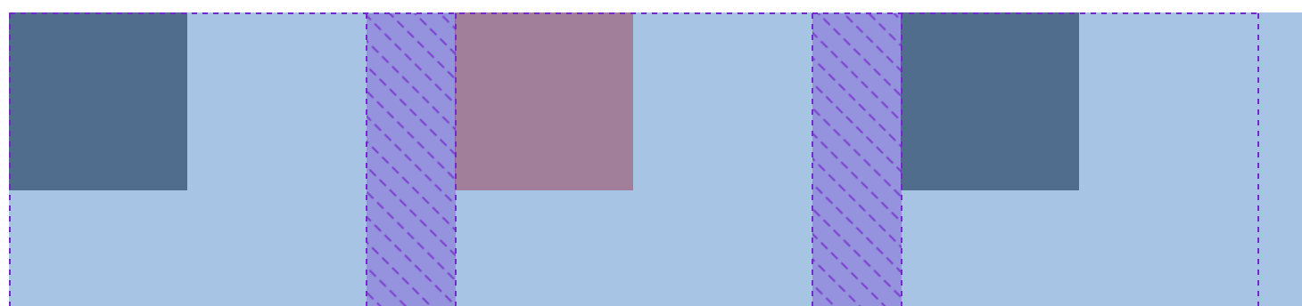
</div>gap (column-gap, row-gap)
밑 사진처럼 보라색부분이 column-gap이다.
grid-template-column 값으로 분할하고,
각각의 요소에 gap 값을 margin으로 주는 것이다.
.father {
  height: 100vh;
  display: grid;
  grid-template-columns: 200px 200px 200px;
  column-gap: 20px;
}
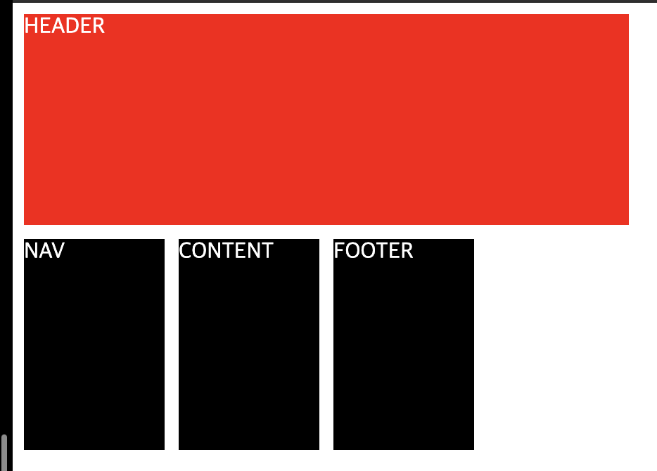
grid-template-area
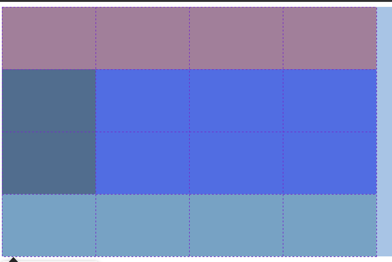
.grid {
  display: grid;
  grid-template-columns: repeat(4, 150px); /* width */
  grid-template-rows: repeat(4, 100px); /* height */
  grid-template-areas:
    "header header header header"
    "nav content content content"
    "nav content content content"
    "footer footer footer footer";
}

.header {
  grid-area: header;
  background-color: red;
}
.nav {
  grid-area: nav;
  background-color: black;
}
.content {
  grid-area: content;
  background-color: blue;
}
.footer {
  grid-area: footer;
  background-color: cadetblue;
}
<div class="grid">
      <div class="header"></div>
      <div class="nav"></div>
      <div class="content"></div>
      <div class="footer"></div>
</div>
grid-column-start / grid-column-end
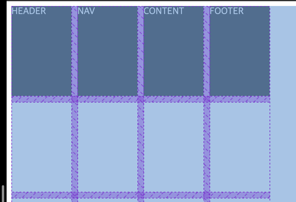
.grid {
  display: grid;
  gap: 10px;
  grid-template-columns: repeat(4, 100px); /* width */
  grid-template-rows: repeat(4, 150px); /* height */
}<div class="grid">
<div class="header">HEADER</div>
<div class="nav">NAV</div>
<div class="content">CONTENT</div>
<div class="footer">FOOTER</div>
</div>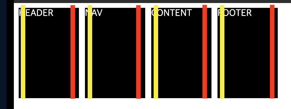
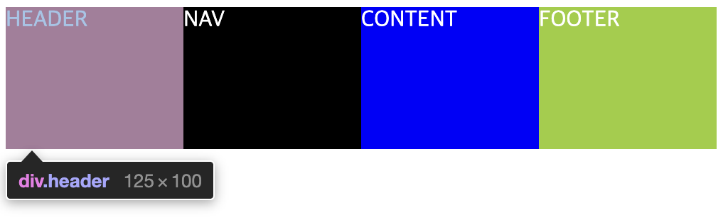
노란색은 grid-column-start의 값이고, 1부터 시작한다.
빨간색은 grid-column-end의 값이고, 2부터 시작한다.
위와 같이 HEADER로 row 한 줄 전체를 하고 싶다면 ?
.header {
background-color: red;
grid-column-start: 1; /* 시작 (line) */
grid-column-end: 5; /* 끝 (line) */
}grid-row-start / grid-row-end
이번엔 위와 같이 column을 합치는 경우도 생겼을 경우에는 어떻게 할까?
일단 grid-column-start/end를 설정해보자.
<div class="grid">
      <div class="header">HEADER</div>
      <div class="nav">NAV</div>
      <div class="content">CONTENT</div>
      <div class="footer">FOOTER</div>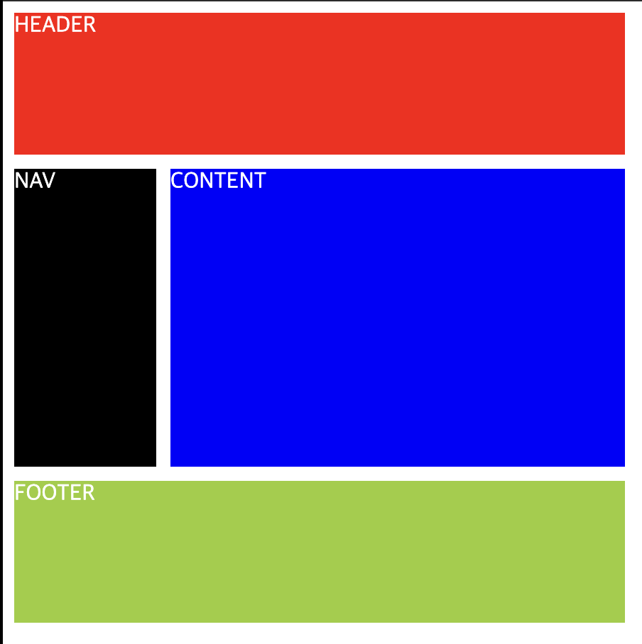
</div>.header {
background-color: red;
grid-column-start: 1; /* 1열부터*/
grid-column-end: 5; /* 4열까지 */
}
.nav {
background-color: black;
grid-column-start: 1; /* 1열부터 */
grid-column-end: 2; /* 1열까지 */
}
.content {
background-color: blue;
grid-column-start: 2;
grid-column-end: 5;
}
.footer {
background-color: yellowgreen;
}header는 1행의 1열부터 4열까지로 설정하고,
nav는 2행의 1열, 3행의 1열을 설정해야 하며
content는 2행의 2열-4열, 3행의 2열-4열까지를 설정해야한다.
여기서 우리는 grid-row-start/end를 사용할 수 있다.
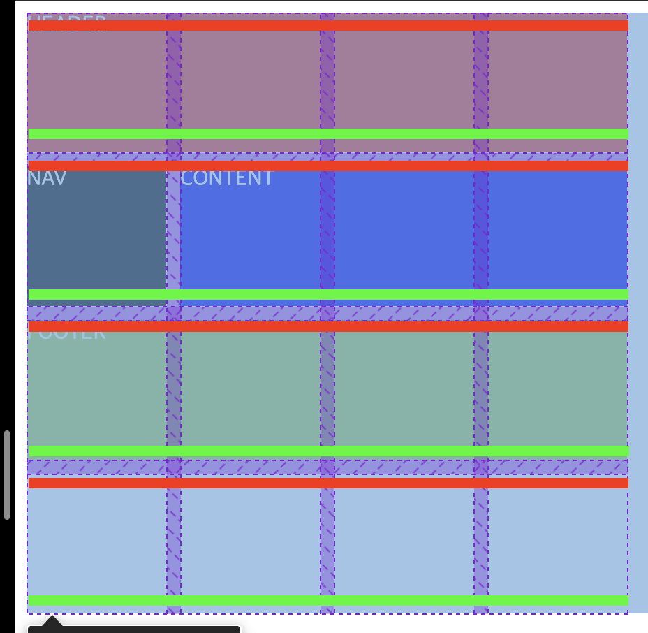
빨간색은 grid-row-start의 값이고, 1부터 시작한다.
형광색은 grid-row-end의 값이고, 2부터 시작한다.
따라서 nav, content는 grid-row-start/end: 2, 4가 되어야 한다.
.header {
background-color: red;
grid-column-start: 1; /* 1열부터*/
grid-column-end: 5; /* 4열까지 */
}
.nav {
background-color: black;
grid-row-start: 2; /* 2행부터 */
grid-row-end: 4; /* 3행까지 */
grid-column-start: 1; /* 1열부터 */
grid-column-end: 2; /* 1열까지 */
}
.content {
background-color: blue;
grid-row-start: 2; /* 2행부터 */
grid-row-end: 4; /* 3행까지 */
grid-column-start: 2; /* 2열부터 */
grid-column-end: 5; /* 4열까지 */
}
.footer {
background-color: yellowgreen;
grid-column-start: 1;
grid-column-end: 5;
}
짠!
header는 1행 전체
nav는 2행 1열, 2행 2열
content는 2행2열 - 2행 4열, 3행2열 - 3행4열
footer는 4행 전체로 구성되었다.
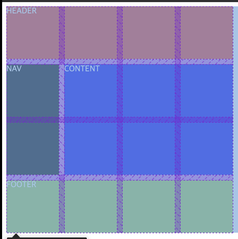
grid-row / grid-column
grid-row/column-start/end는 복잡해서 사용하기 쉽지않다.
그래서 사용할 수 있는게 바로 grid-row/column ㅋㅋ..
위에 코드를 그대로 수정해보면 좀 나아진거 같기도? ㅎㅎ..
.header {
background-color: red;
grid-column: 1 / 5;
}
.nav {
background-color: black;
grid-row: 2 / 4;
grid-column: 1 / 2;
}
.content {
background-color: blue;
grid-row: 2 / 4;
grid-column: 2 / 5;
}
.footer {
background-color: yellowgreen;
grid-column: 1 / 5;
}조금 더 수정해보자.
-1는 끝을 나타낸다. 따라서 라인이 몇개인지 셀 필요가 없다.
span은 몇개의 cell(box) 공간을 차지하는지를 뜻한다.
만약 span 4면 4개의 cell 공간을 차지한다는 뜻이다.
.header {
background-color: red;
grid-column: span 4; /* 열 4cell */
}
.nav {
background-color: black;
grid-row: span 2; /* 행 2cell */
grid-column: span 1; /* 열 1cell*/
}
.content {
background-color: blue;
grid-row: span 2; /* 행 2cell */
grid-column: span 3; /* 열 3cell */
}
.footer {
background-color: yellowgreen;
grid-column: span 4; /* 열 4cell*/
}fr (fraction)
grid Container에서 사용 가능한 공간을 뜻한다.
만약 grid-template-columns: repeat(4, 1fr)이고
width: 500px이면, 1개의 cell은 125px을 갖는다.
<div class="grid">
      <div class="header">HEADER</div>
      <div class="nav">NAV</div>
      <div class="content">CONTENT</div>
      <div class="footer">FOOTER</div>
</div>.grid {
display: grid;
width: 500px;
grid-template-columns: repeat(4, 1fr);
grid-template-rows: repeat(4, 100px);
}
.header {
background-color: red;
}
.nav {
background-color: black;
}
.content {
background-color: blue;
}
.footer {
background-color: yellowgreen;
}justify-items (수평), align-items (수직)
두 속성 모두 기본값은 stretch로, 각 cell을 양옆으로 최대한 늘어난다.
cell들의 너비/높이 설정이 없다면 양옆으로 최대한 늘어난다.
place-items
두개를 한꺼번에 설정할 수 있는 속성이다.
place-items: align(수직) justify(수평)으로 설정할 수 있다.
justify-content (수펑), align-content (수직)
두 속성의 기본값은 start이다. grid 전체를 설정한다.
place-content
place-content: align(수직) justify(수펑)을 설정한다.
justify-self (수평), align-self (수직)
두 속성은 각 cell 클래스에서 적용할 수 있다.
place-self
place-self: align(수직) justify(수평) 으로 설정할 수 있다.
minmax
.grid {
  display: grid;
  height: 100vh;
  gap: 5px;
  grid-template-columns: repeat(10, 1fr);
  grid-template-rows: repeat(4, 100px);
}
.item {
  background-color: yellowgreen;
}
브라우저 크기를 줄이면 어떻게 될까? 당연히 각 cell의 너비도 줄어든다.
이 때, 최소 너비값을 설정하고 싶을 때 minmax를 사용할 수 있다.
grid-template-colums: repeat(10, minmax(100px, 1fr));로 설정해보자.

옆으로 스크롤이 생기고, 최소 너비값이 100px이 된 것을 확인할 수 있다.
auto-fill, auto-fit
auto-fill은 주어진 공간에 빈cell이라도 생성하여 꽉 채운다.
auto-fit은 주어진 공간에 cell을 딱 맞춘다.
<!-- index.html -->
<div class="grid">
<div class="item">1</div>
<div class="item">2</div>
<div class="item">3</div>
<div class="item">4</div>
<div class="item">5</div>
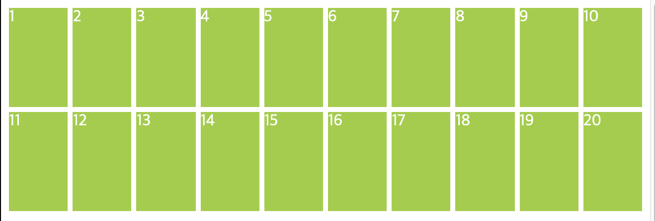
</div>✅ auto-fill
.grid {
  display: grid;
  height: 100vh;
  gap: 5px;
  grid-template-columns: repeat(auto-fill, minmax(100px, 1fr));
  grid-template-rows: repeat(4, 100px);
}
최소너비
100px, 최대너비1fr을auto-fill로 설정
높이100px에 4행 생성
div가 5개밖에 없기 때문에 5개를 생성한다.
파란색박스처럼 빈 공간에도cell을 생성하여 채운다.

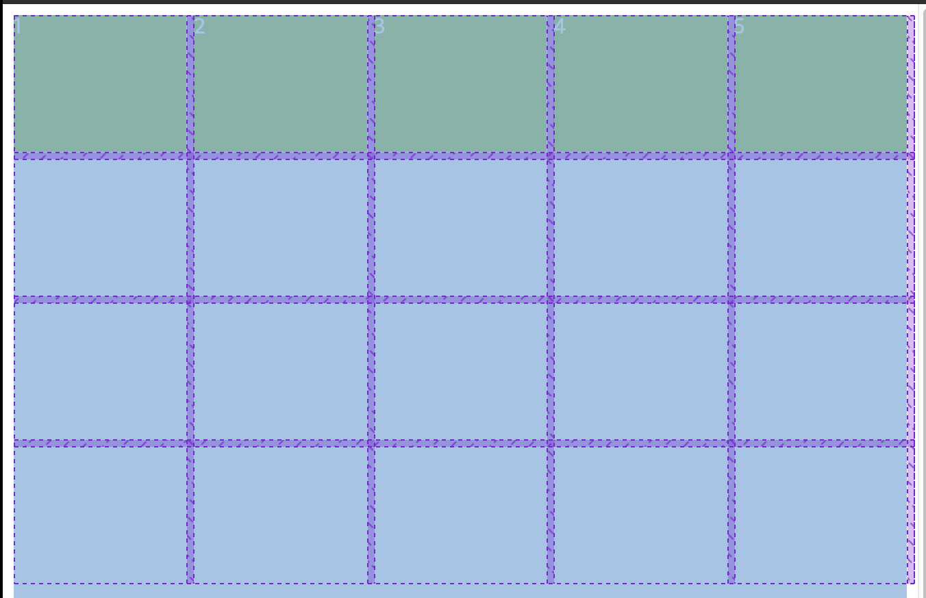
✅ auto-fit
.grid {
  display: grid;
  height: 100vh;
  gap: 5px;
  grid-template-columns: repeat(auto-fit, minmax(100px, 1fr));
  grid-template-rows: repeat(4, 100px);
}
최소너비
100px, 최대너비1fr을auto-fit으로 설정
높이100px에 4행 생성
똑같이 주어진 크기에
div5개를 생성한다.
최소너비100px보다는 큰 너비로 생성되었다.
작은화면에서 두 속성은 동일하게 적용되지만
화면이 커지면 커질수록 다르게 적용되어 사용자에게 보여진다-!
min-content / max-content
min-context content가 작아질 수 있는 만큼 작아지는 속성
max-content content가 필요한 만큼 크게 만드는 속성
<div class="grid">
      <div class="item">Text Text Text Text Text Text</div>
      <div class="item">Text Text Text Text Text Text</div>
</div>
.grid {
display: grid;
height: 100vh;
gap: 5px;
grid-template-columns: max-content min-content;
grid-auto-rows: 100px; /* 각 cell height 100px */
}
.item {
background-color: yellowgreen;
}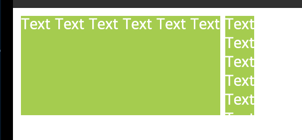
div안에 들어있는 내용을 토대로 스타일이 입혀졌다.
띄어쓰기를 안할 경우, 두 속성 모두 동일하게 보여진다.