inline / inline-block / block
inline
inline은 텍스트라고 말할 수 있다.
너비(width)와 높이(height)를 설정할 필요가 없다.
또한, margin과 padding 속성은 좌우만 반영이 되고, 상하 간격은 반영이 되지 않는다.
옆에 다른 요소(element)가 바로 올 수 있다. <span>, <a>
block
block은 BOX라고 할 수 있다.
너비(width)와 높이(height) 설정이 가능하며,
옆에 다른 요소(elem)가 올 수 없다. <p>, <div>
inline-block
말 그대로 두개의 속성을 모두 갖고 있다.
내부적으로는 block이면서 외부적으로는 inline이다.
너비(width)와 높이(height) 설정이 가능하며,
옆에 다른 요소(elem)가 올 수 있다.
margin과 padding 속성은 좌우상하 모두 반영된다.
/* style.css */
.box {
  display: inline-block;
  background-color: black;
  width: 100px;
  height: 100px;
}
<!-- index.html -->
<body>
<div class="box"></div>
<div class="box"></div>
<div class="box"></div>
</body>
간단한 코드인데, 한가지 문제점이 발견된다.
좌우 margin을 설정한 적이 없는데 각 박스에 margin이 생겨버렸다.
이 margin은 개발자가 원해서 생긴 margin도 아닐뿐더러,
반응형을 만들고자하는 개발자를 머리 아프게 만든다.
inline-block에 margin이 생기는 이유와 해결 방법
이 문제를 flex로 고쳐보자.
/* style.css */
.flex-box {
  display: flex;
}
.box {
  background-color: black;
  width: 100px;
  height: 100px;
}
<!-- index.html -->
<body>
  <div class="flex-box">
  	<div class="box"></div>
    <div class="box"></div>
    <div class="box"></div>
  </div>
</body>
짠. inline-block에서 생겼던 알 수 없는 마진이 쉽게 사라졌다.
flex
요소의 크기와 순서를 flexible(유연)하게, 쉽게 정의할 수 있는 CSS 속성이다.
반응형페이지를 만들기 위한 필수 속성이다.
부모 컨테이너(flex-container)에서 flex를 선언하고 설정을 하면
자식(flex-item)이 영향을 받는다.
flex-direction (default: row)
기본 방향은 row(행)/가로 이다.
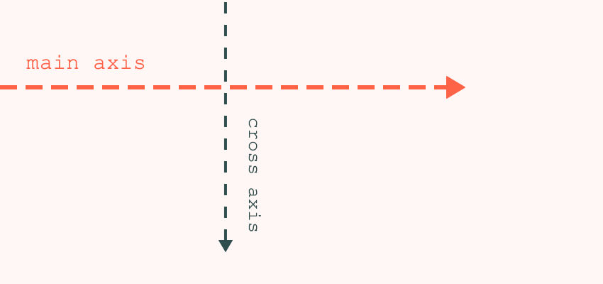
main-axis / cross-axis
기본방향이 row이면 main-axis는 가로이다.
기본방향이 row이면 cross-axis는 세로이다.
column은 그 반대! ㅎㅎ
justify-content / align-items
justify-content는 main-axis 방향의 아이템을 옮길 때 사용한다.
align-items는 cross-axis 방향의 아이템을 옮길 때 사용한다.
align-self
align-items(cross-axis)와 비슷한 일을 한다.
자식의 위치를 스스로 재정의한다.

/* style.css */
.father {
  display: flex;
  justify-content: space-around;
  align-items: start; /* 자식(.child)들은 start */
  height: 100vh;
}
.child {
  background-color: black;
  width: 100px;
  height: 100px;
}
.child:nth-child(2) {
  align-self: center; /* 2번째 자식(.child)는 center */
}
<!-- index.html -->
<div class="father">
<div class="child"></div>
<div class="child"></div>
<div class="child"></div>
</div>order
자식의 순서/위치를 변경한다. 기본값은 0이다.
html을 변경할 수 없을 때 유용하게 사용될 수 있다.
아래 예시는 두번째 box를 첫번째로 옮기는 예시이다.

/* style.css */
.father {
  display: flex;
  justify-content: space-around;
  height: 100vh;
}
.child {
  background-color: black;
  width: 100px;
  height: 100px;
}
.child:nth-child(2) {
  order: -1; /* default: 0 */
  background-color: red;
}
<!-- index.html -->
<div class="father">
<div class="child"></div>
<div class="child"></div>
<div class="child"></div>
</div>flex-wrap
부모가 flex면
자식의 너비(width)가 바뀌더라도 모두 같은 줄에 위치하도록 한다.
flex-wrap은 기본값이 nowrap이다.
wrap으로 변경하는 순간, 자식들의 크기를 유지하라고 말해준다.
flex-wrap: nowrap;
flex-wrap: wrap;
중간에 생기는 공간은
align-content로 정의할 수 있다.


/* style.css */
.father {
  display: flex;
  flex-wrap: wrap; /* no-wrap (Default) */
  justify-content: space-around;
  height: 100vh;
}
.child {
  background-color: black;
  width: 200px;
  height: 200px;
}
<!-- index.html -->
<div class="father">
<div class="child"></div>
<div class="child"></div>
<div class="child"></div>
<div class="child"></div>
<div class="child"></div>
</div>flex-shrink
자식의 flex-wrap설정이 기본값(no-wrap)이고, 설정한 너비가 초과되어 모두 같은 줄에 위치하려고 할 때에 단어 그대로 수축(shrink) 정도를 나타낸다.
기본 값은 1이며, 값이 커질수록 수축의 정도가 커진다.

/* style.css */
.father {
  display: flex;
  justify-content: space-around;
  height: 100vh;
}
.child {
  background-color: black;
  width: 200px;
  height: 200px;
}
.child:nth-child(2) {
  background-color: red;
  flex-shrink: 2; /* 수축정도 2배  (기본값 1)*/
}
<!-- index.html -->
<div class="father">
<div class="child"></div>
<div class="child"></div>
<div class="child"></div>
</div>flex-grow
flex-shrink와 반대로 작용한다.
설정한 너비대로 정상적으로 출력하고 있을 때, 남아있는 공간을 가질 수 있을만큼 차지하게 된다. 단, 설정한 너비를 초과하여 줄어들때에는 같은 비율로 줄어든다.

flex-basis
자식요소에게 flex-shrink, flex-grow 전에 초기 크기를 세팅한다.
flex-direction이 row일 때는 너비(width)값이고,
column일 때는 높이(height)값이다.
잘 사용하지 않는다. 그냥 width/height ..?

정말 유익한 글이었습니다.