[5월 12-13일]
1.box-shadow
<style>
	#example3{box-shadow: 5px 10px 10px skyblue;}
</style>
selector{box-shadow: 오른쪽 아래쪽 투명도 색상} 순으로 표시한다.
2.table
(1) 기본
<html>
    <head></head>
    <body>
        <table>
            <caption>제목</caption>
            <thead>
               <tr>
                   <th>thead내용</th>
               </tr>
            </thead>
            <tbody>
                <tr>
                    <td>tbody내용</td>
                </tr>
            </tbody>
            <tfoot>
                <tr>
                    <td>tfoot내용</td>
                </tr>
            </tfoot>
        </table>
    </body>
</html>
-table은 thead,tbody,tfoot으로 나누어서 만든다.
-caption: 표 제목
-tr:행
-td:열
-th:굵은 글씨의 열
(2) css
    <style>
        table{border-collapse:collapse;}/*테두리선 합치기*/
        td,tfoot th{border-bottom: 1px solid grey;} /*아래테두리선 색상지정*/
        tbody tr:nth-child(even){background:rgb(168, 168, 243);} /*짝수번째 행 배경색 지정*/
        tbody tr:hover{background:pink;} /*마우스 올렸을 때*/
        caption{caption-side:bottom; line-height: 2;} /*caption 위치,크기 지정*/
    </style>
transform vs transition vs animation
transform : 처음과 끝 한번에 바뀜
transition : 처음과 끝 서서히 바뀜
animation : 처음,중간,끝 바뀜 (즉,중간 과정을 설정가능)
3.transform
(1)이미지 이동 (translate)
<style>
    .movex:hover{transform: translateX(50px);} /* 오른쪽으로 이동 */
    .movey:hover{transform:translateY(50px);} /* 아래쪽으로 이동 */
    .movexy:hover{transform: translate(10px,20px);} /* 대각선으로 이동 */
</style>
(2)이미지 확대,축소 (scale)
<style>
    .scalex:hover{transform: scaleX(1.5);} /* 좌우 확대 */
    .scaley:hover{transform: scaleY(1.5);} /* 상하 확대 */
    .scalexy:hover{transform: scale(2,2);} /* 상하좌우 확대 */
    .scalexy:hover{transform: scale(0.5,0.5);} /* 축소 */
</style>
(3)기울임-각도 (skew)
<style>
    .skewx:hover{transform:skewX(40deg);} /* x축 방향 기울임*/
    .skewy:hover{transform:skewY(20deg);} /* y축 방향 기울임 */
    .skewxy:hover{transform:skew(30deg,-30deg);}  /* x축,y축 방향 기울임*/
</style>
(4)회전 (rotate)
<style>
    .rot:hover{transform: rotate(90deg);}
</style>
3차원회전
<style>
    .rotx:hover{transform:rotateX(45deg);}
    .roty:hover{transform:rotateY(45deg);}
    .rotz:hover{transform:rotateZ(45deg);}
    .rotxyz:hover{transform:rotate3d(2.5, 1.2, -1.5, 45deg);}
</style>
(5)origin
<style>
    .bus{transform: rotateZ(10deg);}
    .ltop .bus{transform-origin:left top;} /*왼쪽 위 모서리 기준*/
    .rtop .bus{transform-origin:right top;} /*오른쪽 위 모서리 기준*/
    .lbottom .bus{transform-origin:left bottom;} /*왼쪽 아래 모서리 기준*/
    .rbottom .bus{transform-origin:right bottom;} /*오른쪽 아래 모서리 기준*/
</style>
4.transition
    <style>
        /* 전환 프로퍼티,전환 시간 */
        span{transition:font-size 3s;}
        span:hover{font-size:500%}
    </style>
<style>
        #graph:hover .bar{transition-property: width, background-color;
                    width:600px; transition-duration:5s,5s;}
        .bar:nth-child(1){background-color: red;transition-timing-function:linear;}
        .bar:nth-child(2){background-color: yellow;transition-timing-function:ease;}
        .bar:nth-child(3){background-color: green;transition-timing-function:ease-in;}
        .bar:nth-child(4){background-color: blue;transition-timing-function:ease-out;}
        .bar:nth-child(5){background-color: purple;transition-timing-function:ease-in-out;}
</style>
linear: 시작부터 끝까지 같은 속도로 진행
ease: 천천히 시작->점점 빨라지다가 -> 천천히 끝
ease-in: 느리게 시작
ease-out: 느리게 끝
ease-in-out: 느리게 시작-> 느리게 끝
5.animation
    <style>
        div{width: 100px; height: 100px;
            border:1px solid black; margin:50px;}
        #box{background-color: blue;
            animation-name: change-bg;  /* @keyframes 이름*/
            animation-duration: 3s; /*애니메이션 실행 시간*/
            animation-iteration-count: infinite; /*애니메이션 반복 횟수*/
            animation-direction:alternate;  /*애니메이션 종료 후 재시작 방향*/
            animation-timing-function:ease-in-out;  /*애니메이션의 속도 곡선*/
        @keyframes change-bg{
            from{background-color:blue;} /*0%*/
            50%{background-origin: violet;}
            to{background-color: yellow;
                border-radius:50%;} /*100%*/
        } /*애니메이션이 바뀌는 지점 설정*/
    </style>
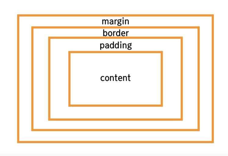
6.css 박스