벨로그를 최근에 시작하게 되어서! 다른 곳에서 포스팅 했던 정보들을 BIL로 가져오려고 합니다!
TIL 자매품 BIL!!!
1) relative(부모요소): 기존 엘리먼트의 위치를 기준으로 움직임
기본설정을 이렇게 해놓은 상태에서
<!DOCTYPE html>
<html lang="en">
<head>
<meta charset="UTF-8">
<meta http-equiv="X-UA-Compatible" content="IE=edge">
<meta name="viewport" content="width=device-width, initial-scale=1.0">
<title>Document</title>
<style>
#box1{
width:400px;
height:400px;
background-color:red;
}
#box2{
width:100px;
height:100px;
background-color: blue;
}
</style>
</head>
<body>
<div id="box1">
</div>
<div id="box2">
</div>
</body>
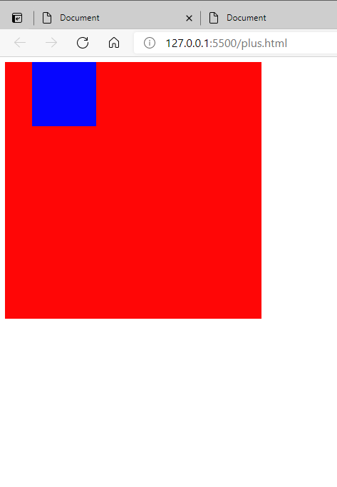
</html>💻 결과물(relative)
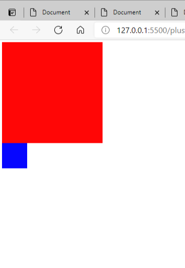
css에서 box2에
            position:relative;

            left: 50px;
요걸 추가해서 결과값을 보면
파란색 박스만 왼쪽에서 50px 떨어진 결과를 볼 수 있다.
position:relative; 를 설정해주면 left,right,top,bottom 값에 픽셀을 지정해줘서 움직이면 된다.
⭐relative는 기존의 box2엘리먼트가 위치해 있던 곳을 기준으로 위치가 변경되는 것이 특징이다.
2) absolute(자식요소) : 브라우저를 기준으로 움직임
absolute는 브라우저를 기준으로 위치가 조정되는데 만약 바로 위의 상태에서 포지션만 relative에서 absolute로 바꾸게 되면 위와 똑같은 결과값이 나온다.
<!DOCTYPE html>
<html lang="en">
<head>
<meta charset="UTF-8">
<meta http-equiv="X-UA-Compatible" content="IE=edge">
<meta name="viewport" content="width=device-width, initial-scale=1.0">
<title>Document</title>
<style>
#box1{
width:400px;
height:400px;
background-color:red;
}
#box2{
width:100px;
height:100px;
background-color: blue;
position:absolute;
left: 50px;
}
</style>
</head>
<body>
<div id="box1">
</div>
<div id="box2">
</div>
</body>
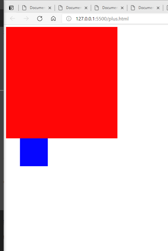
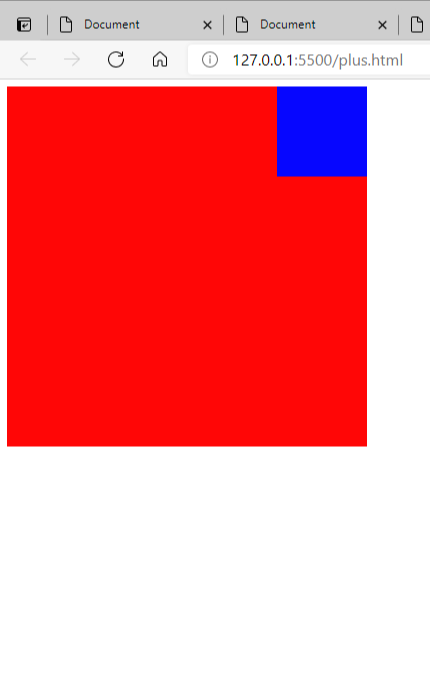
</html>💻 결과물(absolute)
내가 생각하는 개념이 맞는지 모르겠음!!!^^
현재 box2의 브라우저가 box1 이후의 영역부터가 기준이기 때문이다.
만약, html에서 box2를 box1 안에 넣게 된다면 아래와 같이 다른 결과값이 나온다!
이때, box1를 부모영역, box2를 자식영역이라 칭한다!
<!DOCTYPE html>
<html lang="en">
<head>
<meta charset="UTF-8">
<meta http-equiv="X-UA-Compatible" content="IE=edge">
<meta name="viewport" content="width=device-width, initial-scale=1.0">
<title>Document</title>
<style>
#box1{
width:400px;
height:400px;
background-color:red;
}
#box2{
width:100px;
height:100px;
background-color: blue;
position:absolute;
left: 50px;
}
</style>
</head>
<body>
<div id="box1">
<div id="box2">
</div>
</div>
</body>
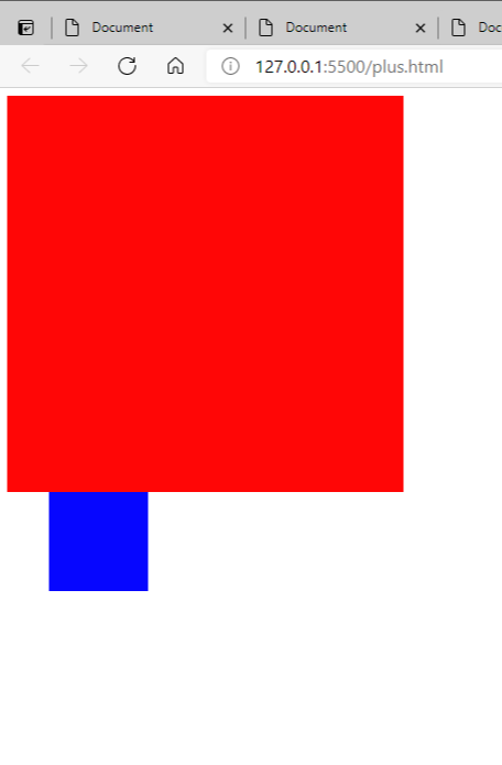
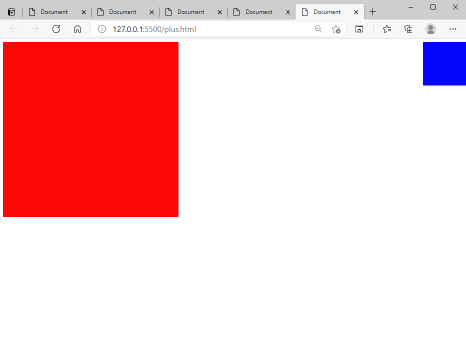
</html>💻 결과물(box1안에 box2를 넣어줌)
여기선 위와 달리 box2가 box1안에 들어갔으니 box1의 기준브라우저를 box2가 같이 갖게 되고, 그래서 위와 같은 결과값이 나오게 되는 것 같음
+++ position (relative와 absolute)을 활용하는 가장 큰 이유는 도형 하나 위에 다른 도형의 위치를 자유자재로 지정하여 원하는 디자인을 만들기 위해서인 것 같다. 도형 위에 다른 도형을 올려서 디자인할때 중요한 점이 2가지 있다는 것을 알게 되었다.
1) html에서 부모영역 안에 자식영역을 넣어주기!
2) css에서 부모영역에는 position: relative; 를, 자식영역에는 position: absolute; 를 꼭 지정해주기!!
무슨 말인지 이해가 안된다면,,,,
아래의 예시들을 보면 이해가 될 것!
나는 box1의 상단우측에 box2를 놓고 싶었다.
그래서 css에서 box1에 position:relative를, box2에 positon:absolute, right:0px를 주었다. 그리고 결과물이 아래와 같음
<!DOCTYPE html>
<html lang="en">
<head>
    <meta charset="UTF-8">
    <meta http-equiv="X-UA-Compatible" content="IE=edge">
    <meta name="viewport" content="width=device-width, initial-scale=1.0">
    <title>Document</title>
    <style>
        #box1{
            width:400px;
            height:400px;
            background-color:red;
            position:relative;
        }
        #box2{
            width:100px;
            height:100px;
            background-color: blue;
            position:absolute;
            right: 0;
        }
    </style>
</head>
<body>
    <div id="box1">
        <div id="box2">
        </div>
    </div>
</body>
</html>
💻 결과물(box1->relative, box2->absolute, right:0px)
만약 box1이나 box2중 하나에만 position 속성을 넣어주면 위와 같은 결과물이 나오지 않게 된다!!!!!!!
box1에서 position:relative;를 뺐을 때, 어떻게 되는지 한번 해보면
💻 결과물(box2->absolute, right:0px)
이런 결과물이 나오게 된다.
absolute는 원래 브라우저를 기준으로 위치가 변경되기 때문에 box1위에서 box2 위치를 조정하기 위해선 css에서 box1(부모영역)에는 position:relative를, box2(자식영역)에 positon:absolute를 꼭 설정해 주어야 한다!!
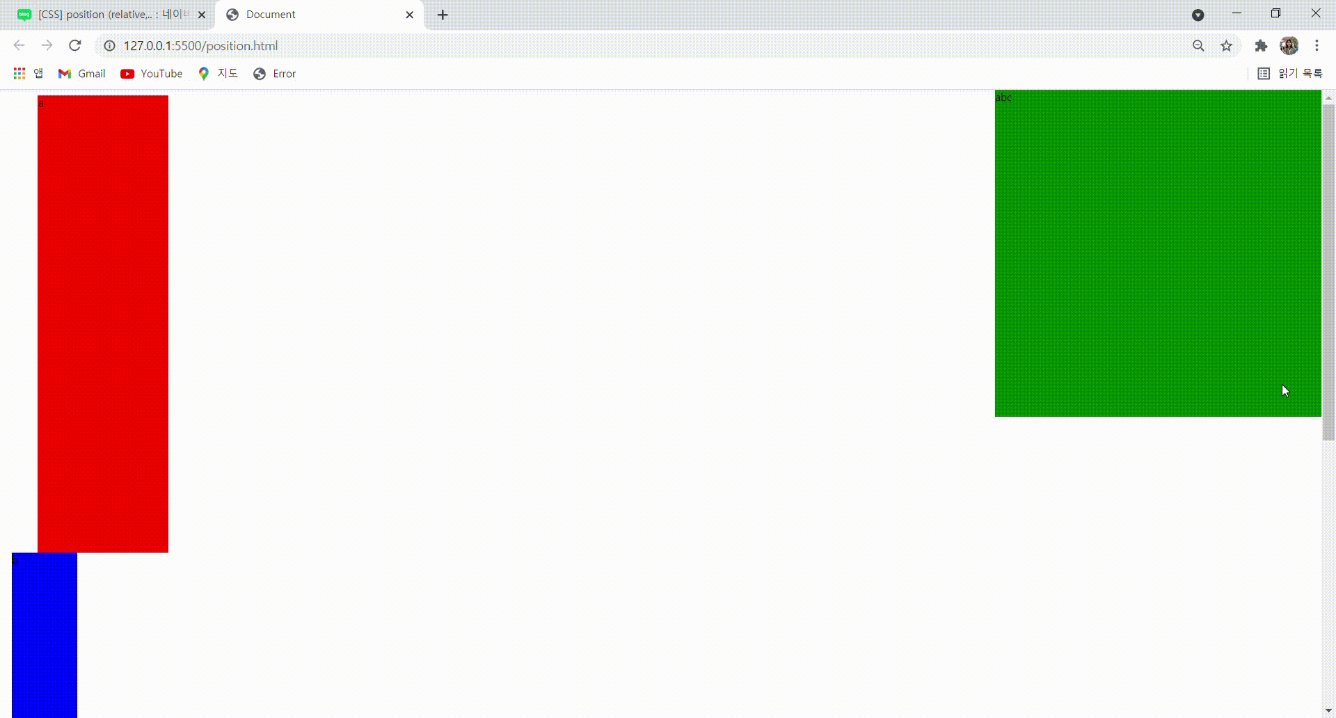
3) fixed: 화면 특정 위치에 항상 고정시켜주는 기능
나는 box3에 교수님처럼 top: 0px; right: 0px; 주었다.
<!DOCTYPE html>
<html lang="en">
<head>
    <meta charset="UTF-8">
    <meta http-equiv="X-UA-Compatible" content="IE=edge">
    <meta name="viewport" content="width=device-width, initial-scale=1.0">
    <title>Document</title>
    <style>
        #box1{
            margin-left:50px;
            width:200px;
            height:700px;
            background-color: red;
        }
        #box2{
            width:100px;
            height:1000px;
            background-color: blue;
            position:relative;
            left:10px;
        }
        #box3{
            position:fixed;
            right:0px;
            top:0px;
            width:500px;
            height:500px;
            background-color: green;
        }
    </style>
</head>
<body>
    <div id="box1">
        a
    </div>
    <div id="box2">
        b
    </div>
    <div id="box3">
        abc
    </div>
</body>
</html>
그러면 결과가 이렇게 나온다
💻 결과물(fixed)
안녕하세요!😊 국비지원으로 개발쪽 공부를 시작한 학생입니다!
혹시나 제가 잘못된 정보를 제공하고 있다면 댓글 부탁드립니다! 💚
글 읽어주셔서 정말 감사합니다🙇♀️