What is? 🤷♀️
margin이란 바깥 여백을 의미한다.
padding은 안쪽 여백을 의미한다.
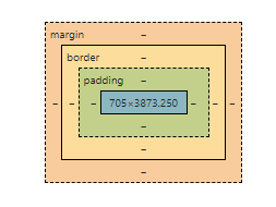
Ctrl + Shift + I를 통해 개발자 도구 창에서 확인할 수 있다. 가장 안의 부분은 content영역이다.
More 🏃♀️
속성값
- px이나 em 같은 단위로 지정할 수 있다.
- 퍼센트(%)로 지정이 가능하다
- auto : display 속성에서 지정한 값에 맞게 적절한 값을 자동으로 지정할 수 있다.
+) 중앙 배치
margin-left : auto; margin-right : auto;
로 지정하면 문서의 내용을 화면 중앙에 배치할 수 있다.
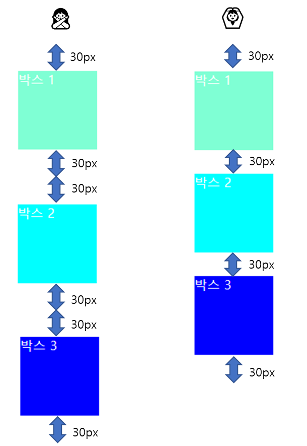
margin overlap(=margin collapse)
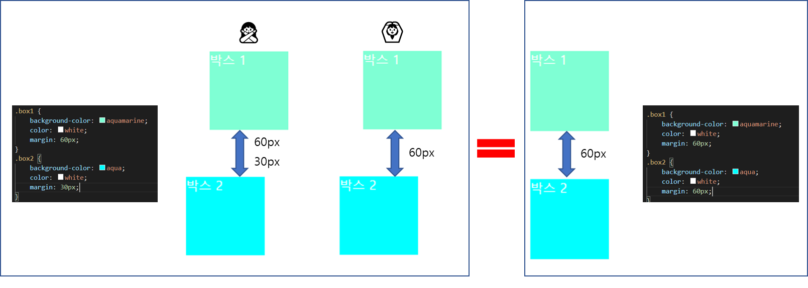
각 요소의 마진이 서로 만나면 마진값이 큰 쪽으로 겹쳐진다.
example 1
HTML_
<body>
    <section class="box1">
        <p> 박스 1</p>
    </section>
    <section class="box2">
        <p> 박스 2</p>
    </section>
    <section class="box3">
        <p> 박스 3</p>
    </section>
</body>
CSS_1
section {
    width: 100px;
    height: 100px;
    margin: 30px;
}

.box1 {
    background-color: aquamarine;
    color: white;
}
.box2 {
    background-color: aqua;
    color: white;
}
.box3 {
    background-color: blue;
    color: white;
}
example 2
CSS_1
section {
width: 100px;
height: 100px;
}
.box1 {
background-color: aquamarine;
color: white;
margin: 60px;
}
.box2 {
background-color: aqua;
color: white;
margin: 30px;
}
.box3 {
background-color: blue;
color: white;
margin: 30px;
}
UnderStand 🏄♂️
padding 사용
section {
    width: 100px;
    height: 100px;
    margin: 30px;
    padding: 70px;
}
왼쪽이 padding이 10px일 때 오른쪽이 padding이 70px일 때이다.
콘텐츠와 박스 내부 사이에 여백이 추가된 것을 알 수 있다.
border 사용
section {
    width: 100px;
    height: 100px;
    margin: 30px;
    padding: 50px;
}

.box1 {
    background-color: aquamarine;
    color: white;
    border: 5px solid black;
}
.box2 {
    background-color: aqua;
    color: white;
}
border을 사용하면 해당 크기만큼 상자가 커진다. 아래 박스와 같은 사이즈를 유지하려면 padding 값에 padding-border값을 넣어주면 된다.
box1의 padding 값을 50 > 45 (px)로 바꾸어준 결과, 두 박스의 크기가 같아진 것을 볼 수 있다.

노션으로 갈아탐