Chap 14 CSS 그리드 레이아웃
CSS 그리드 레이아웃
1. CSS 그리드 레이아웃
CSS 그리드 레이아웃
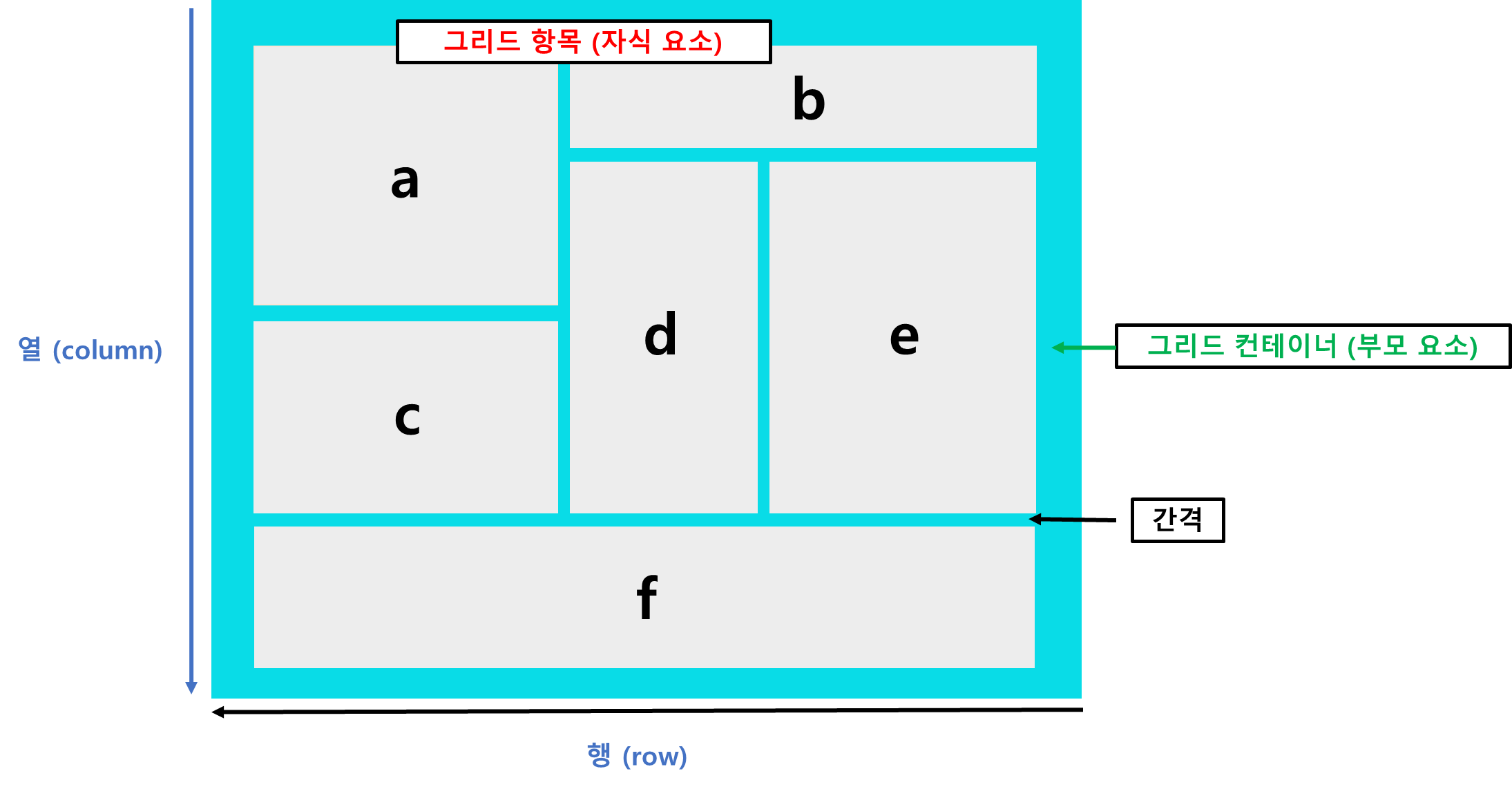
- 플렉스 박스 레이아웃은 주축/교차축 개념이 있지만
CSS 그리드 레이아웃은 양쪽 방향 모두 사용
- (플렉스 그리드 레아웃은 1차원, CSS 그리드 레이아웃은 2차원 이라고도 함)
- 행(row)과 열(column)로 화면을 구성하고, 필요할 경우 그리드 항목 사이에 간격을 둘 수 있음.
2. CSS 그리드 레이아웃 항목을 배치하는 속성
display 속성
배치 요소들을 감싸는 부모 요소를 그리드 컨테이너로 지정
| 속성 | 설명 |
|---|
| grid | 블록 레벨의 그리드 컨테이너를 만듦. |
| inline-grid | 인라인 레벨의 그리드 컨테이너를 만듦. |
grid-template-columns, grid-template-rows 속성
| 속성 | 설명 |
|---|
| grid-template-columns | 그리드 컨테이너 안의 열 개수와 너비 값 |
| grid-template-rows | 그리드 컨테이너 안의 행 개수와 너비 값 |
...
<title>CSS Grid Layout</title>
<style>
      .container {
        display:grid;
        grid-template-columns: 200px 300px 350px;
        grid-template-rows: 50px 100px;
      }
.items{
border: 1px solid #222;
padding:10px;
font-size: 20px;
text-align: center;
}
.items:nth-child(even) {
background-color:#ffc400;
}
</style>
</head>
<body>
<div class="container">
<div class="items">1</div>
<div class="items">2</div>
<div class="items">3</div>
<div class="items">4</div>
<div class="items">5</div>
<div class="items">6</div>
</div>
</body>
</html>
.container {
display:grid;
grid-template-columns: 200px 300px 350px;
grid-template-rows: 50px 100px;
}
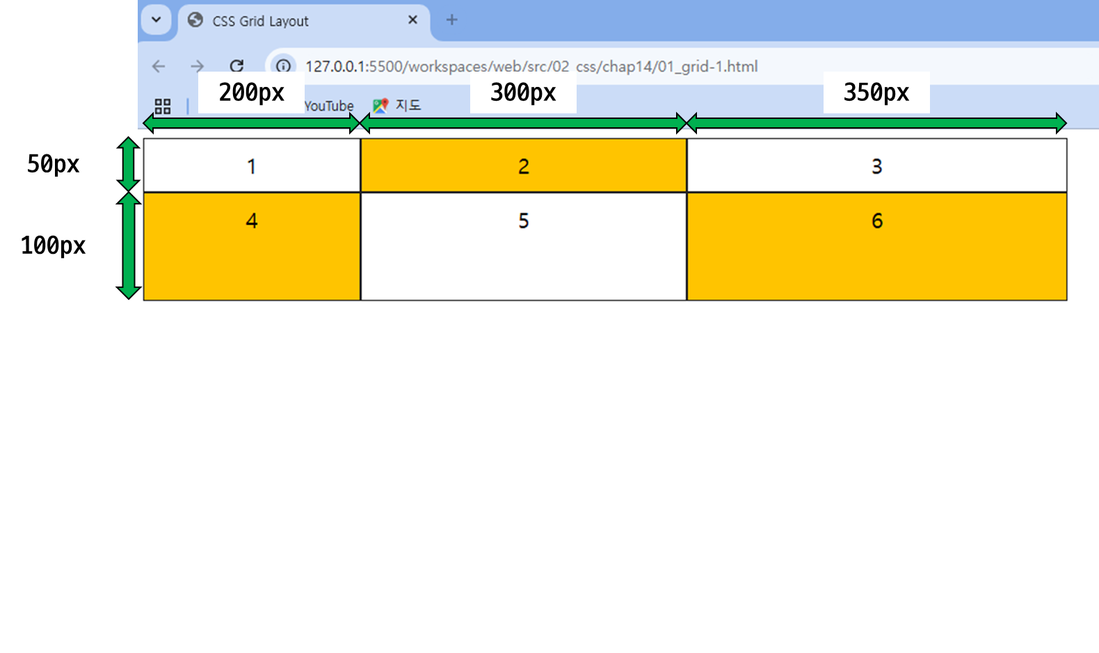
- grid-template-columns에는
200px, 300px, 350px을 배치하였으므로, 각각의 열들이 200, 300, 350px의 크기를 가지게 됨. (3개의 열)
- grid-template-rows에는
50px, 100px을 배치하였으므로, 각각의 행들이 50, 100px의 크기를 가지게 됨. (2개의 열)
grid-auto-rows 속성
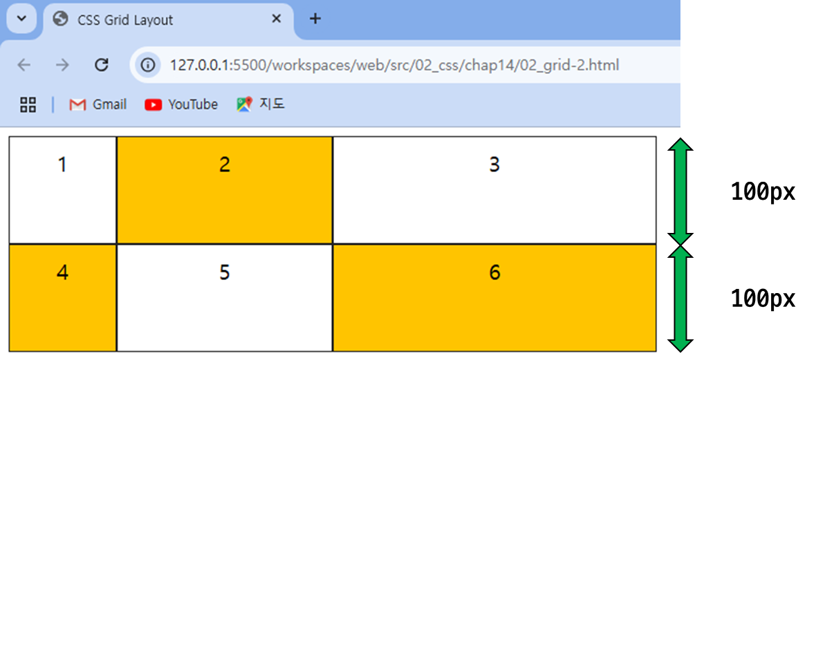
- 동적으로 추가되는 행의 높이 지정
대부분 동적인 웹 사이트는 행의 개수를 미리 정할 수 없는 경우가 많음!
- 그래서 grid-template-rows 보다 grid-auto-rows 속성을 많이 사용함!
...
<title>CSS Grid Layout</title>
<style>
      .container {
        display:grid;
        grid-template-columns: 100px 200px 300px;
        grid-auto-rows: 100px;
      }
.items{
border: 1px solid #222;
padding:10px;
font-size: 20px;
text-align: center;
}
.items:nth-child(even) {
background-color:#ffc400;
}
</style>
</head>
<body>
<div class="container">
<div class="items">1</div>
<div class="items">2</div>
<div class="items">3</div>
<div class="items">4</div>
<div class="items">5</div>
<div class="items">6</div>
</div>
</body>
</html>
.container {
display:grid;
grid-template-columns: 100px 200px 300px;
grid-auto-rows: 100px;
}
- grid-auto-row 를 사용함으로써, 모든 행을 100px의 길이로 지정!
상대적인 크기를 지정하는 fr단위
- 열과 행의 크기를 지정하는
px 단위는 반응형 웹 디자인에 적합하지 않음!
값이 반복된다면? repeat( ) 함수
- 똑같은 값을 여러 번 반복한다면 내장 함수
repeat( ) 함수 사용
grid-template-columns: 1fr 1fr 1fr;
🔽
grid-template-columns: repeat(3, 1fr);
최솟값과 최댓값을 지정하는 minmax( ) 함수
- 행의 높이를 px 값으로 고정하면 내용이 많을 경우 내용이 가려질 수 있음
- 그래서 !
minmax( )함수를 사용하면 행 높이를 최솟값과 최댓값으로 지정 가능
- 코드 예시 ) - fr, repeat, minmax 사용
...
<title>CSS Grid Layout</title>
<style>
      .container {
        width:600px;
        border: 1px solid #ccc;
        display:grid;
        grid-template-columns:repeat(3, 1fr);
        grid-auto-rows: minmax(100px, auto);
      }
.items{
padding:10px;
font-size: 16px;
}
.items:nth-child(odd){
background-color:#ffc400;
}
</style>
</head>
<body>
<div class="container">
<div class="items">Lorem ipsum dolor sit amet consectetur adipisicing elit. Amet, reprehenderit.Lorem ipsum dolor, sit amet consectetur adipisicing elit. </div>
<div class="items">Lorem ipsum dolor, sit amet consectetur adipisicing elit.Lorem ipsum dolor, sit amet consectetur adipisicing elit</div>
<div class="items">Lorem ipsum dolor sit amet.Lorem ipsum dolor, sit amet consectetur adipisicing elit</div>
<div class="items">Lorem ipsum dolor sit.Lorem ipsum dolor, sit amet consectetur adipisicing elit</div>
<div class="items">Lorem, ipsum dolor.</div>
<div class="items">Lorem, ipsum dolor. Lorem ipsum dolor sit amet.</div>
</div>
</body>
</html>
.container {
width:600px;
border: 1px solid #ccc;
display:grid;
grid-template-columns:repeat(3, 1fr);
grid-auto-rows: minmax(100px, auto);
}
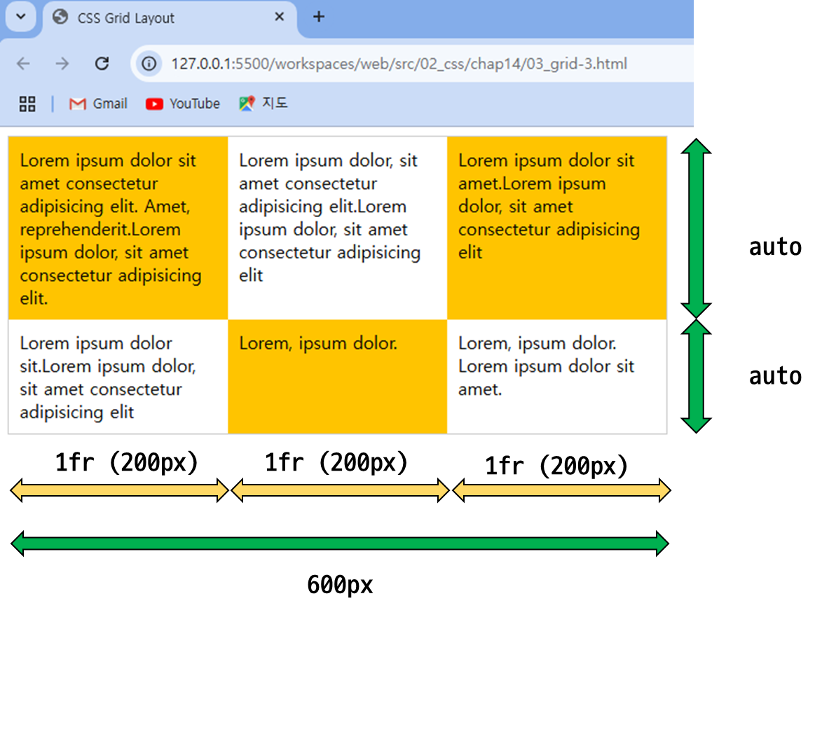
- 총 width를 600px로 설정했으니, 비율을 1fr 1fr 1fr 로 repeat을 하였으니, 1fr 당 600/3 = 200px이 된다.
- 그리고 각 grid의 행은 최소 100px로 잡아주고, 나머지는 텍스트 길이에 따라 auto 값으로 설정됨.
빈 공간을 채우는 auto-fill, auto-fit
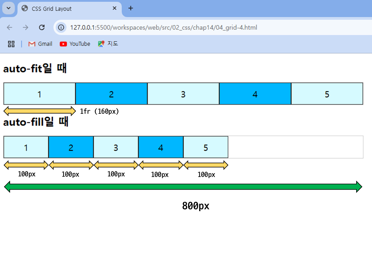
- 열의 개수를 지정하는 대신 auto-fit이나 auto-fill을 지정하면 화면 너비에 따라 행을 채움
- auto-fit :
남는 공간 없이 꽉 채우기
- auto-fill :
열 최소 너비까지만 표시하고 남는 공간은 그대로 둠
- 코드 예시 ) - fr, repeat, minmax 사용
...
<title>CSS Grid Layout</title>
<style>
.container {
width:800px;
border: 1px solid #ccc;
display:grid;
margin-bottom: 20px;
}
      .container-1 {
        grid-template-columns:repeat(auto-fit, minmax(100px, 1fr));
      }
      .container-2 {
        grid-template-columns:repeat(auto-fill, minmax(100px, 1fr));
      }
h1 {
font-size:24px;
}
.items{
border: 1px solid #222;
padding:10px;
font-size: 20px;
text-align: center;
}
.items:nth-child(odd){
background-color:#d6faff;
}
.items:nth-child(even){
background-color:#00b7ff;
}
</style>
</head>
<body>
<h1>auto-fit일 때</h1>
<div class="container container-1">
<div class="items">1</div>
<div class="items">2</div>
<div class="items">3</div>
<div class="items">4</div>
<div class="items">5</div>
</div>
<h1>auto-fill일 때</h1>
<div class="container container-2">
<div class="items">1</div>
<div class="items">2</div>
<div class="items">3</div>
<div class="items">4</div>
<div class="items">5</div>
</div>
</body>
</html>
.container-1 {
grid-template-columns:repeat(auto-fit, minmax(100px, 1fr));
}
.container-2 {
grid-template-columns:repeat(auto-fill, minmax(100px, 1fr));
}
- auto-fit은 남는 공간 없이 꽉 채움! (최대는 1fr → 여기선 160px)
- auto-fill은 최솟값인 100px로 채운 뒤, 남는 공간은 그대로 둠!
그리드 항목의 간격을 조절하는 gap 속성
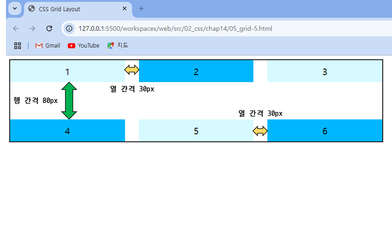
- 값이 1개 : 열 간격과 행 간격을 똑같이 사용
- 값이 2개 : 첫 번째 값은 행 간격, 두 번째 값은 열 간격으로 사용
...
<title>CSS Grid Layout</title>
<style>
.container {
width: 800px;
border: 2px solid #222;
display:grid;
grid-template-columns:repeat(3, 1fr);
gap:80px 30px;
}
.items{
padding:10px;
font-size: 20px;
text-align: center;
}
.items:nth-child(odd){
background-color:#d6faff;
}
.items:nth-child(even){
background-color:#00b7ff;
}
</style>
</head>
<body>
<div class="container">
<div class="items">1</div>
<div class="items">2</div>
<div class="items">3</div>
<div class="items">4</div>
<div class="items">5</div>
<div class="items">6</div>
</div>
</body>
</html>
      ...
        grid-template-columns:repeat(3, 1fr);
        gap:80px 30px;
      }
- gap : 80px 30px; 로 하였기 때문에 각 grid의 열 간격은 30px, 행 간격은 80px로 설정.
3. 그리드 라인을 사용해 배치하기
- CSS 그리드 레이아웃에는 눈에 보이지 않는 그리드 라인이 포함되어 있음
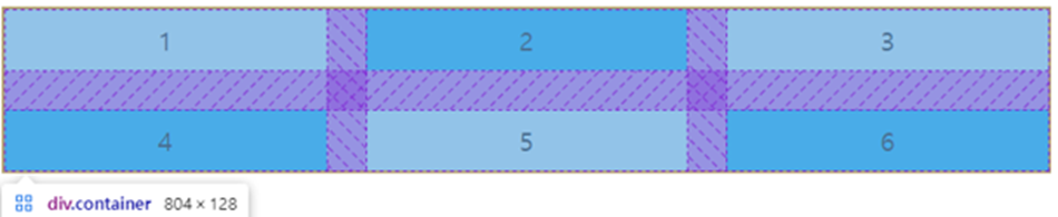
그리드 라인을 사용해 그리드 항목을 배치할 수 있음
그리드 라인
배치 요소들을 감싸는 부모 요소를 그리드 컨테이너로 지정
| 속성 | 설명 | 예시 |
|---|
| grid-column-start | 열의 시작 번호를 지정함. | grid-column-start: 1; |
| grid-column-end | 열의 끝 번호를 지정함. | grid-column-end: 4; |
| grid-column | 열의 시작과 끝 번호를 함께 지정. 시작과 끝 번호는 슬래시 ( / )로 구분. | grid-column: 1 / 4; |
| grid-row-start | 행의 시작 번호를 지정함. | grid-row-start: 2; |
| grid-row-end | 행의 끝 번호를 지정함. | grid-row-end: 4; |
| grid-row | 행의 시작과 끝 번호를 함께 지정. 시작과 끝 번호는 슬래시 ( / )로 구분. | grid-row: 2 / 4; |
...
<title>CSS Grid Layout</title>
<style>
.container{
width:700px;
display:grid;
grid-template-columns:repeat(3, 1fr);
grid-template-rows:repeat(3, 100px);
gap: 1rem;
}
.box{
padding:15px;
color:#fff;
text-align:center;
}
.box1 {
background-color:#3689ff;
grid-column: 1 / -1;
grid-row-start: 1;
}
.box2 {
background-color:#00cf12;
grid-row:2 / -1;
grid-column-start:1;
}
.box3 {
background-color:#ff9019;
grid-column:2 / -1;
grid-row-start: 2;
}
.box4 {
background-color:#ffd000;
grid-column-start:2;
grid-row-start:3;
}
.box5 {
background-color:#ff3f3f;
grid-column: 3 / -1;
grid-row: 3 / -1;
}
</style>
</head>
<body>
<div class="container">
<div class="box box1">box1</div>
<div class="box box2">box2</div>
<div class="box box3">box3</div>
<div class="box box4">box4</div>
<div class="box box5">box5</div>
</div>
</body>
</html>
- 결과 )
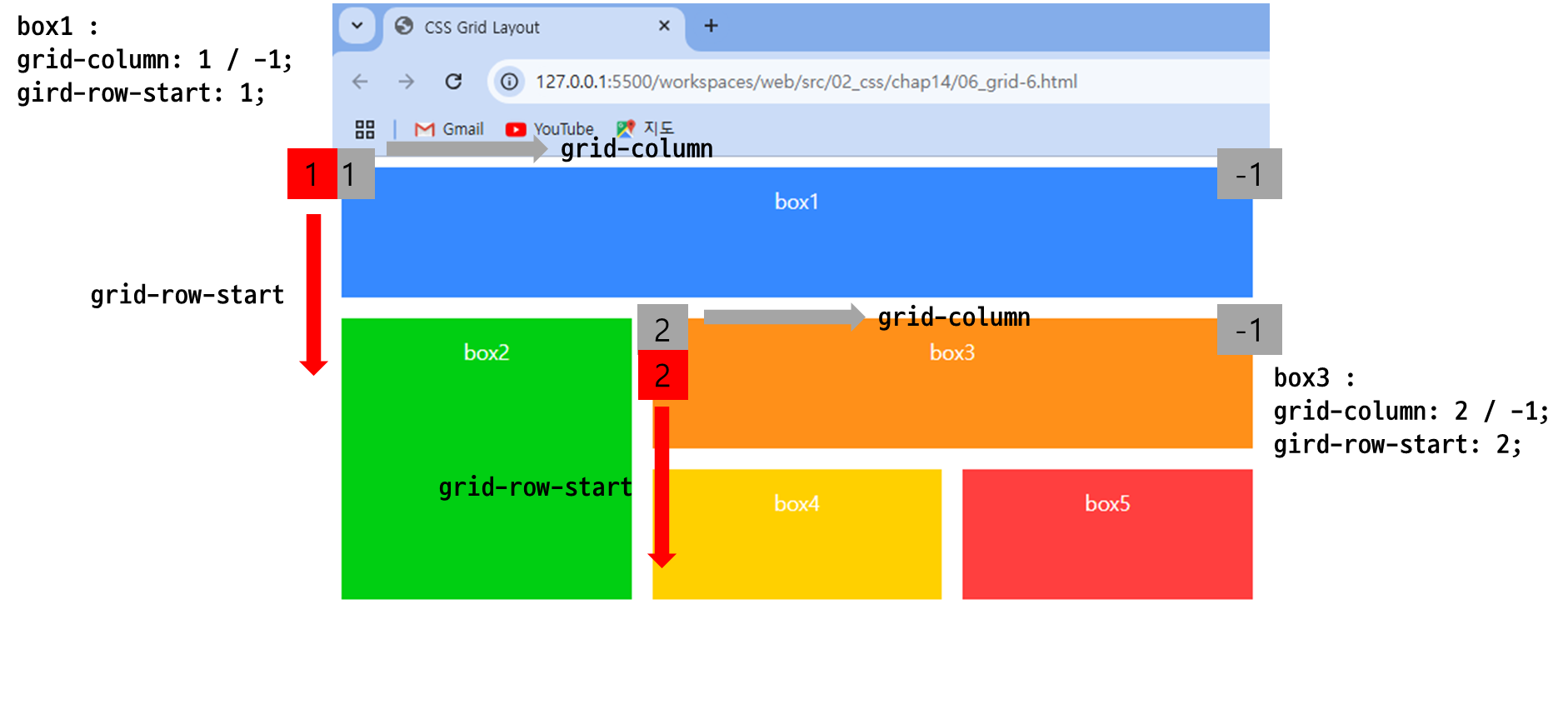
아래 첨부된 이미지와 같이 현재 해당 블록들이 나눠져있음!
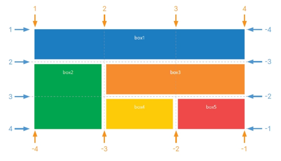
| 박스 | 설명 |
|---|
| box1 영역 | 열은 처음부터 끝까지, 행은 1에서 2까지 |
| box2 영역 | 열은 1에서 2까지, 행은 2에서 끝까지 |
| box3 영역 | 열은 2에서 끝까지, 행은 2에서 3까지 |
| box4 영역 | 열은 2에서 3까지, 행은 3에서 4까지 |
| box5 영역 | 열은 3에서 끝까지, 행은 3에서 끝까지 |
4. 템플릿 영역을 사용해 배치하기
grid-area 속성을 사용해 템플릿 영역을 만들기
...
<title>CSS Grid Layout</title>
<style>
      .container {
        width:700px;
        display:grid;
        grid-template-rows:repeat(3, 100px);
        grid-template-areas:
          "box1 box1 box1"
          "box2 box3 box3"
          "box2 box4 box5";
        gap: 1rem;
      }
.box{
padding:15px;
color:#fff;
text-align:center;
}
.box1 {
background-color:#3689ff;
grid-area: box1;
}
.box2 {
background-color:#00cf12;
grid-area: box2;
}
.box3 {
background-color:#ff9019;
grid-area: box3;
}
.box4 {
background-color:#ffd000;
grid-area: box4;
}
.box5 {
background-color:#ff3f3f;
grid-area: box5;
}
</style>
</head>
<body>
<div class="container">
<div class="box box1">box1</div>
<div class="box box2">box2</div>
<div class="box box3">box3</div>
<div class="box box4">box4</div>
<div class="box box5">box5</div>
</div>
</body>
</html>
- 결과 )
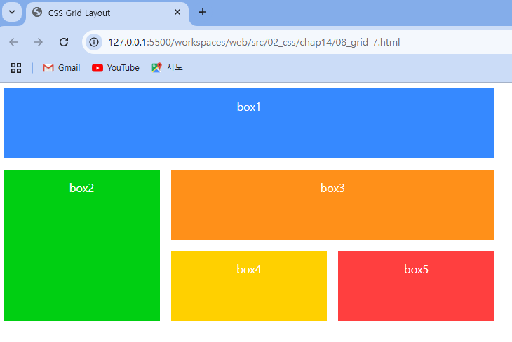
.container {
width:700px;
display:grid;
grid-template-rows:repeat(3, 100px);
grid-template-areas:
"box1 box1 box1"
"box2 box3 box3"
"box2 box4 box5";
gap: 1rem;
}
- grid-template-areas를 사용해서 box1 ~ box5 배치!
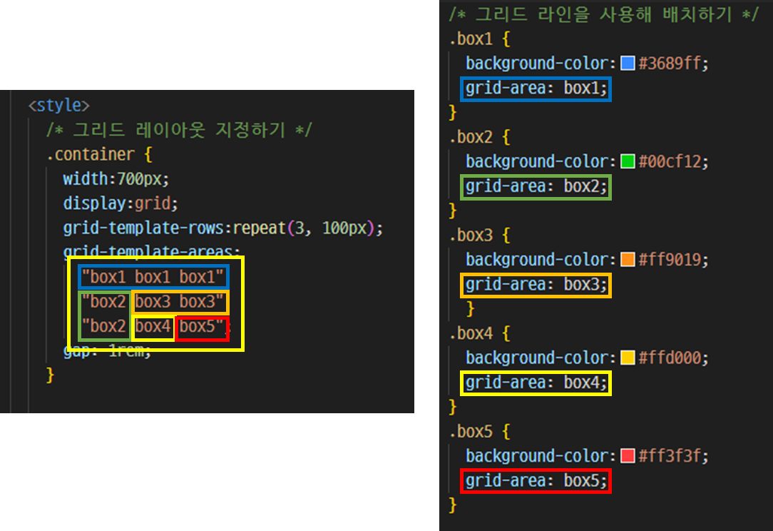
| 박스 | 설명 |
|---|
| box1 영역 | 열은 처음부터 끝까지, 행은 1에서 2까지 |
| box2 영역 | 열은 1에서 2까지, 행은 2에서 끝까지 |
| box3 영역 | 열은 2에서 끝까지, 행은 2에서 3까지 |
| box4 영역 | 열은 2에서 3까지, 행은 3에서 4까지 |
| box5 영역 | 열은 3에서 끝까지, 행은 3에서 끝까지 |