Chap 13-2 플렉스 박스 레이아웃
플렉스 박스 레이아웃
3. 반응형 웹을 위한 속성 살펴보기
| 속성 | 설명 |
|---|---|
| flex-basis | 플렉스 항목의 기본 크기 |
| flex-grow | 남은 공간을 채우기 위해 플렉스 항목을 늘림 |
| flex-shrink | 공간이 부족할 경우 플렉스 항목을 줄임 |
| flex | 앞의 3가지 속성을 한꺼번에 지정 |
flex-basis 속성
- 플렉스 항목의 기본 크기
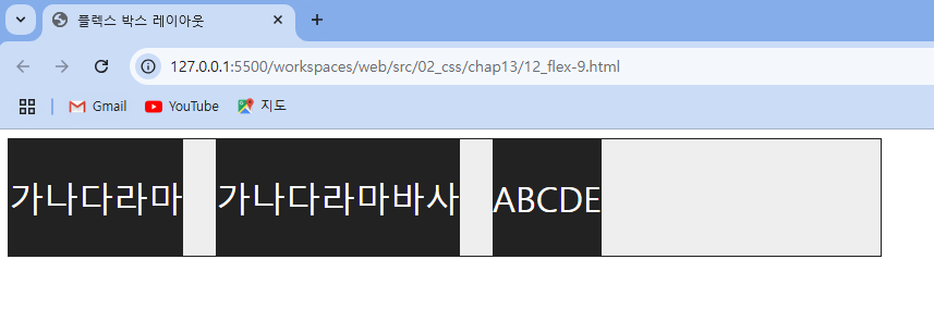
width 값이 지정되어 있다면 그 값을 사용width 값이 없다면 콘텐츠 영역만큼의 크기!
- 코드 예시 )
- width 값 지정한 코드
<!DOCTYPE html>
<html lang="ko">
<head>
  <meta charset="UTF-8">
  <title>플렉스 박스 레이아웃</title>
  <meta name="viewport" content="width=device-width, initial-scale=1">
  <style>
    .container {
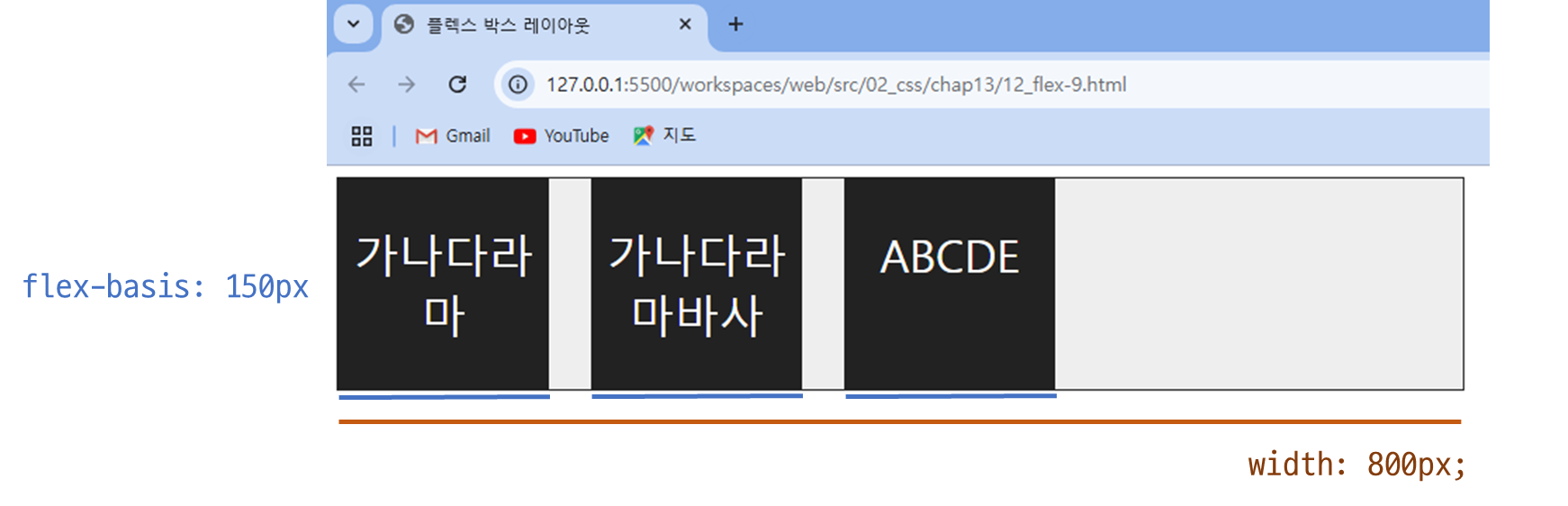
      width: 800px;
      display:flex;
      border:1px solid #222;
      background-color:#eee;
      gap: 30px;
    }
    /* flex-basis 속성을 사용해 플렉스 항목의 기본 크기 지정하기 */
    .box {
      background-color:#222;
      flex-basis: 150px;  /* 플렉스 항목의 기본 크기 150px */
    }
    p {
      color:#fff;
      text-align: center;
      font-size: 2rem;
    }
  </style>
</head>
<body>
  <div class="container">
    <div class="box"><p>가나다라마</p></div>
    <div class="box"><p>가나다라마바사</p></div>
    <div class="box"><p>ABCDE</p></div>
  </div>

</body>
</html>- 결과 )
flex-basis를 지정했을 시! -> 150px로 지정됨
flex-basis를 지정하지 않았을 시! -> 콘텐츠 영역만큼의 크기로 표시
flex-grow 속성
플렉스 컨테이너에 남는 공간이 있을 때 어떻게 나눌지 걱정- 기본값 0 (플렉스 항목을 늘리지 않음)
- 코드 예시 )
<!DOCTYPE html>
<html lang="ko">
<head>
  <meta charset="UTF-8">
  <title>플렉스 박스 레이아웃</title>
  <meta name="viewport" content="width=device-width, initial-scale=1 1">
  <style>
    .container {
      width:800px;
      height:100px;
      display:flex;
      border:1px solid #222;
      gap: 10px;
    }
    .box {
      flex-basis: 150px;
    }
    .box:nth-child(odd) {
      background-color: #ffc400;
    }
    .box:nth-child(even) {
      background-color: #a6ff00;
    }
    p {
      font-weight: bold;
      text-align: center;
    }

    /* 플렉스 항목의 flex-grow 지정하기 */
    #box1 {
      flex-grow: 1;
    }
    #box2 {
      flex-grow: 1;
    }
    #box4 {
      flex-grow: 2;
    }
  </style>
</head>
<body>
  <div class="container">
    <div class="box" id="box1"><p>1</p></div>
    <div class="box" id="box2"><p>2</p></div>
    <div class="box" id="box3"><p>3</p></div>
    <div class="box" id="box4"><p>4</p></div>
  </div>
</body>
</html>- 결과 )
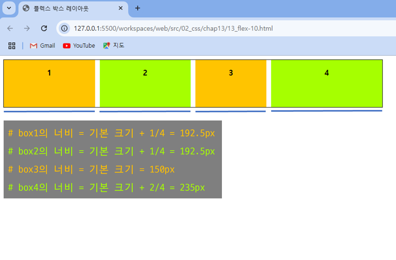
flex-shrink 속성
플렉스 컨테이너 크기를 줄였을 때 플렉스 항목이 얼마나 줄어들지 지정- 기본값 1 (플렉스 항목이 균등하게 줄어듦)
- 코드 예시 )
<!DOCTYPE html>
<html lang="ko">
<head>
  <meta charset="UTF-8">
  <title>플렉스 박스 레이아웃</title>
  <meta name="viewport" content="width=device-width, initial-scale=1 1">
  <style>
    .container {
      width:800px;
      height:100px;
      display:flex;
      border:1px solid #222;
      gap: 10px;
    }
    .box {
      flex-basis: 300px;
    }
    .box:nth-child(odd) {
      background-color: #ffc400;
    }
    .box:nth-child(even) {
      background-color: #a6ff00;
    }
    p {
      font-weight: bold;
      text-align: center;
    }

    /* 플렉스 항목별로 축소 비율 지정하기 */
    #box1 {
      flex-shrink: 1;
    }
    #box2 {
      flex-shrink: 0;
    }
    #box3 {
      flex-shrink: 1;
    }
    #box4 {
      flex-shrink: 2;
    }
  </style>
</head>
<body>
  <div class="container">
    <div class="box" id="box1"><p>1</p></div>
    <div class="box" id="box2"><p>2</p></div>
    <div class="box" id="box3"><p>3</p></div>
    <div class="box" id="box4"><p>4</p></div>
  </div>
</body>
</html>- 결과 )
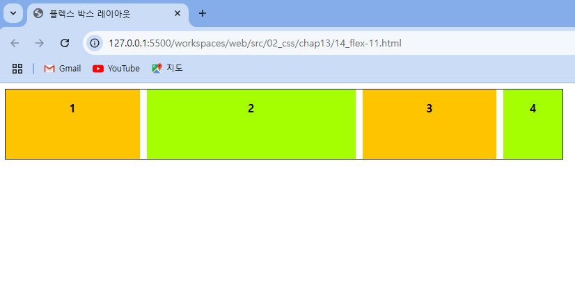
💥 flex 속성
flex-basis와 flex-grow, flex-shrink를 한꺼번에 지정
- flex : m ⇒ flex-grow : m, flex-shrink: 1(기본값), flex-basis: 0; 를 의미!
- flex: m, n
- 첫 번째 숫자 m은 flex-grow 값
- 두 번째 숫자 n에 단위가 있다면 flex-basis 값, 단위가 없다면 flex-shrink 값
- flex: none
- flex: 0 0 auto로 지정한 것과 같음
- 플렉스 컨테이너 안에서 플렉스 항목이 확장하거나 축소되지 않음
- 미리 정해 놓은 width, height 값을 사용하거나 내용에 따라 크기 결정됨
- flex : auto
- flex : 1 1 auto로 지정한 것과 같음
- 컨테이너에 남는 공간이 있다면 똑같은 비율로 늘리고, 공간이 부족하면 똑같은 비율로 줄임
예시 )
flex : 1;             /* flex-grow: 1, flex-shrink: 1 (기본값), flex-basis: 0 (기본값) */
flex : 3;             /* flex-grow: 3, flex-shrink: 1 (기본값), flex-basis: 0 (기본값) */
flex : 0 1 auto;      /* flex-grow: 0, flex-shrink: 1, flex-basis: auto */
flex : 1 300px;       /* flex-grow: 1, flex-shrink: 1 (기본값), flex-basis: 300px */

Hi