Chap 13-1 플렉스 박스 레이아웃
플렉스 박스 레이아웃
1. 플렉스 박스 레이아웃 (flex box layout)에서 사용하는 용어
플렉스 박스 용어
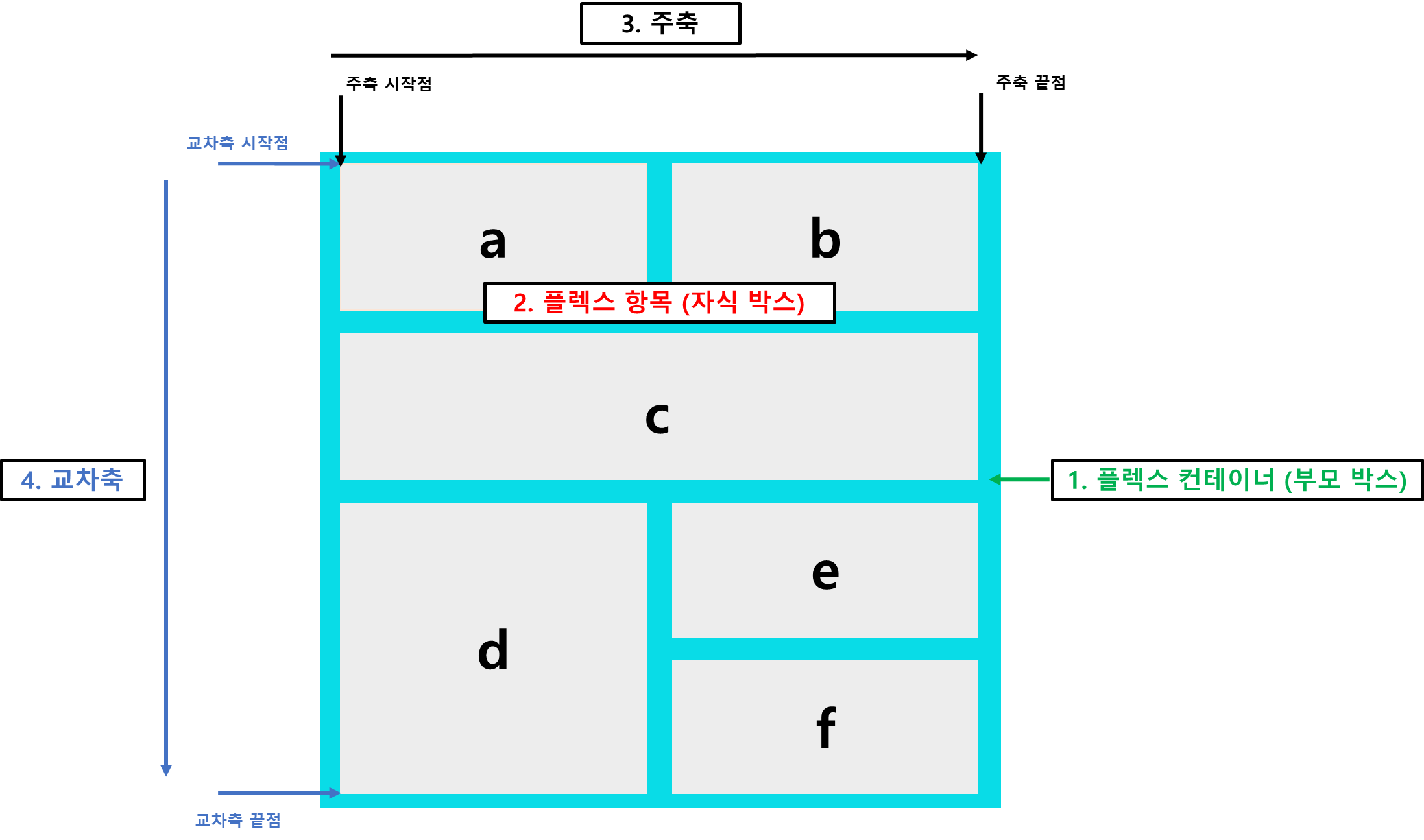
- 플렉스 컨테이너 (부모 박스)
플렉스 박스 레이아웃을 적용할 대상을 묶는 요소
- 플렉스 항목 (자식 박스)
- 플렉스 박스 레이아웃을 적용할 대상으로
a~f 까지 작은 박스들이 모두 해당
- 주축 (main axis)
플렉스 컨테이너 안에서 플렉스 항목을 배치하는 기본 방향이다.- 기본적으로 왼쪽에서 오른쪽이며 수평 방향으로 배치한다.
- 플렉스 항목의 배치가 시작되는 위치를 ’주축 시작점’, 끝나는 위치를 ‘주축 끝점’이라고 한다.
- 교차축 (cross axis)
주축과 교차하는 방향을 말하며 기본적으로 위에서 아래로 배치한다.- 플렉스 항목의 배치가 시작되는 위치를 ’교차축 시작점’, 끝나는 위치를 ‘교차축 끝점’이라고 한다.
플렉서블 박스 레이아웃을 만드는 순서
- CSS를 사용해 적용할 대상을 플렉스 컨테이너로 지정
- 플렉스 컨테이너 안에 플렉스 항목 작성
- CSS를 사용해 주축을 지정
- 가로로 배치할지 (기본), 세로로 배치할지 결정
- 주축을 가로로 했다면 교차축은 세로
- 주축을 세로로 했다면 교추착은 가로
- CSS를 사용해 교차축의 배치 방법 지정
플렉스 컨테이너와 항목에서 사용하는 속성
| 속성값 | 설명 |
|---|
| justify-content | 주축의 정렬 방법 |
| align-items | 교차축의 정렬 방법 |
| align-content | 교차축에 여러 줄로 표시할 경우 정렬 방법 |
| 속성값 | 설명 |
|---|
| align-self | 플렉스 항목을 개별적으로 정렬 |
2. 플렉스 박스 레이아웃 기본 속성
display 속성
배치 요소들을 감싸는 부모 요소를 플렉스 컨테이너로 지정
| 종류 | 설명 |
|---|
| flex | 컨테이너 안의 플렉스 항목을 블록 레벨 요소로 배치 |
| inline-flex | 컨테이너 안의 플렉스 항목을 인라인 레벨 요소로 배치 |
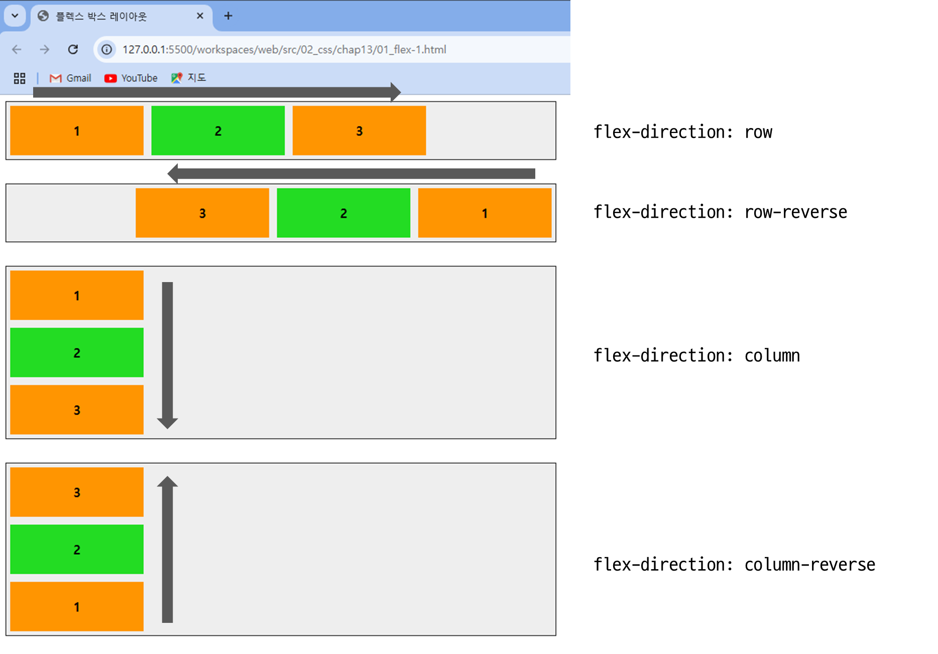
flex-direction 속성
| 종류 | 설명 |
|---|
| row | 주축을 가로로 지정하고 왼쪽에서 오른쪽으로 배치 (기본값) |
| row-reverse | 주축을 가로로 지정하고 반대로 오른쪽에서 왼쪽으로 배치 |
| column | 주축을 세로로 지정하고 위쪽에서 아래쪽으로 배치 |
| column-reverse | 주축을 세로로 지정하고 아래쪽에서 위쪽으로 배치 |
...
<title>플렉스 박스 레이아웃</title>
<meta name="viewport" content="width=device-width, initial-scale=1">
<style>
.container {
width:700px;
height: 100%;
display:flex;
background-color:#eee;
border:1px solid #222;
margin-bottom:30px;
}
.box {
padding:5px 45px;
margin:5px;
width:80px;
}
.box:nth-child(odd) {
background-color: rgb(255, 149, 1);
}
.box:nth-child(even) {
background-color: rgb(35, 220, 35);
}
p {
text-align: center;
font-weight: bold;
}
#opt1{
flex-direction: row;
}
#opt2{
flex-direction: row-reverse;
}
#opt3{
flex-direction: column;
}
#opt4{
flex-direction: column-reverse;
}
</style>
</head>
<body>
<div class="container" id="opt1">
<div class="box"><p>1</p></div>
<div class="box"><p>2</p></div>
<div class="box"><p>3</p></div>
</div>
...
<div class="container" id="opt4">
<div class="box"><p>1</p></div>
<div class="box"><p>2</p></div>
<div class="box"><p>3</p></div>
</div>
</body>
</html>
- 결과 )
flex-wrap 속성
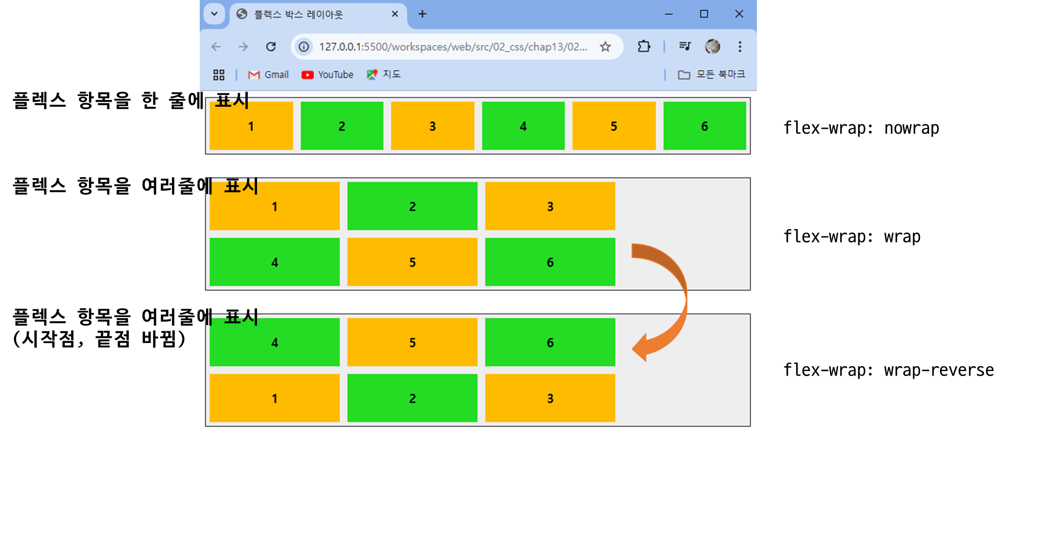
| 종류 | 설명 |
|---|
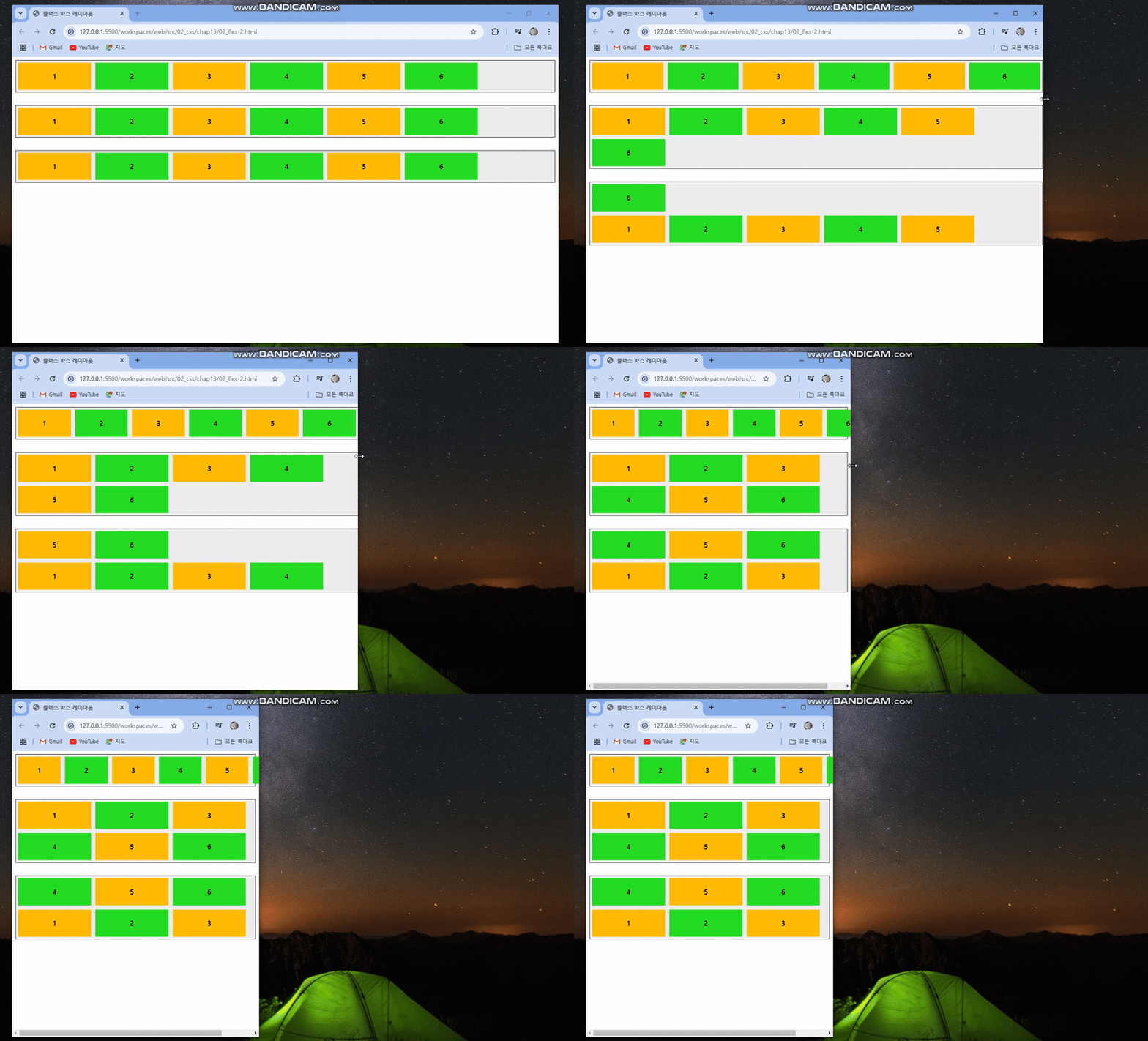
| nowrap | 플렉스 항목을 한 줄에 표시. (기본값) |
| wrap | 플렉스 항목을 여러 줄에 표시. |
| wrap-reverse | 플렉스 항목을 여러 줄에 표시하되, 시작점과 끝점이 바뀜. |
...
<title>플렉스 박스 레이아웃</title>
<meta name="viewport" content="width=device-width, initial-scale=1">
<style>
.container {
display:flex;
justify-content: row;
background-color:#eee;
border:1px solid #222;
margin-bottom:30px;
}
.box {
padding:5px 45px;
margin:5px;
width:80px;
}
.box:nth-child(odd) {
background-color: rgb(255, 187, 0);
}
.box:nth-child(even) {
background-color: rgb(35, 220, 35);
}
p {
text-align: center;
font-weight: bold;
}
#opt1{
flex-wrap: nowrap ;
}
#opt2{
flex-wrap: wrap;
}
#opt3{
flex-wrap: wrap-reverse;
}
</style>
</head>
<body>
<div class="container" id="opt1">
<div class="box"><p>1</p></div>
<div class="box"><p>2</p></div>
<div class="box"><p>3</p></div>
<div class="box"><p>4</p></div>
<div class="box"><p>5</p></div>
<div class="box"><p>6</p></div>
</div>
...
<div class="container" id="opt3">
<div class="box"><p>1</p></div>
<div class="box"><p>2</p></div>
<div class="box"><p>3</p></div>
<div class="box"><p>4</p></div>
<div class="box"><p>5</p></div>
<div class="box"><p>6</p></div>
</div>
</body>
</html>
- 결과 )
justify-content 속성
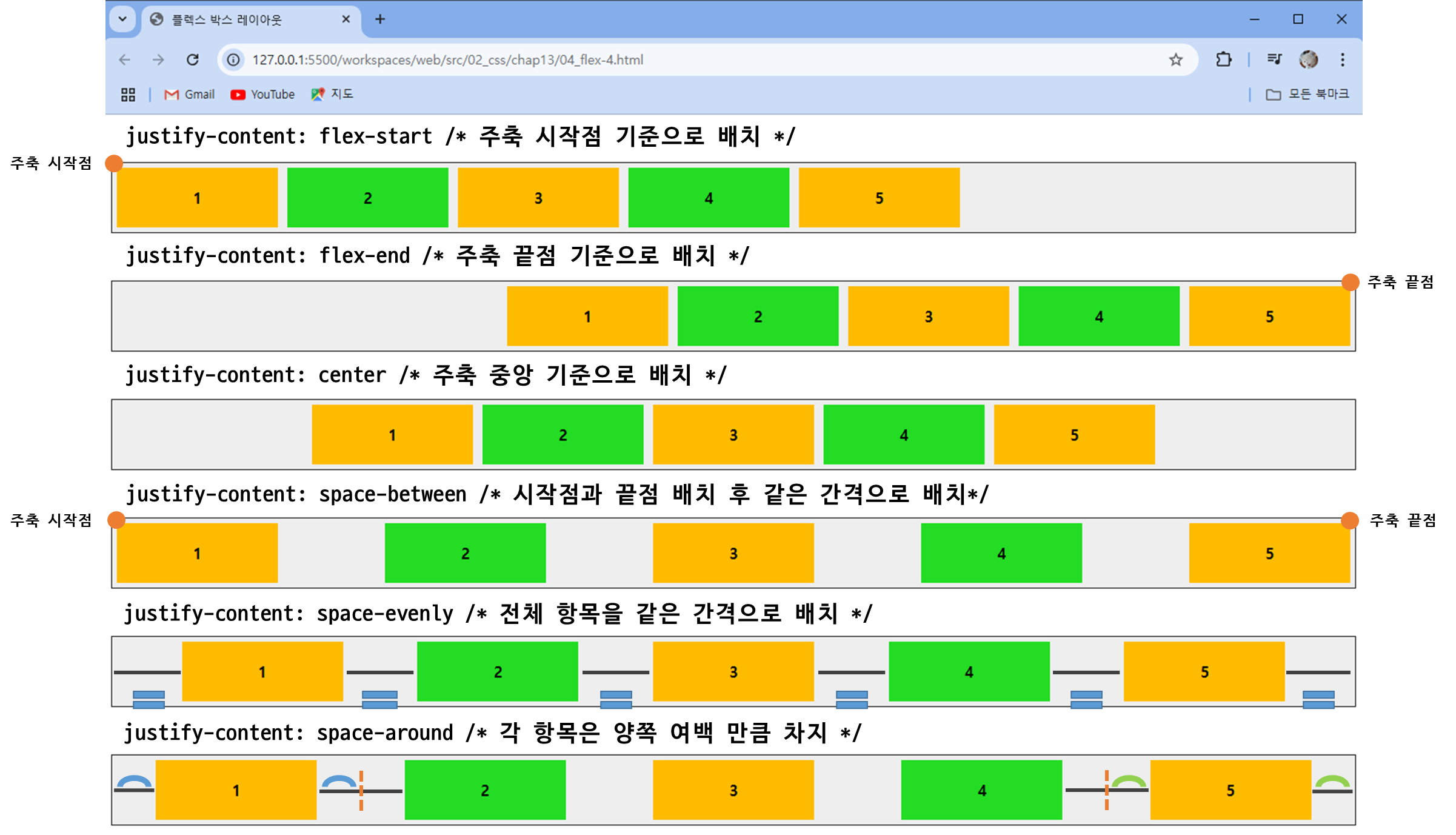
플렉스 항목을 주축 방향으로 배치할 때의 배치 기준
| 속성값 | 설명 |
|---|
| flex-start | 주축의 시작점에 맞춰 배치. (기본값) |
| flex-end | 주축의 끝점에 맞춰 배치 |
| center | 주축의 중앙에 맞춰 배치 |
| space-around | 항목을 고르게 정렬, 각 항목은 양쪽 여백만큼 차지 |
| space-between | 첫 번째 항목은 주축 시작점, 마지막 항목은 주축 끝점에 배치한 후 나머지 항목은 같은 간격으로 배치 |
| space-evenly | 항목을 고르게 정렬, 각 항목의 여백은 모두 동일 |
...
<title>플렉스 박스 레이아웃</title>
<meta name="viewport" content="width=device-width, initial-scale=1">
<style>
.container {
display:flex;
background-color:#eee;
border:1px solid #222;
margin-top: 50px;
}
.box {
padding:5px 45px;
margin:5px;
width:80px;
}
.box:nth-child(odd) {
background-color: rgb(255, 187, 0);
}
.box:nth-child(even) {
background-color: rgb(35, 220, 35);
}
p {
text-align: center;
font-weight: bold;
}
#opt1{
justify-content: flex-start;
}
#opt2{
justify-content: flex-end;
}
#opt3{
justify-content: center;
}
#opt4{
justify-content: space-between
}
#opt5{
justify-content: space-evenly;
}
#opt6{
justify-content: space-around;
}
</style>
</head>
<body>
<div class="container" id="opt1">
<div class="box"><p>1</p></div>
<div class="box"><p>2</p></div>
<div class="box"><p>3</p></div>
<div class="box"><p>4</p></div>
<div class="box"><p>5</p></div>
</div>
...
<div class="container" id="opt6">
<div class="box"><p>1</p></div>
<div class="box"><p>2</p></div>
<div class="box"><p>3</p></div>
<div class="box"><p>4</p></div>
<div class="box"><p>5</p></div>
</div>
</body>
</html>
- 결과 )
justify-content 속성과 margin 속성 함께 사용하기
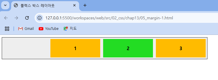
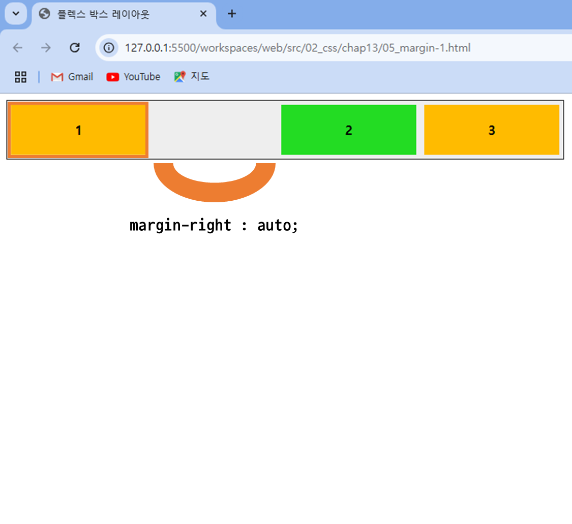
주축에 플렉스 항목을 한 줄로 배치할 때 justify-content 속성과 margin 속성을 함께 사용하면 좀 더 다양하게 배치할 수 있음- justify-content 속성은 플렉스 컨테이너에 사용하고 margin 속성은 플렉스 항목에서 사용
...
<title>플렉스 박스 레이아웃</title>
<meta name="viewport" content="width=device-width, initial-scale=1">
<style>
.container {
width:700px;
display:flex;
justify-content: flex-end;
background-color:#eee;
border:1px solid #222;
margin-bottom:30px;
}
.box {
padding:5px 45px;
margin:5px;
width:80px;
}
.box:nth-child(odd) {
background-color: rgb(255, 187, 0);
}
.box:nth-child(even) {
background-color: rgb(35, 220, 35);
}
p {
text-align: center;
font-weight: bold;
}
#box1 {
margin-right: auto;
}
</style>
</head>
<body>
<div class="container">
<div class="box" id="box1"><p>1</p></div>
<div class="box" id="box2"><p>2</p></div>
<div class="box" id="box3"><p>3</p></div>
</div>
</body>
</html>
- 결과 )
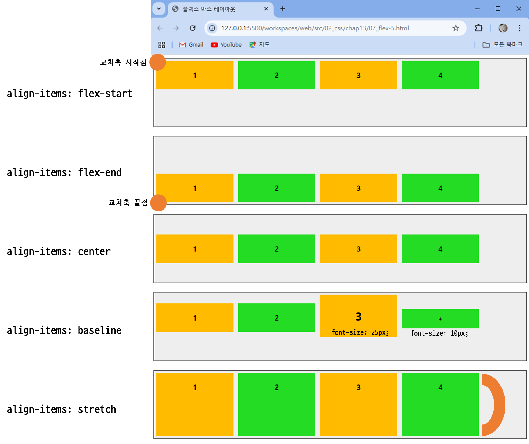
align-items 속성
| 종류 | 설명 |
|---|
| flex-start | 교차축의 시작점에 맞춰 배치함. |
| flex-end | 교차축의 끝점에 맞춰 배치함. |
| center | 교차축의 중앙에 배치함. |
| baseline | 교차축의 문자 기준선에 맞춰 배치함. |
| stretch | 플렉스 항목을 늘려 교차축에 가득 차게 배치함. |
...
<title>플렉스 박스 레이아웃</title>
<meta name="viewport" content="width=device-width, initial-scale=1">
<style>
.container {
width:100%;
height:150px;
display:flex;
justify-content: flex-start;
background-color:#eee;
border:1px solid #222;
margin-bottom:20px;
}
.box {
padding:5px 45px;
margin:5px;
width:80px;
}
.box:nth-child(odd) {
background-color: rgb(255, 187, 0);
}
.box:nth-child(even) {
background-color: rgb(35, 220, 35);
}
p {
text-align: center;
font-weight: bold;
}
#opt1{
align-items: flex-start;
}
#opt2{
align-items: flex-end;
}
#opt3{
align-items: center;
}
#opt4{
align-items: baseline;
}
#opt5{
align-items: stretch;
}
</style>
</head>
<body>
<div class="container" id="opt1">
<div class="box"><p>1</p></div>
<div class="box"><p>2</p></div>
<div class="box"><p>3</p></div>
<div class="box"><p>4</p></div>
</div>
...
<div class="container" id="opt4">
<div class="box"><p>1</p></div>
<div class="box"><p>2</p></div>
<div class="box"><p style="font-size:25px;">3</p></div>
<div class="box"><p style="font-size:10px">4</p></div>
</div>
<div class="container" id="opt5">
<div class="box"><p>1</p></div>
<div class="box"><p>2</p></div>
<div class="box"><p>3</p></div>
<div class="box"><p>4</p></div>
</div>
</body>
</html>
- 결과 )
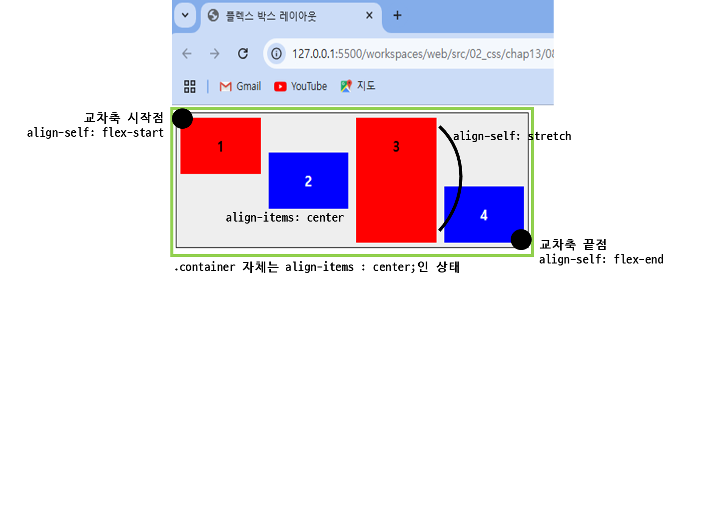
align-self 속성
특정 플렉스 항목만 정렬 방법을 지정할 때 사용하는 속성
| 종류 | 설명 |
|---|
| auto | 부모 요소의 align-items 값을 사용해 정렬. 기본값 |
| normal | 레이아웃 형태나 브라우저에 따라 다르게 정렬 |
| flex-start | 플렉스 컨테이너의 시작점에 맞춰 정렬 |
| flex-end | 플렉스 컨테이너의 끝점에 맞춰 정렬 |
| self-start | 플렉스 항목의 시작 위치에 맞춰 정렬. 텍스트를 포함하고 있을 경우, 언어의 방향에 따라 시작 위치가 결정됨 |
| self-end | 플렉스 항목 자체의 끝에 맞춰 정렬. 텍스트를 포함할 경우, 언어의 방향에 따라 끝 위치가 결정됨 |
| baseline | 플렉스 항목 내 텍스트 기준선에 맞춰 정렬 |
| center | 플렉스 컨테이너의 가운데로 정렬 |
| stretch | 플렉스 컨테이너의 높이에 가득 차게 늘려서 정렬 |
...
<title>플렉스 박스 레이아웃</title>
<meta name="viewport" content="width=device-width, initial-scale=1">
<style>
.container {
width:450px;
height:150px;
background-color:#eee;
border:1px solid #222;
margin-bottom:20px;
display:flex;
align-items: center;
}
.box {
padding:5px 45px;
margin:5px;
width:80px;
}
.box:nth-child(odd) {
background-color: red;
}
.box:nth-child(even) {
background-color: blue;
color: white;
}
p {
text-align: center;
font-weight: bold;
}
#box1 {
align-self: flex-start;
}
#box3 {
align-self: stretch;
}
#box4{
align-self: flex-end;
}
</style>
</head>
<body>
<div class="container">
<div class="box" id="box1"><p>1</p></div>
<div class="box"><p>2</p></div>
<div class="box" id="box3"><p>3</p></div>
<div class="box" id="box4"><p>4</p></div>
</div>
</body>
</html>
- 결과 )
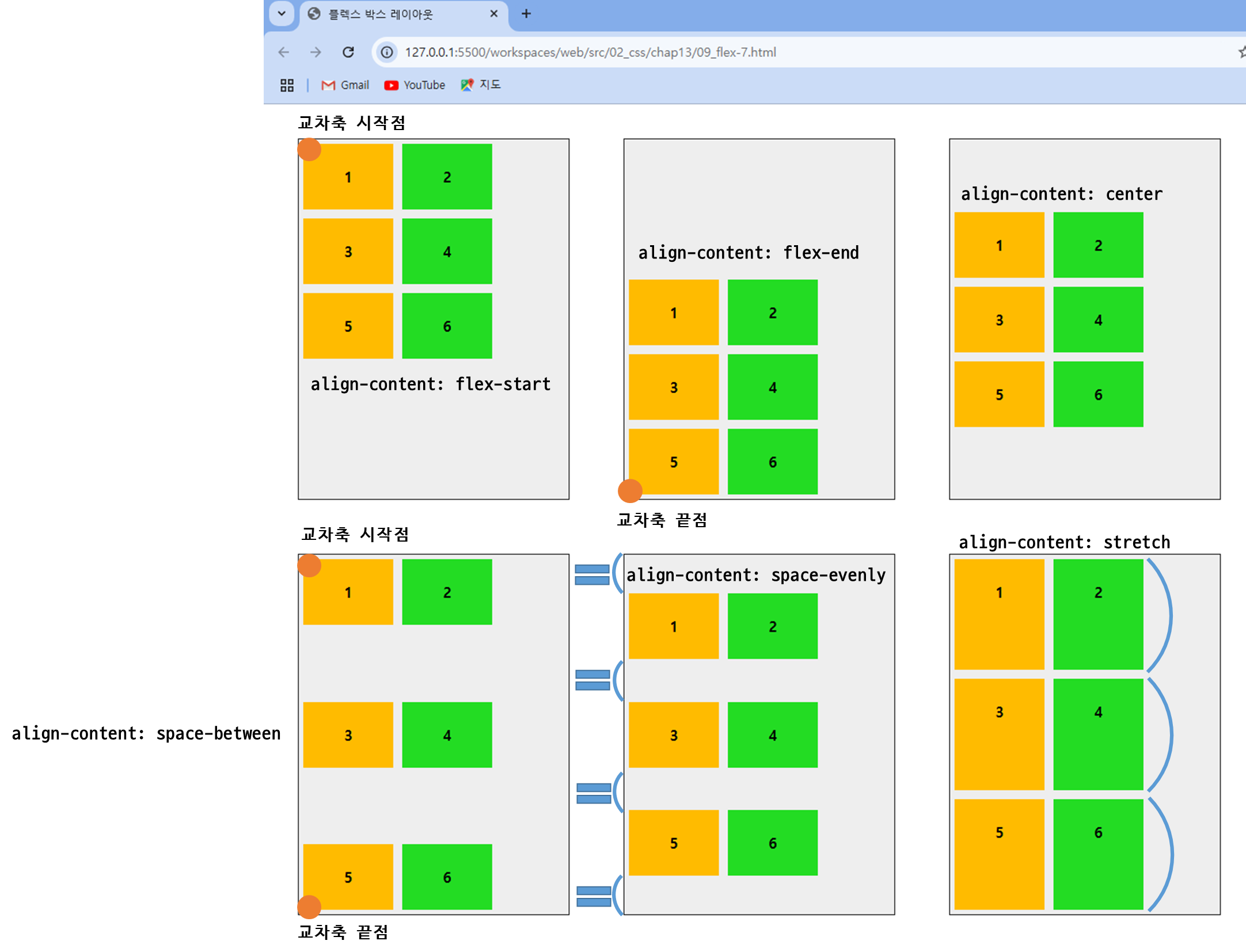
align-content
플렉스 항목이 여러 줄로 표시될 때 교차 축 기준의 배치 방법 지정
| 종류 | 설명 |
|---|
| flex-start | 교차축의 시작점에 맞춰 배치함. |
| flex-end | 교차축의 끝점에 맞춰 배치함. |
| center | 교차축의 중앙에 맞춰 배치함. |
| space-between | 첫 번째 항목과 끝 항목을 교차축의 시작점과 끝점에 맞추고 나머지 항목은 같은 간격으로 배치. |
| space-evenly | 모든 항목을 교차축의 같은 간격으로 배치. |
| space-around | 항목을 고르게 정렬. 각 항목은 양쪽 여백만큼 차지. |
| stretch | 플렉스 항목을 늘려서 교차축에 가득 차게 배치함. |
...
<title>플렉스 박스 레이아웃</title>
<meta name="viewport" content="width=device-width, initial-scale=1">
<style>
.container {
float:left;
width:300px;
height:400px;
display:flex;
flex-flow: row wrap;
border:1px solid #222;
background-color:#eee;
margin:30px;
}
.box {
padding:10px;
margin:5px;
width: 80px;
}
.box:nth-child(odd) {
background-color: rgb(255, 187, 0);
}
.box:nth-child(even) {
background-color: rgb(35, 220, 35);
}
p {
text-align: center;
font-weight: bold;
}
#opt1{
align-content:flex-start;
}
#opt2{
align-content:flex-end;
}
#opt3{
align-content:center;
}
#opt4{
align-content:space-between;
}
#opt5{
align-content:space-evenly;
}
#opt6{
align-content:stretch;
}
</style>
</head>
<body>
<div class="container" id="opt1">
<div class="box"><p>1</p></div>
<div class="box"><p>2</p></div>
<div class="box"><p>3</p></div>
<div class="box"><p>4</p></div>
<div class="box"><p>5</p></div>
<div class="box"><p>6</p></div>
</div>
...
<div class="container" id="opt6">
<div class="box"><p>1</p></div>
<div class="box"><p>2</p></div>
<div class="box"><p>3</p></div>
<div class="box"><p>4</p></div>
<div class="box"><p>5</p></div>
<div class="box"><p>6</p></div>
</div>
</body>
</html>
- 결과 )
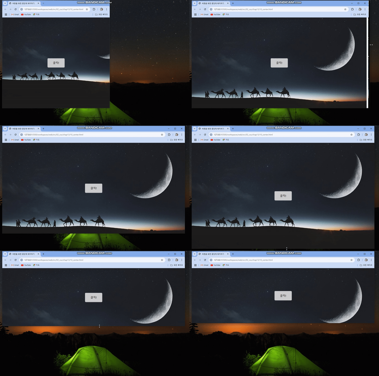
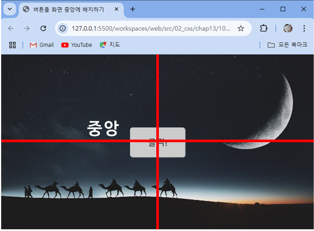
💥 플렉스 박스 레이아웃을 사용해 화면 중앙에 배치하기
플렉스 박스 레이아웃을 가장 많이 사용하는 예!
<!DOCTYPE html>
<html lang="ko">
<head>
<meta charset="UTF-8">
<meta name="viewport" content="width=device-width, initial-scale=1.0">
<title>버튼을 화면 중앙에 배치하기</title>
<style>
* {
margin:0;
box-sizing: border-box;
}
body {
background:url('images/bg5.jpg') no-repeat left top fixed;
background-size:cover;
display: flex;
justify-content: center;
align-items: center;
min-height:100vh;
}
button {
background-color:#ccc;
font-size: 1.2em;
padding:1em 2em;
border:none;
border-radius:5px;
box-shadow:1px 1px 2px #fff;
}
</style>
</head>
<body>
<button>클릭!</button>
</body>
</html>
   ...
      display: flex;            /* 플렉스 컨테이너 지정 */
      justify-content: center;  /* 주축 정렬 방법 - 중앙 정렬 */
      align-items: center;      /* 교차축 정렬 방법 - 중앙 정렬 */
      min-height:100vh;         /* 브라우저 높이의 100% */
   }
   ...
- 해당 코드를 사용하여 화면 크기에 상관없이 버튼을 항상 화면 중앙에 표시함!
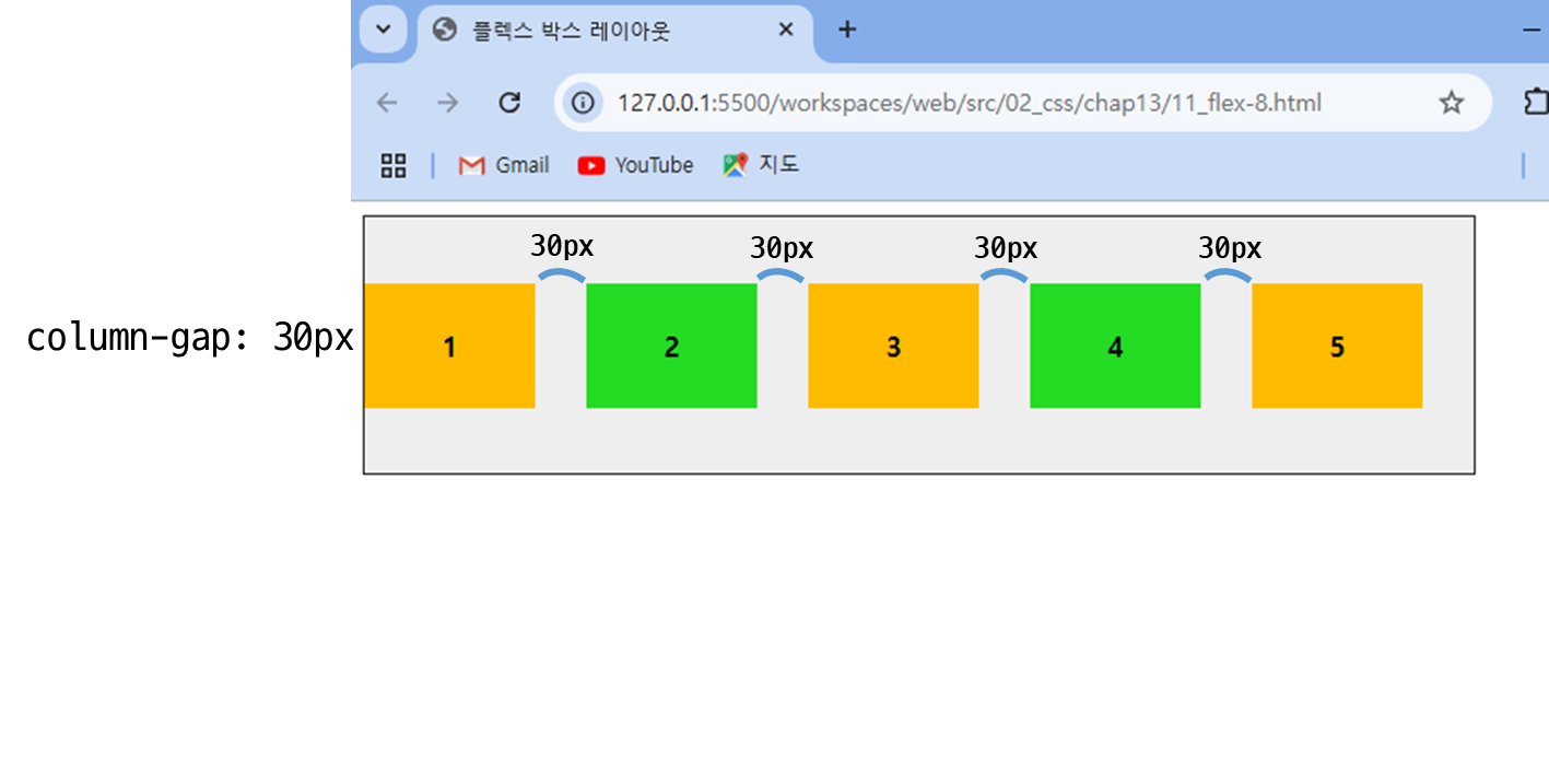
gap 속성
플렉스 컨테이너 안에 있는 플렉스 항목들 간의 간격- 인접한 항목이 있을 경우에만 간격이 생김 (margin과의 차이점)
- 플렉스 컨테이너에서 적용
- row-gap과 column-gap으로 나누어 사용할 수도 있음
<!DOCTYPE html>
<html lang="ko">
<head>
<meta charset="UTF-8">
<title>플렉스 박스 레이아웃</title>
<meta name="viewport" content="width=device-width, initial-scale=1 1">
<style>
.container {
width:650px;
height:150px;
display:flex;
align-items:center;
background-color:#eee;
border:1px solid #222;
column-gap: 30px;
}
.box {
padding: 10px;
width: 80px;
}
.box:nth-child(odd) {
background-color: rgb(255, 187, 0);
}
.box:nth-child(even) {
background-color: rgb(35, 220, 35);
}
p {
text-align: center;
font-weight: bold;
}
</style>
</head>
<body>
<div class="container">
<div class="box"><p>1</p></div>
<div class="box"><p>2</p></div>
<div class="box"><p>3</p></div>
<div class="box"><p>4</p></div>
<div class="box""><p>5</p></div>
</div>
</body>
</html>
   ...
			column-gap: 30px;   /* 플렉스 항목 간의 간격 10px */
   }
   ...
- 해당 코드를 사용하여 flex로 나열된 div들의 간격을 조정!