Pandas 시각화
- Pandas 자체적으로 matplotlib을 기반으로 한 시각화 기능 지원
- Series나 DataFrame에 plot()함수나 plot accessor 사용
- matplotlib을 이용해 그래프에 대한 설정 추가로 가능
plot(kind=)
- kind 매개변수에 지정한 값에 따라 다양한 그래프 그리기 가능
| 종류 | 기능 |
|---|---|
| 'line' | line plot (default) |
| 'bar' | vertical bar plot |
| 'barh' | horizontal bar plot |
| 'hist' | histogram |
| 'box' | boxplot |
| 'kde' | Kernel Density Estimation plot |
| 'pie' | pie plot |
| 'scatter' | scatter plot |
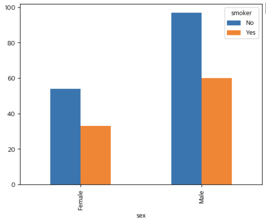
막대그래프 (대표 예시)
DataFrame객체.plot(kind='bar)- kind= 뒤로 그래프 제목, 라벨값, figsize, 색상, 축 라벨 회전 각도 지정 가능
pivot_table()- 피봇 테이블 생성
- index, columns, values, aggfunc(산식) 지정 가능
stacked=True입력 시 막대는 전체 개수가 되고, 범례별 비율을 표현함(막대그래프 쌓기)
  # DataFrame
  tips

  # 출력값
    		total_bill	tip		sex		smoker	day	time		size
    0		16.99		1.01		Female	No		Sun		Dinner	2
    1		10.34		1.66		Male		No		Sun		Dinner	3
    2		21.01		3.50		Male		No		Sun		Dinner	3
    3		23.68		3.31		Male		No		Sun		Dinner	2
    4		24.59		3.61		Female	No		Sun		Dinner	4
    ...	...	...	...	...	...	...	...
    239	29.03		5.92		Male		No		Sat		Dinner	3
    240	27.18		2.00		Female	Yes		Sat		Dinner	2
    241	22.67		2.00		Male		Yes		Sat		Dinner	2
    242	17.82		1.75		Male		No		Sat		Dinner	2
    243	18.78		3.00		Female	No		Thur		Dinner	2
    ```
    ```python
    # 피봇 테이블 생성
    result =tips.pivot_table(index="sex",			# sex를 index로 설정
    					columns="smoker",		# smoker의 값을 컬럼으로 설정
                    		values="total_bill",	# total_bill 컬럼을 이용
                    		aggfunc="count")		# index, colums에 해당하는 total_bill의 개수를 count

    # pivot table 기반 막대 그래프 생성
    result.plot(kind='bar')
    plt.show()