
Responsive Design
- 반응형 디자인을 쉽게 적용할 수 있습니다.
.{breakpoint}:{...classes}| Breakpoints | Starts at |
|---|---|
| [ALL] sm: md: lg: xl: | 0px 640px 768px 1024px 1280px |
| Responsive Classes | |
|---|---|
| .{sm}:bg- .{sm}:w- .{sm}:h- .{sm}:p- .{sm}:m- | background color width height padding margin |
- 이외에도 더 많은 것들을 변경할 수 있습니다.
| Responsive Classes ( 예시 ) | |
|---|---|
| .sm:font-sans .sm:text-lg .sm:text-left .sm:text-{color}-{shade} .sm:font-bold .sm:tracking-tighter .sm:uppercase .sm:border-{color}-{shade} .sm:border-{style} .sm:border-{width} .sm:rounded-{size} .sm:{display} .sm:flex .sm:flex-{col|row} |
- 예시
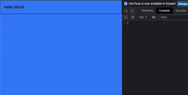
<!DOCTYPE html>
<html lang="en">
  <body class="bg-blue-500 md:bg-red-500">
    <div class="p-4 md:font-bold md:italic">Hello World</div>
  </body>
</html>
Hover Modifier
- Hover 기능을 쉽게 사용할 수 있습니다.
.hover:{...classes}| Hover Clases | |
|---|---|
| .hover:bg- .hover:text-{color}-{shade} .hover:font-bold .hover:border-{color}-{shade} |
- 예시
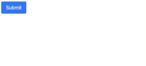
<!DOCTYPE html>
<html lang="en">
  <body>
    <div>
      <button
        class="bg-blue-500 hover:bg-blue-700 text-white py-2 px-4 rounded"
      >
        Submit
      </button>
    </div>
  </body>
</html>
Focus Modifier
.focus:{...classes}| Hover Classes | |
|---|---|
| .focus:bg- .focus:text-{color}-{shade} .focus:font-bold .focus:border-{color}-{shade} |
- 예시
<!DOCTYPE html>
<html lang="en">
  <body>
    <div>
      <input class="focus:bg-blue-200 border border-gray-300" type="text" />
    </div>
  </body>
</html>
Combination Modifier
.{breakpoint}:{mod}:{...classes}| Hover Classes | |
|---|---|
| .md:hover:bg-{color}-{shade} .md:focus:bg-{color}-{shade} .md:hover:text-{color}-{shade} .md:focus:text-{color}-{shade} |
- 예시
<!DOCTYPE html>
<html lang="en">
  <body>
    <div>
      <input
        class="sm:hover:bg-red-500 border border-gray-300"
        type="text"
      />
    </div>
  </body>
</html>
Other Utilities
- 그림자 속성을 추가할 수 있습니다.
.shadow-{size}| Size | |
|---|---|
| md lg xl 2xl inner outline none |
- 예시
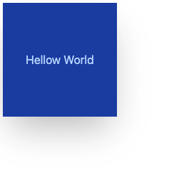
<!DOCTYPE html>
<html lang="en">
  <body>
    <div
      class="shadow-2xl bg-blue-800 text-blue-200 w-40 h-40 flex justify-center items-center"
    >
      Hellow World
    </div>
  </body>
</html>- 투명도를 설정할 수 있습니다.
// 100~0
.opacity-{percent}- 예시
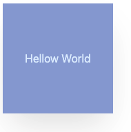
<!DOCTYPE html>
<html lang="en">
  <body>
    <div
      class="opacity-50 shadow-2xl bg-blue-800 text-blue-200 w-40 h-40 flex justify-center items-center"
    >
      Hellow World
    </div>
  </body>
</html>- 커서의 형태를 지정할 수 있습니다.
.cursor-{style}| Styles | |
|---|---|
| default pointer wait text move not-allowed |
- 예시
<!DOCTYPE html>
<html lang="en">
  <body>
    <div
      class="cursor-move bg-blue-800 text-blue-200 w-40 h-40 flex justify-center items-center"
    >
      Hellow World
    </div>
  </body>
</html>- 선택할 때 범위를 지정할 수 있습니다.
.select-{style}| Styles | |
|---|---|
| none text all auto |
- 예시
<!DOCTYPE html>
<html lang="en">
  <body>
    <div
      class="select-all bg-blue-800 text-blue-200 w-40 h-40 flex justify-center items-center"
    >
      Hellow World
    </div>
  </body>
</html>- 화면에서 요소를 숨기지 않고 시각적으로 요소를 숨길 때 사용합니다.
.sr-only
.not-sr-only- 예시
<!DOCTYPE html>
<html lang="en">
  <body>
    <div
      class="select-all bg-blue-800 text-blue-200 w-40 h-40 flex justify-center items-center"
    >
      Hellow World
    </div>
  </body>
</html>
Dark Mode
- 클래스 프리픽스 형태로 다크모드를 지원합니다.
- tailwind.config.js
module.exports = {
  darkMode: 'class',
  // ...
}- html
- 해당 태그에
dark:프리픽스를 사용해서 변경할 부분을 넣어줍니다. - 최종적으로
dark라는 클래스를 상위에 넣어서 다크모드를 컨트롤 합니다.
- 해당 태그에
<!-- Dark mode not enabled -->
<html>
<body>
  <!-- Will be white -->
  <div class="bg-white dark:bg-black">
    <!-- ... -->
  </div>
</body>
</html>

<!-- Dark mode enabled -->
<html class="dark">
<body>
  <!-- Will be black -->
  <div class="bg-white dark:bg-black">
    <!-- ... -->
  </div>
</body>
</html>
아직 나는 취해있을 수 없다...