
Border Style
- 테두리 두께를 지정할 수 있습니다.
.border-{thickness}| Thicknesses | Pixel |
|---|---|
| 0 EMPTY 2 4 8 | 0px 1px 2px 4px 8px |
.border-{side}-{thickness}| Sides ( 특정 방향 ) | Thicknesses | Pixel |
|---|---|---|
| t, b, l, r | 0 EMPTY 2 4 8 | 0px 1px 2px 4px 8px |
- 태두리의 색상을 지정할 수 있습니다.
.border-{color}-{shade}| Colors | Shades |
|---|---|
| black, white | |
| gray, red, orange, yellow, green, teal, indigo, blue, purple, pink... | 100 - 900 |
- 테두리의 디자인을 선택할 수 있습니다.
.border-{style}| Styles | |
|---|---|
| solid dashed dotted double hidden none | border-style: solid; border-style: dashed; border-style: dotted; border-style: double; border-style: hidden; border-style: none; |
- 테두리의 Radus를 설정할 수 있습니다.
.rounded-{radius}| Radiuses | rems | Pixes |
|---|---|---|
| sm Empty md lg xl~3xl full none | 0.125 rem 0.25 rem 0.375 rem 0.5 rem 0.75 ~ 1.5 rem- - 0 | 2px 4px 6px 8px 12px~16px 9999px 0px |
.rounded-{side}-{radius}| Sides | Pixel |
|---|---|
| t r b l tl tr br bl | top-left & top-right top-right & bottom-right bottom-left & bottom-right top-left & bottom-left top-left top-right bottom-right bottom-left |
- 예시

<!DOCTYPE html>
<html lang="en">
  <body>
    <div class="w-16 h-16 border-r-8 border-blue-700"></div>
    <div class="w-16 h-16 border-8 border-blue-700 border-dotted"></div>
    <div class="w-16 h-16 border-4 border-blue-700 rounded-md"></div>
    <div class="w-16 h-16 border-4 border-blue-700 rounded-full"></div>
    <div class="w-16 h-16 border-4 border-blue-700 rounded-tl-full"></div>
  </body>
</html>
Display Modes
- CSS의 display 속성을 자유롭게 설정할 수 있습니다.
.{display}| Display Modes | |
|---|---|
| block inline inline-block flex gride inline-flex table table-row table-cell hidden |
- 예시
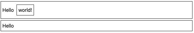
<!DOCTYPE html>
<html lang="en">
  <body>
    <div>
      Hello
      <div class="inline-block">world!</div>
    </div>
    <div>
      Hello
      <div class="hidden">world!</div>
    </div>
  </body>
</html>
Flexbox
- Flex도 자유롭게 사용 가능합니다.
.flex.justify-{alignment}| Alignments | |
|---|---|
| start center end between around evenly | Default |
.justify-items-{alignment}| Alignments | |
|---|---|
| stretch start center end<br / | Default - fill container |
.flex-{direction}| Directions | |
|---|---|
| row row-reverse col col-reverse | Default |
.flex-{wrap}| Wrap Modes | |
|---|---|
| no-wrap wrap wrap-reverse | Default |
- 예시
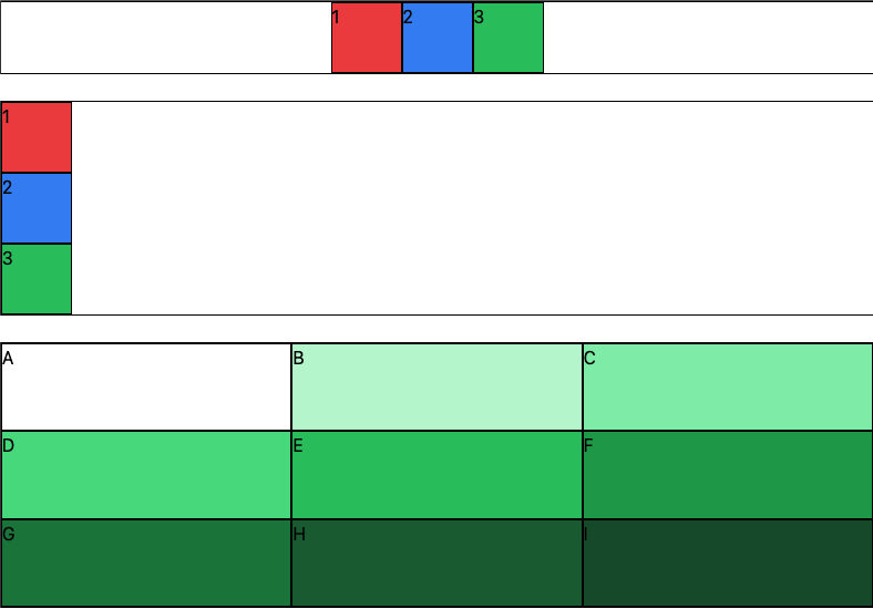
<!DOCTYPE html>
<html lang="en">
  <body>
    <div class="flex justify-center">
      <div class="bg-red-500 w-16 h-16">1</div>
      <div class="bg-blue-500 w-16 h-16">2</div>
      <div class="bg-green-500 w-16 h-16">3</div>
    </div>
    <br />
    <div class="flex flex-col">
      <div class="bg-red-500 w-16 h-16">1</div>
      <div class="bg-blue-500 w-16 h-16">2</div>
      <div class="bg-green-500 w-16 h-16">3</div>
    </div>
    <br />
    <div class="h-60 flex flex-wrap">
      <div class="bg-green-180 w-1/3 h-1/3">A</div>
      <div class="bg-green-200 w-1/3 h-1/3">B</div>
      <div class="bg-green-300 w-1/3 h-1/3">C</div>
      <div class="bg-green-400 w-1/3 h-1/3">D</div>
      <div class="bg-green-500 w-1/3 h-1/3">E</div>
      <div class="bg-green-600 w-1/3 h-1/3">F</div>
      <div class="bg-green-700 w-1/3 h-1/3">G</div>
      <div class="bg-green-800 w-1/3 h-1/3">H</div>
      <div class="bg-green-900 w-1/3 h-1/3">I</div>
    </div>
  </body>
</html>
아직 나는 취해있을 수 없다...