재사용성을 고려한 UI 컴포넌트
재사용 가능한 컴포넌트
만들어가는 서비스가 커져감에 따라 모든 UI 컴포넌트를 직접 작성하는 것은 상당히 비효율적인 일이고 유지 보수성이 매우 떨어집니다.
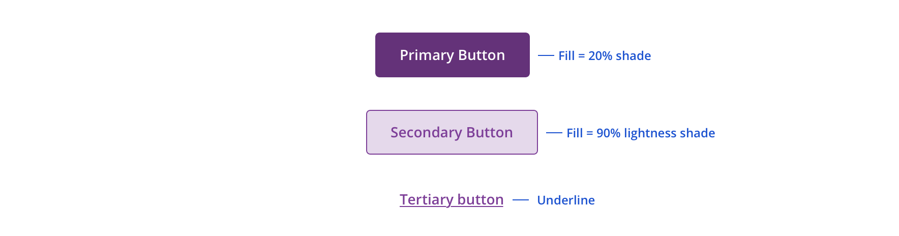
가장 우리가 자주 사용하는 button의 예시를 보면 버튼의 목적에 따라 primary, secondary, teritary, danger 등 시각적으로 정보를 제공하기 위해 다양한 색상의 버튼을 사용하는데요, 추가적으로 다크모드 지원에 따라 더욱 많은 색상을 필요할 수 있습니다.
Size를 고려해볼까요?
small, medium, large 버튼 등 다양한 사이즈의 버튼을 사용하고 있습니다.
그러면 이러한 버튼을 우리는 어떻게 관리해야할까요?
<Button/>
<PrimaryButton/>
<DangerButton/>
<MediumButton/>
<PrimaryMediumButton/>
      .
      .
      .
이는 언뜻 보기에도 좋은 선택이 아님을 알 수 있습니다. 그러면 우리는 어떻게 사용자에게 색상과 사이즈에 따라 다양한 버튼을 제공할 수 있을까요?
classNames를 이용한 컴포넌트 만들기
가장 흔하게 사용되는 방법은 classnames, clsx와 같은 라이브러리를 이용하는 것입니다.
classNames를 이용한 예시를 보겠습니다
.primary {
    background-color: rgb(38,205,149);
    border-color: #007bff;
}

.small {
    width: 4rem;
    font-size: 0.75rem
}
      .
      .
      .
    (생략)
type ButtonProps = {
  intent: "primary" | "basic" | "danger";
  size: "small" | "medium";
  children: React.ReactNode
};

export default function BasicButton({intent ="basic", size = "medium", children, ...props}: ButtonProps) {

  return (
    <button className={classNames(
      styles.base,
      {
        [styles.primary]: intent === "primary",
        [styles.basic]: intent === "basic",
        [styles.danger]: intent === "danger",
        [styles.small]: size === "small",
        [styles.medium]: size === "medium",
      })}
            {...props}
    >
      {children}
    </button>
  );
}
이렇게 css와 classNames를 이용하면 원하는 색상과, 사이즈 별로 사용자에게 다양한 버튼을 제공할 수 있게 되었습니다!

아직 한 가지 부족한 점이 있는데요,

버튼과 자주 사용하는 onClick 을 등록하였을 때, 붉은 밑줄과 함께 에러가 우리를 반겨주는 것을 볼 수 있습니다. 자동완성과 함께 타입 지원을 받기 위해서는 button의 기본 타입을 추가적으로 선언해주면 됩니다
type ButtonProps = React.ButtonHTMLAttributes<HTMLButtonElement> & {
  intent: "primary" | "basic" | "danger";
  size: "small" | "medium";
  children: React.ReactNode
};
타입 에러가 사라졌고, 자동완성도 지원이 됩니다!

<BasicButton intent="basic" size="small">basic</BasicButton>
<BasicButton intent="primary" size="small">primary</BasicButton>
<BasicButton intent="danger" size="small">danger</BasicButton>
이렇게 재사용이 가능한 버튼 컴포넌트를 만들었고, 필요한 컴포넌트에서 알맞은 버튼을 사용할 수 있습니다.
하지만, classNames의 한 가지 불편한 점이 있었는데요, 어느 날 디자인 요구사항이 변경되어, "secondary"라는 색상의 버튼이 추가되면 어떻게 코드를 변경하면 될까요?
먼저, intent에 secondary를 추가하고, [styles.secondary]: intent === "secondary" 를 추가하면 되겠죠.
type ButtonProps = React.ButtonHTMLAttributes<HTMLButtonElement> & {
  intent: "primary" | "basic" | "danger" | "secondary";
  size: "small" | "medium";
  children: React.ReactNode
};
intent에 secondary를 추가하였고, 아래의 button styles에는 아직 추가하지 않은 상태입니다. 하지만, 어떤 에러도 나지 않고, 런타임 시점에서 우리는 secondary button 스타일이 추가되지 않은 사실을 확인할 수 있습니다. button의 종류와 타입이 많아지면서, 컴파일 시점에 동작을 확신할 수 없다는 점은 큰 단점이고, jsx에서 많은 조건을 확인하는 것도 깔끔하지 않아보입니다.
 <button className={classNames(
      styles.base,
      {
        [styles.primary]: intent === "primary",
        [styles.basic]: intent === "basic",
        [styles.danger]: intent === "danger",
        [styles.small]: size === "small",
        [styles.medium]: size === "medium",
      })}
            {...props}
    >
cva 라이브러리를 활용해보자
cva(Class Variance Authority) 라이브러리를 활용하면 이러한 단점을 해결할 수 있습니다.
먼저, 위에서 classNames로 작성한 코드와 동일한 동작을 하는 버튼 컴포넌트를 만들어 봅시다
const buttonStyles = cva(styles.base, {
  variants: {
    intent: {
      primary: styles.primary,
      basic: styles.basic,
      danger: styles.danger
    },
    size: {
      small: styles.small,
      medium: styles.medium,
    },
  },
  defaultVariants: {
    intent: "primary",
    size: "medium",
  },
});

type ButtonProps =
  React.HTMLAttributes<HTMLButtonElement> &
  VariantProps<typeof buttonStyles>;

export default function Button({intent , size, children, ...props}: ButtonProps) {
  return (
    <button className={buttonStyles({intent, size})} {...props}>
      {children}
    </button>
  )
}
classNames에서는 type과 jsx를 모두 수정해야 되었던 것에 비해, 여기에서 secondary라는 버튼을 추가하려면 variants-intent에 secondary: styles.secondary만 추가하면 됩니다.
정리
오늘 포스팅에서는 classNames와 cva를 통해 재사용 가능한 ui 컴포넌트를 구성하는 방법에 대해서 알아보았고, 이를 기반으로 레고 조립과 같이 더 큰 ui 컴포넌트를 구성해나갈 수도 있을 것입니다. 프로젝트와 취향에 따라 적절한 라이브러리를 선택하는데 도움이 되었으면 좋겠습니다!


CVA 형식처럼 사용하는게 있는데 케이스가 수십가지가 넘어가니까 보기힘들더라구요
Switch문과 getSize(size), getColor(intent) 형식의 사용이 유지보수하기 편해 선호하고있습니다
(기획과 디자인의 상상력은 항상 초월적이므로 항상 케이스 외의 상황을 어떻게 지원할지가 고통...)