1.학습내용
키즈가오 사이트 실습
들어가기전
html 하나만있음 = 원페이지 사이트
스크롤에 따라 이벤트가 발생하는 기능 - 패럴렉스 기능 (이 실습에서는 패럴렉스 제외)
기본사항
모바일버전만들때 넣어야하는 속성 viewport 안넣으면 모바일버전에서 pc버전화면그대로 비율이 노출됨
<head>
<meta charset="utf-8">
<meta name="description" content="우리쌀 점토로 만든 키즈가오 웹사이트 소개">
<meta name="keywords" content="키즈가오, 점토, 장난감">
<meta name="author" content="키즈가오">
<meta name="viewport" content="width=device-width, initial-scale=1.0">
<title>키즈가오</title>
<link rel="stylesheet" type="text/css" href="css/style.css">
<link rel="stylesheet" type="text/css" href="css/animation.css">
<link rel="stylesheet" type="text/css" href="css/mobile.css">
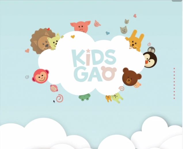
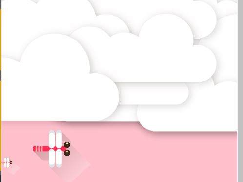
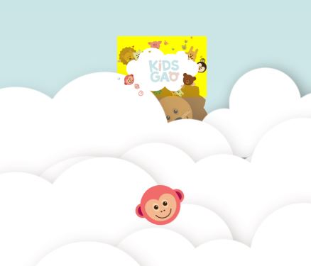
</head>상단영역 도면작업 (잠자리까지)
키즈가오 로고 영역과 구름 잠자리 영역 두개로나눔
첫번째 서랍장에는 가운데 로고와 4개의 움직이는 동물 이미지
두번째 서랍장에는 잠자리와 구름
<header id="intro">

	<div class="introWrap">
		<div class="logo"></div>
		<div class="lion"></div>
		<div class="rabbit"></div>
		<div class="bear"></div>
		<div class="monkey"></div>
	</div>

	<div class="cloudWrap">
		<div class="leftCloud"></div>
		<div class="rightCloud"></div>
		<div class="dragonfly"></div>
	</div>

</header>
css 기본값
브라우저의 x축을 벗어나는 (브라우저 크기보다 더 외곽에 있는 영역) object가 있는 경우 전부다 hidden처리 - hidden 처리 안하면 가로 스크롤이 생성됨
버튼은 기본적으로 테두리를 가지고있음, 그리고 배경색이 회색임, 투명하게 할때는 transparent
float 사용시 clear 속성값만 담고있는 값을 기본값(default)으로 넣어줌
/* Default CSS */
html, body {
	margin: 0;
	padding: 0;
}

body {
	overflow-x: hidden;
}

h1, h2, h3, h4, h5, h6, p {
	margin: 0;
	padding: 0;
}

button {
	border: none;
	background-color: transparent;
}

.clearfix {
	clear: both;
}
첫번째 서랍장 배치작업
부모이름 다 쓰는 방식으로 연습하기!
높이값은 그림참고 width는 항상 100%로 설정(배경이니까 꽉차게, height값 지정해준 이유는 스크롤시 배경이 바뀌기때문)
position을 사용할때는 당위성이 필요! 왜 사용했는가? 밑에 설명
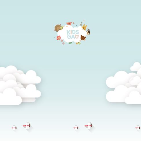
노란색영역에 동물이미지와 로고를 넣을거임
늘리거나 줄였을때 항상 가운데 위치(둘중 2번 써볼거임)
1. margin 0 auto
2. left 50% margin left -380px(우리가 만들어놓은 서랍장의 절반값)
/* Intro */
#intro {
width: 100%;
height: 1600px;
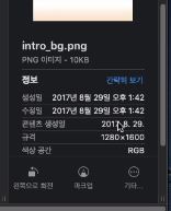
background-image: url(../img/intro/intro_bg.png);
}
#intro .introWrap {
position: relative;
width: 760px;
height: 516px;
background-color: yellow;
left: 50%;
margin-left: -380px;
}
로고, 이미지 삽입
로고를보면 어떤동물은 앞에있고 어떤동물은 뒤에있음 = 레이어 층이있다( z축이 존재한다) - 3차원적인 특징을 가진 포지션 속성값에서 사용가능하기때문에 사용함
z-index 100은 의미는없고 기준점을 만들어준것일뿐 (100보다 작으면 뒤에 배치 100보다 크면 앞에 배치)
lion에 z인덱스를 설정안하면 기본값인 0이라 뒤에 배치
introWrap에 relative 사용한이유
1. 중앙정렬을 하기위해서
left 사용(3차원특징을 가지고있는 position만 사용가능)
2. 동물들을 마진으로 배치작업을 하지않고 top,left값을 사용해서 배치시
예시로 lion에 top: 80px; left: 30px; 줬다고할때 부모의 position상태에따라 3차원특징이 적용된 자식의 좌표기준점이 달라질수있기 때문에( 브라우저기준 or 부모기준)
absolute를 사용한 영역의 부모가 relative or 순수 3차원성격을 가진 속성값을 사용했다면 top left bottom right 좌표기준점은 부모를 기준으로 형성된다.
지금은 마진을 사용해서 별 문제는 없지만 top left 배치상황이 생긴다 했을 때 좌표기준점을 부모로 잡고싶으면 부모에게다가 relative 적용하는게 훨씬 유리
#intro .introWrap .logo {
	position: absolute;

	width: 760px;
	height: 516px;
	background-image: url(../img/intro/logo.png);

	z-index: 100 ;
}


#intro .introWrap .lion {
	position: absolute;

	width: 161px;
	height: 161px;
	background-image: url(../img/intro/lion.png);

	margin: 80px 0 0 30px;
}

#intro .introWrap .rabbit {
	position: absolute;

	width: 105px;
	height: 129px;
	background-image: url(../img/intro/rabbit.png);

	margin: 90px 0 0 580px;
}

#intro .introWrap .bear {
	position: absolute;

	width: 112px;
	height: 105px;
	background-image: url(../img/intro/bear.png);

	margin: 310px 0 0 560px;

	z-index: 200;
}

#intro .introWrap .monkey {
	position: absolute;

	width: 85px;
	height: 93px;
	background-image: url(../img/intro/monkey.png);

	margin: 310px 0 0 50px;

	z-index: 200;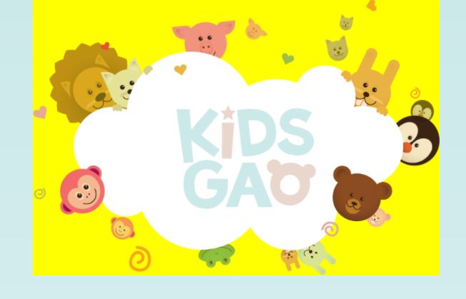
추가사항
이미지작업을 할때 이미지의 크기에 맞춰 공간의 크기를 설정하는게 좋음
공간안에 이미지를 넣을때(background-image) 공간의 크기가 더크면 그 공간을 매꾸려는 속성이있음 = 그림이 반복됨

background -repeat:no-repat; 사용하면 한개만나오지만 공간의 크기는 여전히 300의 크기를 가지게됨
배경의 이미지에 대해서는 다르게 처리해야함 (지금은 안함)
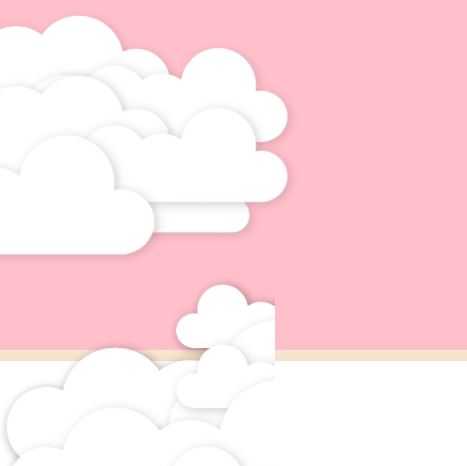
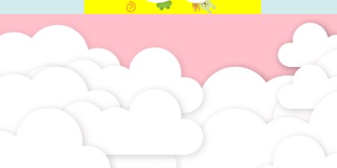
구름과 잠자리부분
cloudWrap 부분이 핑크색, div태그는 block 요소라 y축 정렬
좌우배치 float(left,right) 사용할려고 했으나 브라우저가 줄어들면 레이어 틀어짐 현상 발생
absolute 사용
left, right로 위치 지정
정렬되는 기준점은 relative로 설정한 부모(cloudWrap)을 기준으로 생성
#intro .cloudWrap {
	position: relative;

	width: 100%;
	height: 1050px;
	background-color: pink;
}

#intro .cloudWrap .leftCloud {
	position: absolute;

	width: 934px;
	height: 816px;
	background-image: url(../img/intro/cloud1.png);

	left: 0;

	z-index: 2;
}

#intro .cloudWrap .rightCloud {
	position: absolute;

	width: 843px;
	height: 853px;
	background-image: url(../img/intro/cloud2.png);

	right: 0;
}
모든형제가 3차원이라 레이어겹침현상 일어남

top 사용시 cloudwrap(핑크색)기준으로 위에서부터 800px 내려오게됨
relative를 사용하지않았으면 static이되서 브라우저기준으로 800px내려오게되서 구름사이에 가림
#intro .cloudWrap .dragonfly {
	position: absolute;

	width: 366px;
	height: 228px;
	background-image: url(../img/intro/dragonfly.png);

	top: 800px;
}
고객의 요청
로고를 밑으로 100px정도 내려달라
introWrap에서 margin 100을 사용하니 부모까지 같이 내려감 - 부모자식간 마진병합현상
해결방법1 : intro 영역에 padding 100을 사용해서 intro 와 intro wrap 사이에 공백을 만드는방법
1. 공백이 들어가서 intro 전체높이값은 1600이아니라 1700까지 공간이 벌어지게됨
2. content들이 100px씩 밀리게됨 레이어벌어짐 (여기서는 사용x)
해결방법2 : top 사용 - intro Wrap에 relative를 사용한 3번째 이유
노란색박스는 밑으로 내려갔는데 핑크색은 위치가 변함이 없음 (핑크 안쪽으로 노란색이 들어간걸 볼수있음)
top 사용시 (둘다 3차원적인 요소) 자기가 자신이 주체가 되서 내려가는데 밑에 어떠한 레이아웃이 배치가 되어있더라도 그 요소에 최초 위치는 변함이없다.(겹치는 형태로 이동이됨) = 레이어가 틀어지는 문제가 발생안함
둘다 3차원일경우 나중에 작성된 z축이 더높다(핑크색 밑으로 노란색이 들어가는구조)
#intro .introWrap {
	top: 100px;
}
추가사항
배경제거
실무팁
우리가 만약 디자인작업해야할 상황이면 (photoshop을 할수 있다면) 이미지의 크기는 숫자 5로 떨어지거나 짝수로 떨어져야함 - 애매한숫자(93,129) 사용하지않음
이러한 이미지를 사용하며 배치작업시 레이아웃 구조가 정확하게 배치가 안될수도있음
kidsgao는 왜? 신입일때 만든거라.
애니메이션 추가
이름, 시간, 속도 = 일정한속도, 무한재생, from ~ to to ~ from
나머지도 동일한데 시간이랑 각도만 달라짐
/* Intro */
#intro .introWrap .lion {
animation: spinLion 1500ms linear infinite alternate;
}
@keyframes spinLion {
from {
transform: rotate(-10deg);
}
to {
transform: rotate(10deg);
}
}
#intro .introWrap .rabbit {
animation: spinRabbit 1000ms linear infinite alternate;
}
@keyframes spinRabbit {
from {
transform: rotate(0deg);
}
to {
transform: rotate(5deg);
}
}
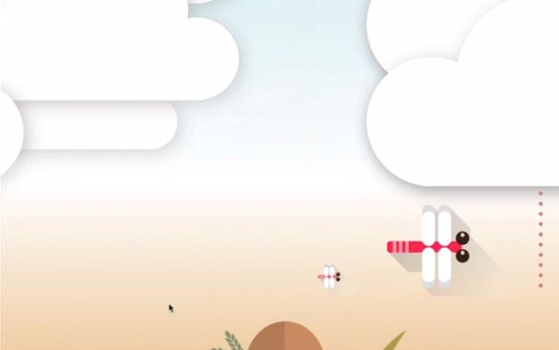
......잠자리가 움직이는 효과 (왼쪽밖에서 나타나서 오른쪽바깥으로)
특정시점에서 구름이 펼쳐지는 효과는 javascript와 관련 (안함)
시작은 이미지의 width값만큼 왼쪽으로 더떙겨줌
keyframes에 사용되는 left bottom 모두 기존에 작성된 position 값때문에 사용할수있는것임
잠자리는 브라우저 크기에 상관없이 항상 바깥쪽에서 사라져야함 (고정값 사용x)
고정값으로 너무 큰 수치를 넣으면 화면을 작게했을때 잠자리가 안보이는시간이 너무김
잠자리의 왼쪽면 기준으로해서 100%이동이라 바깥쪽으로 사라짐
#intro .cloudWrap .dragonfly {
	animation: flyDragonfly 7s linear infinite;
}

@keyframes flyDragonfly {
	from {
		left : -366px;
	}

	to {
		left : 100%
	}
}
실험
처음에 작성한 body - overflow - x hidden이 없다면?
현재 내가보고있는 브라우저 영역을 벗어나는 object까지 표기해줘야하기때문에 가로스크롤이 발생, 방지를 위해 overflow :hidden값을 default 값으로 넣어주는것
미디어쿼리
767px을 벗어나는 영역은 모두 style.css로 대체하겟다는 의미
잠자리는 배경이미지로 박혀있음, 로고도 동물들이 다 박혀있음
포지션 사용x
미디어쿼리를 사용시 미디어쿼리 바깥쪽 영역의 코드를 상속받기떄문에 이미 position값과 left값이 들어가있음
pc버전 -380px은 width 760px때문에 나온것이기때문에 width값을 189px로 바꾸었기 때문에 margin left값도 그에대해 절반값으로 삽입함 - 항상정가운데 배치된걸 볼수 있음
@media (max-width: 767px) {
	#intro {
		height: 1150px;
		background-image: url(../img/mobile/intro/mobile_intro_bg.png);
	}

	#intro .introWrap {
		width: 189px;
		height: 129px;

		margin-left: -94.5px;
		background-color: yellow;
	}

	#intro .introWrap .logo {
		width: 189px;
		height: 129px;
		background-image: url(../img/mobile/intro/mobile_logo.png);
	}
}
기존 이미지 삭제
화면에 노출 감출때
display는 html의 성격을 inline 에서 block 그 반대로 바꾸는 역활 뿐만아니라 노출을 결정할수있는 기능을 가지고있음
크기정리 및 배경색제거
#intro .introWrap .lion,
	#intro .introWrap .rabbit,
	#intro .introWrap .bear,
	#intro .introWrap .monkey,
	#intro .cloudWrap .dragonfly {
		display: none;
	}


	#intro .cloudWrap {
		height: 350px;
		top: 280px;
	}

	#intro .cloudWrap .leftCloud {
		width: 267px;
		height: 314px;
		background-image: url(../img/mobile/intro/mobile_cloud1.png);
	}

	#intro .cloudWrap .rightCloud {
		width: 237px;
		height: 309px;
		background-image: url(../img/mobile/intro/mobile_cloud2.png);
	}
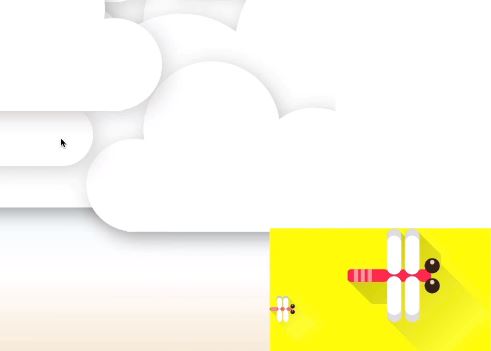
잠자리 이미지 반복적으로 보이는 현상
출력되는이유? 이미지의 width값보다 브라우저의 width값이 크기때문에 배경이미지(background-image) 반복효과가 적용된 것
no reapat를 적용하면 실제 이미지크기는 여기밖에안됨
잠자리를 한마리로 할려면 나머지 크기를 메꿔줘야함. 모바일버전 이미지 크기를 더키워서 해결가능함
그러나 여기서는 반복되는 효과를 사용해서 빈공백을 자동으로 메꿔줌으로써 불필요한 이미지 제작을 막음
반복되는 효과를 잘 이용해서 적용한 사례라 볼 수 있다.
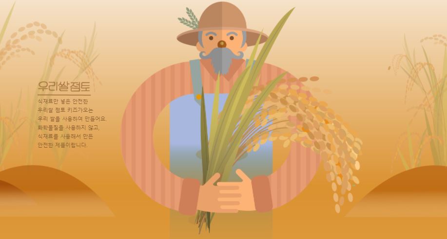
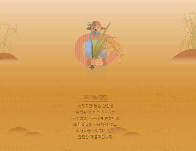
farm1 설계도면
농부의영역이 1078px로 부모보다 자식의높이가 더큼
<div id="farm1">

	<div class="leftRice1"></div>
	<div class="farmer"></div>
	<div class="rightRice1"></div>

	<div class="farmSpeechWrap">
		<img src="img/farm/farm1/farmspeech.png" alt="우리쌀 점토">

		<p class="farmSpeech">
				식재료만 넣은 안전한<br>
				우리쌀 점토 키즈가오는<br>
				우리 쌀을 사용하여 만들어요.<br>
				화학물질을 사용하지 않고,<br>
				식재료를 사용해서 만든<br>
				안전한 제품이랍니다.
		</p>
	</div>

</div>
그라이데이션 때문에 (어려움) -> 왠만해선 그라데이션 안하는게 좋다
br = 엔터
farm1이 relative이기 때문에 right의 top좌표 기준점은 farm1
농부의 이미지는 벼까지 포함이라 눈대중으로 맞췃음
/* Farm1 */
#farm1 {
	position: relative;

	width: 100%;
	height: 800px;
	background-image: url(../img/farm/farm1/farm1_bg.png);
}

#farm1 .leftRice1 {
	position: absolute;

	width: 390px;
	height: 670px;
	background-image: url(../img/farm/farm1/leftrice.png);

	left: 0;
}

#farm1 .rightRice1 {
	position: absolute;

	width: 335px;
	height: 570px;
	background-image: url(../img/farm/farm1/rightrice.png);

	right: 0;
	top: 100px;
}

#farm1 .farmer {
	position: absolute;

	width: 747px;
	height: 1070px;
	background-image: url(../img/farm/farm1/farmer.png);

	left: 50%;
	margin-left: -310px;

}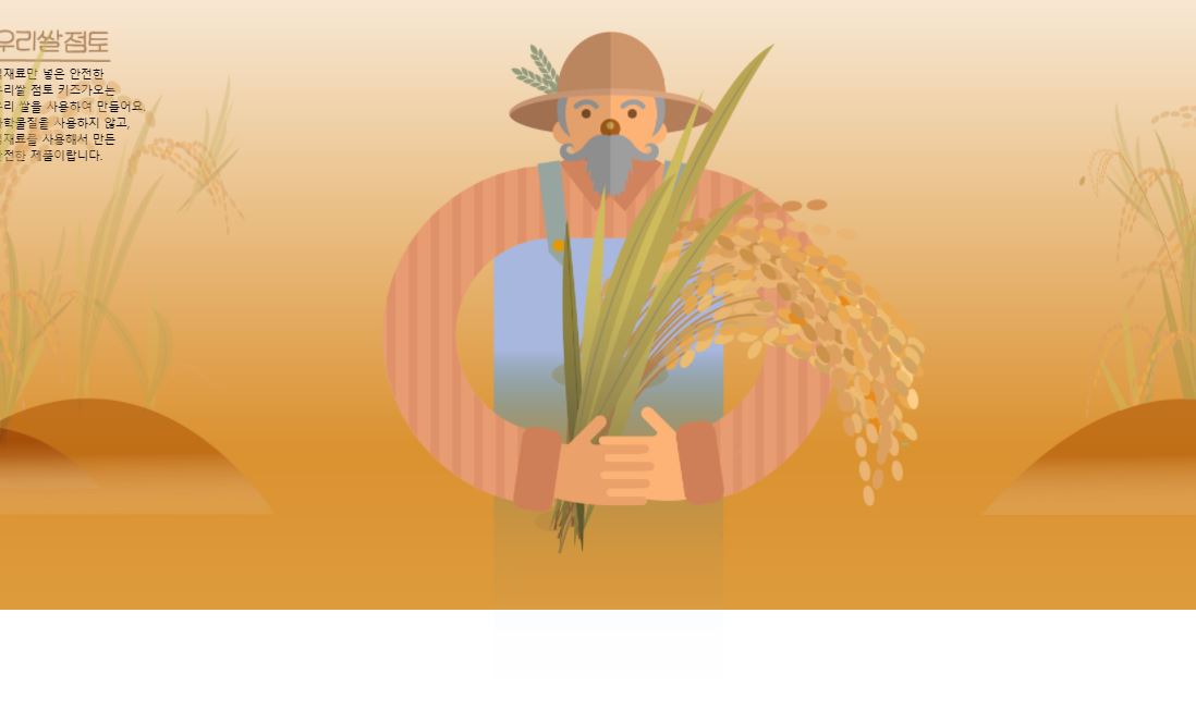
하단에 여백이 생기는이유 농부이미지의 크기가 1078px(그라데이션떄문) 우리가 만들어놓은 공간보다 크기때문에
텍스트 작업
공간배치 작업후 글자모양 작업
line-height : 글자 위아래 간격
먼저나오는 형제가 3차원이기때문에 그다음에 나오는 형제는 2차원이든 3차원이든 관계없이 레이어가 겹침 - 나중에 사용된 3차원이라서 레이어층이 가장위에 배치되어있는것
#farm1 .farmSpeechWrap {
	position: relative;

	top: 250px;
	left: 150px;
}

#farm1 .farmSpeechWrap .farmSpeech {
	color: #895c2f;
	grid-column: 18px;
	line-height: 27px;
}
farm1 모바일작업
farmspeechwrap 부분은 pc버전에 크기를 지정하지않았기 때문에 값을 주어야 한다.
img부분은 높이값 안줘도됨 - 이미지가 가진 비율 그대로 자동으로 높이가 생성
text align 같은경우는 글자 or inline요소를 중앙정렬시킬떄 사용되는 속성(글자나 인라인요소에만 영향을 미침)
farmspeechWrap의 300px이라는 영역안에서 img를 가운데 배치할수있는 이유는 img가 inline-block 성격을 가지고있어서 text align - center가 먹힘
@media (max-width: 767px) {
/* Farm1 */
	#farm1 {
		height: 450px;
		background-image: url(../img/mobile/farm/farm1/mobile_farm1_bg.png);
	}

	#farm1 .leftRice1 {
		width: 86px;
		height: 150px;
		background-image: url(../img/mobile/farm/farm1/mobile_leftrice.png);
	}

	#farm1 .rightRice1 {
		width: 95px;
		height: 170px;
		background-image: url(../img/mobile/farm/farm1/mobile_rightrice.png);

		top: -20px;
	}

	#farm1 .farmer {
		width: 160px;
		height: 250px;
		background-image: url(../img/mobile/farm/farm1/mobile_farmer.png);

		margin-left: -69px;
	}

	#farm1 .farmSpeechWrap {
		width: 300px;

		text-align: center;

		left: 50%;
		margin-left: -150px;
	}

	#farm1 .farmSpeechWrap img {
		width: 79px;
	}

	#farm1 .farmSpeechWrap .farmSpeech {
		line-height: 20px;
		font-size: 12px;
	}
}
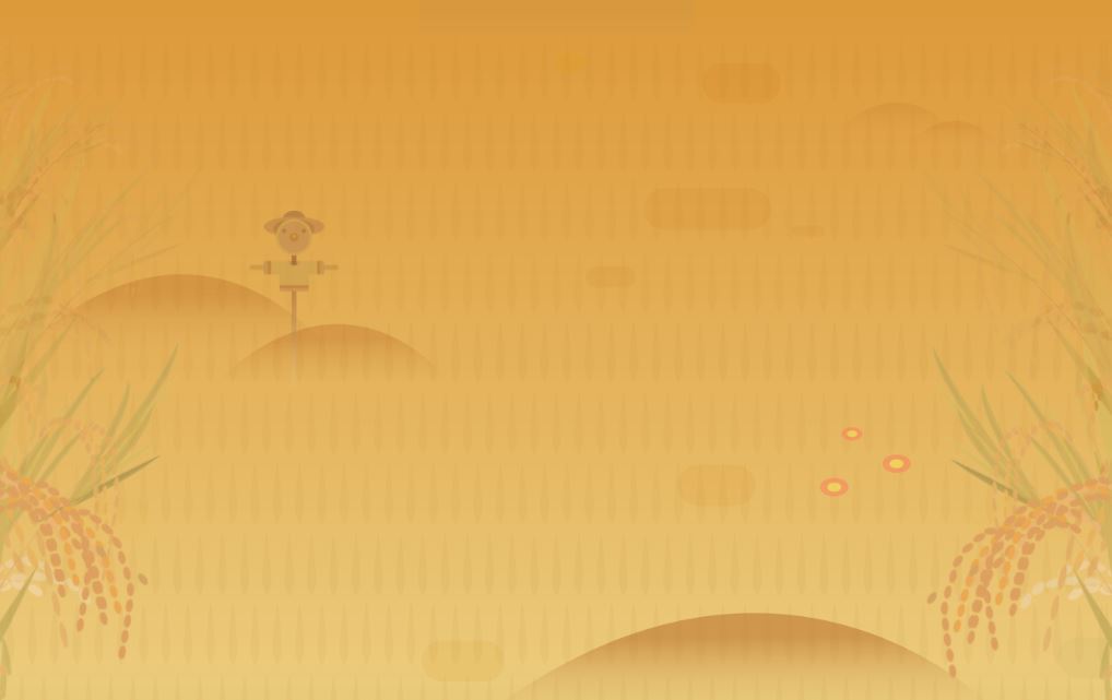
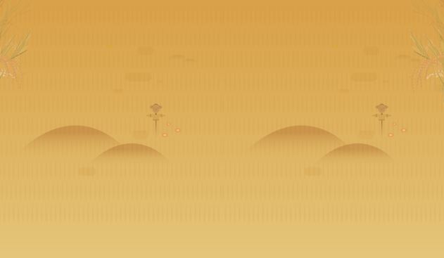
farm2 설계도면
<div id="farm2">
	<div class="leftRice2"></div>
	<div class="scarecrow"></div>
	<div class="rightRice2"></div>
</div>
스타일
좌우 끝배치는 이전에 사용했듯이 absolute 사용해서 left 0 right 0 하는 방법도 있지만 여기서는 float 사용
벼는 둘이 만나기전에 모바일버전으로 바뀜 (float right left 사용해도 무방한 경우)
margin과 top left bottom을 섞어서 사용하는 이유는 다양한 레이아웃 경우의수를 보여주기위해
/* Farm2 */
#farm2 {
	position: relative;

	width: 100%;
	height: 850px;
	background-image: url(../img/farm/farm2/farm2_bg.png);
}

#farm2 .leftRice2 {
	float: left;

	width: 250px;
	height: 850px;
	background-image: url(../img/farm/farm2/leftrice2.png);
}

#farm2 .rightRice2 {
	float: right;

	width: 236px;
	height: 850px;
	background-image: url(../img/farm/farm2/rightrice2.png);
}

#farm2 .scarecrow {
	position: absolute;

	width: 103px;
	height: 206px;
	background-image: url(../img/farm/farm2/scarecrow.png);

	margin: 200px 0 0 300px;
}
farm2 모바일작업
#farm2 {
	height: 440px;
	background-image: url(../img/mobile/farm/farm2/mobile_farm2_bg.png);
	}

#farm2 .leftRice2 {
	width: 57px;
	height: 201px;
	background-image: url(../img/mobile/farm/farm2/mobile_leftrice2.png);
	}

#farm2 .rightRice2 {
	width: 54px;
	height: 202px;
	background-image: url(../img/mobile/farm/farm2/mobile_rightrice2.png);
	}

#farm2 .scarecrow {
	display: none;
	}
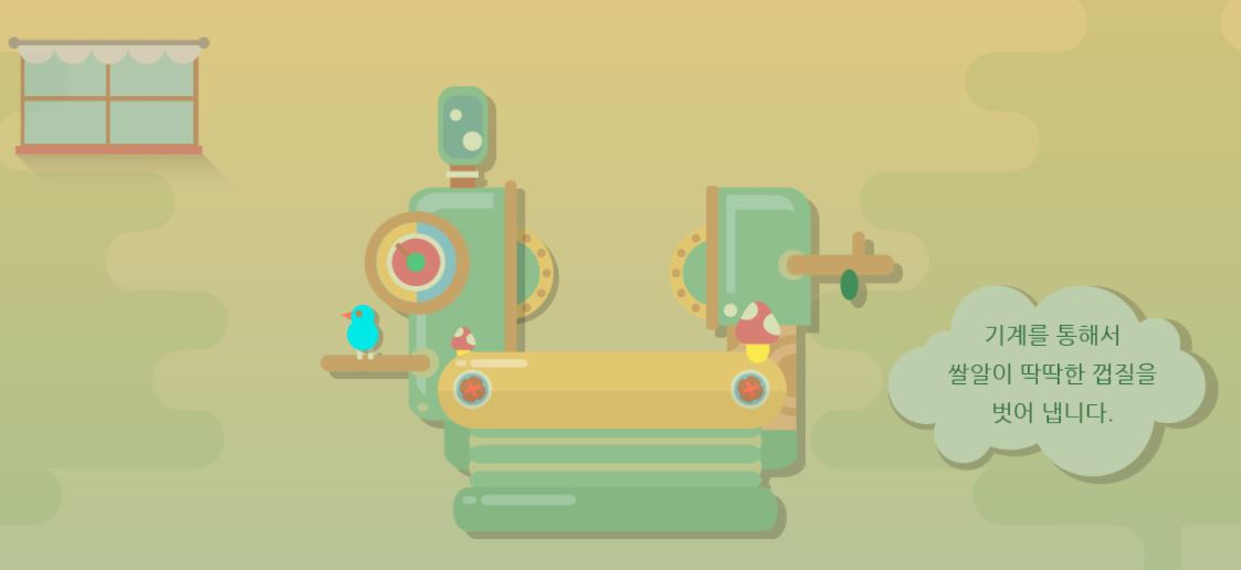
farm3 설계도면
작업하기전 이미지 보는 습관 들이기
회전효과를 적용해야하기때문에 이미지 자체 그림자까지 적용해버리면 어색해짐 그래서 별도의 이미지로 제작
<div id="farm3">

	<div class="farm3Window"></div>
	<div class="machineWrap">
		<div class="machine1"></div>
		<div class="sawShadow"></div>
		<div class="saw1"></div>
		<div class="saw2"></div>
		<div class="machineBird"></div>
		<div class="timer"></div>
	</div>

	<img class="farm3Bubble" src="img/farm/farm3/farm3bubble.png" alt="기계를 통해서 쌀알이 딱딱한 껍질을 벗어 냅니다.">

</div>
farm3 스타일
/* farm3 */
#farm3 {
	position: relative;

	width: 100%;
	height: 850px;
	background-image: url(../img/farm/farm3/farm3_bg.png);
}

#farm3 .farm3Window{
	position: absolute;

	width: 247px;
	height: 169px;
	background-image: url(../img/farm/farm3/window.png);

	margin: 100px 0 0 100px;
}

#farm3 .machineWrap {
	position: relative;

	width: 600px;
	height: 455px;
	/*background-color: yellow;*/

	left: 50%;
	margin-left: -285px;
	top: 150px;
}

#farm3 .machineWrap .machine1 {
	position: absolute;
	width: 586px;
	height: 455px;
	background-image: url(../img/farm/farm3/machine1.png);

	z-index: 900;
}

#farm3 .machineWrap .sawShadow {
	position: absolute;

	width: 95px;
	height: 95px;
	background-image: url(../img/farm/farm3/sawshadow.png);

	margin: 145px 0 0 145px;
}

#farm3 .machineWrap .saw1,
#farm3 .machineWrap .saw2 {
	position: absolute;
	width: 95px;
	height: 95px;
	background-image: url(../img/farm/farm3/saw.png);
}

#farm3 .machineWrap .saw1 {
	margin: 140px 0 0 140px;
}

#farm3 .machineWrap .saw2 {
	margin: 140px 0 0 350px;
}

#farm3 .machineWrap .timer {
	position: absolute;

	width: 103px;
	height: 104px;
	background-image: url(../img/farm/farm3/second.png);

	margin: 125px 0 0 45px;

	z-index: 999;
}

#farm3 .machineWrap .machineBird {
	position: absolute;

	width: 44px;
	height: 49px;
	background-image: url(../img/farm/farm3/machinebird.png);

	margin: 220px 0 0 20px;

	z-index: 999;
}

#farm3 .farm3Bubble {
	position: absolute;

	top: 350px;
	right: 80px;
}
farm3 애니메이션
#farm3 .machineWrap .timer {
	animation: rotateTimer 10000ms linear infinite;
}

@keyframes rotateTimer {
	from { transform: rotate(0deg); }
	to { transform: rotate(360deg);  }
}


#farm3 .machineWrap .saw1 {
	animation: rotateLeftSaw 10000ms linear infinite;
}

@keyframes rotateLeftSaw {
	from { transform: rotate(0deg); }
	to { transform: rotate(360deg);  }
}


#farm3 .machineWrap .saw2 {
	animation: rotateRightSaw 10000ms linear infinite;
}

@keyframes rotateRightSaw {
	from { transform: rotate(360deg); }
	to { transform: rotate(0deg);  }
}
farm3 모바일
@media (max-width: 767px) {
	#farm3 {
		height: 500px;
		background-image: url(../img/mobile/farm/farm3/mobile_farm3_bg.png);
	}

	#farm3 .farm3Window {
		width: 82px;
		height: 56px;
		background-image: url(../img/mobile/farm/farm3/mobile_window.png);

		margin: 10px 0 0 10px;
	}

	#farm3 .machineWrap {
		width: 200px;
		height: 150px;

		top: 120px;
		margin-left: -96px;
	}

	#farm3 .machineWrap .machine1 {
		width: 191px;
		height: 149px;
		background-image: url(../img/mobile/farm/farm3/mobile_machine1.png);
	}

	#farm3 .machineWrap .sawShadow,
	#farm3 .machineWrap .timer,
	#farm3 .machineWrap .machineBird {
		display: none;
	}

	#farm3 .machineWrap .saw1,
	#farm3 .machineWrap .saw2 {
		width: 31px;
		height: 31px;
		background-image: url(../img/mobile/farm/farm3/mobile_saw.png);
	}

	#farm3 .machineWrap .saw1 {
		margin: 50px 0 0 50px;
	}

	#farm3 .machineWrap .saw2 {
		margin: 50px 0 0 115px
	}

	#farm3 .farm3Bubble {
		position: absolute;

		width: 152px;

		left: 50%;
		margin: 0 0 0 -70px;
	}
}
2. 학습 중 어려웠던 점
오늘은 어려웠던 점은 별로 없었고 다른 사람들이 멘토님께 질문 하는 내용을 멘토님 답을 보기전에 내가 먼저 찾아보기도 하였다
3. 해결방법
멘토님께 들어오는 질문을 답을 보지않고 먼저 답을 생각해본뒤 비교해보고 정말로 모르겠는 것들은 답변을 정독했고 그래도 이해가지않는 부분은 구글 검색으로 해결했다
4. 소감
나 뿐만 아니라 다른 사람들도 정말 열심히 하고 있다는 걸 느꼇고 나도 뒤쳐지지 않도록 열심히 해야겠다고 마음먹었다.

매우 긍정적인 개발자