
1. 학습내용
키즈가오 사이트 실습 -2
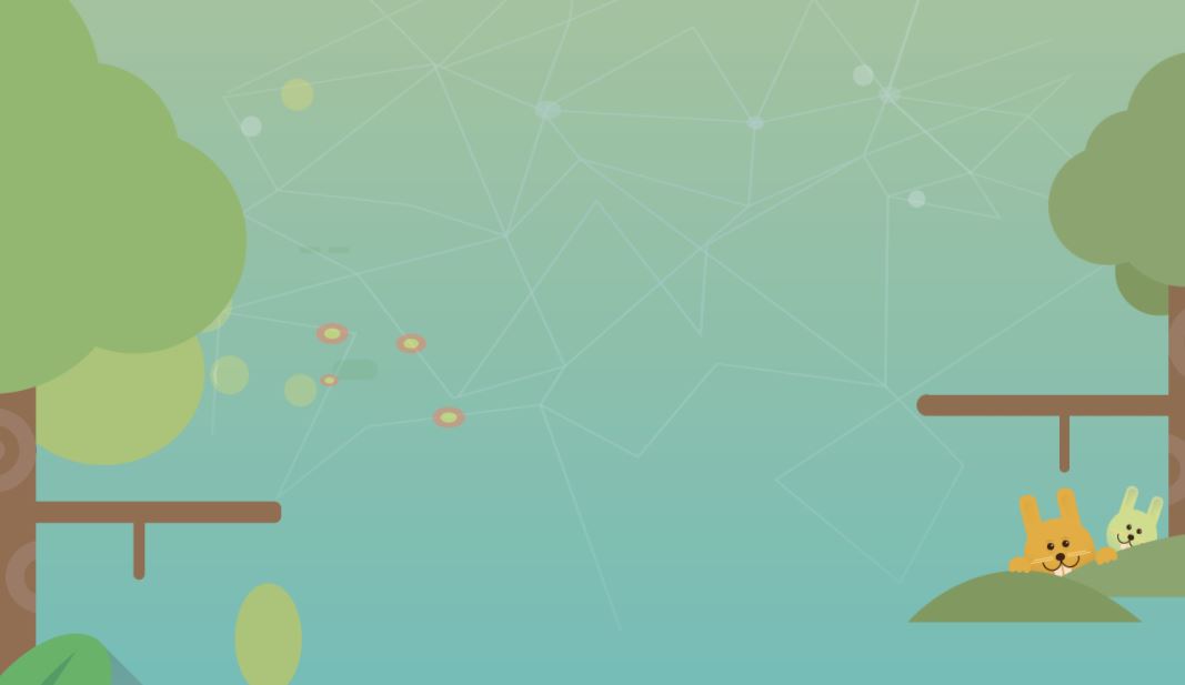
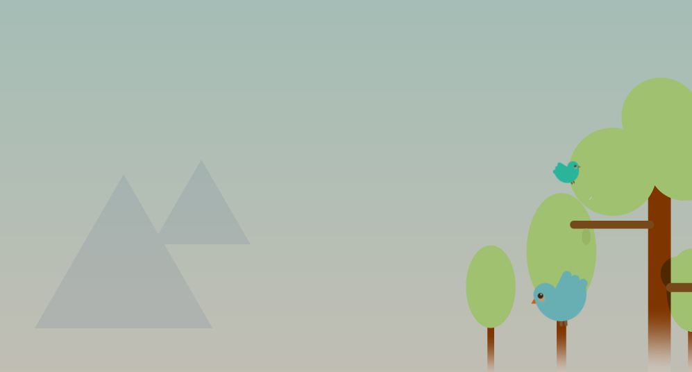
forest1 설계도면
<div id="forest1">
	<div class="leftTree"></div>

	<div class="treeWrap">
		<div class="rightTree"></div>
		<div class="rabbit1"></div>
		<div class="rabbit2"></div>
	</div>
</div>
forest1 css작업
leftTree의 네모박스 그림자가 forest2 영역을 침범하고있다.
absolute left, right만 너무 많이 사용해서 float 사용해봄
멘토님은 float 보단 position을 사용하는걸 추천
top,left,bottom,right 자기주도해서 움직인다 -> 다른영역에 침범할 수 있다.
#forest1 {
	width: 100%;
	height: 1050px;
	background-image: url(../img/forest/forest1/forest1_bg.png);
}

#forest1 .leftTree {
	position: absolute;

	width: 445px;
	height: 1200px;
	background-image: url(../img/forest/forest1/lefttree.png);

	left: 0;
}

#forest1 .treeWrap {
	float: right;
	position: relative;

	width: 304px;
	height: 572px;

	top: 100px;
}

#forest1 .treeWrap .rightTree {
	position: absolute;

	width: 304px;
	height: 572px;
	background-image: url(../img/forest/forest1/righttree.png);

	z-index: 10;
}

#forest1 .treeWrap .rabbit1 {
	position: absolute;

	width: 82px;
	height: 103px;
	background-image: url(../img/forest/forest1/rabbit1.png);

	margin: 435px 0 0 107px;
}

#forest1 .treeWrap .rabbit2 {
	position: absolute;

	width: 56px;
	height: 75px;
	background-image: url(../img/forest/forest1/rabbit2.png);

	margin: 435px 0 0 200px;
}
forest1 애니메이션
#forest1 .treeWrap .rabbit1 {
	animation: spinRabbitOne 1000ms linear infinite alternate;
}

@keyframes spinRabbitOne {
	from { transform: rotate(0deg);  }
	to { transform: rotate(10deg);  }
}

#forest1 .treeWrap .rabbit2 {
	animation: spinRabbitTwo 1000ms linear infinite alternate;
}

@keyframes spinRabbitTwo {
	from { transform: rotate(10deg);  }
	to { transform: rotate(0deg);  }
}
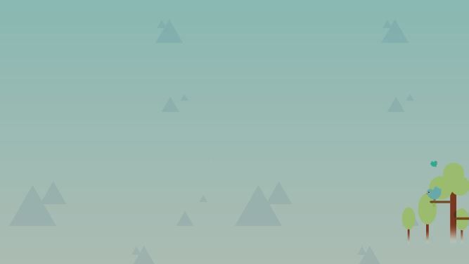
forest1 모바일
relative 사용이유?
treewrap은 relative라 static 상태에도 부모기준 top적용이라 의미가없다. 그리고 style.css에서 그나마 영향있다고 생각되는건 lefttree부분에 left0인데 어차피 브라우저나 부모기준이나 left 0의 결과가 같아서 그렇게 넣은듯
멘토님 답변
보통 relative를 설정하는 이유는 자식 요소의 위치의 기준을 만들려고 할 때 사용합니다. 자식은 absolute 로 배치하는 방식이 가장 많이 사용하는 패턴입니다. 혹시 forest 안의 자식 요소들 중에 absolute를 사용하는게 있지 않을까 추측해보구요. 아니라면 하나의 기준점을 미리 만들어둔거라고 생각하시면 될 것 같습니다 :)
@media (max-width: 767px) {
	#forest1 {
		position: relative;

		height: 400px;
		background-image: url(../img/mobile/forest/forest1/mobile_forest1_bg.png);
	}

	#forest1 .leftTree {
		width: 79px;
		height: 187px;
		background-image: url(../img/mobile/forest/forest1/mobile_lefttree.png);
	}

	#forest1 .treeWrap {
		width: 68px;
		height: 129px;

		top: 200px;
	}

	#forest1 .treeWrap .rabbit1,
	#forest1 .treeWrap .rabbit2 {
		display: none;
	}

	#forest1 .treeWrap .rightTree {
		width: 68px;
		height: 129px;
		background-image: url(../img/mobile/forest/forest1/mobile_righttree.png);
	}
}
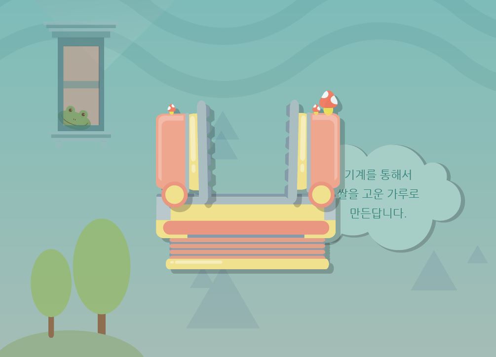
forest2 설계도면
<div id="forest2">
<div class="frog"></div>
<div class="machineWrap2">
<div class="machineBottom"></div>
<div class="machineLeft"></div>
<div class="machineRight"></div>
</div>
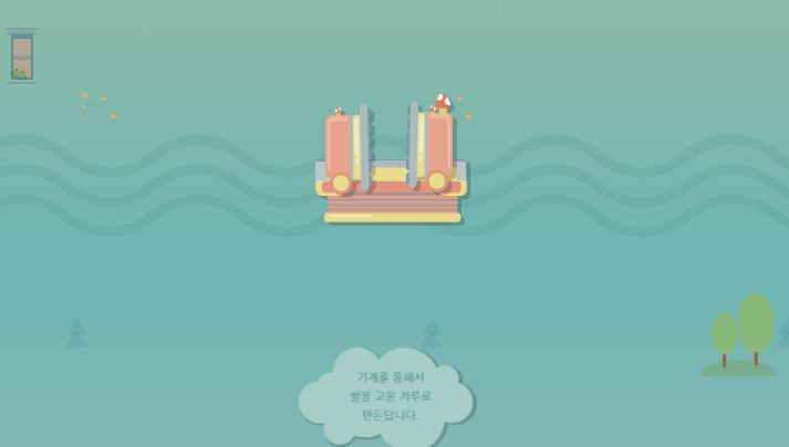
<img class="forestBubble" src="img/forest/forest2/forestbubble.png" alt="기계를 통해서 쌀을 고운 가루로 만든답니다.">
<div class="forest2Tree"></div>
</div>forest2 css
같은z축을 가지고있다면 나중에 작성된 z축이 위쪽으로 배치
#forest2 {
	width: 100%;
	height: 750px;
	background-image: url(../img/forest/forest2/forest2_bg.png);
}

#forest2 .frog {
	position: absolute;

	width: 153px;
	height: 257px;
	background-image: url(../img/forest/forest2/frog.png);

	margin: 50px 0 0 100px;
}

#forest2 .machineWrap2 {
	position: relative;

	width: 400px;
	height: 400px;

	left: 50%;
	margin-left: -200px;
	top: 180px;
}

#forest2 .machineWrap2 .machineBottom {
	position: absolute;

	width: 374px;
	height: 162px;
	background-image: url(../img/forest/forest2/machinebottom.png);

	margin-top: 220px;

	z-index: 200;
}

#forest2 .machineWrap2 .machineLeft {
	position: absolute;

	width: 123px;
	height: 228px;
	background-image: url(../img/forest/forest2/machineleft.png);

	margin-top: 30px;

	z-index: 200;
}

#forest2 .machineWrap2 .machineRight {
	position: absolute;

	width: 123px;
	height: 248px;
	background-image: url(../img/forest/forest2/machineright.png);

	margin: 10px 0 0 260px;

	z-index: 200;
}

#forest2 .forestBubble {
	position: relative;

	float: right;

	top: -100px;
	margin-right: 100px;
}

#forest2 .forest2Tree {
	float: left;
	position: relative;

	width: 304px;
	height: 282px;
	background-image: url(../img/forest/forest2/forest2tree.png);

	top: 50px;
}
forest2 모바일
여기서는 relative 안넣어주면 img를 absolute로 바꿔준 구름영역이 상위로 올라감(브라우저기준이 됨)
배치작업을 할 때는 이전에 적용됐던 요소때문에 그 다음에 나오는 요소가 의도한바와 다르게 배치되는 경우도있음
작성된 순서대로 배치작업을 해야함
@media (max-width: 767px) {
    #forest2 {
		position: relative;

		height: 400px;
		background-image: url(../img/mobile/forest/forest2/mobile_forest2_bg.png);
	}

	#forest2 .frog {
		width: 34px;
		height: 57px;
		background-image: url(../img/mobile/forest/forest2/mobile_frog.png);

		margin: 0 0 0 20px;
	}

	#forest2 .machineWrap2 {
		width: 200px;
		height: 110px;

		top: 70px;
		margin-left: -97px;
	}

	#forest2 .machineWrap2 .machineBottom {
		width: 141px;
		height: 60px;
		background-image: url(../img/mobile/forest/forest2/mobile_machinebottom.png);

		left: 50%;
		margin: 50px 0 0 -70.5px;
	}

	#forest2 .machineWrap2 .machineLeft {
		width: 46px;
		height: 85px;
		background-image: url(../img/mobile/forest/forest2/mobile_machineleft.png);

		margin: 0 0 0 20px;
	}

	#forest2 .machineWrap2 .machineRight {
		width: 46px;
		height: 93px;
		background-image: url(../img/mobile/forest/forest2/mobile_machineright.png);

		margin: -10px 0 0 130px;
	}

	#forest2 .forestBubble {
		position: absolute;

		width: 161px;

		top: 290px;
		left: 50%;
		margin-left: -83px;
	}

	#forest2 .forest2Tree {
		float: right;

		width: 69px;
		height: 76px;
		background-image: url(../img/mobile/forest/forest2/mobile_forest2tree.png);

		top: 130px;
		margin-right: 20px;
	}
}
forest3 설계도면
<div id="forest3">

	<div class="forest3Wrap">
		<div class="forest3Tree"></div>
		<div class="smallBird"></div>
		<div class="bigBird"></div>
	</div>

</div>
forest3 css
여기서도 마찬가지로 부모에 relative를 넣어주지 않으면 새의 top, left값이 브라우저 기준이라 위로 올라간다
마진같은경우는 부모가 어떤상태인지 따라 달라지지 않음
#forest3 {
	width: 100%;
	height: 600px;
	background-image: url(../img/forest/forest3/forest3_bg.png);
}

#forest3 .forest3Wrap {
	float: right;
	position: relative;

	width: 354px;
	height: 440px;

	top: 100px;
}

#forest3 .forest3Wrap .forest3Tree {
	position: absolute;

	width: 354px;
	height: 440px;
	background-image: url(../img/forest/forest3/forest3tree.png);
}

#forest3 .forest3Wrap .smallBird {
	position: absolute;

	width: 40px;
	height: 35px;
	background-image: url(../img/forest/forest3/bird_sm.png);

	top: 120px;
	left: 125px;
}

#forest3 .forest3Wrap .bigBird {
	position: absolute;

	width: 83px;
	height: 80px;
	background-image: url(../img/forest/forest3/bird_big.png);

	margin: 280px 0 0 94px;
}
forest3 애니메이션
#forest3 .forest3Wrap .smallBird {
	animation: spinSmallBrid 1000ms linear infinite alternate;
}

@keyframes spinSmallBrid {
	from {
		transform: rotate(0deg);
	}

	to {
		transform: rotate(10deg);
	}
}

#forest3 .forest3Wrap .bigBird {
	animation: spinBigBrid 1000ms linear infinite alternate;
}

@keyframes spinBigBrid {
	from {
		transform: rotate(-10deg);
	}

	to {
		transform: rotate(10deg);
	}
}
forest3 모바일
@media (max-width: 767px) {
	#forest3 {
		height: 630px;
		background-image: url(../img/mobile/forest/forest3/mobile_forest3_bg.png);
	}

	#forest3 .forest3Wrap {
		width: 99px;
		height: 127px;

		top: 300px;
	}

	#forest3 .forest3Wrap .forest3Tree {
		width: 99px;
		height: 127px;
		background-image: url(../img/mobile/forest/forest3/mobile_forest3tree.png);
	}

	#forest3 .forest3Wrap .smallBird,
	#forest3 .forest3Wrap .bigBird {
		display: none;
	}
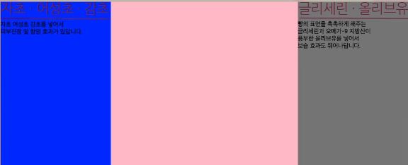
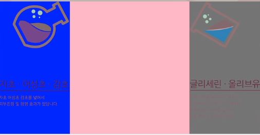
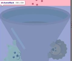
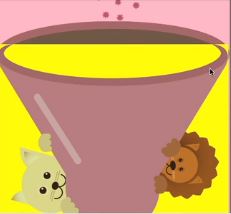
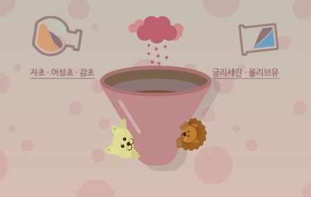
science 설계도면
center부분 이미지 하나는 앞만보이고 하나는 완성된 화면
저렇게 작업한이유는? javascript 적용된 버전 안에서는 중앙의 쌀알이 안으로 들어가는 효과가 필요해서, 그래서 앞쪽 이미지와 전체이미지를 따로 분류 (안에 z축을 만들어주기위해서)
상단에 비커는 정보를 가진 이미지가 아니라서(alt 사용필요x) - background image
글자 이미지는 정보성을 띄고있기떄문에 - img
<div id="science">
	<div class="scienceWrap">
    		<div class="scienceLeftWrap">
			<div class="gly"></div>
			<img src="img/science/leftTitle.png" alt="자초, 어성초, 감초">
			<p>
				자초 어성초 감초를 넣어서<br>
				피부진정 및 함염 효과가 있답니다.
			</p>
		</div>

		<div class="scienceCenterWrap">
			<div class="purpleSteam"></div>
			<div class="funnelBack"></div>
			<div class="funnelFront"></div>
            	</div>

		<div class="scienceRightWrap">
			<div class="water"></div>
			<img src="img/science/rightTitle.png" alt="글리세린, 올리브유">
			<p>
				빵의 표면을 촉촉하게 해주는<br>
				글리세린과 오메가-9 지방산이<br>
				풍부한 올리브유를 넣어서<br>
				보습 효과도 뛰어나답니다.
			</p>
		</div>
	</div>
</div>
science css(기초 골격)
position :relative (혹시모르니까)
height의 100%는 부모영역의 안쪽의 100%를 의미
science .scienceWrap . scienceRight 영역에는 left를 사용하든 right를 사용하든 결과는 같다
3개의 width값의 크기는 감싸고있는 영역의 width값을 넘어가서는 안된다. 안그러면 줄바꿈현상일어남
#science {
	position: relative;

	width: 100%;
	height: 800px;
	background-image: url(../img/science/science_bg.png);
}

#science .scienceWrap{
	position: relative;

	width: 1068px;
	height: 655px;
    background-color: yellow;

	margin: 0 auto;
}

#science .scienceWrap .scienceLeftWrap {
	float: left;
	width: 288px;
	height: 100%;
    background-color: blue;
}

#science .scienceWrap .scienceCenterWrap {
	position: relative;
	float: left;
	width: 488px;
	height: 100%;
    background-color: pink;
}

#science .scienceWrap .scienceRightWrap {
	float: left;
	width: 292px;
	height: 100%;
	background-color: gray;
}
science css 왼쪽 오른쪽 작업
margin bottom 때문에 비커 밑에 공백이 생김
이미지와 글자사이에 공백
img태그에 margin bottom을 넣어서 만들어도되고 p태그에다가 padding 사용해서 만들어도됨
#science .scienceWrap .scienceLeftWrap .gly {
	width: 230px;
	height: 192px;
	background-image: url(../img/science/gly.png);

	margin: 0 0 130px 55px;
}

#science .scienceWrap .scienceLeftWrap p,
#science .scienceWrap .scienceRightWrap p {
	color: #8e7577;
	font-size: 18px;
	line-height: 26px;

	padding-top: 10px;
}

#science .scienceWrap .scienceRightWrap .water {
	width: 204px;
	height: 191px;
	background-image: url(../img/science/water.png);

	margin-bottom: 130px;
}
css 마무리
구름 중앙 배치
funnel back z축 위쪽으로 funnel front가 올려져 있는 형태 (검사에서 노란색배경 넣어봄)
둘다 3차원적인 성격을 가지고 있고 형제관계로 만나면 다음에 나오는 형제의 z축 값이 높다
#science .scienceWrap .scienceCenterWrap .purpleSteam {
	position: relative;

	width: 241px;
	height: 216px;
	background-image: url(../img/science/grape.png);

	left: 50%;
	margin-left: -120px;
}

#science .scienceWrap .scienceCenterWrap .funnelBack {
	position: absolute;

	width: 488px;
	height: 438px;
	background-image: url(../img/science/funnelback.png);
}

#science .scienceWrap .scienceCenterWrap .funnelFront {
	position: relative;

	width: 485px;
	height: 390px;
	background-image: url(../img/science/funnelfront.png);

	margin-top: 48px;
}
science Animation
css에서 배경제거
#science .scienceWrap .gly {
	animation: spinGly 1500ms linear infinite alternate;
}

@keyframes spinGly {
	from { transform: rotate(0deg); }
	to { transform: rotate(50deg); }
}

#science .scienceWrap .water {
	animation: spinWater 1500ms linear infinite alternate;
}

@keyframes spinWater {
	from { transform: rotate(0deg); }
	to { transform: rotate(-50deg); }
}
science 모바일 작업
자식으로 float 사용되게 되면(left center right) 3차원특징을 가지게되어 자식의높이값이 부모에게 영향을 줄 수 없음
그때 부모가 overflow - hidden 값을 가지게되면 float을 사용한 자식의 높이값이 부모에게 영향을 줄 수 있다.
height auto를 사용하면 자식의 높이값으로 대체시키겟다라는 의미 (centerwrap의 높이값이 222로 제일큼, 그래서 부모 science Wrap의 박스의 높이값도 222로 표기됨)
sciecneWrap은 css에있는 margin 0 auto로 중앙이 잡혀있는 상태. 그리고 top 180px을 적용해 살짝 내려줌
모바일버전에서는 그림자있음
사실 디자인 작업할때 pc버전과 모바일버전 맞춰서 작업하는게 좋음 어디에는 그림자있고 어디에는 없고.. 통일성없는 작업은 좋지않음
@media (max-width: 767px) {
	#science {
		height: 580px;
		background-image: url(../img/mobile/science/mobile_science_bg.png);
	}

	#science .scienceWrap {
		overflow: hidden;
		width: 360px;
		height: auto;

		top: 180px;
	}

	#science .scienceWrap .scienceLeftWrap {
		width: 100px;
	}

	#science .scienceWrap .scienceLeftWrap .gly {
		width: 76px;
		height: 63px;
		background-image: url(../img/mobile/science/mobile_gly.png);

		margin: 0 0 10px 0;
	}

	#science .scienceWrap .scienceLeftWrap img,
	#science .scienceWrap .scienceRightWrap img {
		height: 15px;
	}

	#science .scienceWrap .scienceLeftWrap p,
	#science .scienceWrap .scienceRightWrap p {
		display: none;
	}

	#science .scienceWrap .scienceCenterWrap {
		width: 160px;
		height: 222px;
	}

	#science .scienceWrap .scienceCenterWrap .purpleSteam {
		width: 80px;
		height: 71px;
		background-image: url(../img/mobile/science/mobile_grape.png);

		margin-left: -40px;
	}

	#science .scienceWrap .scienceCenterWrap .funnelBack {
		width: 173px;
		height: 151px;
		background-image: url(../img/mobile/science/mobile_hopperback.png);
	}

	#science .scienceWrap .scienceCenterWrap .funnelFront {
		width: 160px;
		height: 122px;
		background-image: url(../img/mobile/science/mobile_hopperfront.png);

		left: 50%;
		margin: 20px 0 0 -80px;
	}

	#science .scienceWrap .scienceRightWrap {
		width: 100px;
	}

	#science .scienceWrap .scienceRightWrap .water {
		width: 67px;
		height: 63px;
		background-image: url(../img/mobile/science/mobile_water.png);

		margin-bottom: 10px;
		margin-left: 32px;
	}
}
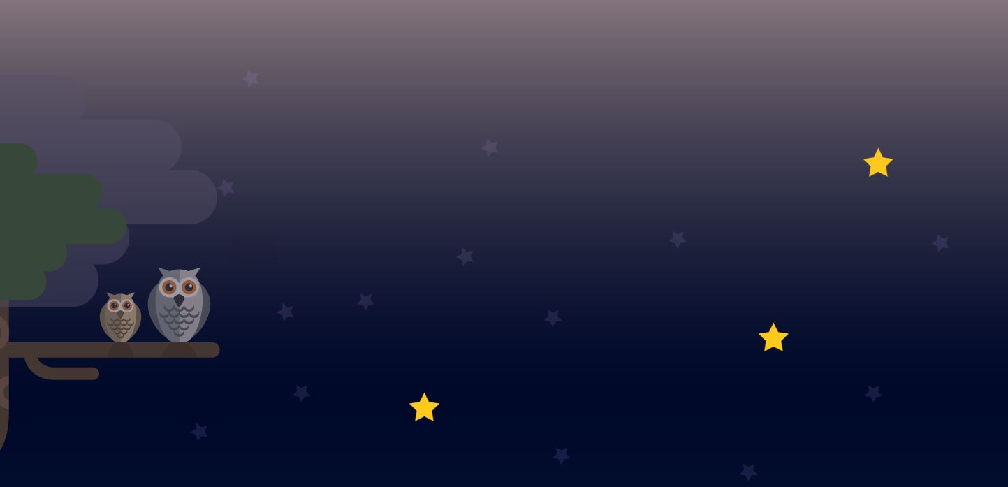
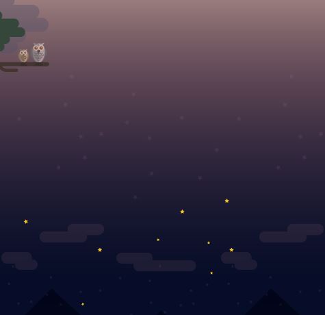
night1 설계도면
<div id="night1">
	<div class="owl"></div>
	<div class="starWrap">
		<div class="star1"></div>
		<div class="star2"></div>
		<div class="star3"></div>
	</div>
</div>
night1 css
부엉이와 별들을 감싸는 공간은 둘다 div 태그라 y축 정렬이됨
1. float 사용
2. 형제관계의 position상태를 특징을 이용
먼저나오는 형제가 3차원이면 그다음 형제는 2차원이든 3차원이든 상관없이 레이어가 겹치게됨, 겹친후 --> margin left 적용해줌 (relative 사용필요 x) 밑으로 내리기위해 top사용(relative 사용)
#night1 {
	width: 100%;
	height: 700px;
	background-image: url(../img/oneday/night1/night1_bg.png);
}

#night1 .owl {
	position: absolute;

	width: 334px;
	height: 571px;
	background-image: url(../img/oneday/night1/owl.png);

	margin-top: 50px;
}

#night1 .starWrap {
	position: relative;

	width: 750px;
	height: 400px;

	top: 150px;
	margin-left: 600px;
}


#night1 .starWrap .star1,
#night1 .starWrap .star2,
#night1 .starWrap .star3 {
	position: absolute;

	width: 53px;
	height: 50px;
	background-image: url(../img/oneday/night1/star1.png);
}

#night1 .starWrap .star1 {
	margin-top: 350px;
}

#night1 .starWrap .star2 {
	margin-left: 650px;
}

#night1 .starWrap .star3 {
	margin: 250px 0 0 500px;
}
night1 Animation
켜졋다 작아졌다. - scale
동일한 효과라 3개 한번에
#night1 .starWrap .star1,
#night1 .starWrap .star2,
#night1 .starWrap .star3 {
	animation: pulseStar 1s linear infinite alternate;
}

@keyframes pulseStar {
	from {  transform: scale(1); }
	to { transform: scale(0.8); }
}
night1 모바일
night에 relative가 없고 starwrap에 absolute 사용하면 맨위로 올라감. why? 감싸고있는 night1이 position이없어서 static상태라서 브라우저 기준으로 잡히게되서그럼
@media (max-width: 767px) {
	#night1 {
		position: relative;
		height: 500px;
		background-image: url(../img/mobile/oneday/night1/mobile_night1_bg.png);
	}

	#night1 .owl {
		width: 88px;
		height: 151px;
		background-image: url(../img/mobile/oneday/night1/mobile_owl.png);

		margin-top: 0;
	}

	#night1 .starWrap {
		position: absolute;

		width: 308px;
		height: 157px;
		background-image: url(../img/mobile/oneday/night1/mobile_star.png);

		top: 300px;
		margin-left: 50px;
	}


	#night1 .starWrap .star1,
	#night1 .starWrap .star2,
	#night1 .starWrap .star3 {
		display: none;
	}
}
2. 학습 중 어려웠던 점
사이트 만드는 방식이 비슷해서 오늘도 시간은 걸렸지만 어렵지는 않았다. 그러나 중간에 레이아웃 포지션 구조에 대해서 질문이 생겼다.
3. 해결방법
일단 그 부분에 대해 멘토님께 질문을 던지기 보다는 내가 먼저 해결해보는 습관을 가지기 위해 코드를 뜯어보며 고민했다. 나만의 답을 가지고 멘토님께 답을 여쭈어보았고 얼추 비슷한 답을 얻을 수 있었다.
4. 소감
사람들이 코딩할 때 어렵다 어렵다 하면서 왜 자꾸 하는지 몰랐는데 막히던 부분에서 내가 직접 답을 찾아냈을 때 나오는 뿌듯감이 원동력이 되는 것 같다.

매우 긍정적인 개발자