1. 학습내용
transform
일부 간단한 애니메이션은 css도 구현가능함
선택한 오브젝트 크기를 확대 축소 각도 회전시키거나 위치변경 하는데 사용
<div class="transform"></div>.transform {
width: 300px;
height: 300px;
background-color: yellow;
margin-top: 100px;
margin-left: 100px;rotate
2차원적인 회전효과
값은 양수, 음수 둘다 가능
양수시 오른쪽 회전 음수시 왼쪽 회전(-10deg : 왼쪽으로 10도 회전)
.transform {
	transform: rotate(45deg);
}
scale
scale은 내가 선택한 영역을 비율로 키울때 사용
값은 차례대로 x축, y축 [(2,3) X축으로 2배 Y축으로 3배]
줄이고 싶으면(비율로 움직이기때문에) 소수점 단위로 주면됨 [0.5, 0.5 = 0.5배, 0.5배]
.transform {
    transform: scale(2, 3);
}
skew
각도에 영향을 미침 3차원적인 회전효과
값은 차례대로 x축회전, y축회전 (양수, 음수 둘다가능)
.transform {
    transform: skew(10deg, 20deg);
}
translate
선택한 영역의 위치를 변경할때
값은 차례대로 x축, y축
가끔 구조배치할때 사용하는 사람도 있음
최초위치에서 x축 100px, y축 300px 이동
.transform {
	transform: translate(100px, 300px);
}
Prefix
transform사용시(익스플로러 10.0이상에서 사용가능) 9.0에서도 사용하고싶다. 이때 속성앞에 prefix를 달아두면됨(그 이하는 불가)
하위버전까지 고려하는것
webkit (크롬,사파리) moz(파폭) ms(익스플로러) o(오페라)
prefix가 없는 transform을 default(기본값)으로 넣어주면됨
.transform {
	-webkit-transform: rotate(10deg);
	-moz-transform: rotate(10deg);
	-ms-transform: rotate(10deg);
	-o-transform: rotate(10deg);
    	transform: rotate(10deg);
}
transition
<div class="transition"></div>간단한 애니메이션
마우스올렸을떄 600으로 크기증가
사용자입장에선 움직임이 부자연스러운 애니메이션효과.
.transition {
	width: 300px;
	height: 300px;
	background-color: yellow;
 }
.transition:hover {
	width: 600px;
 }

애니메이션의 움직임이 변화하는 과정을 보여주고 싶을때 사용
property - 변화하고자 하는 영역 넣기
duration - 애니메이션이 진행되는 시간(s:초)
timing - 애니메이션이 움직이는 속도의 성격
linear : 시작부터 끝까지 일정한 속도 유지
delay - 마우스를 올렸을때 바로 시작되는 것이 아니라 약간의 딜레이 이후 효과를 발동, 마우스를 치웟을때 딜레이이후 다시 돌아감
.transition {
	transition-property: width;
	transition-duration: 2s;
	transition-timing-function: linear;
	transition-delay: 1s;
}
코드정리
transition이 반복적으로 나옴. 여러개의 속성값은 하나의 속성으로 정리가 가능하다.
순서는 상관없는데 duration과 delay 순서에는 신경쓰기. 먼저나오는게 duration, 나중이 delay
즉, 하나만 적으면 duration만 적용됨
.transition {
	transition: width 2s linear 1s
}
사용하는곳 : 메뉴에 마우스 올렸을 때 바로 색상을 바꾸는게 아닌 자연스러운 색상변화를 적용하고 싶을때
변화를 주고자하는 속성을 , 를 통해 계속 늘려갈 수 있음
.transition {
	transition: width 2s linear 1s, height 2s linear;
}
.transition:hover {
	width: 600px;
	height: 600px;
}
Animation
animation-name : 애니메이션 이름 정하기
duration, timing, delay는 transition과 동일
animation-iteration-count: 실행 횟수 (infinite 무한반복)
animation-direction: 진행방향 (normal, alternate:왕복)
alternate 돌아올 때도 iteration-count 소모, 예를들어 6번 count라고 하면 왕복을 3번만 한다.
.animation {
    width: 300px;
    height: 300px;
    background-color: tomato;

    animation-name: changeWidth;
    animation-duration: 3s;
    animation-timing-function: linear;
    animation-delay: 1s;
    animation-iteration-count: infinite;
    animation-direction: alternate;
}
@keyframes 애니메이션 효과 구현을 위해 따라와야하는 코드
뒤에는 animation-name
keyframes와 animation의 설정을 연동시켜주는것
keyframes 안쪽에는 실제 애니메이션이 발동하는 형태값을 입력, from 시작 to 끝
결과는 마우스 움직임도없는데 자동으로 움직임 ##### normal이 정방향이라서 from ~ to 반복 총 횟수는 6 alternate로 변경시 from ~ to, to ~ from 한번으로 쳐서 총3번움직임
from ~ to 뿐만아니라 0% 50% 100% 이런식으로 더 자세하게 특정지점을 지정할 수 있다
@keyframes changeWidth {
    0% {
        width: 300px;
        height: 300px;
        background-color: tomato;
        border: solid 0px blue;
    }
    50% {
        background-color: brown;
    }
    100% {
        width: 600px;
        height: 600px;
        background-color: yellowgreen;
        border: solid 10px blue;
    }
}
kidsago 움직이는 사자
<div class="spin-lion"></div>.spin-lion {
width: 150px;
height: 150px;
background-color: blue;오른쪽 왼쪽으로 움직이는 애니메이션
1500ms = 1.5s
.spin-lion {
 	animation: spinLion 1500ms linear infinite alternate;
}
 @keyframes spinLion {
    from { transform: rotate(-10deg); }
    to { transform: rotate(10deg); }
}
animation prefix
유의점 : animation은 keyframes와 같이 사용하게 되는데, 애니메이션에 prefix를 붙였다면 prefix를 붙인 keyframes를 또 만들어줘야한다.
표준을 지원하는 브라우저(기본값)이 들어가 있어야함
keyframes 앞에 prefix를 달았다고해서 안에 내용물을 대표하지않음. 그래서 하나하나 다 달아줘야한다.
.spin-lion {
    -webkit-animation: spinLion 1500ms linear infinite alternate;
    animation: spinLion 1500ms linear infinite alternate;
}
@-webkit-keyframes spinLion {
    from { -webkit-transform: rotate(-10deg); }
    to { -webkit-transform: rotate(10deg); }
}
@keyframes spinLion {
    from { transform: rotate(-10deg); }
    to { transform: rotate(10deg); }
}
복잡한 animation 만드는 사이트
https://jeremyckahn.github.io/stylie/
1. keyframe추가, 조정
2. export
class-name, iterations(count), vender(prefix) 조정
output size: keyframes을 얼마나 많이 사용할 것인지 결정한다. keyframe이 많을수록 코드는 길어지지만 움직임이 부드러워진다.
generated css 부분의 코드를 복사 붙여넣기한다
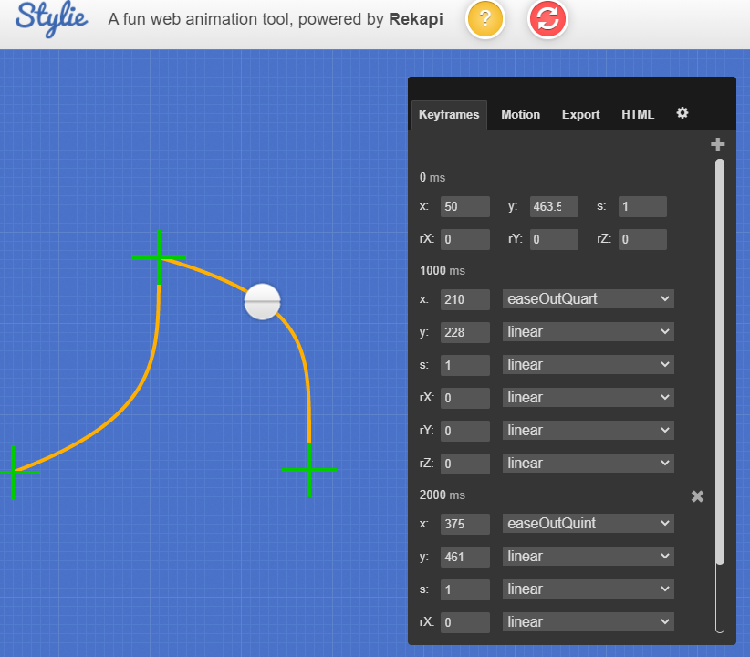
.png)
실습
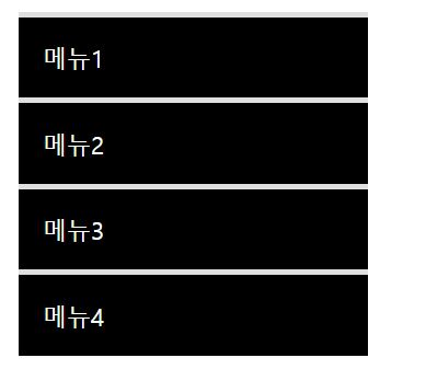
마우스 올리면 배경색 바뀌는 메뉴
<nav class="mouse-animation">
	<ul>
		<li><a href="#">메뉴1</a></li>
		<li><a href="#">메뉴2</a></li>
		<li><a href="#">메뉴3</a></li>
		<li><a href="#">메뉴4</a></li>
	</ul>
</nav>
.mouse-animation li {
width: 250px;
background-color: #000000;
padding: 20px;
border-top: solid 5px #dfdfdf;
}
.mouse-animation li a {
color: #ffffff;
font-size: 20px;
}
1. 마우스 올렸을 때 효과 추가
자연스러운 효과적용을 위해 transition 사용
속도의 성격은 기본값
.mouse-animation li {
	transition: opacity 0.5s, margin-left 0.5s;
}
.mouse-animation li:hover {
    opacity: 0.5;
    margin-left: 10px;
}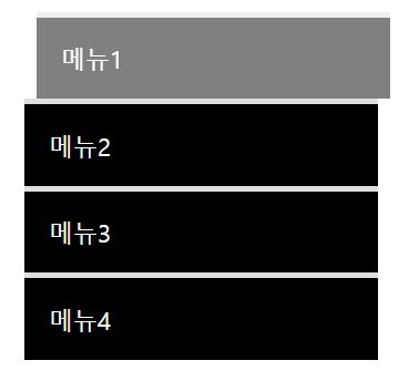
opacity 단점 : 배경뿐만아니라 글자까지도 투명도에 영향을 받음
글자에는 영향을 주지않고 배경색만 바뀌길 원할때 색깔을 rgba로 변경
rgba(0,0,0,1) 앞에 3개숫자가 색상이고 네번째 숫자는 투명도를 말함. 1은 완벽하게 보이는 것, 0은 안보이는 것
.mouse-animation li {
    width: 250px;
    background-color: rgba(0,0,0,1);
}
.mouse-animation li:hover {
	background-color: rgba(0,0,0,0.5);
}
움직일때마다 박스 형태 색상 변화
<div class="move-box"></div>.move-box {
poistion: relative;
width: 200px;
height: 200px;
background-color: red;애니메이션 적용
relative(3차원)일때 top,left 사용가능
색상이 변하는 네모가 원이 되었다가 네모가 되면서 정사각형으로 사이클돔
.mover-box {
    animation-name: moveBox;
	animation-duration: 4s;
	animation-timing-function: linear;
	animation-delay: 1s;
	animation-iteration-count: infinite;
	animation-direction: alternate;
 }
@keyframes moveBox {
	0% {
		background-color: green;
		left: 0;
		top: 0;
	}
	25% {
		background-color: yellow;
		left: 500px;
		top: 0px;
	}
	50% {
		background-color: gray;
		left: 500px;
		top: 500px;
		border-radius: 50%;
	}
	75% {
		background-color: blue;
		left: 0px;
		top: 500px;
	}
	100% {
		background-color: red;
		top: 0;
		left: 0;
	}
}
animation 추가 속성
play-state : running(브라우저에 접속하자마자 동작시키는것) , paused(움직이지않음)
fill mode : backwards
박스의 색깔은 red인데 애니메이션 색상은 green이면 애니메이션이 부자연스러워짐 - 빨간색이였다가 갑자기 초록색으로 이동
박스색깔과 애니메이션 색상이 동일하게 하는게 대부분인데 그게 아닐경우 최초사용자가 접속했을때 green으로 보였으면 할때 backwards 사용
backwards 사용하면 animation 0%에서 입력된 상태를 기준으로 해서 최초화면을 보여주는것
.mover-box {
	animation-play-state: paused;
	animation-fill-mode: backwards;
원형 크기가 바뀌면서 원형 안에 박스의 크기도 변화되는 애니메이션
중앙으로 맞춰주기 위해 flex 사용
justify = x축, align = y축
<div class="outer-border">
    	<div class="inner-border"></div>
</div>
.outer-border {
display: flex;
justify-content: center;
align-items: center;
width: 200px;
height: 200px;
border: solid 15px red;
border-radius: 50%;
}애니메이션 적용
scale(비율) 적용
.outer-border {
animation: outerBorder 2s infinite;
}
@keyframes outerBorder {
	0% { border-color: red; transform: scale(1);}
	25% { border-color: yellow; transform: scale(1.2);}
	50% { border-color: blue; transform: scale(1.3);}
	75% { border-color: green; transform: scale(1.2);}
	100% { border-color: pink; transform: scale(1);}
}
너무 왼쪽이라 중앙으로 이동
margin 0(상하) auto(좌우) 적용시 x축 중앙, 그리고 margin top 사용해서 위쪽 위치만 다시 재설정
.outer-border {
	margin: 0 auto;
    margin-top: 200px
}
안쪽 모양 작업
안쪽에 애니메이션 작업을 안했는데 박스까지 scale이 되고있음
scale은 적용한 영역의 자식요소에게까지 영향을 미침
.inner-border {
    width: 75px;
    height: 75px;
    border: 5px solid purple;
}
회전하면서 border 크기가 달라지는 애니메이션
transform: rotate(0deg): 처음과 끝만 지정해줘도 알아서 부드럽게 움직임
border-width: 테두리 선 굵기 조절 속성
.inner-border {
    animation: innerBorder 2s infinite alternate;
}
@keyframes innerBorder {
    0% { transform: rotate(0deg);}
    25% { border-color: blue; border-width: 10px;}
    50% { border-color: yellow; border-width: 20px;}
    75% { border-color: green; border-width: 40px;}
    100% { transform: rotate(360deg); border-color: gray; border-width: 5px;}
}
border가 원의영역을 벗어남
inner-border 크기를 기준으로 해서 border가 안쪽으로 생성
.inner-border {
    box-sizing: border-box;
}
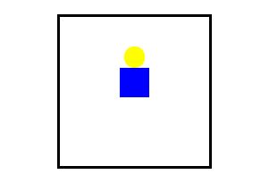
마리오 동전
<div class="mario-container">
	<div class="mario-coin"></div>
	<div class="mario-box"></div>
<div>
모양 만들기
margin 0은 좌 우 위 아래 여백을 주지않겠다는 의미, auto는 가로 중앙에 배치한다는 뜻
.mario-container {
	position: relative;
	width: 500px;
	height: 500px;
	border: solid 10px black;
	margin: 0 auto;
	margin-top: 200px;
}
.mario-container .mario-coin {
	position: relative;
	width: 70px;
	height: 70px;
	background-color: yellow;
	margin: 0 auto;
	margin-top: 100px;
	border-radius: 50%;
}
.mario-container .mario-box {
	position: relative;
	width: 100px;
	height: 100px;
	background-color: blue;
	margin: 0 auto;
}
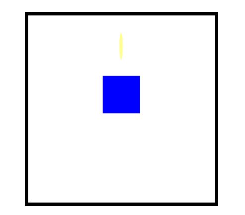
1. 마리오 박스에 애니메이션적용
이름은 jumpBox 움직이는데 시간은 0.5초 속도는 linear(일정한 속도) 무한으로 움직이고 반복효과 적용
.mario-container .mario-box {
animation: jumpBox 0.5s linear infinite alternate;
}
2. keyframe 적용
transform을 사용하여 박스가 y축으로 위아래로 움직이는 효과 만들기
tranform:translate(x,y): x축, y축으로 이동할 때 사용, 둘 중 한 방향으로만 이동할 때는 translateX(), translateY() 사용
@keyframes jumpBox {
	0% {transform: translateY(0px);}
	50% {transform: translateY(-10px);}
	100% {transform: translateY(0px);}
}
3. 동전 점프를 위한 애니메이션 적용
opacity(투명도) 적용
코인이 올라가면 내려올필요가 없기 때문에 마지막 부분도 -100px로 지정
.mario-container .mario-coin {
animation: jumpCoin 0.8s linear infinite;
}

@keyframes jumpCoin {
	0% {transform: translateY(0);
    	opacity: 1;
    	}
	50% {transform: translateY(-100px);
    	opacity: 0;
    	}
	100% {transform: translateY(-100px);
    	opacity: 0;
    	}
}
4. 동전 회전효과
transform안에서 다양한 속성값들을 추가적으로 적용 시킬수 있다.
transform: rotate()는 2차원에서 좌, 우로 움직이는 속성
rotateX(), rotateY()는 X, Y축을 기준으로 회전효과를 적용시킨다.
두개의 속성값을 하나의 transform안에 적용시킴 여기서 주의점은 여러개의 속성값을 적용 시킬때 ,가 아니라 띄워쓰기로 한다.
@keyframes jumpCoin {
	0% {transform: translateY(0);
    	opacity: 1;
    	}
	50% {transform: translateY(-100px) rotateY(180deg);
    	opacity: 0;
    	}
	100% {transform: translateY(-100px) rotateY(360deg);
    	opacity: 0;
    	}
}
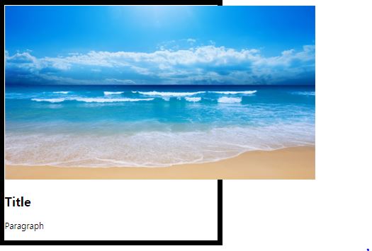
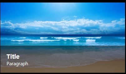
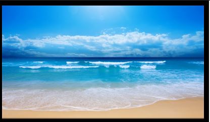
마우스 올리면 이미지가 커지는 사진
<div class="hover-image">
  	<img src="https://img.pngio.com(add).png">
</div>
.hover-image {
width: 400px;
border: solid 10px #000000;
}
1. 크기 맞추기
이미지 감싸고있는 공간보다 이미지가 더큼, 안에들어가게끔 작업
퍼센트를 사용할때 퍼센트를 사용한 지점의 부모가 누구인지에 따라 공간의 크기가 설정된다
hover-image img {
	width: 100%;
}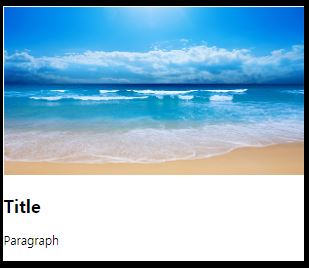
2. 타이틀과 paragrah 설정 및 조절
이미지와 글자사이에 미세한 공백, 공백의 이유는 img태그는 태생적으로 하단에 미세한 공백을 가지고있음 - vertical align middle 적용(공백제거)
vertical align middle은 원래는 인라인 요소의 x축정렬작업을 진행할때 사용하는 속성
img도 inline-block 요소의 성격을 가지고있기 떄문에 단순히 x축정렬로만 사용되는게 아니라 img 태그가 가지고있는 하단의 공백을 제거할떄도 사용됨
.hover-image img {
	vertical-align: middle;
}
.hover-image .image-info {
	background-color: rgba(0, 0, 0, 0.5);
	padding: 20px;
}
.hover-image .image-info h2,
.hover-image .image-info p {
	margin: 0;
	padding: 0;
	color: #ffffff;
}
.hover-image .image-info h2 {
	font-size: 20px;
}
.hover-image .image-info p {
	font-size: 15px;
}
absolute 적용
자식에게 absolute를 적용하면 3차원이 되서 2차원 부모는 인식하지 못한다.
.hover-image .image-info {
position: absolute;
}
이미지의 크기를 좀더 자세하게 잡기위해서 box sizing 사용 - 패딩을 포함한 공간이 width안쪽으로 형성이 되도록
.hover-image .image-info {
	box-sizing: border-box;
	width: 100%;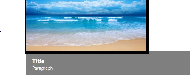
box-sizing 정리
CSS에서 width와 height를 계산하는 방법은 꽤 독특합니다. width: 200px 이고 height: 100px, padding: 20px, border: 5px solid black
결론부터 이야기하자면 기본적으로는 오른쪽 처럼 그려지게 됩니다.
width를 200px로 설정했다고 할지라도 전체 너비가 200px이 되는 것이 아닌, 여기에 padding과 border-width가 더해져서 그려지게 됩니다.
이런 계산 방법을 content-box(기본값)
위 예시에서 왼쪽처럼 요소를 렌더링하고 싶다면 box-sizing 속성을 border-box로 주면 됩니다.
부모에게 relative(3차원)를 적용
자식의 width 100% 값이 화면전체가 아니라 부모의 전체로 바뀌는 걸 알 수 있다.
부모가 3차원 성격을 가지고 있다면 자식에게 3차원을 적용했을 때 width값의 크기를 부모를 기준으로 설정시킬 수 있다.

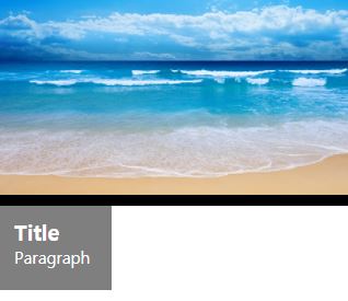
타이틀,내용을 이미지 안쪽으로 넣기
부모가 relative(3차원)일때 자식이 absolute(3차원)이면 left,bottom을 사용하면 좌표기준점은 부모를 기준으로 형성된다.
부모 공간안에서 left 0 bottom 0이 적용된것
.hover-image .image-info {
	left: 0;
	bottom: 0;
}
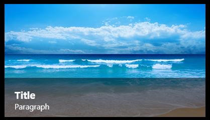
마우스 올렸을 때 이미지 크기가 커지도록 설정
scale 사용해서 1대 3비율로 커지게하기
transform만 쓰니 애니메이션이 부자연스러워서 transition 사용해서 transform에 0.3초 속도는 linear 적용
그런데 hover-image 영역을 벗어나서 커지게됨 - overhidden 적용으로 벗어나는건 모두 안보이게함
그림에 마우스를 올렸을때 마우스아이콘 변경(이벤트가 발생한다라는 의미를 알려주기위해)
.hover-image:hover img {
	transform: scale(1.3);
}
.hover-image img {
	transition: transform 0.3s linear;
}
.hover-image {
	cursor: pointer;
	overflow: hidden;
}
마우스 커서 올릴시 하단의 이미지정보가 아래쪽에서 위쪽으로 올라오면서 출현기능
1. 페이지소스로 이미지정보높이를 찾기(85px)
2. 이미지정보 최초위치를 -85px 밑으로 해놓기 - 안보임
이유는 hover-image영역을 벗어나서(overflow-hidden처리를해서)
3. 커서를 가져갔을때 이미지 위치를 bottom 0으로 이동하게 설정
4. 자연스러운 애니메이션을 위해 transition 적용
.hover-image .image-info {
	bottom: -85px;
	transition: bottom 0.3s linear;
.hover-image:hover .image-info {
	bottom: 0;
}
2. 어려웠던 내용
css 애니메이션 속성 재밌기도 했지만 부모로 물려받는 부분에서 살짝 헷갈렸다.
3. 해결방법
선생님께서 알려주신 유용한 사이트를 계속 하다보니 익숙함에 저절로 이해가 되었다.
4. 소감
일단 웹사이트로 애니메이션을 만들었다는게 굉장히 보람차고 생각보다 어렵지 않은 방법으로 애니메이션을 만들 수 있어서 자신감이 돋는 시간이였다.

매우 긍정적인 개발자