1. lmplot
tips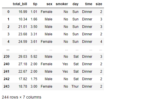
total_bill 과 tip 사이의 관계를 파악해보자
참고로 둘 다 float data이기 때문에 lmplot 그리기에 문제 없다
sns.set_style("darkgrid")
sns.lmplot(x="total_bill", y="tip", data=tips, height=7) # size => height
plt.show()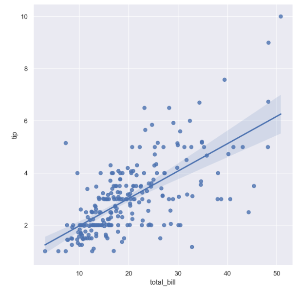
특히 total_bill 이 10 ~ 20 일 때 data들 간의 상관관계가 좀 더 강한 모습을 보인다.
- 이제는 hue option 사용하여 smoker을 구분지어보자
sns.set_style("darkgrid")
sns.lmplot(x="total_bill", y="tip", data=tips, height=7, hue="smoker")
plt.show()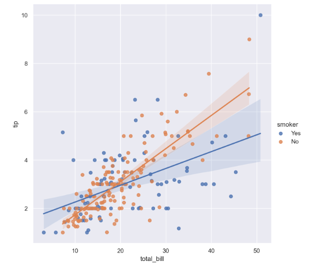
흡연자의 경우보다, 비흡연자의 경우 total_bill 과 tip 사이의 더 큰 양의 상관관계를 가진다.
anscombe = sns.load_dataset("anscombe")
anscombe.tail()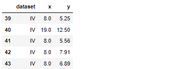
- 'dataset'
anscombe["dataset"].unique()
총 44개의 데이터, 그리고 x,y data는 float형, dataset은 category형 자료인 것 같음
- dataset == 'I' 인 data만 가져와보자
sns.set_style("darkgrid")
sns.lmplot(x="x", y="y", data=anscombe.query("dataset == 'I'"), ci=None, height=7)
plt.show()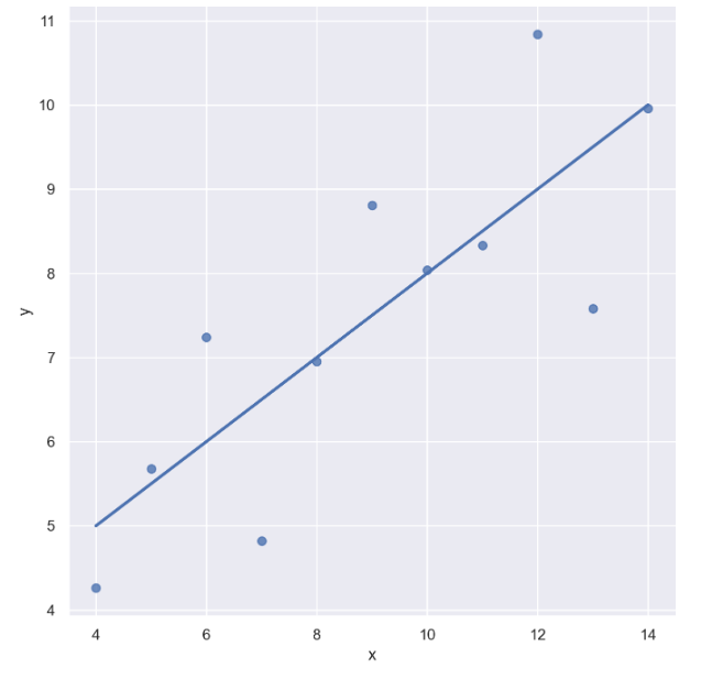
- 마커 사이즈 변경 : scatter_kws={"s": })
sns.set_style("darkgrid")
sns.lmplot(x="x", y="y", data=anscombe.query("dataset == 'I'"), ci=None, height=7, scatter_kws={"s": 150}) 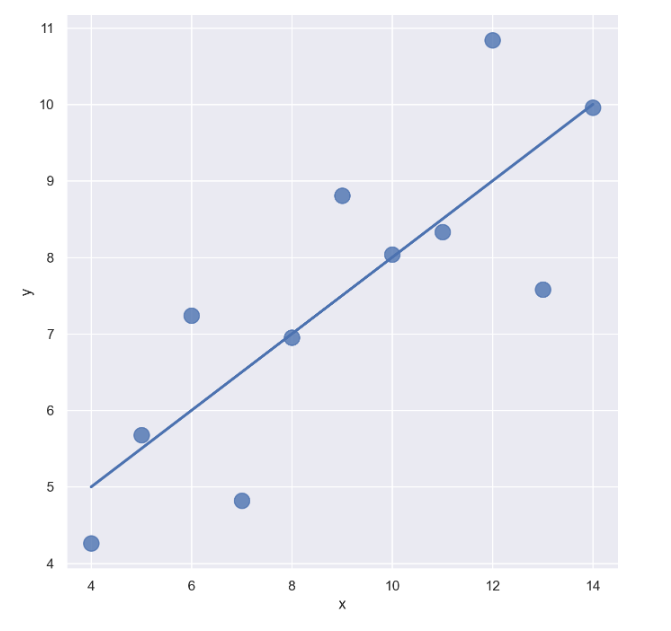
- dataset == 'II'인 data만 가져오자
sns.set_style("darkgrid")
sns.lmplot(
    x="x",
    y="y",
    data=anscombe.query("dataset == 'II'"),
    order=1, # 차수에 따라 옵션 변경
    ci=None,
    height=7,
    scatter_kws={"s": 80}) # ci 신뢰구간 선택
plt.show()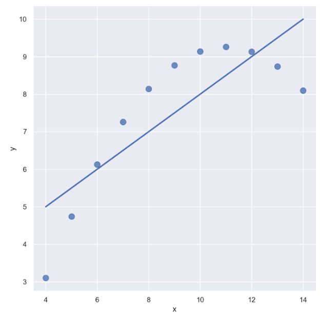
sns.set_style("darkgrid")
sns.lmplot(
    x="x",
    y="y",
    data=anscombe.query("dataset == 'II'"),
    order=2, # 차수에 따라 옵션 변경
    ci=None,
    height=7,
    scatter_kws={"s": 80}) # ci 신뢰구간 선택
plt.show()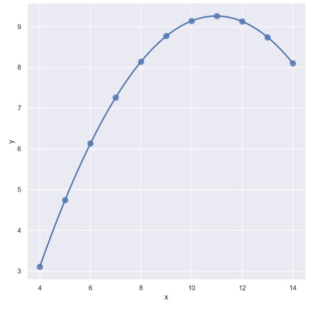
- dataset == 'III'인 data만 가져오자
sns.set_style("darkgrid")
sns.lmplot(
    x="x",
    y="y",
    data=anscombe.query("dataset == 'III'"), # 아웃라이어 있는 데이터
    ci=None,
    height=7,
    scatter_kws={"s": 80}) # ci 신뢰구간 선택
plt.show()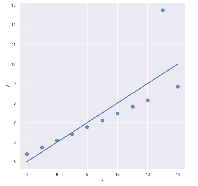
- outlier는 제외하고 lmplot을 그리고 싶을 때 : robust=True
sns.set_style("darkgrid")
sns.lmplot(
    x="x",
    y="y",
    data=anscombe.query("dataset == 'III'"),
    robust=True, # 원본에서 많이 떨어진 데이터는 없는 셈 친다
    ci=None,
    height=7,
    scatter_kws={"s": 80}) # ci 신뢰구간 선택
plt.show()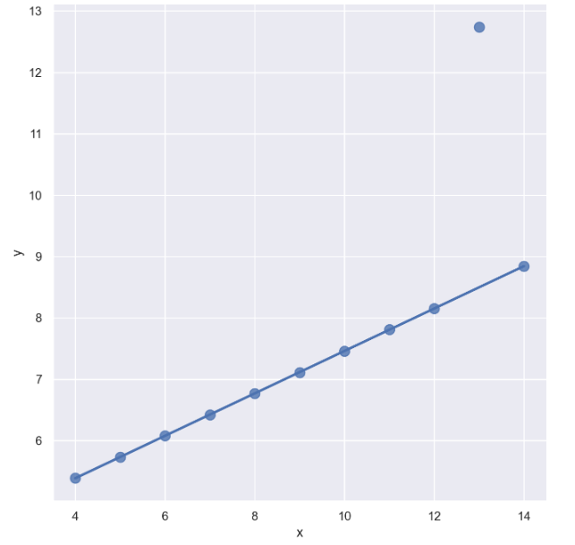
outlier을 제외하니 좀 더 fit하게 바뀜
2. heatmap
flights = sns.load_dataset("flights")
flights.head()
이 때 "month" data는 category 자료이다
flights.info()
heatmap을 그리기 전 pivot table을 먼저 생성
flights = flights.pivot(index="month", columns="year", values="passengers")
flights.head()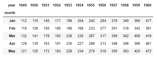
annot= True 옵션을 이용하여 데이터 수치를 나타내자 (정수형으로)
plt.figure(figsize=(10, 8))
sns.heatmap(data=flights, annot=True, fmt="d")
plt.show()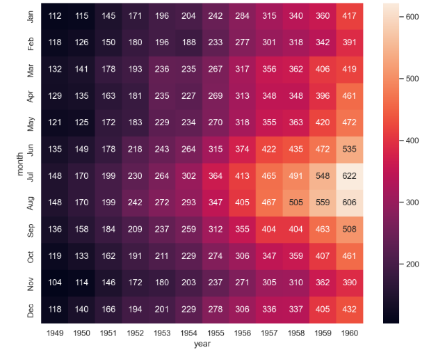
- color을 바꾸고 싶다면
plt.figure(figsize=(10, 8))
sns.heatmap(flights, annot=True, fmt="d", cmap="YlGnBu")
plt.show()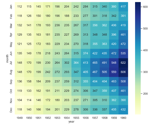
- 연도가 증가할 수록 전체 승객의 수는 증가하는 경향을 보임
- 또한 연도별로 여름에 승객 수가 많은 경향을 보임
--> 이런 식으로 데이터의 흐름을 시각적으로 파악 가능
3. pairplot
- 다수의 컬럼을 한 번에 비교할 수 있음
iris = sns.load_dataset("iris")
iris.tail()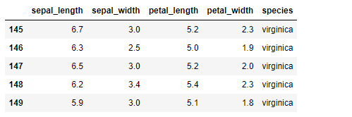
sns.set_style("ticks")
sns.pairplot(iris)
plt.show()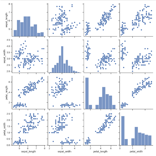
- sepal_length 와 petal_width 는 양의 상관관계가 있어 보임
- sepal_length 와 petal_length 또한 양의 상관관계가 있어 보임
--> 일단 좀 더 자세히 살펴보자 !
iris.head(2)- species( ) data
iris["species"].unique()
sns.pairplot(iris, hue="species")
plt.show()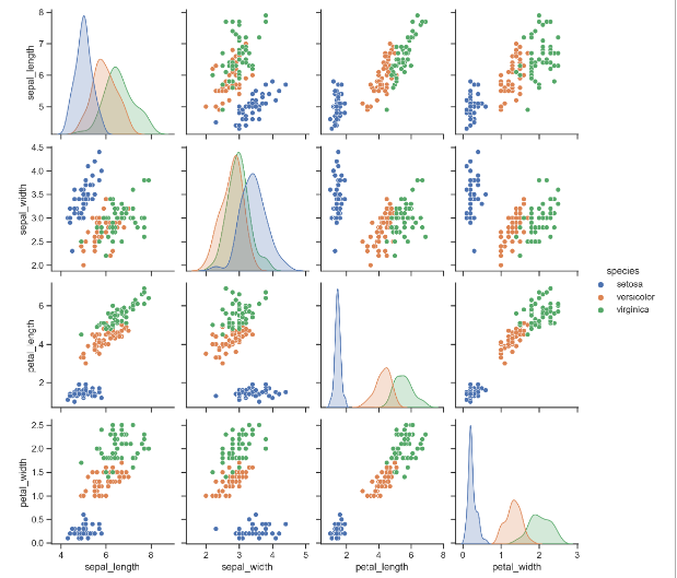
전체 데이터 말고 원하는 특정 컬럼들만 pairplot으로 그려보자
sns.pairplot(iris,
             x_vars=["sepal_width", "sepal_length"],
             y_vars=["petal_width", "petal_length"])
plt.show()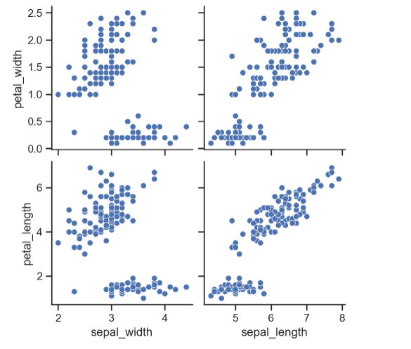
sepal_width는 petal_width, peatl_length와 음의 상관관계를,
그리고 sepal length는 petal_width, petal_length와 양의 상관관계를 보이는 것 같다.
- 다시 한 번 species data
sns.pairplot(iris,
             x_vars=["sepal_width", "sepal_length"],
             y_vars=["petal_width", "petal_length"],
            hue = "species")
plt.show()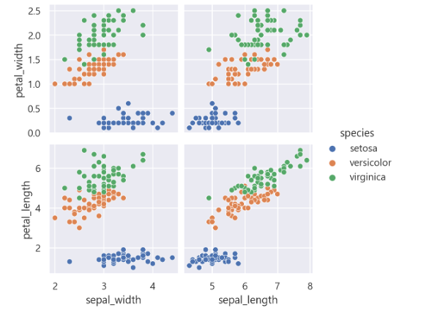
species 종류별로 확연히 그룹이 나뉘는 모습

데이터 관련 학습 일지