단계 1 of 24
justify-content: flex-end; 속성을 이용하여 해당 문제를 해결하였습니다.
justify-content
- flex-start: 요소들을 컨테이너의 왼쪽으로 정렬합니다.
- flex-end: 요소들을 컨테이너의 오른쪽으로 정렬합니다.
- center: 요소들을 컨테이너의 가운데로 정렬합니다.
- space-between: 요소들 사이에 동일한 간격을 둡니다.
- space-around: 요소들 주위에 동일한 간격을 둡니다.
#pond {
 display: flex;
 justify-content: flex-end;
}
단계 2 of 24
justify-content: center;를 이용하여 문제를 해결하였습니다.
justify-content
- flex-start: 요소들을 컨테이너의 왼쪽으로 정렬합니다.
- flex-end: 요소들을 컨테이너의 오른쪽으로 정렬합니다.
- center: 요소들을 컨테이너의 가운데로 정렬합니다.
- space-between: 요소들 사이에 동일한 간격을 둡니다.
- space-around: 요소들 주위에 동일한 간격을 둡니다.
#pond {
	display: flex;
    justify-content: center;
}
단계 3 of 24
justify-content: space-around;를 이용하여 문제를 해결하였습니다.
#pond {
	display: flex;
    justify-content: space-around;
}
단계 4 of 24
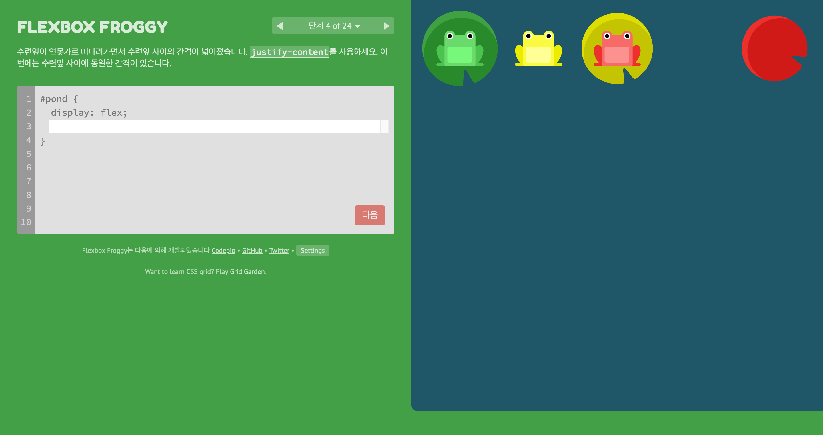
justify-content: space-between;를 이용하여 문제를 해결하였습니다.
#pond {
	display: flex;
    justify-content: space-between;
}
단계 5 of 24
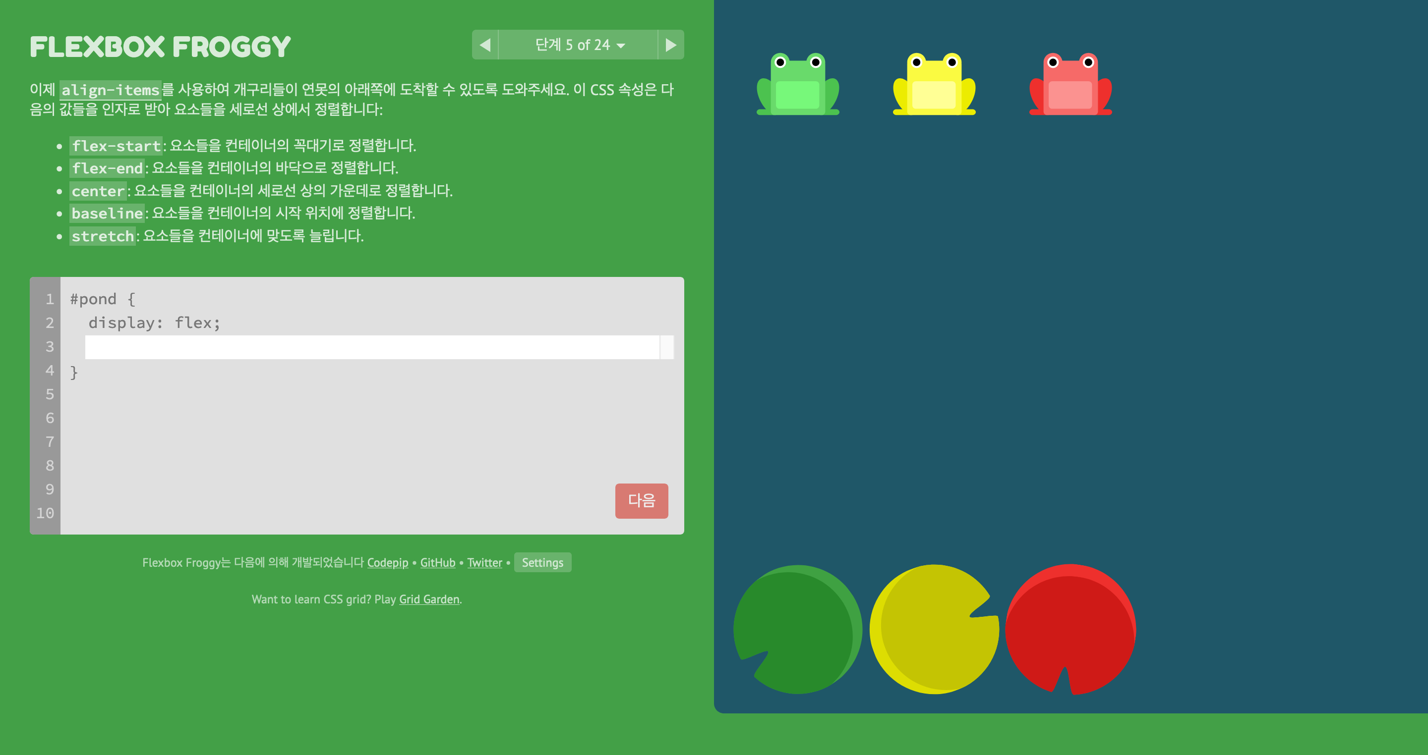
align-items: flex-end;를 이용하여 문제를 해결하였습니다.
align-items
- flex-start: 요소들을 컨테이너의 꼭대기로 정렬합니다.
- flex-end: 요소들을 컨테이너의 바닥으로 정렬합니다.
- center: 요소들을 컨테이너의 세로선 상의 가운데로 정렬합니다.
- baseline: 요소들을 컨테이너의 시작 위치에 정렬합니다.
- stretch: 요소들을 컨테이너에 맞도록 늘립니다.
#pond {
	display: flex;
    align-items: flex-end;
}
단계 6 of 24
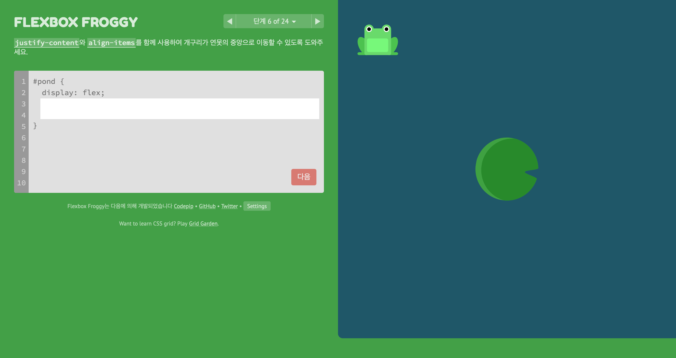
justify-content: center;와 align-items: center;를 이용하여 문제를 해결하였습니다.
#pond {
	display: flex;
    justify-content: center;
    align-items: center;
}
단계 7 of 24
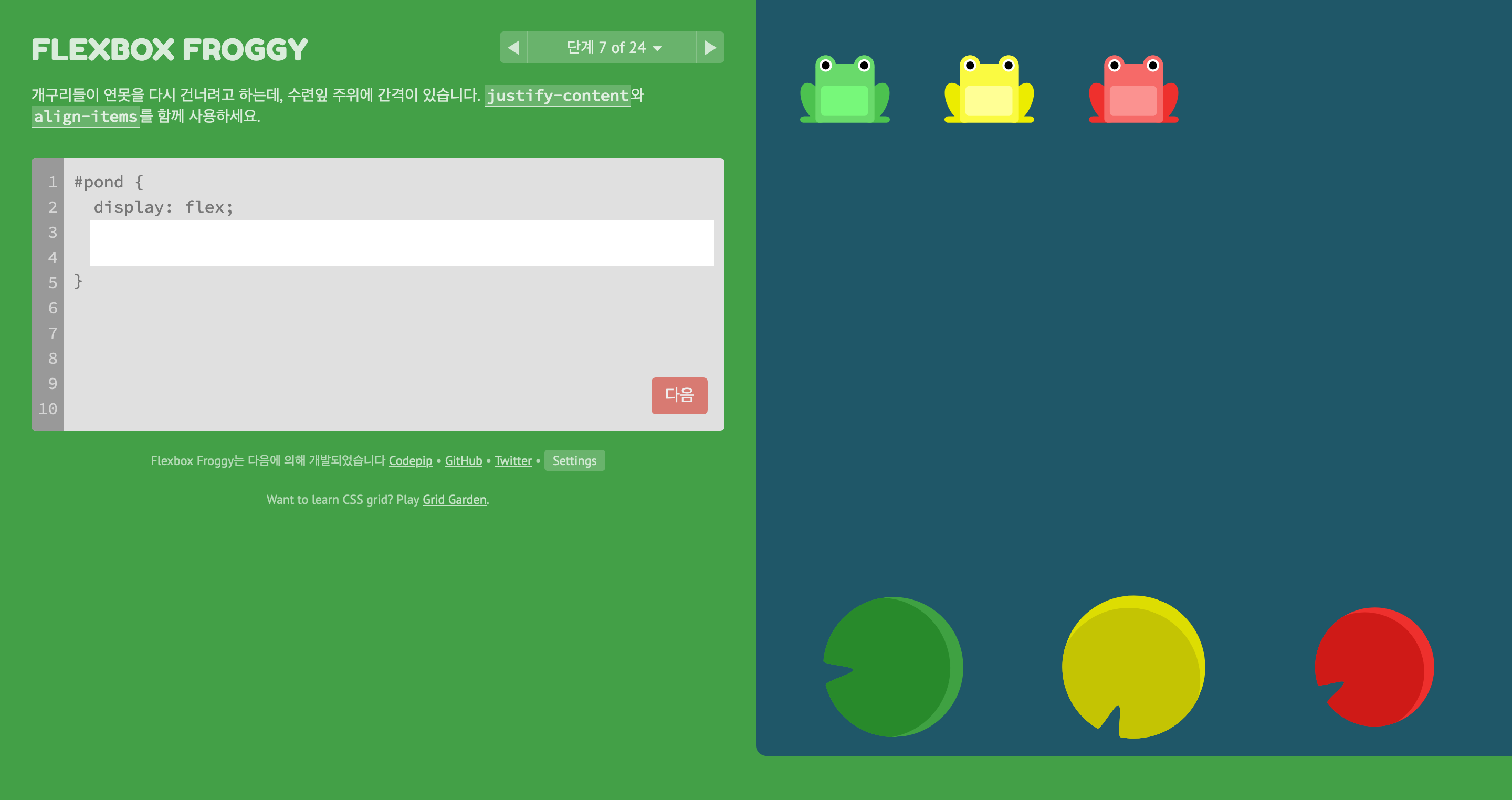
justify-content: space-around;와 align-items: flex-end를 이용하여 문제를 해결하였습니다.
#pond {
	display: flex;
    justify-content: space-around;
    align-items: flex-end;
}
단계 8 of 24
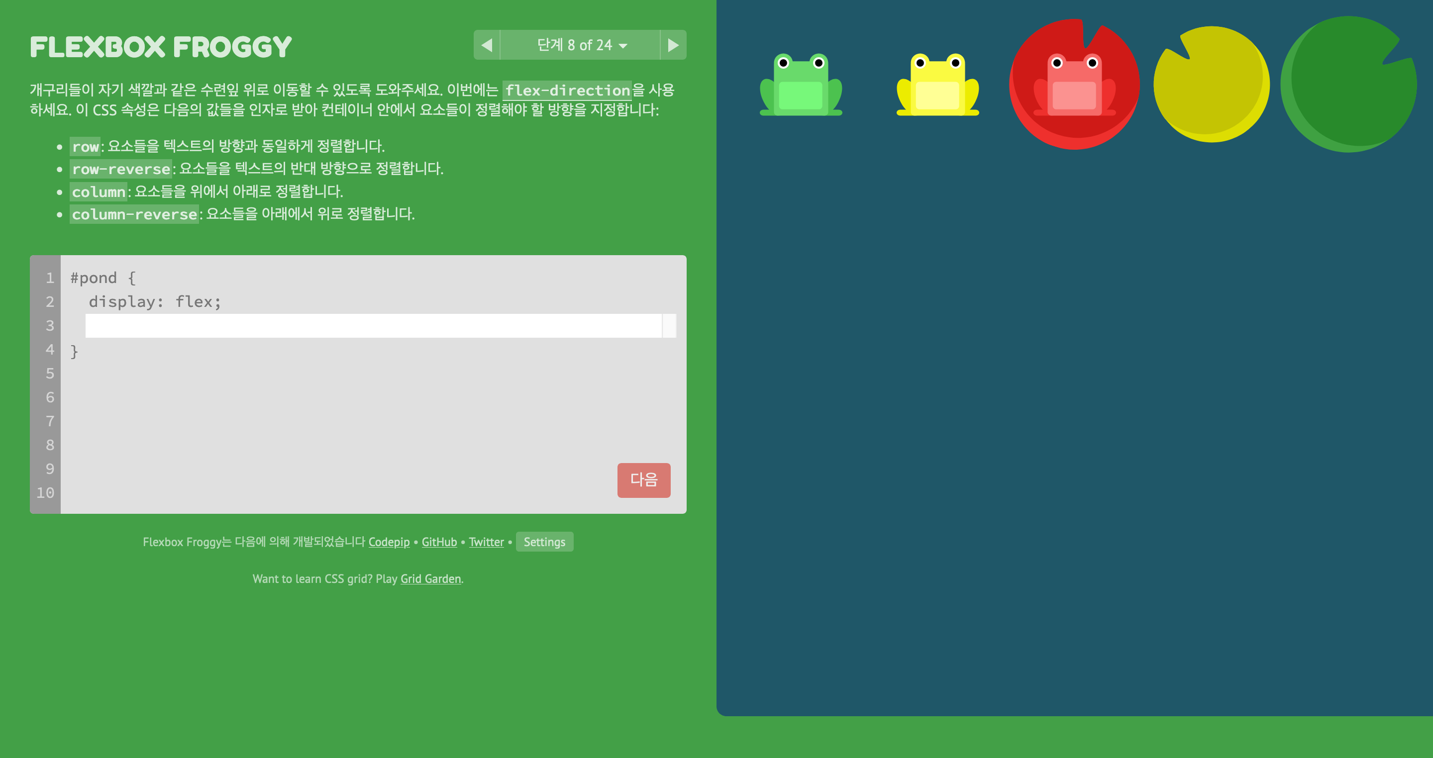
flex-direction: row-reverse를 이용하여 문제를 해결하였습니다.
flex-direction
- row: 요소들을 텍스트의 방향과 동일하게 정렬합니다.
- row-reverse: 요소들을 텍스트의 반대 방향으로 정렬합니다.
- column: 요소들을 위에서 아래로 정렬합니다.
- column-reverse: 요소들을 아래에서 위로 정렬합니다.
#pond {
	display: flex;
    flex-direction: row-reverse;
}
단계 9 of 24
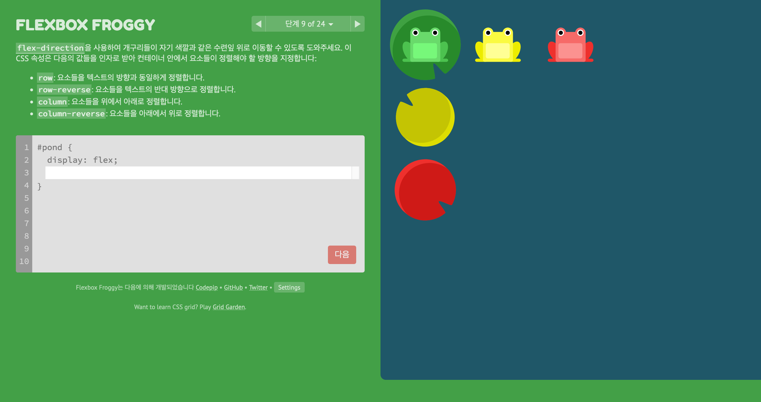
flex-direction: column;을 이용하여 문제를 해결하였습니다.
flex-direction
- row: 요소들을 텍스트의 방향과 동일하게 정렬합니다.
- row-reverse: 요소들을 텍스트의 반대 방향으로 정렬합니다.
- column: 요소들을 위에서 아래로 정렬합니다.
- column-reverse: 요소들을 아래에서 위로 정렬합니다.
#pond {
	display: flex;
    flex-direction: column;
}
단계 10 of 24
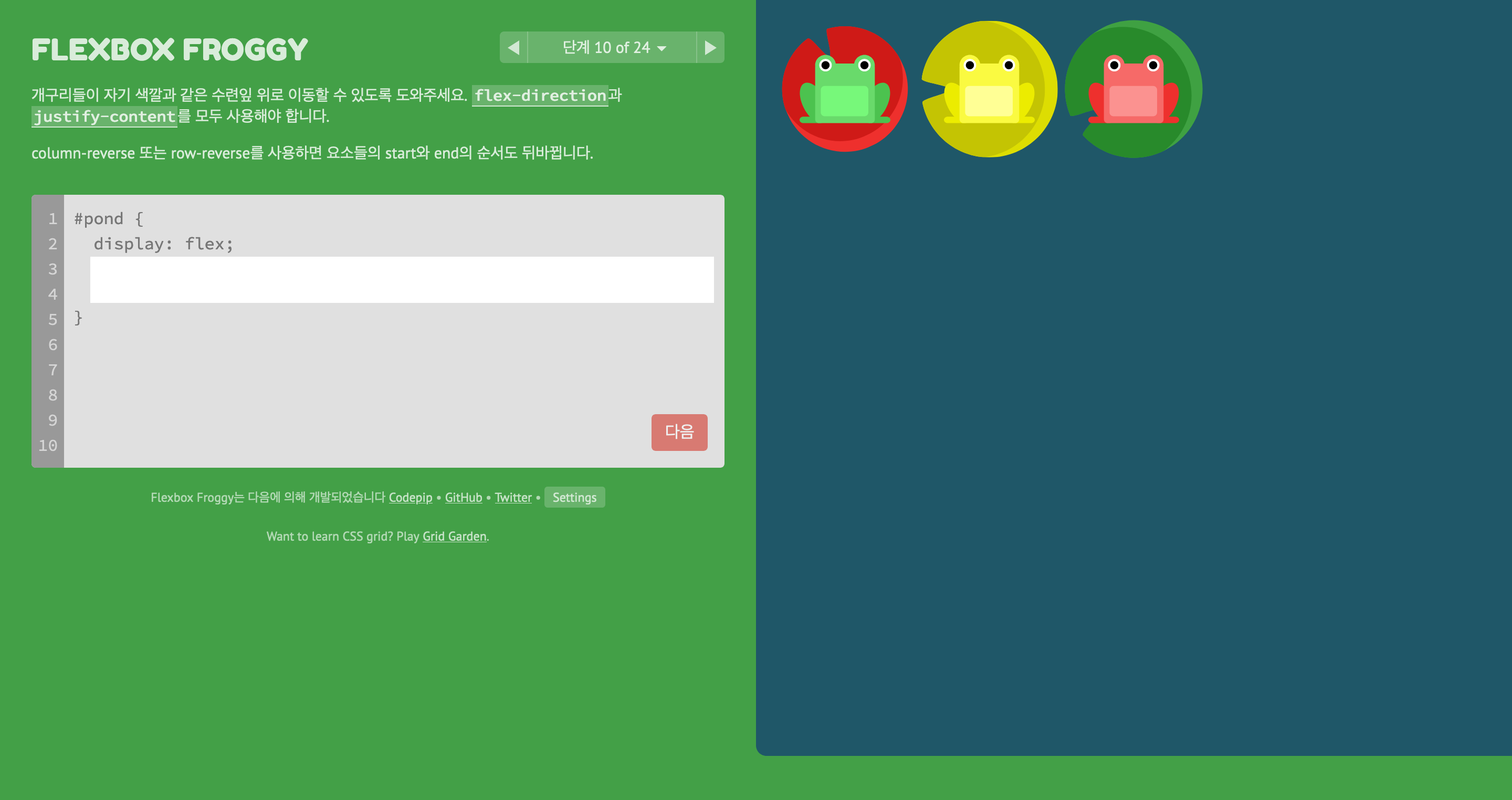
flex-direction: row-reverse;와 justify-content: flex-end;를 이용하여 문제를 해결하였습니다.
#pond {
	display: flex;
    flex-direction: row-reverse;
    justify-content: flex-end;
}
단계 11 of 24
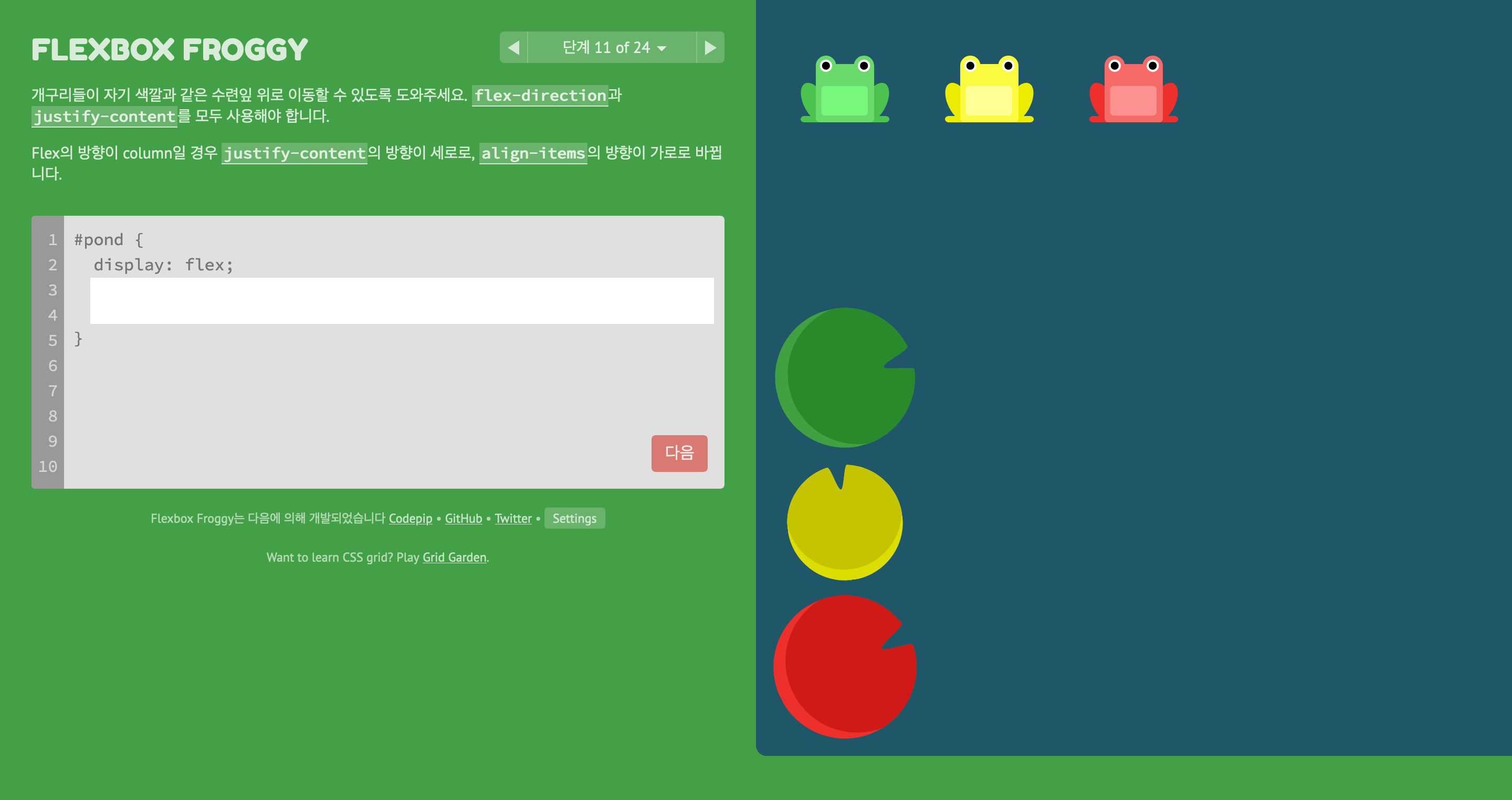
flex-direction: column;와 justify-content: flex-end;를 이용하여 문제를 해결하였습니다.
#pond {
	display: flex;
    flex-direction: column;
    justify-content: flex-end;
}
단계 12 of 24
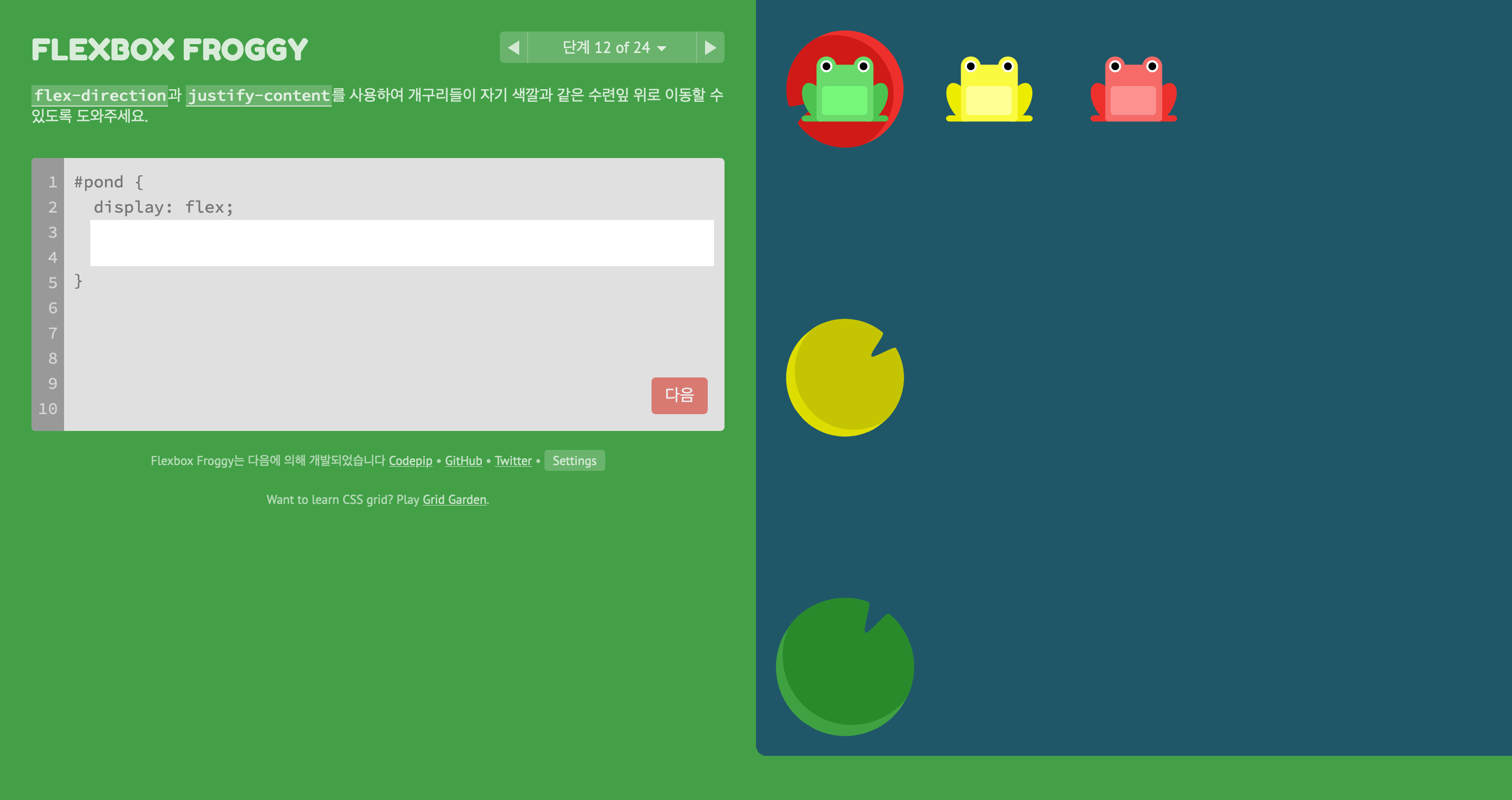
flex-direction: column-reverse;와 justify-content: space-between;을 이용하여 문제를 해결하였습니다.
#pond {
	display: flex;
    flex-direction: column-reverse;
    justify-content: space-between;
}
단계 13 of 24
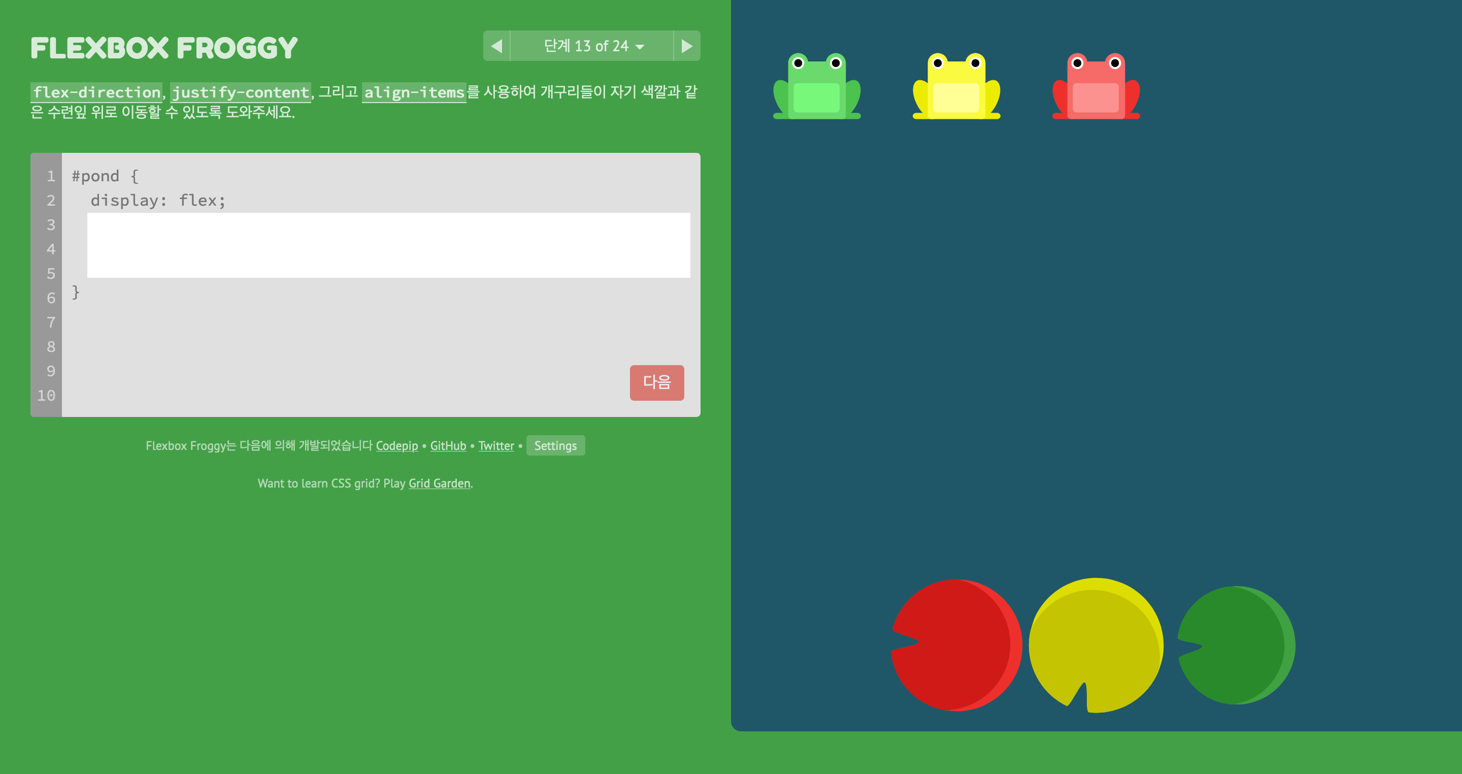
justify-content: center;, align-items: flex-end, flex-direction: row-reverse;를 이용하여 문제를 해결하였습니다.
#pond {
	display: flex;
    justify-content: center;
    align-items: flex-end;
    flex-direction: row-reverse;
}
단계 14 of 24
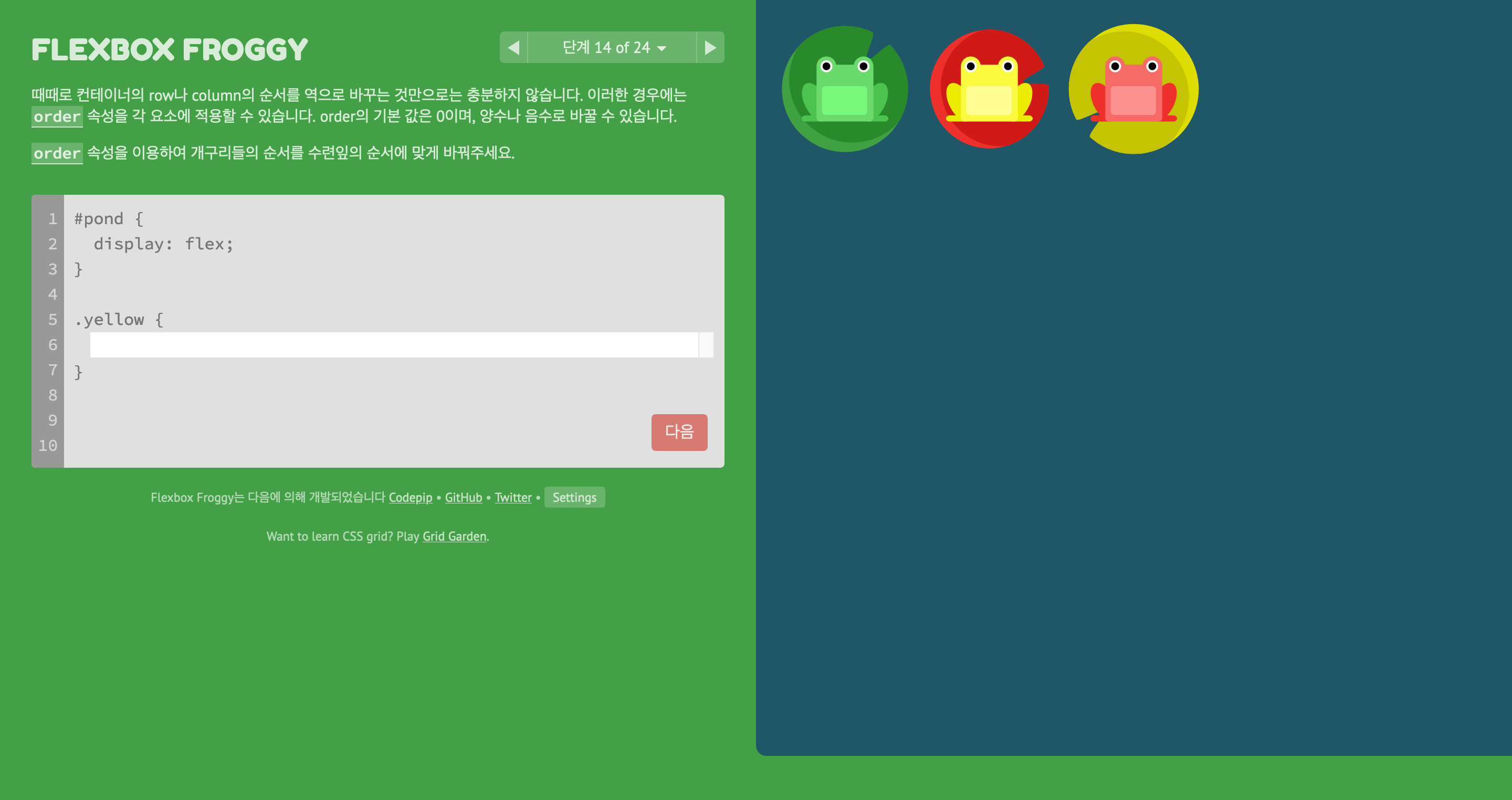
order: 3;을 이용하여 문제를 해결하였습니다.
#pond {
	display: flex;
}

.yellow {
	order: 3;
}
단계 15 of 24
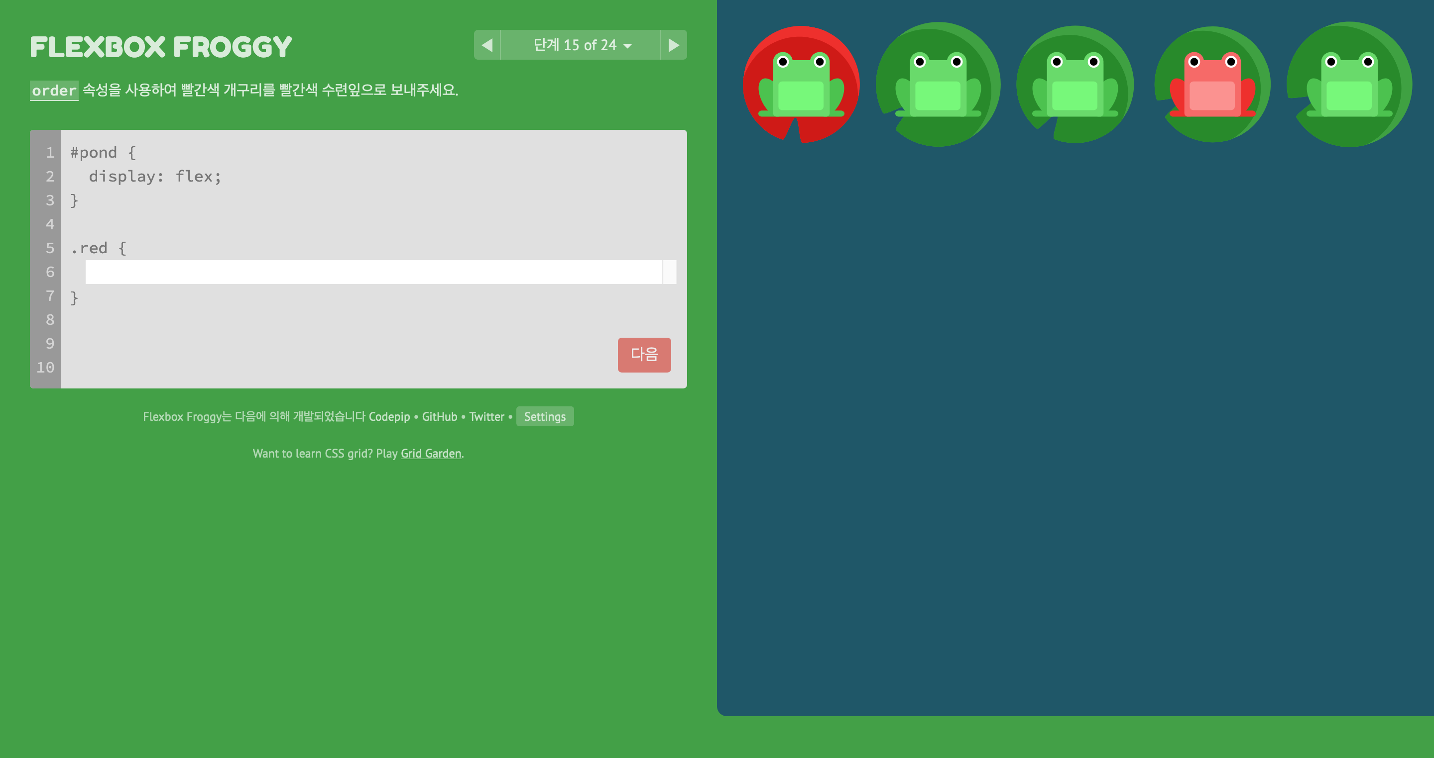
order: -1을 이용하여 문제를 해결하였습니다.
#pond {
	display: flex;
}

.red {
	order: -1;
}
단계 16 of 24
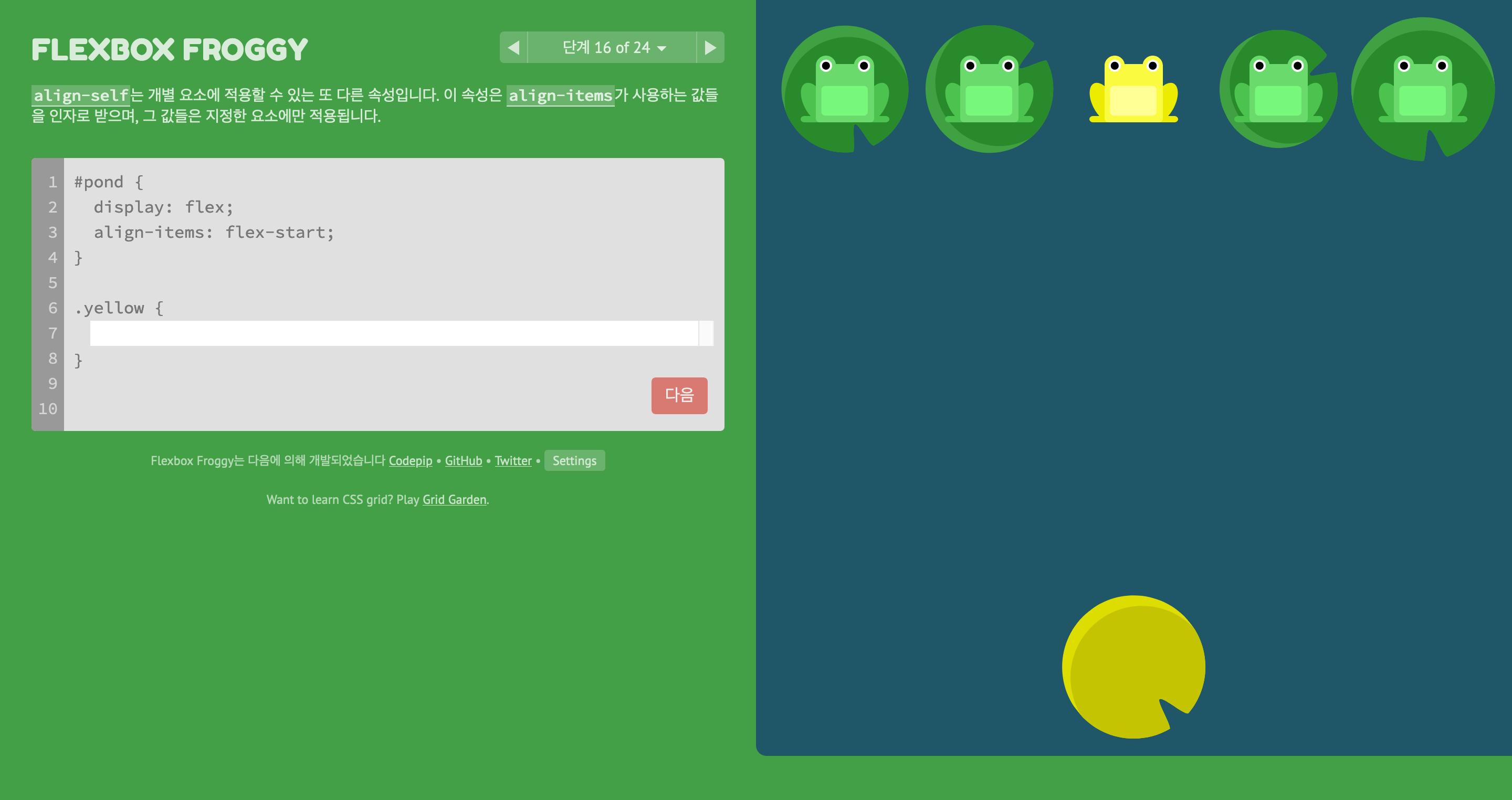
align-self: flex-end;를 이용하여 문제를 해결하였습니다.
#pond {
	display: flex;
    align-items: flex-start;
}

.yellow {
	align-self: flex-end;
}
단계 17 of 24
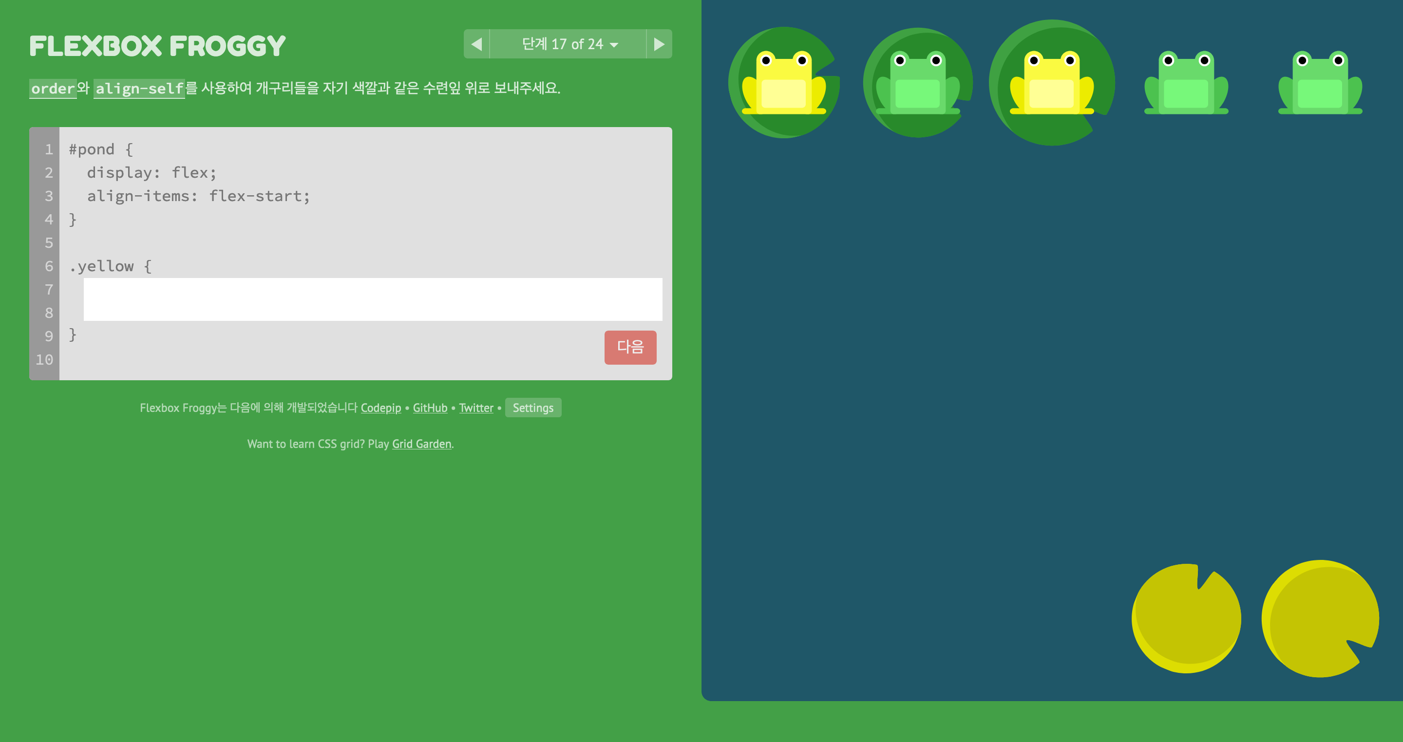
order: 1;, align-self: flex-end;를 이용하여 문제를 해결하였습니다.
#pond {
	display: flex;
    align-items: flex-start;
}

.yellow {
	order: 1;
    align-self: flex-end;
}
단계 18 of 24
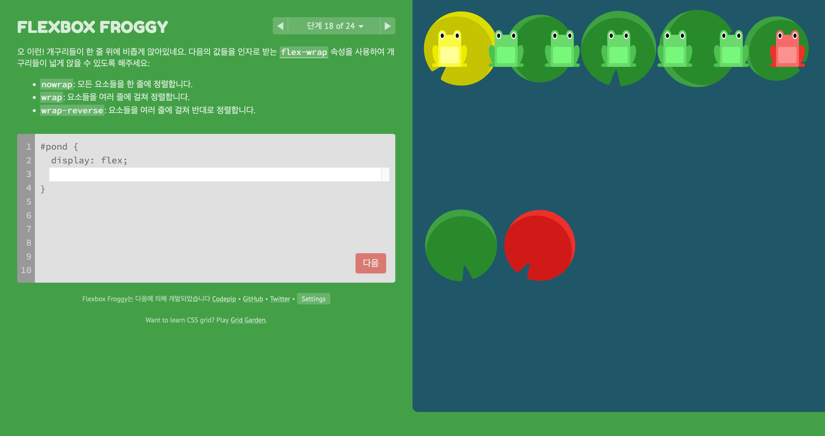
flex-wrap: wrap;를 이용하여 문제를 해결하였습니다.
flex-wrap
- nowrap: 모든 요소들을 한 줄에 정렬합니다.
- wrap: 요소들을 여러 줄에 걸쳐 정렬합니다.
- wrap-reverse: 요소들을 여러 줄에 걸쳐 반대로 정렬합니다.
#pond {
	display: flex;
    flex-wrap: wrap;
}
단계 19 of 24
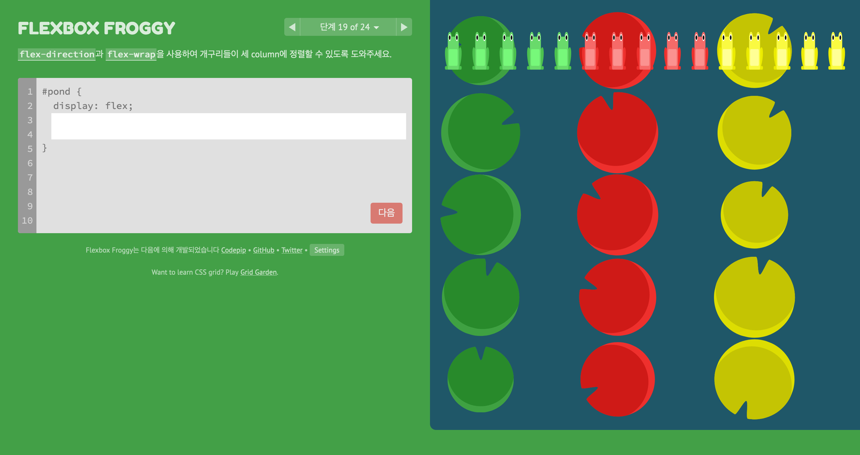
flex-direction: column;, flex-wrap: wrap;을 이용하여 문제를 해결하였습니다.
#pond {
	display: flex;
    flex-direction: column;
    flex-wrap: wrap;
}
단계 20 of 24
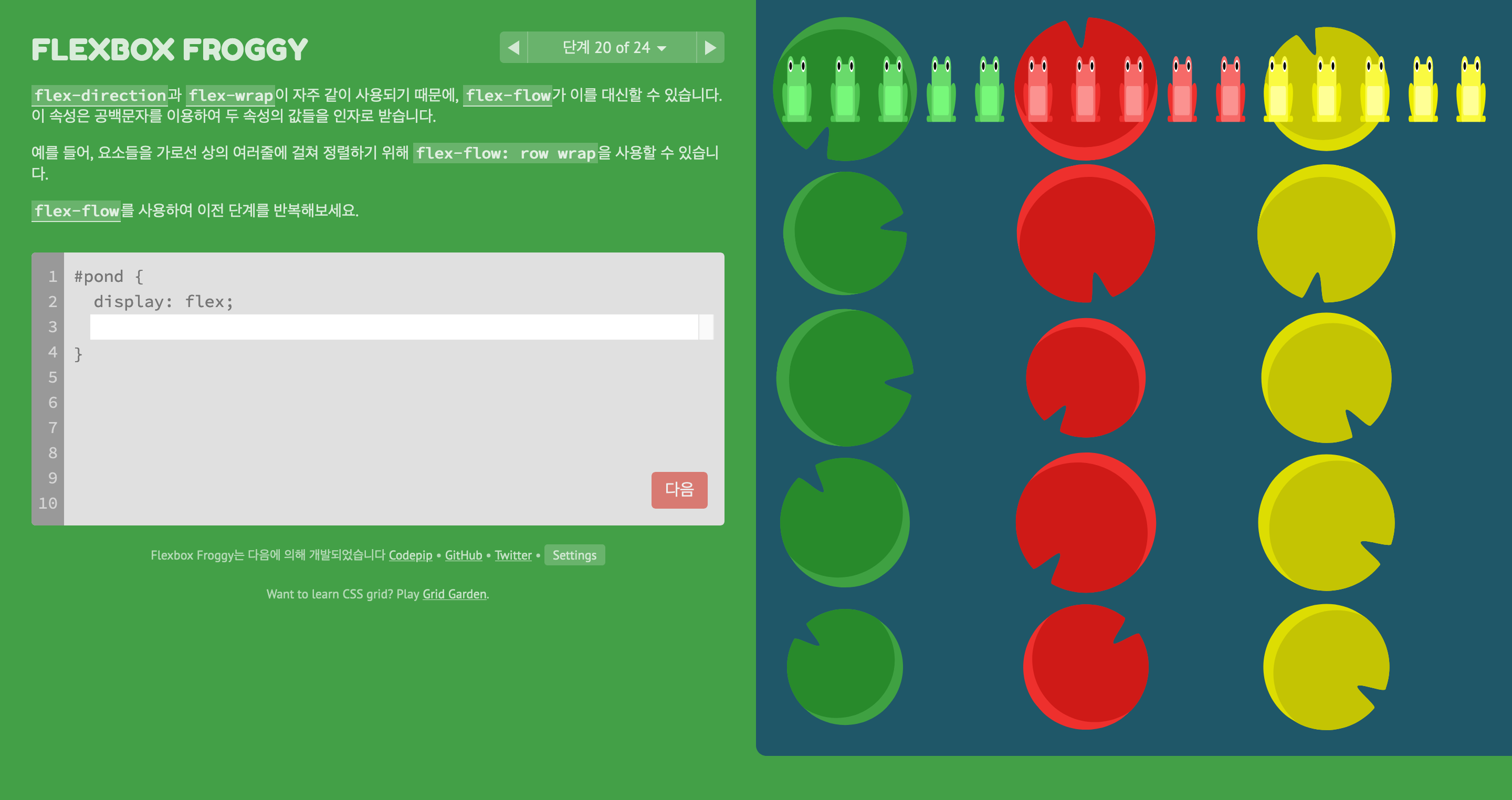
flex-flow: column wrap;를 이용하여 문제를 해결하였습니다.
flex-flow
- Shorthand property for
<flex-direction>and<flex-wrap>.
flex-flow: column wrap;단계 21 of 24
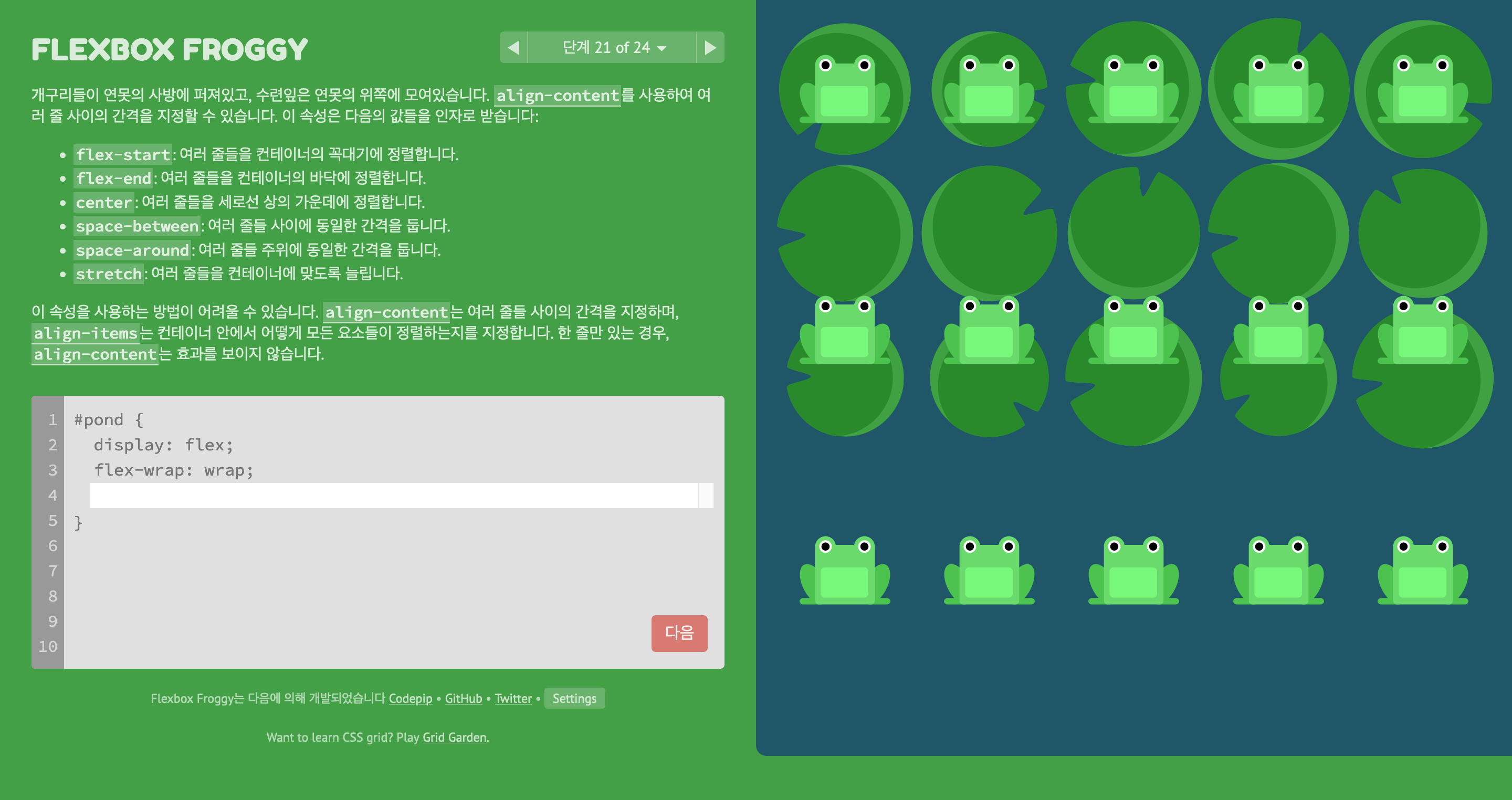
align-content: flex-start;를 이용하여 문제를 해결하였습니다.
align-content
- flex-start: 여러 줄들을 컨테이너의 꼭대기에 정렬합니다.
- flex-end: 여러 줄들을 컨테이너의 바닥에 정렬합니다.
- center: 여러 줄들을 세로선 상의 가운데에 정렬합니다.
- space-between: 여러 줄들 사이에 동일한 간격을 둡니다.
- space-around: 여러 줄들 주위에 동일한 간격을 둡니다.
- stretch: 여러 줄들을 컨테이너에 맞도록 늘립니다.
#pond {
	display: flex;
    flex-wrap: wrap;
    align-content: flex-start;
}
단계 22 of 24
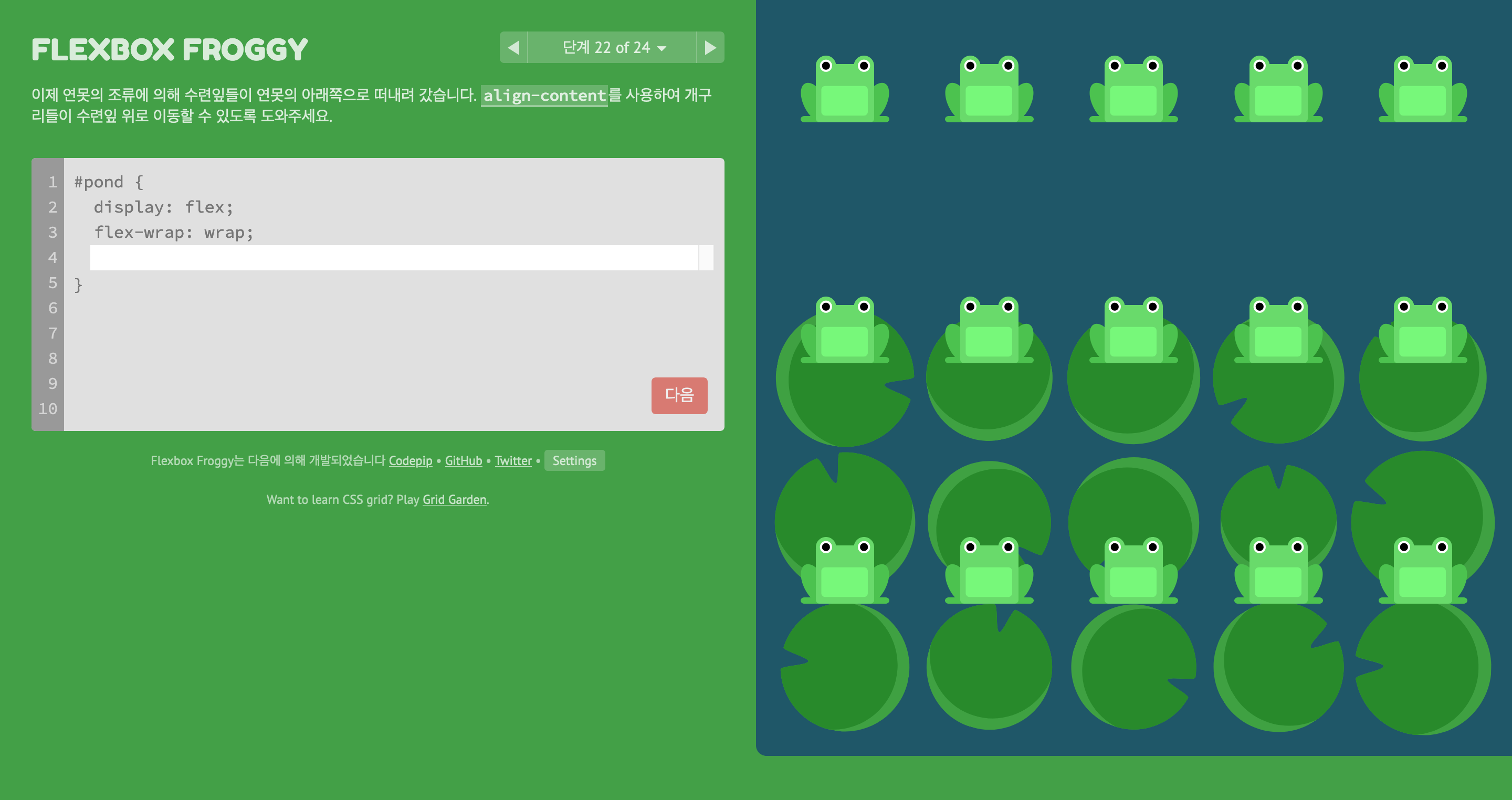
align-content: flex-end;를 이용하여 문제를 해결하였습니다.
#pond {
	display: flex;
    flex-wrap: wrap;
    align-content: flex-end;
}
단계 23 of 24
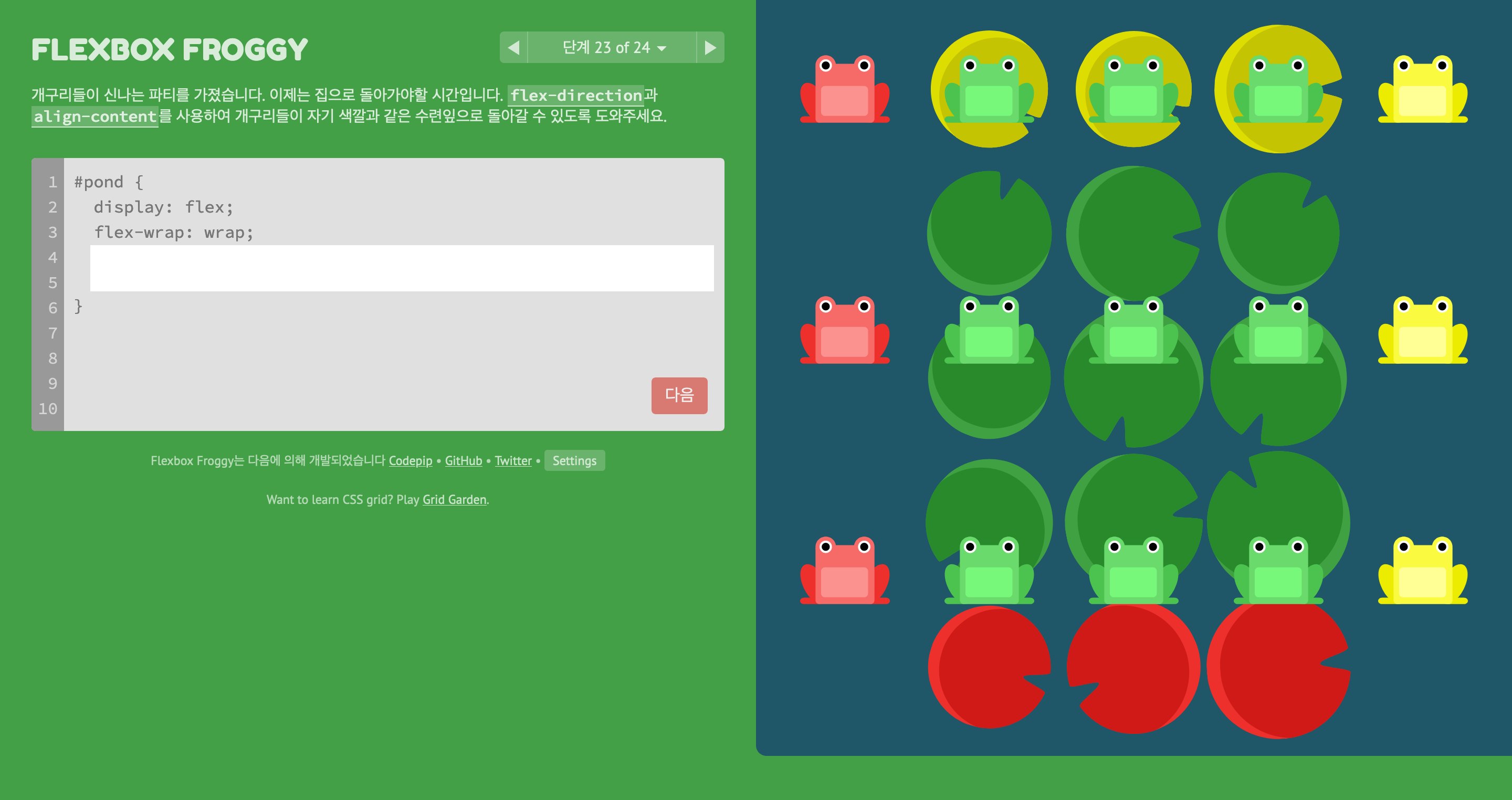
flex-direction: column-reverse, align-content: center;를 이용하여 문제를 해결하였습니다.
#pond {
	display: flex;
    flex-wrap: wrap;
    flex-direction: column-reverse;
    align-content: center;
}
단계 24 of 24
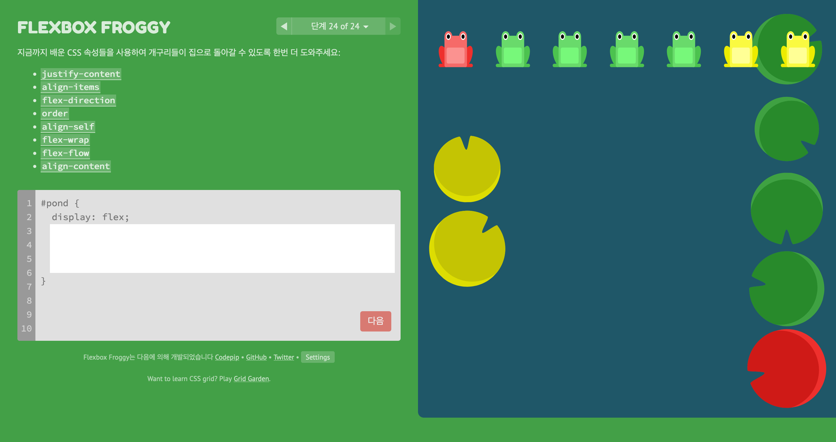
flex-flow: column-reverse wrap-reverse;, justify-content: center;, align-content: space-between;, align-self: center;를 이용하여 문제를 해결하였습니다.
#pond {
	display: flex;
    flex-flow: column-reverse wrap-reverse;
    justify-content: center;
    align-content: space-between;
    align-self: center;
}
정리
justify-content: Aligns flex items along the main axis.
- flex-start (default)
- flex-end
- center
- space-between
- space-around
- space-evenly
align-items: Aligns flex items along the cross axis.
- flex-start
- flex-end
- center
- baseline
- stretch (default)
flex-direction: Defines the direction of the main axis.
- row (default)
- row-reverse
- column
- column-reverse
order: Specifies the order of the flex item.
<integer>(...-1, 0 (default), 1, ...)
align-self: Aligns a flex item along the cross axis, overriding the align-items value.
- flex-start
- flex-end
- center
- baseline
- stretch
flex-wrap: Specifies whether flex items are forced on a single line or can be wrapped on multiple lines.
- nowrap (default)
- wrap
- wrap-reverse
flex-flow: Shorthand property for flex-direction and flex-wrap.
<flex-direction> <flex-wrap>
align-content: Aligns a flex container's lines within the flex container when there is extra space on the cross-axis.
- flex-start
- flex-end
- center
- space-between
- space-around
- space-evenly
- stretch (default)