Flexbox 레이아웃 사용법
<div class="flex-container">
  <div class="box"></div>
  <div class="box"></div>
  <div class="box"></div>
</div>
.flex-container {
display : flex;
}
.box {
width : 100px;
height : 100px;
background : grey;
margin : 5px;
}⭐⭐⭐ 박스를 감싸는 부모요소에게 display: flex 사용
CSS Flex에 대해 아주 자세히 나와있는 사이트
Flexbox 세부속성 사용하기
.flex-container {
  display : flex;
  justify-content : center;  /* 좌우정렬 */
  align-items : center;  /* 상하정렬 */
  flex-direction : column; /* 세로정렬 */
  flex-wrap : wrap;  /* 폭이 넘치는 요소 wrap 처리 */
}
.box {
  flex-grow : 2;  /* flex-grow 먹은 1에 대해서 폭이 상대적으로 몇배인지 결정 */
}
📒오늘의 숙제
👉 nav-bar 만들기
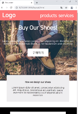
HTML
<nav class="nav-container">
	<div class="nav-item">ShooShop</div>
	<div style="flex-grow: 1"></div>
	<div class="nav-item">Products</div>
	<div class="nav-item">Services</div>
</nav>
CSS
.nav-container {
    display: flex;
    background-color: pink;
    height: 40px;
    align-items: center;
    padding: 10px;
}

.nav-item {
    margin-right: 10px;
    color: white;
}
💻