
CDD 개발 도구
Styled Components
CSS 코드를 다룰 때 다음과 같은 불편함
- class, id 이름을 짓느라 고민한 적이 있다.
- CSS 파일 안에서 내가 원하는 부분을 찾기 힘들었다.
- CSS 파일이 너무 길어져서 파일을 쪼개서 관리해 본 적이 있다.
- 스타일 속성이 겹쳐서 내가 원하는 결과가 나오지 않은 적이 있다.

React 환경에서 사용 가능한 Styled Components라는 라이브러리를 이용하면 이런 불편함을 CSS를 컴포넌트화 시킴으로써 해결해 준다.
Styled Components는CSS in JS라는 개념이 대두되면서 나온 라이브러리.CSS in JS라이브러리를 사용하면 CSS도 쉽게 Javascript 안에 넣어줄 수 있으므로,HTML + JS + CSS까지 묶어서 하나의 JS파일 안에서 컴포넌트 단위로 개발할 수 있게 된다.
Styled Components 설치하기
터미널에 아래의 명령어 한 줄을 입력해 Styled Components 라이브러리를 설치할 수 있다.
# with npm
npm install --save styled-components@latest

# with yarn
yarn add styled-components
그 다음 Styled Components를 사용할 파일로 불러와주면 사용 준비는 완료.
import styled from "styled-components"Styled Components 문법
1. 컴포넌트 만들기
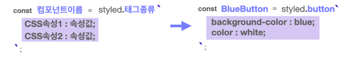
Styled Components는 ES6의 Templete Literals 문법을 사용. (✅ 따옴표가 아닌 백 틱 (`) 을 사용)
컴포넌트를 선언한 후 styled.태그종류를 할당하고, 백 틱 안에 기존에 CSS를 작성하던 문법과 똑같이 스타일 속성을 작성해 주면 된다.
예시
import styled from "styled-components";

//Styled Components로 컴포넌트를 만들고
const BlueButton = styled.button`
  background-color: blue;
  color: white;
`;

export default function App() {
  // React 컴포넌트를 사용하듯이 사용하면 됩니다.
  return <BlueButton>Blue Button</BlueButton>;
}
2. 컴포넌트를 재활용해서 새로운 컴포넌트 만들기
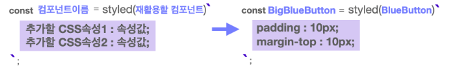
- 이미 만들어진 컴포넌트를 재활용해서 새로운 컴포넌트를 만들 수도 있다.
- 컴포넌트를 선언하고
styled()에 재활용할 컴포넌트를 전달해 준 다음, 추가하고 싶은 스타일 속성을 작성해 주면 된다.
예시
import styled from "styled-components";

const BlueButton = styled.button`
  background-color: blue;
  color: white;
`;

//만들어진 컴포넌트를 재활용해 컴포넌트를 만들 수 있습니다.
const BigBlueButton = styled(BlueButton)`
  padding: 10px;
  margin-top: 10px;
`;

//재활용한 컴포넌트를 재활용할 수도 있습니다.
const BigRedButton = styled(BigBlueButton)`
  background-color: red;
`;

export default function App() {
  return (
    <>
      <BlueButton>Blue Button</BlueButton>
      <br />
      <BigBlueButton>Big Blue Button</BigBlueButton>
      <br />
      <BigRedButton>Big Red Button</BigRedButton>
    </>
  );
}
3. Props 활용하기
Styled Component로 만든 컴포넌트도 React 컴포넌트처럼 props를 내려줄 수 있다.
- 내려준 props 값에 따라서 컴포넌트를 렌더링 하는 것도 가능하다.
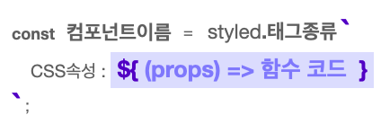
- Styled Components는 템플릿 리터럴 문법(
${ })을 사용하여 JavaScript 코드를 사용할 수 있다. - props를 받아오려면 props를 인자로 받는 함수를 만들어 사용하면 된다.
1) Props로 조건부 렌더링하기
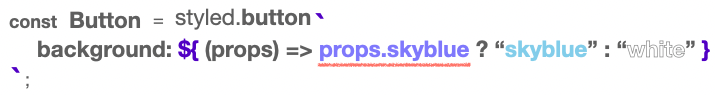
- 삼항 연산자를 활용해
<Button>컴포넌트에 skyblue라는 props가 있는지 확인하고, 있으면 배경색으로 skyblue를, 없을 경우 white를 지정해 주는 코드.
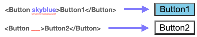
Button1의 경우는 skyblue라는 props가 있어 배경색이 skyblue로 지정됐고, Button2의 경우는 props가 아예 없어 배경색이 white로 지정된 것을 확인할 수 있다.
예시
import styled from "styled-components";
import GlobalStyle from "./GlobalStyle";
//받아온 prop에 따라 조건부 렌더링이 가능합니다.
const Button1 = styled.button`
  background: ${(props) => (props.skyblue ? "skyblue" : "white")};
`;

export default function App() {
  return (
    <>
      <GlobalStyle />
      <Button1>Button1</Button1>
      <Button1 skyblue>Button1</Button1>
    </>
  );
}
2) Props 값으로 렌더링하기
props의 값을 통째로 활용해서 컴포넌트 렌더링에 활용할 수 있다.
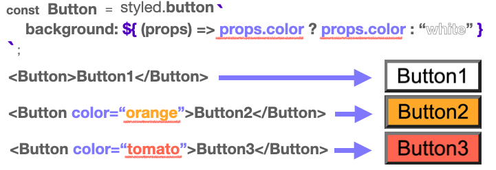
- 똑같이 삼항 연산자를 사용하고 있지만, 이번에는
props.color가 없다면white를,props.color가 있다면props.color의 값을 그대로 가져와서 스타일 속성 값으로 리턴해주고 있는 것을 볼 수 있다. - 그 결과
color라는 이름으로 받은 props의 값으로 배경색이 지정된 것을 확인할 수 있다.
예시
import styled from "styled-components";
import GlobalStyle from "./GlobalStyle";
//받아온 prop 값을 그대로 이용해 렌더링할 수도 있습니다
const Button1 = styled.button`
background: ${(props) => (props.color ? props.color : "white")};
`;
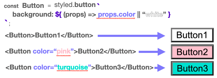
//다음과 같은 형식으로도 활용할 수 있습니다.
const Button2 = styled.button`
background: ${(props) => props.color || "white"};
`;
export default function App() {
return (
<>
<GlobalStyle />
<Button1>Button1</Button1>
<Button1 color="orange">Button1</Button1>
<Button1 color="tomato">Button1</Button1>
<br />
<Button2>Button2</Button2>
<Button2 color="pink">Button2</Button2>
<Button2 color="turquoise">Button2</Button2>
</>
);
}4. 전역 스타일 설정하기
전역 스타일을 설정하기 위해 Styled Components에서 createGlobalStyle 함수를 불러온다.
import { createGlobalStyle } from "styled-components";그다음 이 함수를 사용해 CSS 파일에서 작성하듯 설정해 주고 싶은 스타일을 작성
const GlobalStyle = createGlobalStyle`
	button {
		padding : 5px;
    	margin : 2px;
    	border-radius : 5px;
	}
`
이렇게 만들어진 <GlobalStyle> 컴포넌트를 최상위 컴포넌트에서 사용해 주면 전역에 <GlobalStyle> 컴포넌트의 스타일이 적용
function App() {
	return (
		<>
			<GlobalStyle />
			<Button>전역 스타일 적용하기</Button>
		</>
	);
}
잘 살펴보면 3. Props 활용하기의 예제에서 이미 위 코드와 같은 전역 스타일이 설정되어 있음을 알 수 있다.
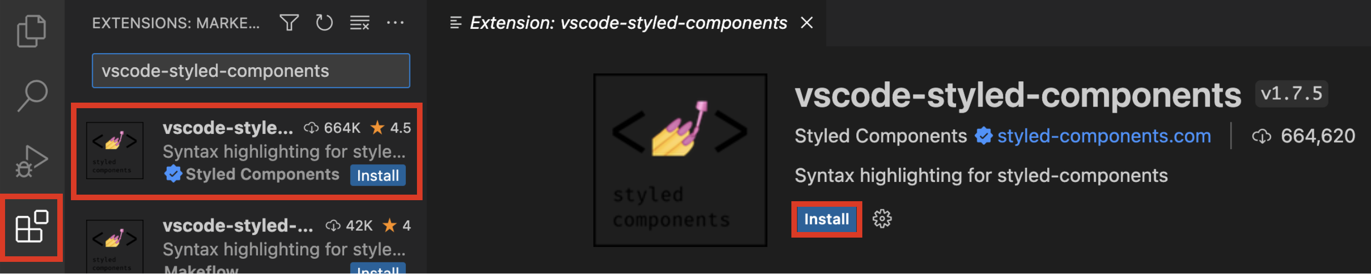
Styled Components 관련 익스텐션 소개
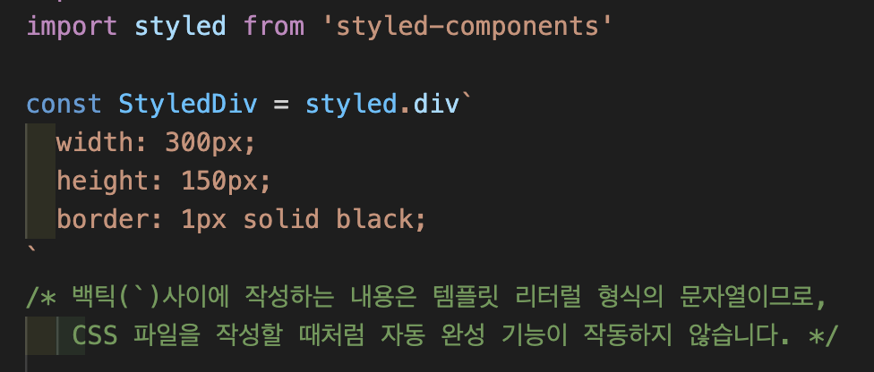
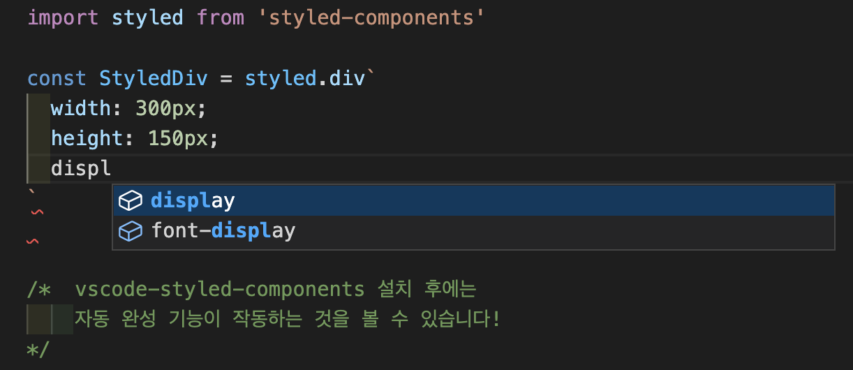
styled Components를 사용할 때, CSS 코드를 템플릿 리터럴을 사용해서 작성하게 되는데, CSS 코드를 문자열로 작성하는 것이기 때문에, 아래 이미지처럼 VSCode에서 코드 작성 시 CSS 파일에서 작성하는 것처럼 자동 완성 기능을 사용할 수 없다.
이때 도움이 되는 VSCode 익스텐션이 있습니다. 바로 VSCode-Styled-Components라는 익스텐션.
설치 후 다시 확인해보면, Styled-Components 코드 작성 시 자동 완성 기능을 잘 사용할 수 있는 것을 볼 수 있다.
Storybook
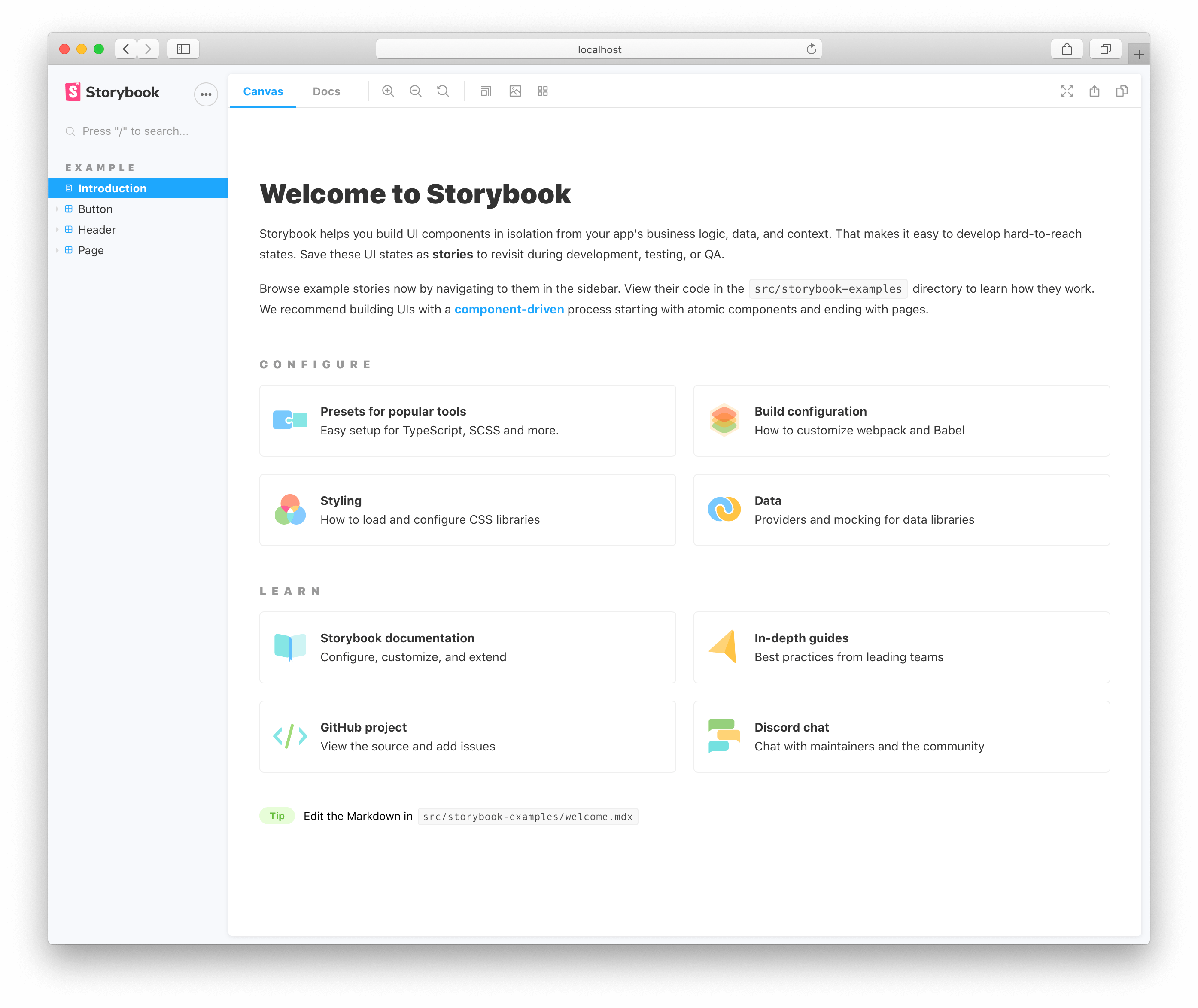
Storybook은 UI 개발 즉, Component Driven Development를 하기 위한 도구
- 각각의 컴포넌트들을 따로 볼 수 있게 구성해 주어 한 번에 하나의 컴포넌트에서 작업할 수 있다.
- 복잡한 개발 스택을 시작하거나, 특정 데이터를 데이터베이스로 강제 이동하거나, 애플리케이션을 탐색할 필요 없이 전체 UI를 한눈에 보고 개발할 수 있다.
- 재사용성을 확대하기 위해 컴포넌트를 문서화.
- 자동으로 컴포넌트를 시각화하여 시뮬레이션할 수 있는 다양한 테스트 상태를 확인할 수 있다.
- 이를 통해 버그를 사전에 방지할 수 있도록 도와준다.
- 테스트 및 개발 속도를 향상.
- 애플리케이션 또한 의존성을 걱정하지 않고 빌드할 수 있다.
Storybook에서 지원하는 주요 기능
- UI 컴포넌트들을 카탈로그화하기
- 컴포넌트 변화를 Stories로 저장하기
- 핫 모듈 재 로딩과 같은 개발 툴 경험을 제공하기
- 리액트를 포함한 다양한 뷰 레이어 지원하기