1. radio button을 모듈화한 이유
radio button을 직접 구현하면 radio button에 대한 이해도가 증가할 것이라고 생각하여 라이브러리를 사용하지 않고 직접 구현하게 되었다. 덕분에 리팩토링을 하면서 유지보수가 쉬웠고, 코드의 가독성이 좋아서 리팩토링하는 과정이 비교적 수월했다.
필요한 기능은 다음과 같다.
예또는아니오를 누르기만 하면 질문에 응답한 것으로 check하기예를 누르면"1"을,아니오를 누르면"2"를 저장했다가 모든 설문이 끝난 후 server에 보내야 함- radio button 또는 label click 가능
- radio button은 check되지 않았을 때, check 됐을 때, hover했을 때, focus 됐을 때로 나눠서 스타일 적용
2. 전체적인 구조 및 구성
src/common/ 아래에 모듈화한 코드를 기능별로 구분해서 저장했다.
RadioBtn이라는 폴더 아래에 네 개의 파일을 뒀다.
index.tsx: 실제 radio button 컴포넌트를 정의하는 파일RadioBtnGroup.tsx: radio button을 그룹화하기 위한 파일radioBtnTypes.ts: radio button과 관련된 type을 정의하는 파일styles.ts: radio button의 스타일을 정의하는 파일
📦RadioBtn
 ┣ 📜index.tsx
 ┣ 📜RadioBtnGroup.tsx
 ┣ 📜radioBtnTypes.ts
 ┗ 📜styles.ts
3. type 정의하기: radioBtnTypes.ts
radioBtnTypes.ts은 radio button과 관련된 type을 저장한 파일이다.
전체 코드는 아래와 같다.
// radioBtnTypes.ts

import { InputHTMLAttributes, ChangeEvent } from "react";

// 라디오 버튼 옵션
export interface RadioBtnOption {
  label: string;
  name: string;
  value: string;
}

// RadioBtnGroup 컴포넌트의 props
export interface RadioBtnGroupProps {
  options: RadioBtnOption[];
  onChange: (e: ChangeEvent<HTMLInputElement>) => void;
  value: string;
}

// RadioBtn 컴포넌트의 props
export interface RadioBtnProps extends InputHTMLAttributes<HTMLInputElement> {
  label: string;
}
RadioBtnOption
- 개별 radio button 옵션을 정의
label: 사용자에게 표시될 택스트name: radio button group의 공통 name 속성value: 해당 radio button의 실제 값
RadioBtnGroupProps
RadioBtnGroup컴포넌트의 속성을 정의options:RadioBtnOption인터페이스를 사용하여 정의된 radio button 옵션 배열onChange: radio button의 값이 변경될 때 호출되는 이벤트 핸들러value: 현재 선택된 라디오 버튼의 값
RadioBtnProps
- 개별 radio button 컴포넌트의 속성을 정의
InputHTMLAttributes<HTMLInputElement>를 상속받아 표준<input>요소의 모든 속성을 사용할 수 있도록 함label: radio button 옆에 표시될 텍스트 정의
4. styled-components를 활용해서 디자인
styled-components를 사용하여 radio button과 관련된 스타일을 설정했다. styled-components를 사용하면 컴포넌트 단위의 스타일링이 가능하고, 재사용성 및 유지보수성이 향상된다.
전체 코드는 아래와 같다.
// RadioBtn/styles.ts

import styled from "styled-components";
import * as colors from "@styles/Colors";

// radio btn group wrapping
export const Wrapper = styled.div`
  padding: 0.5rem;
  display: grid;
  gap: 1rem;
`;

// radio btn과 label wrapping
export const RadioWrapper = styled.div`
  display: flex;
  gap: 17px;
  align-items: center;
`;

// custom radio btn
export const Radio = styled.input`
  -webkit-appearance: none;
  appearance: none;
  width: 28px;
  height: 28px;
  border: 1.5px solid ${colors.mainColor};
  border-radius: 50%;
  transition: all 0.05s ease-in-out;
  cursor: pointer;
  position: relative;

  /* 내부 점 */
  ::after {
    content: "";
    display: block;
    border-radius: 50%;
    width: 12px;
    height: 12px;
    position: absolute;
    top: 50%;
    left: 50%;
    transform: translate(-50%, -50%);
  }

  /* 선택됐을 때 */
  :checked {
    border: 1.5px solid ${colors.mainColor};
    ::after {
      background-color: ${colors.mainColor};
    }
  }

  :focus {
    outline: 3px solid ${colors.blue[200]};
  }

  :hover {
    ::after {
      background-color: ${colors.blue[200]};
    }
  }
`;

// radio btn label
export const Label = styled.label`
  font-family: "SUIT";
  font-style: normal;
  font-weight: 700;
  font-size: 18px;
  line-height: 1.5;
  display: flex;
  align-items: center;
  color: ${colors.black};
  cursor: pointer;
`;
Wrapper
- radio button group을 감싸는 컴포넌트
RadioWrapper
- 각 radio button과 해당하는 label을 감싸는 컴포넌트
Radio
- 실제
<input>radio button 요소의 스타일 appearance속성을 통해 기본 브라우저 스타일을 제거하고,::afterpseudo-element를 활용하여 사용자 정의 원형 디자인을 적용- 선택됐을 때(
checked), 포커스 됐을 때(focus), 마우스 호버했을 때(hover)에 대한 스타일 정의
Label
- radio button에 대한 label 스타일
5. 개별 radio button 만들기: RadioBtn/index.tsx
RadioBtn 폴더의 index.tsx에 radio button과 해당하는 label을 묶어주는 코드를 작성했다.
전체 코드는 아래와 같다.
import type { RadioBtnProps } from "@components/common/RadioBtn/radioBtnTypes";
import { RadioWrapper, Radio, Label } from "./styles";

const RadioBtn = ({ label, id, value, ...rest }: RadioBtnProps) => {
  return (
    <RadioWrapper>
      <Radio type="radio" id={id} value={value} {...rest} />
      <Label htmlFor={id}>
        <span>{label}</span>
      </Label>
    </RadioWrapper>
  );
};

export default RadioBtn;
RadioBtn
- radio button의
label,id,value등 속성을 받아옴 {...rest}을 사용하여 추가적인 속성을 쉽게Radio컴포넌트에 전달 가능Radio- 실제 radio button의 요소를 나타내며, props로 받은 속성을 적용함
Label- radio button의 label
htmlFor속성을 이용하여 해당label과 radio button을 연결label을 클릭하면 연관된 radio button이 선택됨
6. radio button group 만들기: RadioBtnGroup.tsx
6.1. radio button을 그룹화하는 이유
HTML에서 <input type="radio"> 요소는 동일한 name 속성을 공유하는 요소 그룹으로 작동하게 설계되었다. 이 그룹 내의 라디오 버튼 중 하나만 선택할 수 있기 때문에, 사용자가 한 번에 하나의 옵션만을 선택하도록 강제하는데 사용된다. 이를 프로그래밍적으로 처리하는 것보다 브라우저의 기본 동작을 이용하는 것이 효율적이다.
따라서 RadioBtnGroup 컴포넌트를 사용하여 여러 개의 radio button 옵션을 그룹화하여 렌더링하는 것이 중요하다.
6.2. 코드 설명
// RadioBtnGroup.tsx

import { Wrapper } from "./styles";
import {
  RadioBtnGroupProps,
  RadioBtnOption,
} from "@components/common/RadioBtn/radioBtnTypes";
import RadioBtn from "./index";

const RadioBtnGroup = ({ options, onChange, value }: RadioBtnGroupProps) => {
  function renderOptions() {
    return options.map(({ label, name, value: optionValue }: RadioBtnOption) => {
      const optionId = `radio-option-${label}`;
      const isChecked = value === optionValue;

      return (
        <RadioBtn
          value={optionValue}
          label={label}
          key={optionId}
          id={optionId}
          name={name}
          onChange={onChange}
          checked={isChecked}
        />
      );
    });
  }
  return <Wrapper>{renderOptions()}</Wrapper>;
};

export default RadioBtnGroup;
props
options: radio button으로 표시할 옵션의 배열onChange: radio button의 값이 변경될 때 호출되는 콜백함수value: 현재 선택된 radio button의 값
renderOptions()
-
options배열의 각 항목을 순회하면서 radio button을 생성 -
유일한
id생성optionId: 각 radio button의label값을 기반으로 유일한 식별자를 생성- 접근성이 향상되머,
label이 radio button과 연결됨
-
선택 여부 확인
isChecked: 현재 선택된 radio button의 값이 해당 옵션의 값과 일치하는지 확인- 어떤 radio button이 check되어야 하는지 결정
-
RadioBtn컴포넌트 사용RadioBtn: 실제 radio buttton을 렌더링하는 역할- 필요한 props를 전달하여 각 radio button을 생성
-
Wrapper- 그룹화된 radio button을 감싸주는 스타일 컴포넌트
7. radio button group 사용하기: question4/index.tsx
7.1. 상태 정의하기: fourthState
상태관리 툴로 recoil을 사용했고, recoil로 radio button의 선택 상태를 관리했다.
// recoil/SurveyState.ts

import { atom } from "recoil";

export const fourthState = atom<string>({
  key: "fourthState",
  default: "",
});- radio button의
value가"1"과"2"라서 type은string으로 지정
7.2. FourthQuestion 컴포넌트
RadioBtnGroup 컴포넌트를 사용하여 radio button group을 렌더링했다.
전체 코드는 아래와 같다.
// question4/index.ts
import React from "react";
import { useRecoilState } from "recoil";
import { RadioBtnContainer } from "./styles";
import RadioBtnGroup from "@components/common/RadioBtn/RadioBtnGroup";
import { fourthState } from "@recoil/SurveyState";
const FourthQuestion = () => {
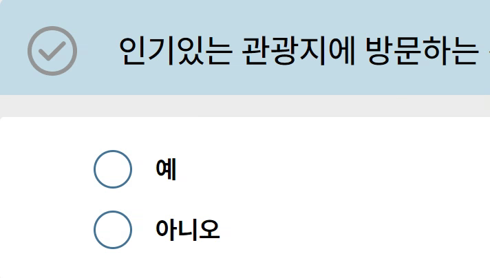
const radioBtns = [
{
label: "예",
name: "button-types",
value: "1",
},
{
label: "아니오",
name: "button-types",
value: "2",
},
];
const [selectedValue, setSelectedValue] = useRecoilState(fourthState);
function radioBtnGroupHandler(event: React.ChangeEvent<HTMLInputElement>) {
setSelectedValue(event.target.value);
}
return (
<RadioBtnContainer>
<RadioBtnGroup
options={radioBtns}
value={selectedValue}
onChange={radioBtnGroupHandler}
/>
</RadioBtnContainer>
);
};
export default FourthQuestion;radio button 옵션 설정
radioBtns배열을 정의하여 radio button의label과name,value지정
recoil 상태와 연결
useRecoilState(fourthState)를 사용하여 recoil의fourthState상태와 연결- 컴포넌트 내에서 해당 상태를 읽고 업데이트 가능
radio button value 변경 처리
radioBtnGroupHandler(): radio button의 value가 변경될 때마다 호출됨setSelectedValue를 사용하여 recoil 상태 업데이트
렌더링
RadioBtnGroup컴포넌트를 사용하여 radio button group을 렌더링options와value,onChange를 props로 전달하여 radio button group은 주어진 옵션을 바탕으로 radio button을 렌더링
8. 마무리
이와 같이 radio button을 모듈화해서 사용하면 아래와 같은 이점이 있다.
재사용성 증가
한 번 작성된 radio button 컴포넌트는 다양한 환경 및 페이지에서 재사용할 수 있다. 이로 인해 중복 코드를 작성할 필요가 없어지며, 일관된 UI/UX를 제공할 수 있다.
유지보수성 향상
중앙화된 코드 구조 덕분에 radio button에 관련된 스타일이나 로직의 변경이 필요할 경우 한 곳에서만 수정하면 된다.
확장성
필요한 기능이나 스타일이 추가될 경우에도, 모듈화된 구조 덕분에 확장이 용이하다.
브라우저의 기본 동작 활용
radio button group의 동작을 프로그래밍적으로 처리하지 않고 HTML의 기본 동작을 활용하므로, 성능상의 부담이 적고 안정성이 높다.