SCSS를 사용하던 중, 클릭했을 때 추가 클래스를 주어 안 보이던 요소가 스르륵 나타나게 하는 효과를 구현 중이었다.
transition이 적용이 안 되어 찾아보니, display: none에는 transition 속성이 안 먹는다고 한다.
아래 height, transform: scale, opacity 세 가지 모두 시도해보았지만, 원하는 아코디언 형태의 CSS는 구현되지 않았다. (셋 다 화면에 나타나는 형태도 다름)
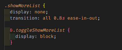
결론은 아코디언 효과를 A-Z 하나하나 구현하느니 차라리 위 코드처럼 display: none/block으로 가기로 했다.
🥝 참고한 출처
1. 컨텐츠만 시각적으로 숨기지만, 접근성 트리에는 있어야 하는 경우
height 사용하는 법
/* box */
div {
  width: 100%;
  height: 0vh;
  margin-top: 10px;
  background: linear-gradient(180deg, rgba(238,174,202,1) 0%, rgba(148,187,233,1) 100%);
  transition: all 0.3s;
}
.act {
  height: 60vh;
}
transform: scale 사용하는 법
div {
  width: 100%;
  height: 60vh;
  transform: scaleY(0);
  transform-origin: 0px 0px;
  margin-top: 10px;
  background: linear-gradient(180deg, rgba(238,174,202,1) 0%, rgba(148,187,233,1) 100%);
  transition: all 0.3s;
}
.act {
  transform: scaleY(1);
}
opacity 사용하는 법
div {
  width: 100%;
  height: 60vh;
  opacity: 0;
  margin-top: 10px;
  background: linear-gradient(180deg, rgba(238,174,202,1) 0%, rgba(148,187,233,1) 100%);
  transition: all 0.3s;
}
.act {
  opacity: 1;
}
2. 컨텐츠도 시각적으로 숨기고, 접근성 트리에도 없어야 하는 경우
visibility 속성 사용하는 법
/* box */
div {
  visibility: hidden;
  width: 100%;
  height: 0vh;
  margin-top: 10px;
  background: linear-gradient(180deg, rgba(238,174,202,1) 0%, rgba(148,187,233,1) 100%);
  transition: all 0.3s;
}
.act {
  visibility: visible;
  height: 60vh;
}

/* button */
button {
  background-color: skyblue;
  padding: 10px 15px;
  border: transparent;
  border-radius: 10px;
  color: #fff;
}
setTimeout 사용하는 법
동적으로 클래스를 붙이기 전 setTimeout을 사용하여 렌더링 트리가 생성된 후 transition을 구현할 수도 있다. 하지만 굳이 이렇게..? 심지어 리렌더링의 문제로 setTimeout보다 visibility를 추천한다고 한다.
요약
사용자 눈에 안 보인다면 특별한 이유가 없는 한 접근성 트리에도 없는 게 맞을 것 같다. 따라서 우선 display: none/block으로 가려고 한다.

영어강사, 프론트엔드 개발자를 거쳐 데이터 분석가를 준비하고 있습니다 ─ 데이터분석 블로그: https://cherylog.tistory.com/