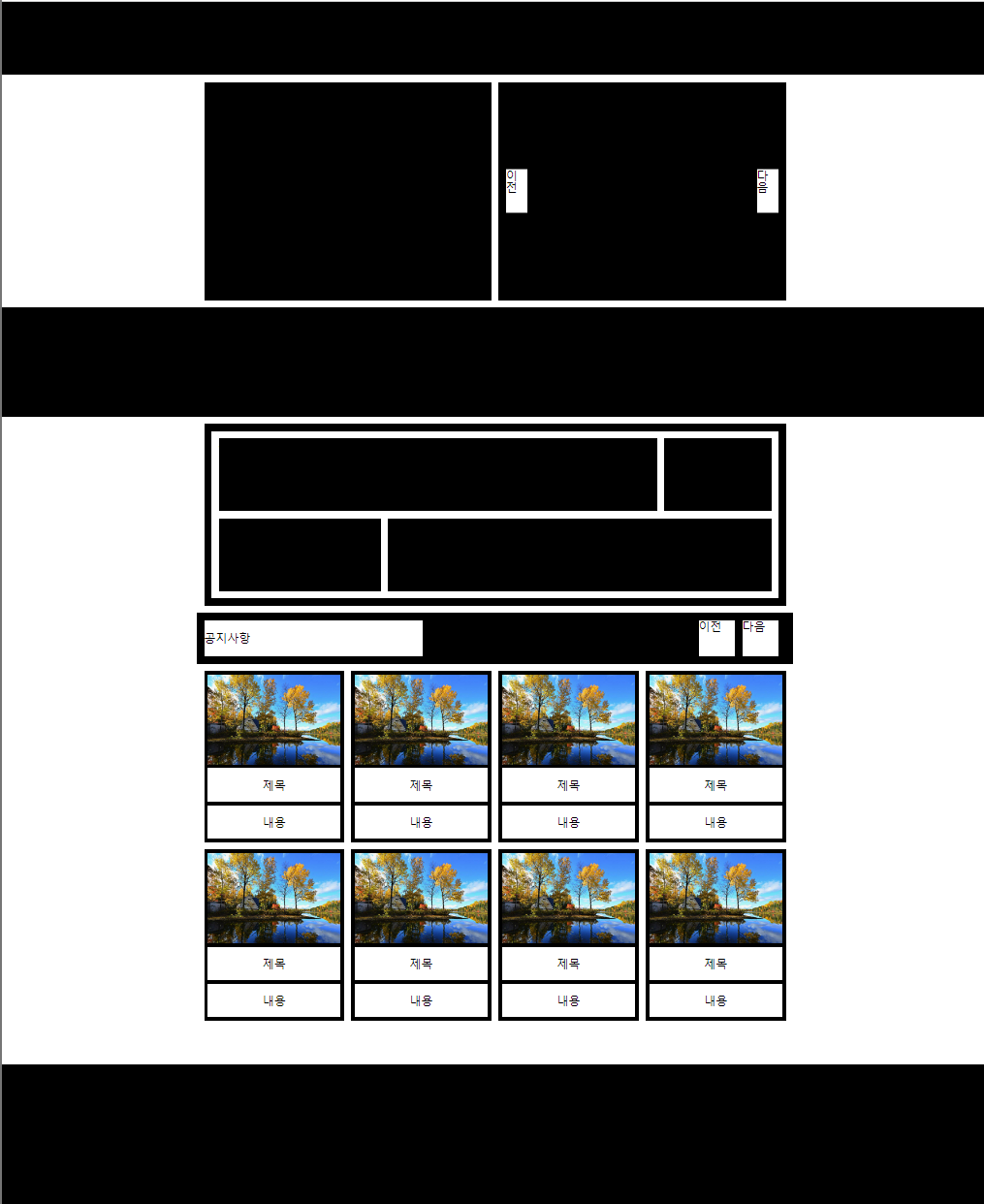
float를 사용하여 웹 레이아웃 구성하기
.box1{overflow:hidden;}
.box1 div{float:left;}
.box1 div:last-child{float:right;}
float1
🔅 등장하는 개념
- .box{overflow:hidden;} - .box div{float:left;}
- calc((100% - 여백px) / 개수))
- calc(50% - 5px); : 1/2로 박스 나누기
- div{margin-right:10px;} - div:lastchild{margin-right:0;}
float2
🔅 등장하는 개념
- position:fixed; - top:0; left:0; : 왼쪽에 고정(브라우저 영향x / 상,좌0의위치)
- main > div{margin-bottom:10px;} : main아래 직계 div(.box1~7)만 선택하여 아래 여백 10px 부여
- .box{overflow:hidden;} - .box div{float:left;} - .box div:last-child{float:right;} : 1/2박스 경우, div1 왼쪽 - 여백5px - div2 오른쪽
float3
🔅 등장하는 개념
기본 설정
- 글자 사용하는 경우
- *{font:inherit;} : 글씨체 초기화
- body{line-height:1;} : 행간격1
- ul
- list-style:none; : ul 기호 삭제
- a
- color:inherit; : 글씨 색상 초기화
- text-decoration:none; : 밑줄 없앰
- img
- vertical-align:top; : 이미지 아래 공백 없애기
- max-width:100% : 이미지 최대 너비 100%
- position:relative(부모) - absolute(자녀) : 태그 위치 설정
- top, bottom, left, right로 위치 지정 (%,px)- transform:translate(-50%,-50%) : top-left corner기준으로 정가운데 위치시키기 때문에 transform속성을 이용해 x,y축으로 각각 -50%씩 부여하여 정 가운데 위치
- 두 쪽 모두 %적용해주는 경우 : tftl(-50%,-50%)
- 둘 중 하나만 적용하거나, 하나는 px로 살짝 조정하는 경우 : 적용하는 쪽에만 (-50%)
(ex) top:50% right:30px -> tftlY(-50%) : Y축(상하)
top:0 right:30% -> tftlX(-50%) : X축(좌우)header{ position:relative;} header h1{ position:absolute; top: 50%; left: 50%; transform:translate(-50%, -50%); }
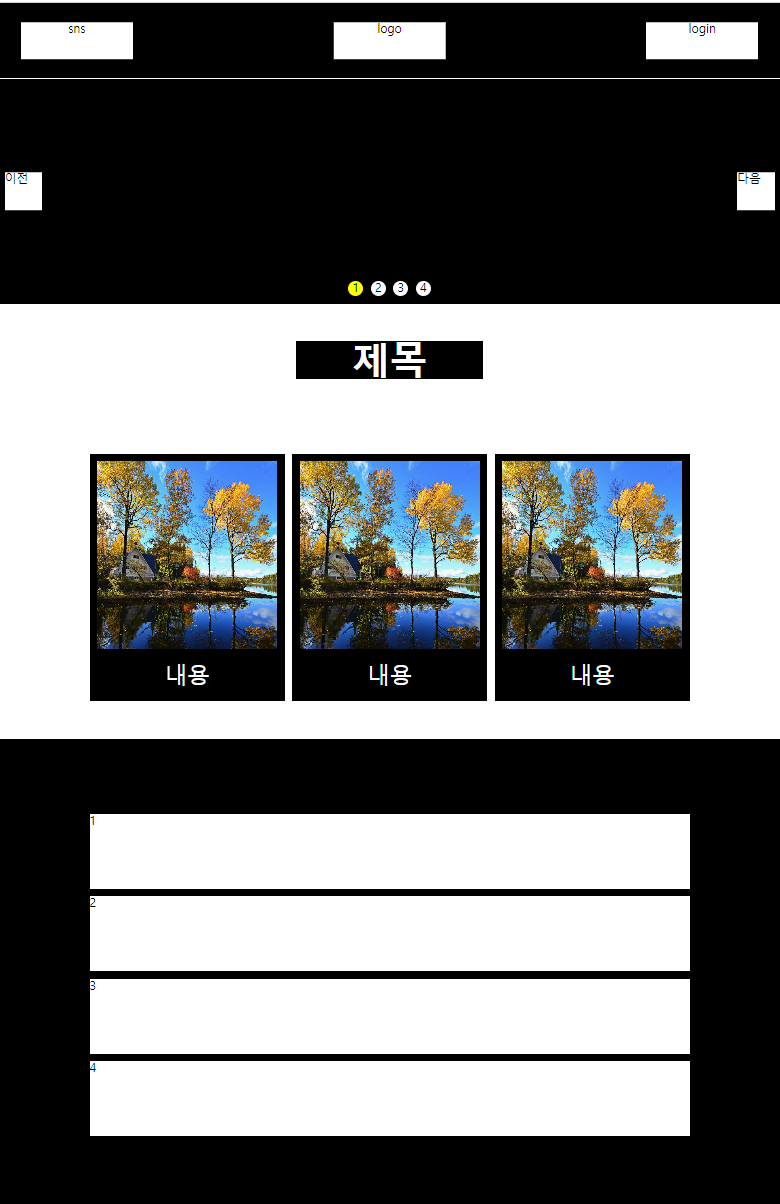
h1은 a태그를 감싸고 있기 때문에, a태그에 대한 css속성도 지정해줘야함
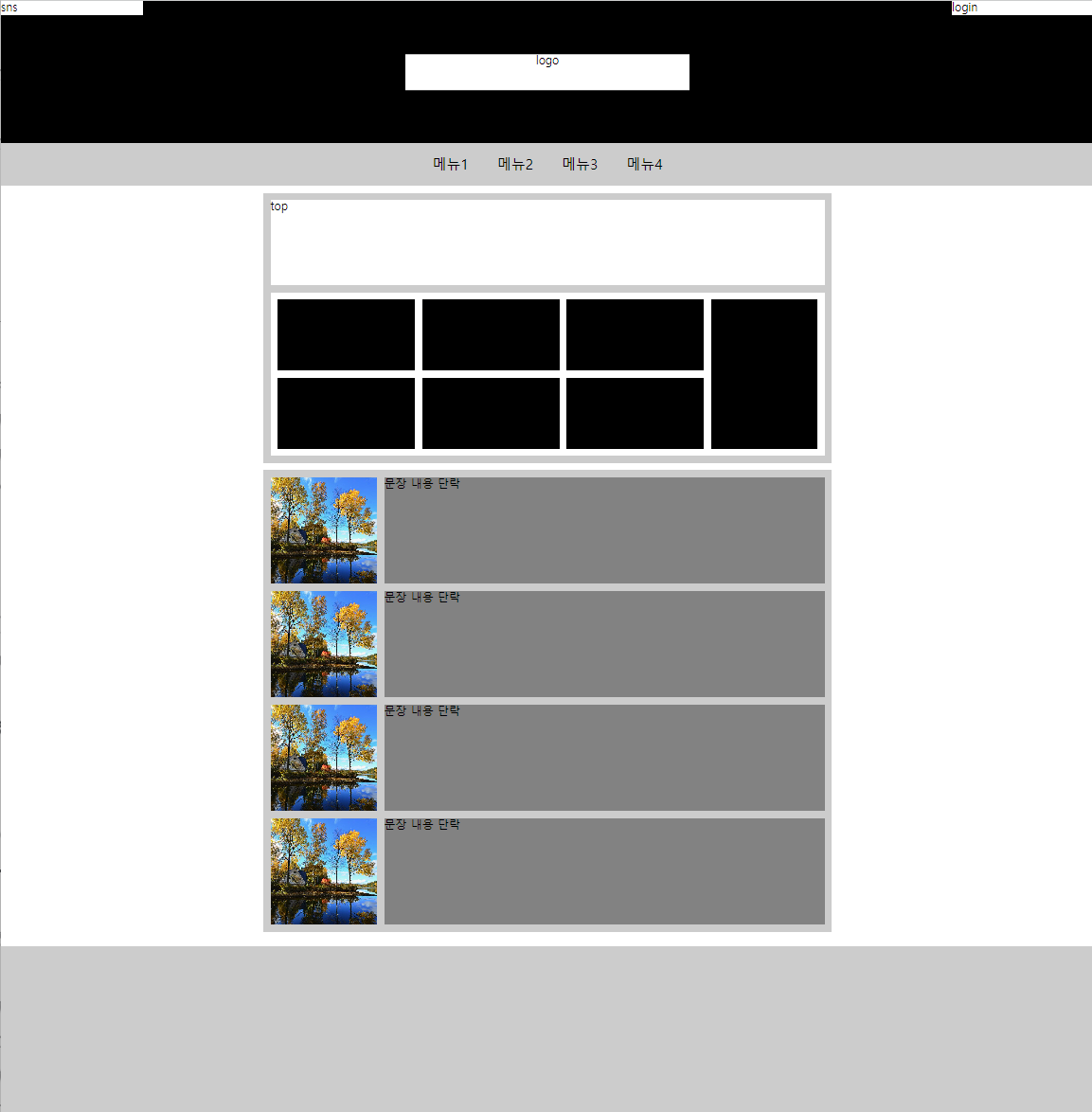
    <header>
        <h1><a href="logo">logo</a></h1>
        <div class="sns">sns</div>
        <div class="login">login</div>
    </header>
    <style>
    	header{}
        header h1{}
        header h1 a{}
        header div{}
        header .sns{}
        header .login{}
     </style>
a태그 display:block-height:n% 높이 적용
- block태그는 높이 height을 적용해줘야 클릭 할 수 있음)
- inline은 높이 기본값으로 적용됨. inline-block은 높이 적용해줘야함
header h1 a{
	display:block;
	height:100%;
	)
- text-align:center; - 글자 가운데 정렬
- border-radius : n% - n만큼 모서리 둥글게
- object-fit:cover; - 이미지 비율에 맞게 조정
⚙️ 오답노트
태그 안에 class가 나올 때, 태그-태그-태그 구성일 때 마크업, css 틀 잡는 것을 헷갈려 함
 <section class="box1">
            <a href="" class="btn prev">이전</a>
            <a href="" class="btn next">다음</a>
            <div class="page">
                <span class="active">1</span>
                <span>2</span>
                <span>3</span>
            </div>
        </section>
- section.box$*3 으로 section class = box 만들기
- a.class 태그
- div로 먼저 묶고 span태그 넣는거
- css : .box1 .page - .box1 .page span - .box1 .page span.active 순서,
- 맨 위 부모태그에서 relative 주면 아래는 absolute 계속 적용해줘도 됨
magin, padding 여백 주는 것에 대한 감 잡기
.box1 .page span{
            background: #f00;
            border-radius: 50%;
            width: 30px;
            height: 30px;
            /* margin-right: 5px; */
            float: left;
            margin: 0 5px;
			}
- margin 0 5px : 좌 우 모두 5px씩 늘려주기. mr10으로 하면 우만늘어나서 가운데정렬 대칭 안맞게됨
- float left : 옆으로 붙어 출력 (안해주면 설정적용x)
어느 지점에서 어떤 속성을 적용해줘야 하는지 헷갈려 함
 .box3{
      background: #000;
      padding: 100px 0;
      }
 .box3 ul{
         width: 800px;
         margin: 0 auto;
		}
.box3 ul li{
           background: #fff;
           margin-bottom: 10px;
           height: 100px;
		   }
- box3에서 padding 부여 (height 안해줘도 됨)
- ul에서 width 부여하고 margin 0 auto로 가운데정렬
- li에서 부가설정
float4
🔅 등장하는 개념 / 오답
display:inline-block;
header .bottom ul{overflow: hidden;
        background: #ccc;
        display: inline-block;
        vertical-align: top;
        }
줄바꿈을 하지 않고, 요소들을 동일한 라인에 가로로 배열 (가운데 정렬)
- inline속성에서 할 수 없었던 width/height 변경 및 line-height를 커스텀하게 적용 가능
- vertical-align:top; - inline-block 끼리 높이가 안맞을 때 상위 공백이 생기는 것을 없앨 때 적용
css 속성 정리
<style>
        main{width: 800px; margin: 10px auto;}
        .top-area{background: #ccc; padding: 10px; margin-bottom: 10px;}
        .top-area .top{background: #fff; height: 120px; margin-bottom: 10px;}
        .top-area .bottom{background: #fff; overflow: hidden; padding: 10px;}
        .top-area .bottom .left{float: left;
            width: calc((100% - 160px));
            overflow: hidden;}
        .top-area .bottom .left li{background: #000;
            float: left;
            width: calc((100% - 20px) / 3);
            margin-right: 10px;
            height: 100px;}
        .top-area .bottom .left li:nth-child(3n){margin-right: 0;}
        .top-area .bottom .left li:nth-child(n+4){margin-top: 10px;}
        .top-area .bottom .right{float: right; background: #000; width: 150px; height: 210px;}
</style>
- main : width로 넓이 / margin으로 가운데 정렬 10px로 상하 간격 띔
- top area : padding줘서 안에 공백 / mb로 bottom area와 띄어줌
- top : 높이 주고 / mb로 bottom과 띄어줌
- bottom : overflow:hidden / padding으로 박스와 흰색배경 사이 공백
- bottom .left
- width : 100%에서 160(right 150px + 여백 10px)
- float:left
- li에도 float left 적용하기위해 overflow:hidden
- bottom .left li
- 각각 6개의 박스 -> float left
- width : 2 / 2 / 2의 여백(-20px)
- mr10으로 오른쪽 공백
- nth 3n : 3,6번째 박스 mr
- nth n+4 : 1,2,3 / 4,5,6 사이 4,5,6에 윗공백 10px
- right : height= (박스 각각 100+100) + 여백 10px = 210px
li+li : 첫번째빼고 모두 속성 적용(왕따선택자)
.bottom-area ul li+li{margin-top: 10px;}
- 첫 번째 li를 제외하고 margin top 10px을 적용하라
float5
🔅 등장하는 개념 / 오답
<main>
    <div class="inner">
        <div class="section1">
            <div>left</div>
            <div>right
                <a href="" class="btn-prev">이전</a>
                <a href="" class="btn-next">다음</a>
            </div>
        </div>
    </div>
- div inner을 먼저 설정해주고, section을 나눠줘야 한다
- 이전 다음 등 버튼은 항상 a.class태그를 사용한다
<li>
 	<a href="">
		<img src="./image.jpg" alt="">
		<strong>제목</strong>
        <p>내용</p>
    </a>
</li>
- strong태그는 제목에 사용한다
<style>
    main{}
    .inner{width: 800px; margin: 0 auto;}
    .section1{overflow: hidden; background: #fff; margin-top: 10px;}
    .section1 div{background: #000;
        float: left;
        width: calc(50% - 5px);
        height: 300px;
        position: relative;
        }
    .section1 div:last-child{position: relative; float: right;}
    .section1 .btn-prev{position: absolute;
        top: 50%; left:10px;
        transform: translateY(-50%);
        background: #fff;
        width: 30px; height: 60px;}
    .section1 .btn-next{position: absolute;
        top: 50%; right:10px;
        transform: translateY(-50%);
        background: #fff;
        width: 30px; height: 60px;}
</style>
- inner로 section1의 넓이, 중앙정렬
- section div에 float left + width로 2개의 박스로 나눔
- position relatvie로 박스 자리에 고정시킴(btn이 붙어있을 수 있는 자리 지정)
- lstchild : float right로 가운데 여백
<style>
            .section3{margin-top: 10px; padding: 10px; background: #000;}
            .section3 .box1{overflow: hidden;
                padding: 10px;
                background: #fff;}
            .section3 .box1 div{float: left;
                height: 100px;
                background: #000;
                width: calc(80% - 5px);}
            .section3 .box1 div:last-child{
                float: right;
                width: calc(20% - 5px);}
            .section3 .box2{overflow: hidden;
                background: #fff; padding: 10px; padding-top: 0;}
            .section3 .box2 div{float: left;
                height: 100px;
                background: #000;
                width: calc(30% - 5px);}
            .section3 .box2 div:last-child{
                float: right;
                width: calc(70% - 5px);}
    </style>
- mt10으로 위와 구분 / p10으로 박스 안에 들어간 박스를 만들 수 있게 테두리를 만들어줌)
- box1 : 흰색의 padding을 만들어서 안에 넣어줌
- div : fleft로 calc하고, lastchild로 fright calc해서 박스 나눠줌