1.학습한 내용
7월 2일 금요일에 학습하였던 레이아웃의 확장 파생된 내용으로 Z-index관련된 것을 학습하였다.
## HTML 내용
<!--
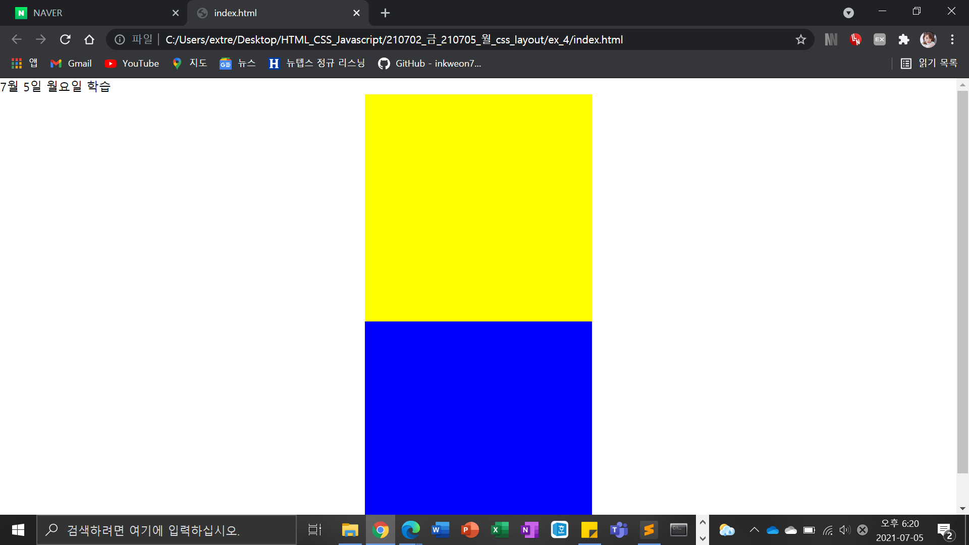
<div class="z-one"></div>
<div class="z-two"></div>
-->
Z-index는 보통 단위를 생략한다. 겹쳐져 있는것을 끌어 올리고 싶을때 사용한다.
최초 Z-index가 입력되지 않은 것들은 0이라 생각.
<!--
<div class="left-1"></div>
<div class="right-1"></div>
-->
<!--
<header></header>
<section>
<div class="left"></div>
<div class="center"></div>
<div class="right"></div>
</section>
<footer></footer>
-->
<!--
<section>
<div class="left-2"></div>
<div class="right-2"></div>
</section>
<div class="clearfix"></div>
<footer> </footer>
-->
<!--
<div class="over-box">
<p>Nice to meet you Nice to meet you Nice to meet you Nice to meet you Nice to meet you Nice to meet you Nice to meet you Nice to meet you Nice to meet you Nice to meet you Nice to meet you Nice to meet you Nice to meet you Nice to meet you Nice to meet you Nice to meet you Nice to meet you Nice to meet you Nice to meet you Nice to meet you Nice to meet you Nice to meet you Nice to meet you Nice to meet you Nice to meet you Nice to meet you Nice to meet you Nice to meet you Nice to meet you Nice to meet you Nice to meet you Nice to meet you Nice to meet you Nice to meet you Nice to meet you Nice to meet you </p>
</div>
-->
<!-- https://flexbox.help/ 여기 사이트 방문해서 공부 -->
<!--
<div class="container">
<div class="item one"></div>
<div class="item two"></div>
<div class="item three"></div>
</div>
-->
<!--
<div class="center-1"></div>
<div class="center-2"></div>
-->
</body>
</html>
.z-one {
/*position: absolute;*/
width: 200px;
height: 200px;
background-color: yellow;
/*z-index: 10;*/
}
.z-two {
/*position: absolute;*/
width: 200px;
height: 200px;
background-color: blue;
/*z-index: 20;*/
}
## css 내용
.left-1{
float: left;
width: 100px ;
height: 150px;
background-color: blue;
}
.right-1{
float: right;
width: 100px;
height: 150px;
background-color: green;
}
/*
header {
width: 100%;
height: 100px;
background-color: yellow;
}
.left {
float: left;
width: 300px;
height: 200px;
background-color: pink;
}
.center {
float: left;
width: 500px;
height: 200px;
background-color: blue;
}
.right {
position: absolute;
float: right;
width: 300px;
height: 200px;
background-color: green;
}
footer {
clear: both;
float right, float left의 기능을 끈다.
width: 100%;
height: 100px;
background-color: black;
}
section {
width: 1400px;
height: 200px;
background-color: orange;
}*/
/*
.left-2 {
float: left;
width: 100px;
height: 150px;
background-color: yellow;
}
.right-2 {
float: right;
width: 100px;
height: 150px;
background-color: blue;
}
footer{
width: 100%;
height: 100px;
background-color: black;
}
.clearfix {
clear: both;
}
section {
overflow: hidden; 감춤
width: 800px;
background-color: orange;
}
*/
/*
.over-box {
overflow: hidden;
overflow-y: scroll;
width: 200px;
height: 200px;
background-color: yellow;
}*/
.container {
display: flex;
/*flex-direction: row;*/
/*flex-wrap: wrap;*/
flex는 float의 발전된 개념
flex-flow: row wrap;
justify-content: space-between; /*flex-end space-between space-around */ 근처 동일한 공백이 생성된다.
align-items: baseline; 밑에쪽 line 맞혀서 정렬
width: 1000px;
height: 500px;
border: solid 10px red;
}
.item {
width: 200px;
height: 200px;
}
.one {
height: 100px;
background-color: yellow;
}
.two {
height: 200px;
background-color: blue;
}
.three {
/*width: 900px;*/
height: 300px;
background-color: orange;
}
.center-1 {
width: 300px;
height: 300px;
background-color:yellow;
margin: 0 auto;
}
.center-2 {
position: relative;
width: 300px;
height: 300px;
background-color:blue;
left: 50%;
margin-left: -150px;
}
*https://css-tricks.com/centering-in-css/
중앙 정렬과 관련된 code 내용이 다나옴.
코드를 입력하세요2. 학습한 내용중 어려웠던 점 또는 해결못한 것들
저번 주말에 HTML에 대한 강의를 복습하고 교재로 학습을 진행하였다. CSS 강의 복습(3번째)을 하지 못해서 현재도 머릿속 내용이 뒤죽박죽이다. 그렇지만, 오늘은 비교적 내용이 적은편이었고, 학습 보조 site를 소개 받아서 학습을 하면, 7월 2일에 학습했던 내용보다는 어려운점이 없을것 같다.
layout과 부모자녀 개념을 빨리 익혀야 할것 같다.
3. 해결방법 작성
css 강의 2배속으로 복습을 시작하는것이 해결방법일것 같다. HTML 관련 내용은 책과 인터넷 검색으로 예제를 직접 만들어보아야 할것 같다. (실무 적용을 위해서는 다양한 연습을 하는것이 필수!!)
4.학습 소감
HTML 내용을 3번정도 복습하니 머릿속에 들어온다. CSS도 곧 그렇게 될것이다.
1. 진도나가기 (1.5배속)
2. 강의만 보고 노트정리 (2배속) 놓친 부분 정리
3. 창을 띄워서 수정하면서 실습하면서 진행 (2배속)
+ 책에 있는 내용 정리
완벽하게 학습할수 있는 나만의 사이클을 만들었다. 다만, 주말에 하려고 하였던 일지수정은 하지 못 하였는데, 머릿속에 먼저 넣고 구체적이고 자세하게 수정을 하여야할것 같다.

일단 하는 개발자