1.학습한 내용
어제에 이어 네이버 메인 페이지 실습과정을 끝 마쳤다.
(1) 메인 페이지 실습 (오른쪽 영역, footer 영역)
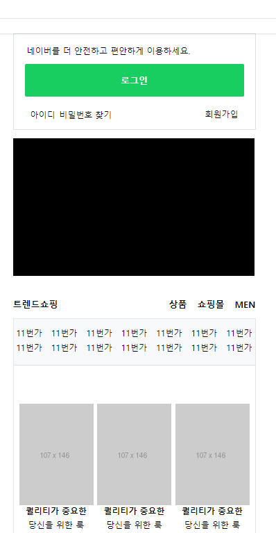
△ 오른쪽 영역
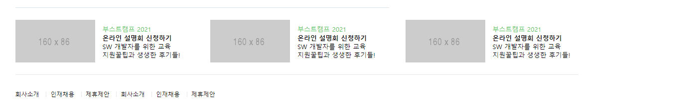
△ footer 영역
(2) 학습한 내용
로그인 영역 제작
로그인 버튼을 a tag로 제작하였고 inline 요소인데 display를 통하여 block으로 바꿔주었다.
<div id="account">
				<p>네이버를 더 안전하고 편안하게 이용하세요.</p>
				<a href="#">로그인</a>
				<div class="account_sub">
					<div class="left">
				<span>아이디</span>
				<span>비밀번호 찾기</span>
				</div>
				<span>회원가입</span>
			</div>
		</div>

#main_right #account a {
	display: block;
	width: 100%;
	background-color: #19ce60;
	border-radius: 2px;

	padding: 15px 0;
	margin-bottom: 14px;

	text-align: center;
	font-size: 13px;
	color: #fff;
	font-weight: 700;
}
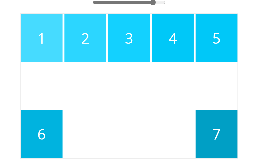
block의 성질 (아래 그림 보라색 참조)과 같이 div tag 안에 있는 로그인 칸을 쭉 채우기 위해 사용 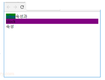
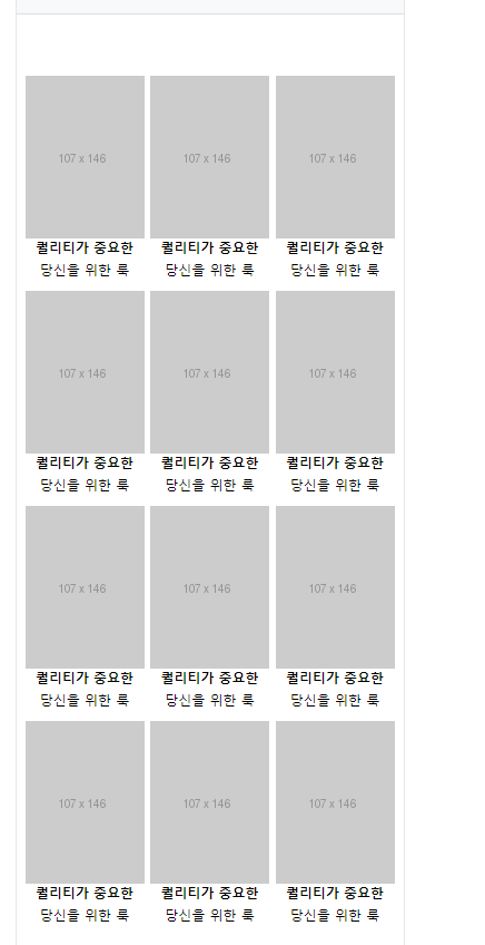
쇼핑 타이틀 부분 ( 트렌드 쇼핑 )
어제 학습한 것과 같이 https://flexbox.help/에서 tool을 활용하여 배치하였다. 특이적으로 배웠던 내용은 없다.
쇼핑 타이틀 부분 ( 트렌드 쇼핑 )
display: flex;
	flex-direction: row;
	flex-wrap: wrap;
	justify-content: space-between;
	align-items: center;
	align-content: space-between;
다음과 같이 flex: space-between로 설정시 flex-wrap: wrap 상태에서는 부모의 크기를 넘어가는 내용들은 줄바꿈이 일어나게 된다. 이 때 내부 콘텐츠의 개수가 동일하지 앟으면 두번째 줄 컨텐츠가 극단적으로 배치되는 현상이 보인다.
그래서 내부 요소의 개수, 길이가 array 할 수 있는 상황이 아니라면 float:left를 사용하여 array 하는 것이 도움이 된다.
footer 영역
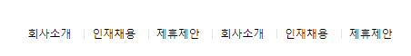
맨앞 생성한 세로 막대기 없애기
#main-footer .corp_lists li:first-child:before {
	content: initial;
}

#main-footer .corp_lists li:before {
	content: "";
	display: inline-block;
	width: 1px;
	height: 11px;
	background-color: #e4e8eb;
	margin: 0 8px;

}
짝대기 밑으로 내려감
vertical-align: -1px;<li::before>
태그의 앞에 꾸밈을 추가하는 before를 이용하여 문구 사이에 세로줄을 제작
<vertical-align:-1px>
픽셀값을 전달하면 위아래 위치 이동이 가능
<content: initial;>
회사소개 앞 부분의 막대기를 제거하는데 사용
더 상세한 내용을 검색해보았다.
[공유]::before와::after, 그들의 정체는?
http://blog.hivelab.co.kr/%EA%B3%B5%EC%9C%A0before%EC%99%80after-%EA%B7%B8%EB%93%A4%EC%9D%98-%EC%A0%95%EC%B2%B4%EB%8A%94/
2. 실습
깃허브 소스코드:
naver-2 실습 HTML
https://github.com/Yeonsu-Hong/Daegu-AI-school/issues/27
naver-2 실습 css
https://github.com/Yeonsu-Hong/Daegu-AI-school/issues/28
3. 어려웠던 내용 & 해결방법
직접 공간을 계산하여 div tag 안에 tag들을 넣어주는 것이 어렵고, 머릿속에서 상상한 것대로 배치하는 것이 쉽지가 않다. 물론 연습을 많이 하여야 해결될 부분인 것 같다.
4. 소감
연습 또 연습
- 깃허브 사용법을 아직 잘 모르는 것 같은데, 동영상과 검색을 통해 익혀서 재정리를 할 예정.