저번시간 숙제코드는 다음과 같이 짜봤습니닷..
import 'package:flutter/material.dart';
void main() {
runApp(const MyApp());
}
class MyApp extends StatelessWidget {
const MyApp({Key? key}) : super(key: key);
Widget build(BuildContext context) {
return MaterialApp(
home: Scaffold(
appBar: AppBar(title: Text('앱임')),
body: Text('안녕'),
bottomNavigationBar: BottomAppBar(
child: Row(
mainAxisAlignment: MainAxisAlignment.spaceEvenly,
children: [
Icon(Icons.phone),
Icon(Icons.message),
Icon(Icons.contact_page)
])),
));
}
}
단위
flutter에서 단위는 lp이다.
50lp는 약 1.2cm라고 한다.
scaffold
앱의 아주 기본적인
appBar
body
bottomNavigationBar 이 세 구조를 쉽게 만들 수 있는 컴포넌트이다.
scaffold를 사용하면 기본적인 이 모양 만들 수 있음.
정렬
Row, Column을 이용하면 된다. 거기서 또 간격 지정이나 이런걸 하려면 mainAxisAlignment: MainAxisAlignment.spaceEvenly,
이걸 쓰면 된다.
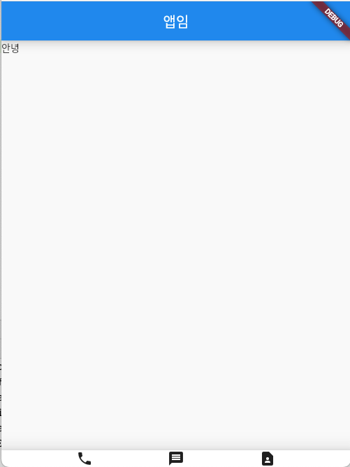
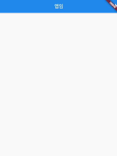
bottomNavigationBar height 지정하는 법
저기 사진을 보면 bottomNavigation의 높이가 작아보인다.
그러면 다음과 같이 지정할 수 있다. 기존 child를 Container로 감싼 후, height를 주면 된다.
Widget build(BuildContext context) {
    return MaterialApp(
        //50lp=1.2cm
        home: Scaffold(
      appBar: AppBar(title: Text('앱임')),
      body: Text('안녕'),
      bottomNavigationBar: BottomAppBar(
          child: Container(
            height:100,
            child: Row(

                mainAxisAlignment: MainAxisAlignment.spaceEvenly,
                children: [
              Icon(Icons.phone),
              Icon(Icons.message),
              Icon(Icons.contact_page)
            ]),
          )),
    ));
  }
SizedBox()
SizedBox()를 쓰면 Container보다 성능 상 이점이 있다.
width, height, child만 필요한 박스는 SizedBox()를 사용하면 된다고 한다.
  Widget build(BuildContext context) {
    return MaterialApp(
        //50lp=1.2cm
        home: Scaffold(
      appBar: AppBar(title: Text('앱임')),
      body: Text('안녕'),
      bottomNavigationBar: BottomAppBar(
          child: SizedBox(
            height:100,
            child: Row(

                mainAxisAlignment: MainAxisAlignment.spaceEvenly,
                children: [
              Icon(Icons.phone),
              Icon(Icons.message),
              Icon(Icons.contact_page)
            ]),
          )),
    ));
  }
margin
margin은 좀 귀찮다. margin:EdgeInsets.all() 하고 괄호 안에 숫자를 주면 된다.
.뒤에 all 이면 모든 부분에서 margin을 준다.
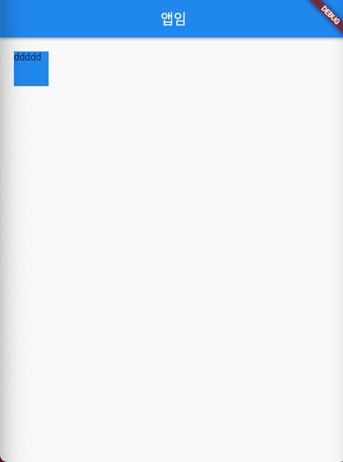
.fromLTRB(left,top,right,bottom) 이런것도 있음
  Widget build(BuildContext context) {
    return MaterialApp(

        home: Scaffold(
            appBar: AppBar(title: Text('앱임')),
            body: Container(
                width: 50,
                height: 50,
                color: Colors.blue,
                margin: EdgeInsets.all(20))));
  }
테두리
decoration을 이용한다.
decoration: BoxDecoration(border: Border.all(color:Colors.black))
  Widget build(BuildContext context) {
    return MaterialApp(

        home: Scaffold(
            appBar: AppBar(title: Text('앱임')),
            body: Container(
                width: 50,
                height: 50,

               decoration: BoxDecoration(border: Border.all(color:Colors.black)),
        )));
  }
박스 중앙정렬 하고싶으면
Container를 Center로 감싸고 child로 Container를 주면 된다.
  Widget build(BuildContext context) {
    return MaterialApp(

        home: Scaffold(
            appBar: AppBar(title: Text('앱임')),
            body: Center(
              child: Container(
                  width: 50,
                  height: 50,
                  color: Colors.blue,

        ),
            )));
  }
하단 중앙 정렬
Align으로 감싸고 alignment 속성에 Alignment.botttomCenter이런거 하면 이렇게 된다.
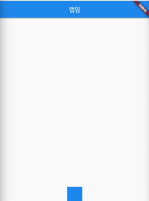
  Widget build(BuildContext context) {
    return MaterialApp(

        home: Scaffold(
            appBar: AppBar(title: Text('앱임')),
            body: Align(
              alignment: Alignment.bottomCenter,
              child: Container(
                  width: 50,
                  height: 50,
                  color: Colors.blue,


        ),
            )));
  }
꽉 채우기 하고싶으면
width에 width: double.infinity 하면 된다.
텍스트 스타일 주기
Text 안에 style을 정의하면 된다.
Text(글자, style:TextStyle(color:Colors.red))
  Widget build(BuildContext context) {
    return MaterialApp(
        home: Scaffold(
            appBar: AppBar(title: Text('앱임')),
            body: SizedBox(
                child: Text(
              '안녕하세요',
              style: TextStyle(color: Colors.red),
            ))));
  }
버튼 디자인하는 법
버튼을 만들 땐, TextButton(), IconButton(), ElevatedButton()
셋 중 하나를 사용하면 된다고 한다.
그런데 꼭 있어야 하는것!!
Button안에 child로 Text랑 onPressed가 있어야 된다.
child: Text('글자'),
onPressed: () {},
Widget build(BuildContext context) {
    return MaterialApp(
        home: Scaffold(
            appBar: AppBar(title: Text('앱임')),
            body: SizedBox(
                child: TextButton(
              child: Text('글자'),
              onPressed: () {},
            ))));
  }
AppBar()안에 넣을 수 있는 것들
title:제목
leading: 햄버거 버튼 들어가는 자리에 넣을만한 아이콘
actions:우측 아이콘들
아래처럼 여러개 넣을 수 있다.
Widget build(BuildContext context) {
return MaterialApp(
home: Scaffold(
appBar: AppBar(actions:[Icon(Icons.star)],title: Text('앱임')),
body: SizedBox(
)));
}레이아웃 혼자서도 잘 짜는 법
- 예시 디자인 준비
- 예시화면 네모 그리기
- 바깥 네모부터 하나하나 위젯으로 만들기
- 마무리 디자인 (정렬)
