Grid System의 구성요소 (1)

[출저] http://styleguide.co.kr/content/resolution-grid/gridsystem.php
1. Columns (칼럼): 실제로 컨텐츠를 포함하는 부분
2. Gutter (거터): 칼럼과 칼럼사이의 공간
3. Margin (마진): 여백은 내용과 화면의 왼쪽 및 오른쪽 가장자리 사이의 공간. 주로 큰 스크린에 사용
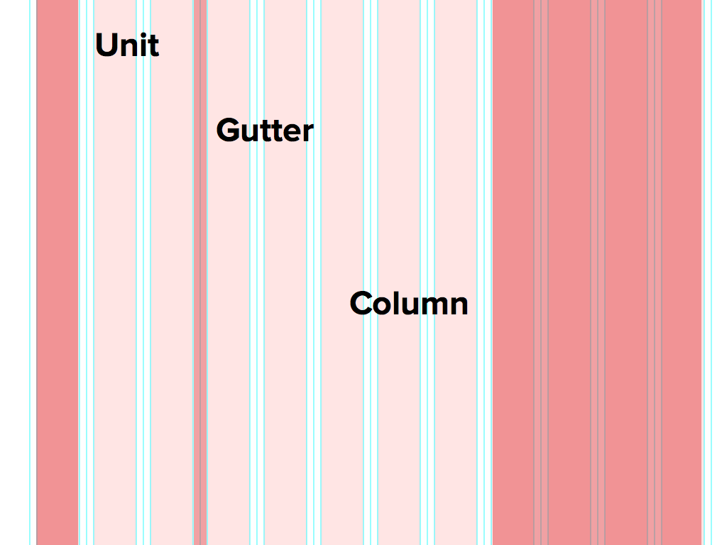
Grid System의 구성요소 (2)
[출저] https://thoughtbot.com/upcase/design-for-developers-resources/grid
[출저] https://brunch.co.kr/@macga/3
1. Unit
Units are building blocks of the grid. They are uniform in size.
= 상단에서 부르는 컬럼 부분이 유닛이라고 불림.
2. Gutter
Equal spacing between units.
= 유닛 사이의 여백
3. Column
A combination of a number of units and gutters.
= 유닛 + 거터 * 2
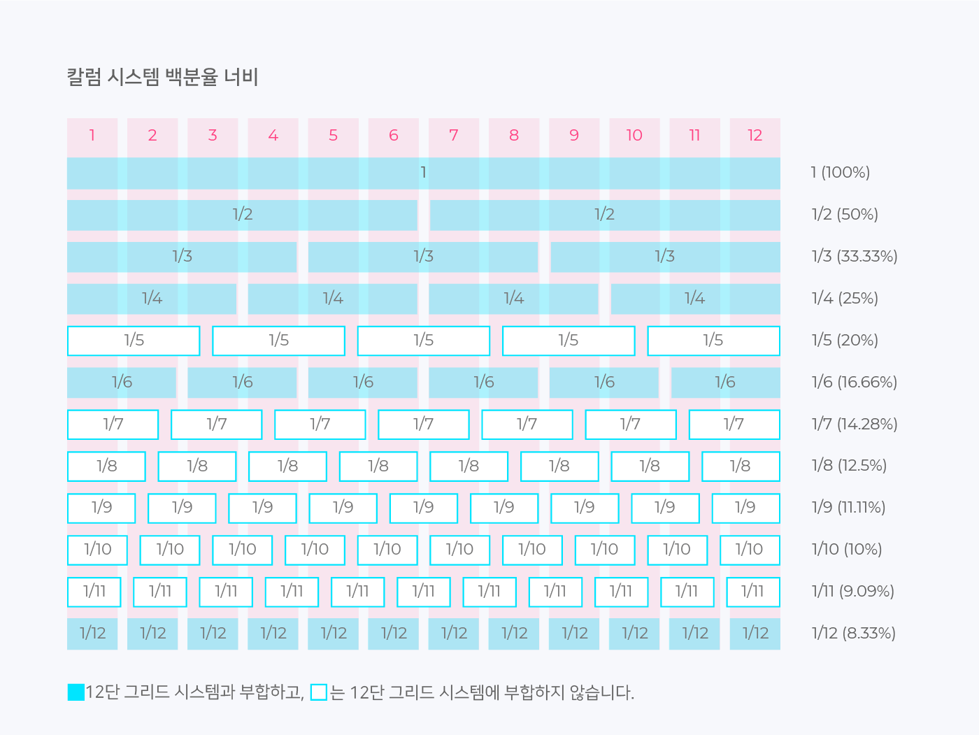
Unit이 백분율로 사용되는 경우
- 확실히 하기 위해 기존 design system에서 해당 페이지를 늘려보았을 때 column의 값이 변하는 경우 = 백분율로 계산 필요
- 그대로인 경우 = 고정값을 사용하면 된다.
Margin이 있는 경우
12 cols / gutter = 0px / margin = 50px
(100% - 100px) * 1/12
- 100px은 margin*2
- 여기서 unit은 (100% - 100px)이다.
Grid System 콘텐츠 영역 (백분율)
💡 Figma : quick-search(ctrl + /)에서 grid 검색하여 적용
💡 container : 개발에서 주로 사용되는 단어로 columns를 모두 더한 값을 뜻한다.
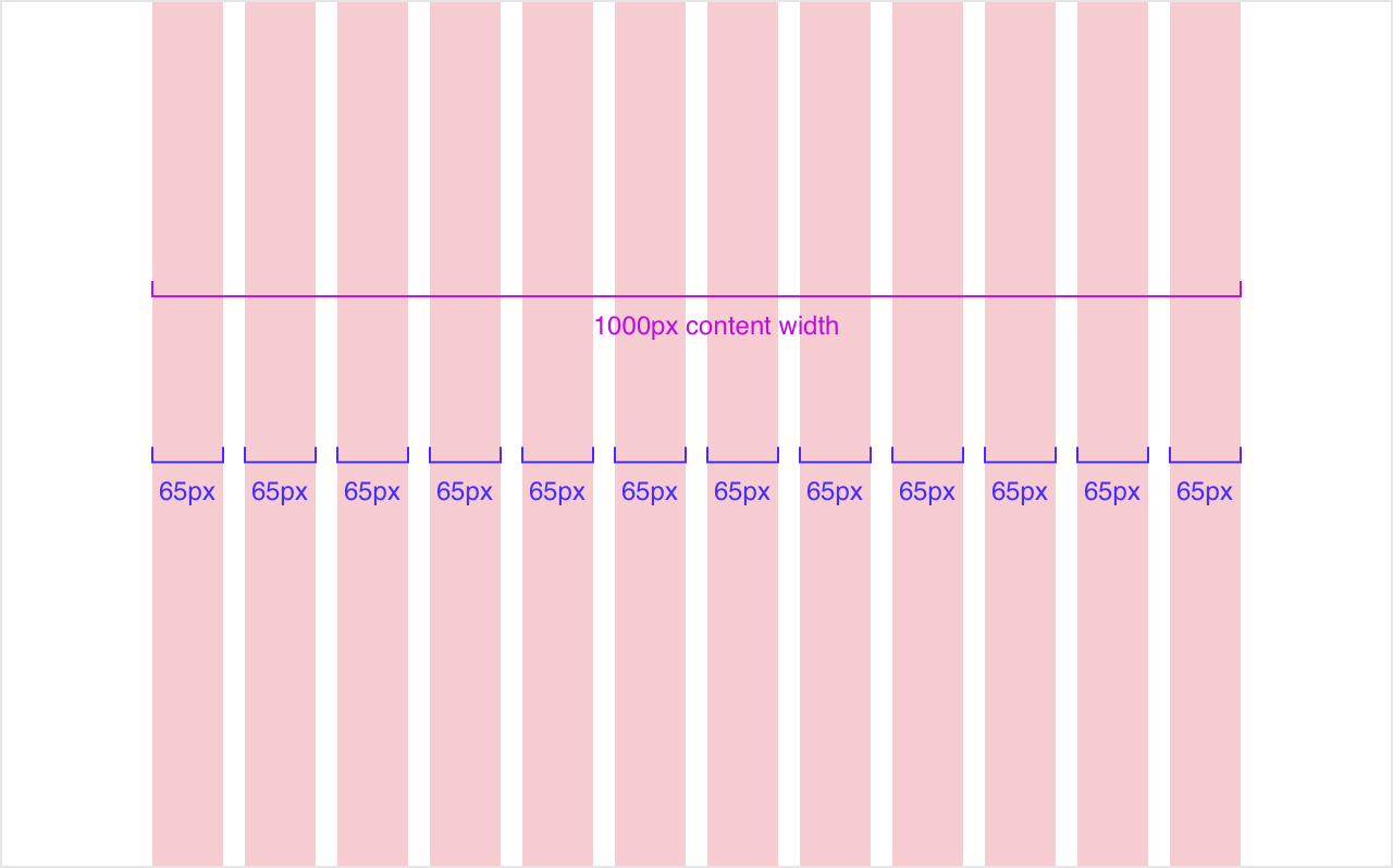
- 여기서는
content-width= container - 만약에 max-width가 device breakpoint에 정해져 있는 경우, 해당 값은
max-content-width가 된다.
Grid-system SCSS
관련된 컨텐츠는 이곳을 클릭해주세요

Frontend Developer