시각화 라이브러리 종류
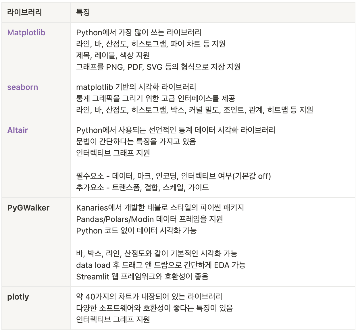
matplotlib
- 시각화 라이브러리 중 가장 많은 기능을 지원하는 라이브러리
- 다른 라이브러리 개발에 토대가 된 라이브러리
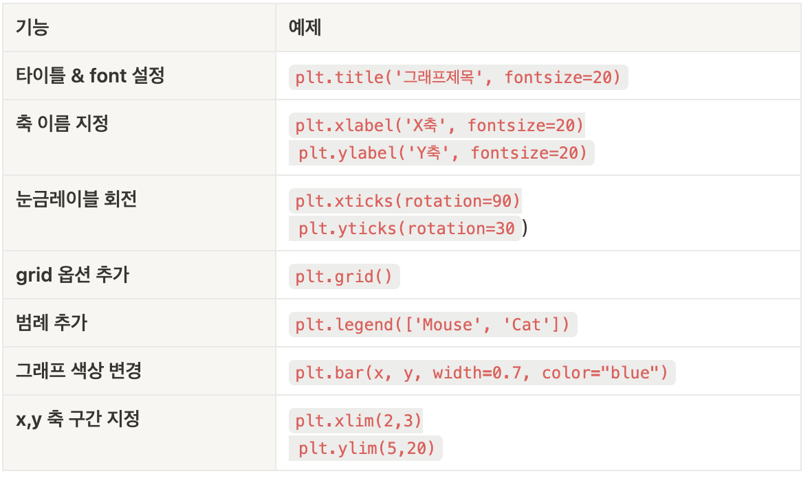
- 주요 옵션
- 막대그래프
df2.groupby('Gender')['Customer ID'].count().plot.bar(color=['yellow','green'])- 데이터프레임을 이용한 라인그래프
d1 = df2.groupby('Category')['Customer ID'].count().reset_index()

# figure 함수를 이용하여, 전체 그래프 사이즈 조정
dplot1 = plt.figure(figsize = (4 , 3))

# x축, y축 설정
x=d1['Category']
y=d1['Customer ID']

# 그래프 그리기
# 보라색, * 으로 데이터포인트 표시, 투명도=50%, 라인 굵기 5
plt.plot(x, y, color='purple', marker='*', alpha=0.5, linewidth=5)

plt.title("group by category - user cnt")
plt.xlabel("category")
plt.ylabel("usercnt")- 언스택을 활용한 라인그래프
# 카테고리, 성별 유저수 구하기
# stack 은 pivot 테이블과 비슷하게, 데이터프레임을 핸들링하는 데 주로 사용됩니다.
# 반대로 인덱스를 컬럼으로 풀어주는 unstack 이 있습니다.
d2 = df2.groupby(['Category','Gender'])['Customer ID'].count().unstack(1)# 성별이 컬럼으로

# 막대 그래프, 컬러는 hex code 를 사용하여 지정할 수 있습니다.
# hex code 찾기: https://html-color-codes.info/
dplot8 = d2.plot(kind='bar',color=['#F4D13B','#9b59b6'])
plt.title("bar plot1")
plt.xlabel("category")
plt.ylabel("usercnt")- 누적 막대그래프
# stacked=True 로 설정하면 누적그래프를 그릴 수 있습니다.
dplot9 = d2.plot(kind='bar', stacked=True, color=['#F4D13B','#9b59b6'])
plt.title("bar plot2")
plt.xlabel("category")
plt.ylabel("usercnt")- 파이차트
# 성별 비중 구하기
piedf = df2.groupby('Gender')['Customer ID'].count().reset_index()

# labels 옵션을 통해 그룹값을 표현해줄 수 있습니다.
dplot7= plt.figure(figsize=(3,3))
plt.pie(
    x=piedf['Customer ID'],
    labels=piedf['Gender'],
    # 소수점 첫째자리까지 표시
    autopct='%1.1f',
    colors=['#F4D13B','#9b59b6'],
    startangle=90
)
# 범례 표시하기
plt.legend(piedf['Gender'])
# 타이틀명, 타이틀 위치 왼쪽, 타이틀 여백 50, 글자크기, 굵게 설정
plt.title("pie plot", loc="left", pad=50, fontsize=8, fontweight="bold")- 산점도
# 나이와 평균 결제금액 분포 나타내기
d3 = df2.groupby('Age')['Purchase Amount (USD)'].mean().reset_index()

# x축: 나이 / y축: 구매금액, 데이터 포인트 색상: red
plt.scatter(d3['Age'],d3['Purchase Amount (USD)'], c="red")- 이중축 그래프
# 1. 기본 스타일 설정
plt.style.use('default')
plt.rcParams['figure.figsize'] = (4, 3)
plt.rcParams['font.size'] = 12

# 2. 데이터 준비
x = np.arange(2020, 2027)
y1 = np.array([1, 3, 7, 5, 9, 7, 14])
y2 = np.array([1, 3, 5, 7, 9, 11, 13])

# 3. 그래프 그리기- line 그래프
# subplot 모듈을 사용하면 여러 개의 그래프를 동시에 시각화 가능
# 전체 도화지를 그려주고(figure) 위치에 각 그래프들을 배치
fig, ax1 = plt.subplots()

# 라인 그래프
# 선 색상 초록, 굵기 5, 투명도 70%, 축 이름: Price
ax1.plot(x, y1, color='green', linewidth=5, alpha=0.7, label='Price')
# y 축 범위 설정
ax1.set_ylim(0, 20)
# y 축 이름 설정
ax1.set_ylabel('Price ($)')
# x 축 이름 설정
ax1.set_xlabel('Year')


# 3. 그래프 그리기- bar 그래프
# x축 공유(즉, 이중축 사용 의미)
ax2 = ax1.twinx()
# 막대 보라색, 투명도 70%, 막대 넓이 0.7
ax2.bar(x, y2, color='purple', label='Demand', alpha=0.7, width=0.7)
# y 축 범위 설정
ax2.set_ylim(0, 18)
# y 축 이름 설정
ax2.set_ylabel(r'Demand ($\times10^6$)')

# 레이블 위치
# 클수록 가장 위쪽에 보여진다고 생각하면 됨.
# ax2.set_zorder(ax1.get_zorder() + 10) 와 비교해보세요!
ax1.set_zorder(ax2.get_zorder() + 20)
ax1.patch.set_visible(False)

# 범례 지정, 위치까지 함께
ax1.legend(loc='upper left')
ax2.legend(loc='upper right')- 피라미드 그래프 -> 몰라,,,,
# 나이 구간 설정
bins2 = [10, 15, 20, 25, 30, 35, 40, 45, 50, 55, 60, 65, 70, 75, 80]

# cut 활용 절대구간 나누기
# bins 파라미터는 데이터를 나눌 구간의 경계를 정의
# [0, 4, 8, 12, 24]는 0~4, 4~8, 8~12, 12~24의 네 구간으로 데이터를 나누겠다는 의미

df2["bin"] = pd.cut(df2["Age"], bins = bins2)

# apply 와 lambda 를 활용한 전체 컬럼에 대한 나이 구간 컬럼 추가하기
#15는 15-20 으로 반환됨
df2["age"] = df2["bin"].apply(lambda x: str(x.left) + " - " + str(x.right))

# 나이와 성별 두 컬럼을 기준으로 유저id 를 count 하고 인덱스 재정렬
df7 = df2.groupby(['age','Gender'])['Customer ID'].count().reset_index()

# 계산한 결과를 바탕으로 피벗테이블 구현
df7 = pd.pivot_table(df7, index='age', columns='Gender', values='Customer ID').reset_index()

# 피라미드 차트 구현을 위한 대칭 형태 만들어주기
df7["Female_Left"] = 0
df7["Female_Width"] = df7["Female"]
df7["Male_Left"] = -df7["Male"]
df7["Male_Width"] = df7["Male"]

# matplotlib 라이브러리를 통한 그래프 그리기
dplot6 = plt.figure(figsize=(7,5))

# 수평막대 그리기 barh사용. 색상과 라벨 지정
plt.barh(y=df7["age"], width=df7["Female_Width"], color="#F4D13B", label="Female")
plt.barh(y=df7["age"], width=df7["Male_Width"], left=df7["Male_Left"],color="#9b59b6", label="Male")

# x 축과 y 축 범위 지정
plt.xlim(-300,270)
plt.ylim(-2,12)
plt.text(-200, 11.5, "Male", fontsize=10)
plt.text(160, 11.5, "Female", fontsize=10, fontweight="bold")

# 그래프에 값 표시하기
# 해당 구문을 없애고 실행해보세요!
# 외울 필요는 없습니다.
# plt.text()는 그래프의 특정 위치에 텍스트를 표시
# 텍스트를 표시할 위치 설정
# x=df7["Male_Left"][idx]-0.5: x좌표는 df7의 "Male_Left" 열의 값에서 0.5를 뺀 위치
# y=idx: y좌표는 현재 인덱스 (idx)로 설정되어, y축 방향으로 각 인덱스 위치에 텍스트 표시
# s="{}".format(df7["Male"][idx]): 표시할 텍스트는 df7의 "Male" 열에 있는 값을 문자열로 변환
# ha="right": 텍스트의 수평 정렬 오른쪽
# va="center": 텍스트의 수직 정렬 중앙
for idx in range(len(df7)):
    # 남성 데이터 텍스트로 추가
    plt.text(x=df7["Male_Left"][idx]-0.5, y=idx, s="{}".format(df7["Male"][idx]),
             ha="right", va="center",
             fontsize=8, color="#9b59b6")
    # 여성 데이터 텍스트로 추가
    plt.text(x=df7["Female_Width"][idx]+0.5, y=idx, s="{}".format(df7["Female"][idx]),
             ha="left", va="center",
             fontsize=8, color="#F4D13B")
# 타이틀 지정. 이름, 위치, 여백, 폰트사이즈, 굵게 설정
plt.title("Pyramid plot", loc="center", pad=15, fontsize=15, fontweight="bold")
seaborn
- Matplotlib을 기반으로 다양한 색상 테마와 통계용 차트 등의 기능을 추가한 시각화 패키지
- 종류
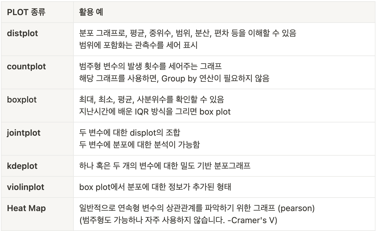
- 바 그래프
# seaborn 라이브러리를 통한 그래프 그리기
plt.figure(figsize=(15, 8))
dplot1 = sns.barplot(x="Date", y="user count", data=df9, palette='rainbow')
dplot1.set_xticklabels(dplot1.get_xticklabels(), rotation=30)
dplot1.set(title='Monthly Active User') # title barplot

# 바차트에 텍스트 추가하기
# patches 는 각 막대를 의미 .
for p in dplot1.patches:
    # 각 바의 높이 구하기
    height = p.get_height()
    # X 축 시작점으로부터, 막대넓이의 중앙 지점에 텍스트 표시
    dplot1.text(x = p.get_x()+(p.get_width()/2),
    # 각 막대 높이에 10 을 더해준 위치에 텍스트 표시
    y = height+10,
    # 값을 정수로 포맷팅
    s = '{:.0f}'.format(height),
    # 중앙 정렬
ha = 'center') - 카운트그래프
# 시즌별 카테고리별 유저수(count 값과 동일) 구하기
plt.figure(figsize=(6, 5))

# hue 는 범례
dplot2 = sns.countplot(x='Category', hue='Gender', data=df2, palette='cubehelix')
dplot2.set(title='bar plot3')- 히스토그램
sns.histplot(x=df2['Age'])- 박스플롯
sns.boxplot(x = df2['Purchase Amount (USD)'],palette='Wistia')

# 응용
dplot5 = sns.boxplot(y = df2['Purchase Amount (USD)'], x = df2['Gender'], palette='PiYG')
dplot5.set(title='box plot yeah')- 상관관계 그래프
# 상관계수 구하기
df10.corr()

# seaborn 라이브러리를 통한 그래프 그리기
# annot: 각 셀의 값 표기,camp 는 팔레트
dplot10 = sns.heatmap(df10.corr(), annot = True, cmap = 'viridis') # camp =PiYG 도 넣어서 색상을 비교해보세요.
dplot10.set(title='corr plot')- 조인트 그래프
#두 변수에 분포에 대한 분석시 사용
#hex 를 통해 밀도 확인
sns.jointplot(x=df2['Purchase Amount (USD)'], y=df10['Review Rating'], kind = 'hex', palette='cubehelix')
altair
- 지원되는 함수에 따라 값을 넣어주면 그래프가 도출되는 형식으로 작동
- 동적(움직이는) 그래프 구현
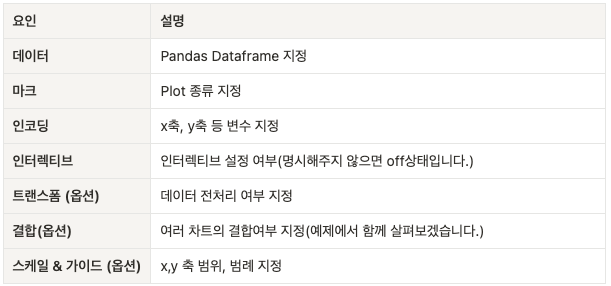
- 주요 문법 : 데이터, 마크, 인코딩은 필수로 기입해야 함
- 바그래프
alt.Chart(df).mark_bar().encode(
    x='Date',
    y='user count'
).interactive() # 동적 구현 - 파이차트
# altair 라이브러리를 통한 그래프 그리기
source = df33
colors = ['#F4D13B','#9b59b6']
#innerRadius=50 >> 도넛차트의미
dplot3 = (
alt.Chart(source).mark_arc(innerRadius=50).encode(
    theta="Customer ID",
    color="Gender",

).configure_range(category=alt.RangeScheme(colors))) # 컬러 반영하기
dplot3.title = "donut plot" # 타이틀 설정
dplot3- 동적 그래프
# altair 라이브러리를 통한 그래프 그리기
source = merge_df
colors = ['pink','#9b59b6']

# 선택(드래그) 영역 설정
brush = alt.selection_interval()
points = (alt.Chart(source).mark_point().encode(
    # Q: 양적 데이터 타입 / N: 범주형 데이터 타입
    x='Age:Q',
    y='Purchase Amount (USD):Q',
    # 선택되지 않은 부분은 회색으로 처리
    color=alt.condition(brush, 'Gender:N', alt.value('lightgray')),
).properties(  # 선택 가능영역 설정
    width=1000,
    height=300
)
.add_params(brush)) # 산점도에 드래그 영역 추가하는 코드

# 아래쪽 가로바차트
bars = alt.Chart(source).mark_bar().encode(
    y='Gender:N',
    color='Gender:N',
    x='sum(Customer ID):Q'
).properties(
    width=1000,
    height=100
).transform_filter(brush) # 산점도에서 선택된 데이터만 필터링해 막대 그래프에 반영

#산점도와 막대 그래프를 수직으로 결합
dplot4 = (points & bars)

dplot4= dplot4.configure_range(category=alt.RangeScheme(colors))
pygwalker
- 간단한 설치만으로도 EDA 가능
- 간편하게 그린 그래프를 PNG FILE 로 내보내기가 가능
pip install pygwalker
import pygwalker as pyg
df2 = pd.read_csv("customer_details.csv")
walker = pyg.walk(df2)
👋🏻