sqldeveloper
[하위질의 (SubQuery)]
: 하나의 쿼리에 다른 쿼리가 포함되는 구조, ()로처리
1) 단일 행 서브쿼리(단일 행 반환) : > , < , >=, <= , <>
Main Query
Sub Query -----> 1개결과
2) 다중 행 서브쿼리(여러 행 반환) : in, any, all
Main Query
Sub Query -----> 여러 개의 결과
   < any : 비교 대상 중 최대값보다 작음
   > any : 비교 대상 중 최소값보다 큼
              (ex. 과장직급의 급여를 받는 사원조회)
   =  any  : in연산자와 동일
   <  all   : 비교 대상 중 최솟값보다 작음
   >  all   : 비교대상중 최대값보다 큼
(ex. 모든과장들의 직급보다 급여가 많은 사원조회)-
group by rollup : a, b별 집계(Subtotal 구하기)
-> group by rollup(컬럼1, 컬럼2); -
group by cube : a별 집계 또는 b별 집계
-> group by cube(컬럼1, 컬럼2); -
group by grouping sets
-> group by grouping sets((컬럼1), ( ));← () All Rows의 역할
[문제3] 'IT_PROG' 직급 중 가장 많이 받는 사원의 급여보다 더 많은 급여를 받는 'FI_ACCOUNT' 또는 'SA_REP' 직급 직원들을 조회하시오
조건1) 급여 순으로 내림차순 정렬하시오
조건2) 급여는 세 자리마다 콤마(,) 찍고 화폐단위 '원’을 붙이시오
select last_name as 사원명,
       job_id as 업무ID,
       to_char(salary*1234, '99,999,999')||'원' as 급여
from employees
where (job_id = 'FI_ACCOUNT' or job_id = 'SA_REP') and salary >= all(select salary
                                                                     from employees
                                                                     where job_id='IT_PROG');
ex5) 'IT_PROG'와 같은 급여를 받는 사원들의 이름, 업무ID, 급여를 전부 구하시오
select last_name, job_id, salary
from employees
where salary in (select salary from employees where job_id='IT_PROG');
[문제4] 자기 업무id(job_id)의 평균급여를 받는 직원들을 조회하시오
조건1) 평균급여는 100단위 이하 절삭하고 급여는 세자리마다 콤마, $표시
조건2) 사원이름(last_name), 업무id(job_id), 직무(job_title), 급여(salary) 로 표시하시오
조건3) 급여순으로 오름차순 정렬하시오
select last_name as 사원이름,
	   job_id as 업무id,
       job_title as 직무,
       to_char(salary, '$999,999') as 급여
from employees
join jobs using (job_id)
where (job_id, salary) in (select job_id, trunc(avg(salary),-3)
from employees group by job_id);
HTML
display: none;
=> 아예 없었던 것처럼 영역도 잡히지 않는다.
visibility: hidden;
=> 브라우저에는 보이지 않지만 영역은 잡고 있다.
inline
- 줄바꿈 없이 순서대로 한 줄에 다른 엘리먼트들과 나란히 배치된다
- 컨텐트의 크기 만큼만 공간을 차지하므로 width, height 속성을 지정해도 무시된다
- padding, margin 속성은 좌우 간격만 반영이 되고 상하 간격은 반영되지 않는다
<span>,<a>,<em>등
block
- 혼자 한 줄을 차지한다
- 매번 줄바꿈이 되어 여러 줄에 보이게 된다
- width, height, padding, margin 속성이 모두 반영된다
<div>,<p>,<h1>등
inline-block
- inline 엘리먼트처럼 전후 줄바꿈 없이 한 줄에 다른 엘리먼트들과 나란히 배치된다.
- inline에서 불가능하던 width, height, padding, margin 속성의 상하 간격 지정이 가능하다.
- inline-block을 이용하면 여러 개의 엘리먼트를 한 줄에 정확히 원하는 너비만큼 배치할 수 있기 때문에 레이아웃에 활용할 수 있다.
<button>,<select>등
visibility 속성
- 기본값은 ‘visible'이며 'hidden'을 지정할 경우에는 지정된 요소가 보이지 않게 된다.
- 'display: none;'은 원래 없었던 것처럼 표현되지만,
'visibility: hidden'은 보이지만 않고 공간은 유지된다.
<style type="text/css">
div{
	border: 2px solid yellowgreen;
	color: blue;
	background: aliceblue;
}
span{
	border: 3px dotted red;
	background: yellow;
}
</style>
<body>
	<h3>인라인, 인라인 블록, 블록</h3>
	<hr>
	나는 <div>div</div> 입니다.<br><br>

	나는 <div style="display: none">div(none)</div> 입니다.<br><br>

	나는 <div style="display: inline">div(inline)</div> 입니다.<br><br>

	나는 <div style="display: inline-block; height: 50px;">div(inline-block)</div> 입니다.
    <br><br>

	나는 <div>div<span style="display: block;">span(block)</span> 입니다.</div>
</body>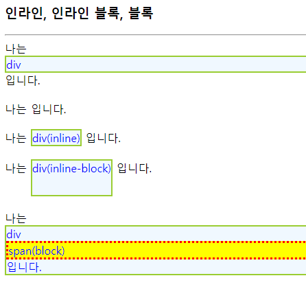
<style type="text/css">
.paging{
	text-align: center;
}
.paging a{
	display: inline-block;
	padding: 5px 8px;
	border: 1px solid #ccc;
	background-color: beige;
	font-weight: bold;
}
</style>
</head>
<body>
	<p class="paging">
		<a href="#">1</a>
		<a href="#">2</a>
		<a href="#">3</a>
		<a href="#">4</a>
		<a href="#">5</a>
	</p>
</body>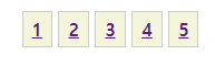
<style type="text/css">
#float{
	float: right;
	border: 1px dotted black;
	width: 7em; 			/*7글자*/
	padding: 0.25em;
	margin: 1em;
}
.text1{
	margin-right: 10em;
	text-align: justify; /*양쪽으로 정렬*/
}
.text2{
	clear: both;
}
</style>
</head>
<body>
	<h3>학기말 공지</h3>
	<hr>
	<div>
		<p id="float">
			24일 피아니스트 조성진의 크리스마스 특별 연주가 있습니다.
		</p>

		<p class="text1">
			이제 곧 겨울 방학이 시작됩니다. 학기 중 못다한 Java, C++, 프로그래밍 열심히 하기 바랍니다.
			인터을 준비하는 학생들은 프로젝트 개발에 더욱 힘쓰세요. 그럼 다음 학기에 만나요.
		</p>

		<p class="text2">
			이제 곧 겨울 방학이 시작됩니다. 학기 중 못다한 Java, C++, 프로그래밍 열심히 하기 바랍니다.
			인터을 준비하는 학생들은 프로젝트 개발에 더욱 힘쓰세요. 그럼 다음 학기에 만나요.
		</p>
	</div>
</body>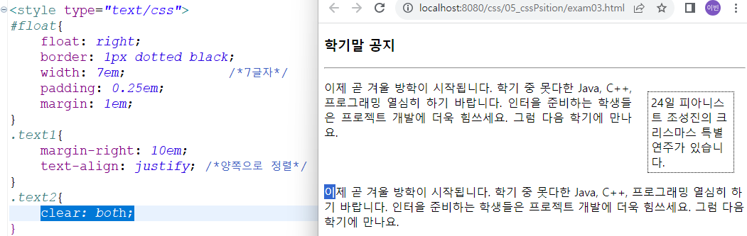
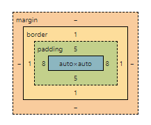
<style type="text/css">
*{        /* *은 모드 태그들 */
margin: 0;
padding: 0;
}
body{
	font: 12px Tahoma, sans-serif; /* Tahoma체가 없으면 sans-serif로 해줘~*/
}
#wrap{
	width: 800px;
	background-color: silver;
	margin: 0 auto; /* 화면의 크기에 따라 유동적으로 가운데 정렬 */
}
#header{
	background-color: red;
}
#container{
	background-color: cyan;
}
#container:after{
	content: '';
	display: block;
	clear: both;
}
.nav{
	float: left;
	background-color: lime;
	width: 180px;
}
.content{
	float: right;
	background: lime;
	width: 600px;
}
#footer{
	background-color: green;
	margin-top: 30px;
}
</style>
</head>
<body>
<div id="wrap">
	<div id="header">
		<h1>LOGO</h1>
			<p>This website is...</p>
	</div>

	<div id="container">
		<div class="nav">
			<h2>Navigation</h2>
				<ul>
					<li><a href="#">Menu 1</a></li>
					<li><a href="#">Menu 2</a></li>
					<li><a href="#">Menu 3</a></li>
				</ul>
		</div>

		<div class="content">
			<h2>Content Title</h2>
			<p>
			Pellentesque habitant morbi tristique senectus et netus 	et malesuada fames
			ac turpis egestas. Vestibulum tortor quam, feugiat vitae, ultricies eget, tempor sit
			amet, ante. Donec eu libero sit amet quam egestas semper. Aenean ultricies mi
			vitae est. Mauris placerat eleifend leo. Quisque sit amet est et sapien ullamcorper
			pharetra. Vestibulum erat wisi, condimentum sed, commodo vitae, ornare sit amet,
			wisi. Aenean fermentum, elit eget tincidunt condimentum, eros ipsum rutrum orci,
			sagittis tempus lacus enim ac dui. Donec non enim in turpis pulvinar facilisis.
			Ut felis. Praesent dapibus, neque id cursus faucibus, tortor neque egestas augue,
			eu vulputate magna eros eu erat. Aliquam erat volutpat. Nam dui mi, tincidunt
			quis, accumsan porttitor, facilisis luctus, metus
			</p>
		</div>
	</div>

	<div id="footer">
		<address>Seoul, Korea</address>
	</div>
</div>
</body>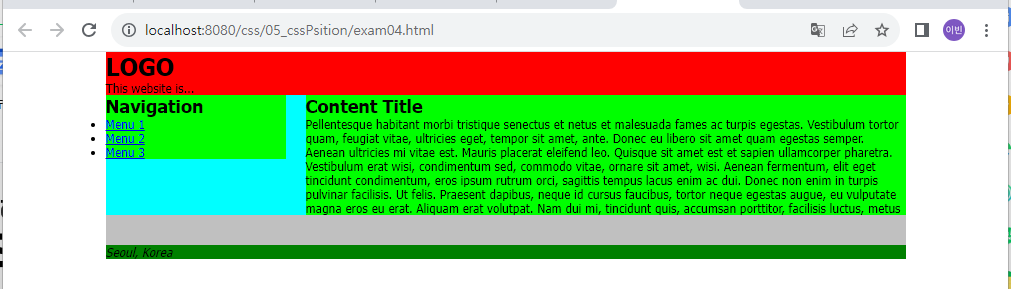
position 속성
- 값으로는 absolute, relative, fixed의 3가지가 있다.
- 이렇게 설정된 후에는 left, right, top, bottom 속성으로 그 위치를 지정하게 된다.
(1) position: absolute;
- 부모 tag의 위치를 기준으로 상대적으로 배치
- HTML 문서에 2개 이상의 요소가 나열되면, 뒤에 배치되는 요소는 앞에 놓인 요소를 기준으로
배치된다. 하지만, ‘position: absolute’으로 지정하면, 다음 요소가 이 블록을 인지하지 못한 채
오로지 주어진 절대값을 기준으로 배치된다. - ‘position: absolute’ 지정한 후, left, right, top, bottom 속성으로 그 위치를 지정할 수 있다.
(2) position: relative;
- 자기 자신을 기준으로 상대적으로 배치
- 기준값 기준으로 상대적으로 배치된다.
- ‘position: relative’로 지정된 후, left, right, top, bottom의 위치 값들은 relative가 지정된 블록 그
자신의 위치에서 지정한 값만큼 이동하게 된다. - ‘position: absolute’를 지정하는 경우, 이를 감싸는 블록에는 ‘position: relative’로 지정해야 한다.
(3) position: fixed;
- 뷰포트를 기준으로 상대적으로 배치
- 위치는 항상
<body>를 기준으로 위치된다. - 위치는 고정이다.
(4) z-index
- position을 지정한 여러 블록이 겹치게 되면, 나중에 작성한 블록이 위로 올라가게 된다.
- z-index 속성으로 블록의 위, 아래의 위치를 조정할 수 있다.
- z-index의 큰 값이 위로 올라간다.
- 기본값이 0, 음수 ~ 양수까지 줄 수 있다
<style type="text/css">
div {
	display: inline-block;
	width: 50px;
	height: 50px;
	border: 1px solid lightgray;
	text-align: center;
	color: white;
	background: red;
}
#down:hover{              /* 기준 점은 자기 자신을 기준으로*/
	position: relative;
	left: 20px;
	top: 20px;
	background: green;
}
#up:hover{              /* 기준 점은 자기 자신을 기준으로*/
	position: relative;
	/*
	right: 20px;
	bottom: 20px;
	*/
	left: -20px;
	top: -20px;
	background: green;
}
</style>
</head>
<body>
	<h3>상대배치, relative</h3>
	<hr>
	<div>T</div>
	<div id="down">h</div>
	<div>a</div>
	<div>n</div>
	<div id="up">k</div>
	<div>s</div>
</body>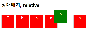
<style type="text/css">
div{
	display: inline-block;
	position: absolute;
	border: 1px solid lightgray;
}
div > p{
	display: inline-block;
	position: absolute;            /* body(부모)를 기준으로 함 */
	width: 15px;
	height: 20px;
	background: lightgray;
}
#fixed{
	position: fixed;
	bottom: 10px;
	right: 10px;
	width: 120px;
	padding: 5px;
	background: red;
	color: white;
}
</style>
</head>
<body>
	<h3>Merry Christmas!!</h3>
	<hr>
	<p>메리 크리스마스</p>
	<div>
		<img alt="크리스마스 트리" src="../image/christmastree.png" width="200" height="200">
		<p style="left: 50px; top: 30px;">M</p>
		<p style="left: 100px; top: 0px; margin: 0;">E</p>
		<p style="left: 100px; top: 80px;">R</p>
		<p style="left: 150px; top: 110px;">R</p>
		<p style="left: 30px; top: 130px;">Y</p>
	</div>

	<div id="fixed">메리 크리스마스</div>
</body>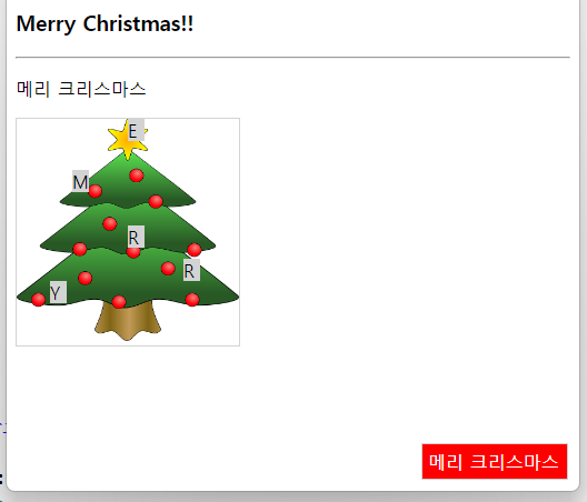
<style type="text/css">

div {position: absolute;}

img {position: absolute;}

#spadeA{left: 10px;  top: 20px; z-index: -3;}
#spade2{left: 40px;  top: 30px; z-index: 8;}
#spade3{left: 80px;  top: 40px; z-index: 2;}
#spade7{left: 120px; top: 50px; z-index: 1;}
</style>
</head>
<body>
	<h3>z-index 프로퍼티</h3>
	<hr>
	<div>
		<img id="spadeA" alt="스페이드A" src="../image/spade-A.png" width="100" height="140">
		<img id="spade2" alt="스페이드2" src="../image/spade-2.png" width="100" height="140">
		<img id="spade7" alt="스페이드7" src="../image/spade-7.png" width="100" height="140">
		<img id="spade3" alt="스페이드3" src="../image/spade-3.png" width="100" height="140">
	</div>
</body>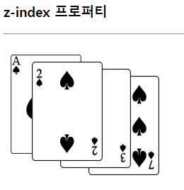
span 안에 span
<style type="text/css">
.cover span {
visibility: hidden;
/* display: none; */
}
.cover:hover span{
visibility: visible;
color: red;
}
</style>
</head>
<body>
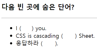
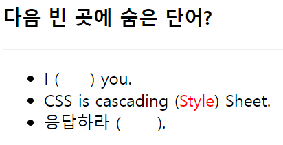
<h3>다음 빈 곳에 숨은 단어?</h3>
<hr>
<ul>
<li>I (<span class="cover"><span>love</span></span>) you.
<li>CSS is cascading
(<span class="cover"><span>Style</span></span>) Sheet.
<li>응답하라 (<span class="cover"><span>1988</span></span>).
</ul>
</body>원래는
span {
 	visibility: hidden;
    }
<span>love</span>
.cover span {
 	visibility: hidden;
}
.cover:hover span{
	visibility: visible;
	color: red;
<span class="cover"><span>love</span></span>
<style type="text/css">
p{
	width: 15em;
	height: 3em;
	border: 2px solid lightgray;
}
.hidden{ overflow: hidden; }
.visible{ overflow: visible; }
.scroll{ overflow: scroll; }
.auto{ overflow: auto; }
</style>
</head>
<body>
	<h3>overflow 프로퍼티</h3>
	<hr>

	<p class="hidden">
    overflow에 hidden 값을 적용하면 박스를 넘어가는 내용이 잘려 보이지 않습니다.
    </p><br>

	<p class="visible">
    overflow에 visible 값을 적용하면 콘텐트가 박스를 넘어가서도 출력됩니다.
    </p><br>

	<p class="scroll">
    overflow에 scroll 값을 적용하면 박스에 스크롤바를 붙여 출력합니다.
    </p><br>

	<p class="auto">
    overflow에 auto 값을 적용하면 콘텐트가 박스를 넘어갔을 때 박스에 스크롤바를 붙여 출력합니다.
    </p><br>
</body>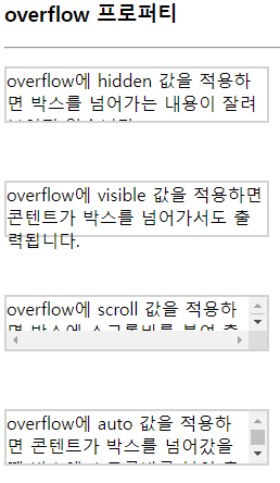
transform: scale
- box안의 이미지를 확대할 때 사용한다.
transition
- 시간의 흐름을 줘서 부드럽게 확대되도록 설정한다.
- ease : 기본값, 느리게 시작해서 빠르게 전환한 다음 다시 천천히 종료
linear : 처음부터 끝까지 같은 속도로 전환
<style type="text/css">
.imgDiv{
border: 1px solid red;
width: 150px;
height: 150px;
margin: 100px;
overflow: hidden; /*3. 사진이 커지지만 사진이 뚫고 나오지 못하고 박스에 막힌채로 커짐*/
}
img{
width: 100%;
height: 100%;
object-fit: cover; /*1. 상위 div에 맞게 들어가도록 설정 */
}
.imgDiv:hover img{
transform: scale(1.8); /*2. 마우스를 올렸을 때 이미지가 커지게 */
}
.imgDiv img{
transform: all 0.35s linear;
/*애니메이션 효과 - 마우스 오버시 이미지가 즉시 커지지 않고 30.5 second의 시간에 걸쳐 커진다*/
}
</style>
</head>
<body>
<div class="imgDiv">
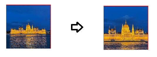
<img alt="헝가리" src="../image/1.jpg">
</div>div보다 사진이 더 커서 튀어나옴
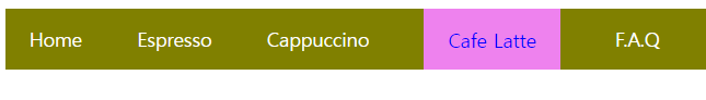
<style>
#menubar {
	background: olive;
}
#menubar ul{
	margin: 0;
	padding: 0;
	width: 650px;
}
#menubar ul li{
	display: inline-block;
	list-style: none;
	padding: 15px 20px; /*위&아래 좌&우*/
}
#menubar ul li a:hover{
	padding: 15px 20px;
	background: violet;
	color: blue;
}
#menubar ul li a{
	color: white;
	text-decoration: none; /* a태그의 밑줄 제거*/
}

</style>
</head>
<body>
	<div id="menubar">
		<ul>
			<li><span><a href="#">Home</a></span></li>
			<li><a href="#">Espresso</a></li>
			<li><a href="#">Cappuccino</a></li>
			<li><a href="#">Cafe Latte</a></li>
			<li><a href="#">F.A.Q</a></li>
		</ul>
	</div>
</body>