
-
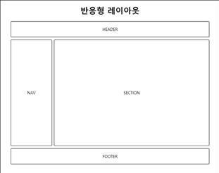
전형적인 웹 페이지 구성 요소
-
레이아웃 구분
공간 분할 순서
1) 웹 페이지 구상
2) 웹 페이지의 구성 영역 분리
3) 구성 영역을 행 단위로 분리 --> 가로로 선을 그릴 수 있는 부분을 분리
4) 나누어진 행의 내부 요소를 분리 -
초기화
--> 모든 HTML 페이지의 첫 번째 스타일시트
--> 초기화 코드는 모든 웹 브라우저에서 동일한 출력 결과를 만드는 데 사용<style> * { margin: 0; padding: 0; } body { font-family: sans-serif; } li { list-style: none; } a { text-decoration: none; } img { border: 0; } </style> -
헤더 구조 작성 (header + navigation)
#main_header 태그
<body>
   <header id="main_header">
       <div id="title">
           <h1>Rint Development</h1>
           <h2>HTML5 + CSS3 Basic</h2>
       </div>
       <nav id="main_gnb">
           <ul>
               <li><a href="#">Web</a></li>
               <li><a href="#">Mobile</a></li>
               <li><a href="#">Game</a></li>
               <li><a href="#">Simulation</a></li>
               <li><a href="#">Data</a></li>
           </ul>
       </nav>
       <nav id="main_lnb">
           <ul>
               <li><a href="#">HTML5</a></li>
               <li><a href="#">CSS3</a></li>
               <li><a href="#">JavaScript</a></li>
               <li><a href="#">jQuery</a></li>
               <li><a href="#">Node.js</a></li>
           </ul>
       </nav>
   </header>
</body>
헤더 중앙정렬
<style>
    #main_header {
        width: 960px;
        margin: 0 auto; <!-- 위 아래 여백x, 좌우는 자동 중앙정렬 -->
        }
</style>
헤더 태그 내부 요소 위치 지정
<style> #main_header { height: 160px; <!-- 강제 높이 지정 --> position: relative; <!-- 자식 요소를 헤더 기준으로 이동 --> } #main_header > #title { position: absolute; <!-- #main_header 기준으로 이동 --> left: 20px; top: 30px; } #main_header > #main_gnb { position: absolute; right: 0; top: 0; } #main_header > #main_lnb { position: absolute; right: 0; bottom: 10px; } </style> -
수평 메뉴
--> 수직으로 되어있는 메뉴바를 수평으로 변경한다.
메뉴 수평 정렬 + 메뉴 모양 꾸미기
<style> #main_gnb > ul { overflow: hidden; } #main_gnb > ul > li { float: left; } #main_gnb > ul > li > a { display: block; padding: 2px 10px; border: 1px solid black; } #main_gnb > ul > li > a:hover { background: black; color: white; } #main_gnb > ul > li:first-child > a { border-radius: 10px 0 0 10px; } #main_gnb > ul > li:last-child > a { border-radius: 0 10px 10px 0; } #main_lnb > ul {overflow: hidden; } #main_lnb > ul > li { float: left; } #main_lnb > ul > li > a { display: block; padding: 10px 20px; border: 1px solid black; } #main_lnb > ul > li > a:hober { background: black; color: white; } #main_lnb > ul > li:first-child > a { border-radius: 10px 0 0 10px; } #main_lnb > ul > li:last-child > a { border-radius: 0 10px 10px 0; } -
콘텐츠 구성
#content 태그
<div id="content">
   <section id="main_section">
       <h1>Main Section</h1>
       <p>Lorem ipsum dolor sit amet, consectetur adipiscing elit.</p>
   </section>
   <aside id="main_aside">
       <h1>Main Aside</h1>
       <p>Lorem ipsum dolor sit amet, consectetur adipiscing elit.</p>
   </aside>
</div>
#content 태그 중앙 정렬
<style>
    #content {
        width: 960px;
        margin: 0 auto;
    }
</style>
section, aside를 좌, 우로 구분
#content { overflow: hidden; <!-- 부모 태그에 overflow: hidden 추가 --> } #content > #main_section { width: 750px; float: left; } #content > #main_aside { width: 200px; float: right; } -
본문 구성 (#main_section)
본문 태그
<section id="main_section">
  <article class="main_article">
    <h1>Main Section</h1>
      <p>Lorem ipsum dolor sit amet, consectetur adipiscing elit.</p>
  </article>
  <article class="main_article">
    <h1>Main Section</h1>
      <p>Lorem ipsum dolor sit amet, consectetur adipiscing elit.</p>
  </article>
  <article class="main_article">
    <h1>Main Section</h1>
      <p>Lorem ipsum dolor sit amet, consectetur adipiscing elit.</p>
  </article>
</section>
본문 css
<style> #main_section > article.main_article { margin-bottom: 10px; padding: 20px; border: 1px solid black; } </style> -
사이드 탭바 구성 (#main_aside)
--> 보통은 JavaScript로 구성한다.
탭바 태그
<aside id="main_aside">
    <input id="first" type="radio" name="tab" checked="checked" />
    <input id="second" type="radio" name="tab" />
    <section class="buttons">
        <label for="first">First</label>
        <label for="second">Second</label>
    </section>
    <div class="tab_item">
        <ul>
            <li><a href="#">HTML5 Canvas</a></li>
            <li><a href="#">HTML5 Audio</a></li>
            <li><a href="#">HTML5 Video</a></li>
            <li><a href="#">HTML5 Semantic Web</a></li>
        </ul>
    </div>
    <div class="tab_item">
        <ul>
            <li><a href="#">CSS3 Transition</a></li>
            <li><a href="#">CSS3 Animation</a></li>
            <li><a href="#">CSS3 Border</a></li>
            <li><a href="#">CSS3 Box</a></li>
        </ul>
    </div>
** 탭바 css
 <style>
     input:nth-of-type(1) { display: none; }
     input:nth-of-type(1) ~ div:nth-of-type(1) { display: none; }
     input:nth-of-type(1):checked ~ div:nth-of-type(1) { display: block; }
     input:nth-of-type(2) { display: none; }
     input:nth-of-type(2) ~ div:nth-of-type(2) { display: none; }
     input:nth-of-type(2):checked ~ div:nth-of-type(2) { display: bloack; }
  </style>
/* 탭 모양 구성 */ section.buttons { overflow: hidden; } section.buttons > label { /* 수평 정렬 */ display: block; float: left; /* 크기 및 글자 위치 지정 */ width: 100px; height: 30px; line-height: 30px; text-align: center; /* 테두리 지정 */ box-sizing: border-box; border: 1px solid black; /* 색상 지정 */ background: black; color: white; } input:nth-of-type(1):checked ~ section.buttons > label:nth-of-type(1) { background: white; color: black; } input:nth-of-type(2):checked ~ section.buttons > label:nth-of-type(2) { background: white; color: black; } -
푸터 구성
푸터 HTML
<footer id="main_footer">
   <h3>HTML5 + CSS3 Basic<h3>
   <address>Website Layout Basic</address>
</footer>
푸터 css
<style>
    #main_footer {
        /* 중앙 정렬 */
        width: 960px;
        margin: 0 auto;
        margin-bottom: 10px;
        /* 테두리 */
        box-sizing: border-box;
        padding: 10px;
        border: 1px solid black;
        /* 글자 정렬 */
        text-align: center;
    }
</style>
웹사이트 개발과 신발을 좋아하는 학생입니다.