[개발일지14일차]KIDGAO실습3
1.학습내용
Kidsgao 홈페이지 마지막 부분까지 드디어 실습 끝냈다.
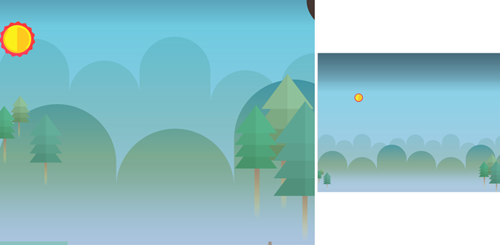
해, 양쪽 나무
<div id="morning">
		<div class="sun"></div>
		<div class="leftPine"></div>
		<div class="rightPine"></div>
</div>- style.css
#morning {
	position: relative;
	(큰 공간 id를 배치할 때 포지션을 못정하겠다면 안전하게 relative로 감싸주는 것도 방법)

	width: 100%;
	height: 800px;
	background-image: url(../img/oneday/morning/morning_bg.png);
}


#morning .sun {
	width: 131px;
	height: 131px;
	background-image: url(../img/oneday/morning/sun.png);
}

#morning .leftPine {
	position: absolute;

	width: 231px;
	height: 329px;
	background-image: url(../img/oneday/morning/leftpine.png);

	top: 270px;
}

#morning .rightPine {
	position: absolute;

	width: 294px;
	height: 609px;
	background-image: url(../img/oneday/morning/rightpine.png);

	right: 0;
	bottom: 0;
}- 일직선으로 움직이는 해(달보다 1.5초 느리게)
#morning .sun {
	animation: moveSun linear 10s 1500ms infinite;
}

@keyframes moveSun {
	from {
		margin-left: -131px;
	}
	to {
		margin-left: 110%;
	}
}
*mobile.css
#morning {
		height: 720px;
		background-image: url(../img/mobile/oneday/morning/mobile_morning_bg.png);
	}


	#morning .sun {
		width: 33px;
		height: 32px;
		background-image: url(../img/mobile/oneday/morning/mobile_sun.png);
	}

	#morning .leftPine {
		width: 48px;
		height: 81px;
		background-image: url(../img/mobile/oneday/morning/mobile_leftpine.png);
	}

	#morning .rightPine {
		width: 77px;
		height: 149px;
		background-image: url(../img/mobile/oneday/morning/mobile_rightpine.png);

		top: 220px;
	}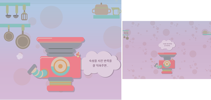
주방모습
<div id="kitchen">
	<div class="leftPan"></div>
	<div class="rightPot"></div>

	<div class="steamWrap">
		<div class="steam"></div>
		<div class="bubble1"></div>
	</div>

	<img class="kitchenBubble" src="img/kitchen/kitchenbubble.png"
   			 alt="숙성을 시킨 반죽을 잘 익혀주면">
</div>- style.css
#kitchen {
	position: relative;

	width: 100%;
	height: 800px;
	background-image: url(../img/kitchen/kitchen_bg.png);
}

#kitchen .leftPan {
	float: left; /*float 3차원*/

	width: 253px;
	height: 384px;
	background-image: url(../img/kitchen/pan.png);
}

#kitchen .rightPot {
	float: right; /*float 3차원*/

	width: 243px;
	height: 132px;
	background-image: url(../img/kitchen/pot.png);
}


#kitchen .steamWrap {
	position: relative;

	width: 483px;
	height: 457px;
	/*background-color: yellow;*/

	left: 50%;
	margin-left: -275px;
	top: -100px;

	clear: both;
	(왼쪽 오른쪽을 float사용하면서 하단footer영역이 같은 레이어에 배치.
    이 현상을 막기위해 마지막 float태그 다음 태그에 clear 작성)
}

#kitchen .steamWrap .steam {
	position: absolute;

	width: 479px;
	height: 457px;
	background-image: url(../img/kitchen/steam.png);

	z-index: 100;
}

#kitchen .steamWrap .bubble1 {
	position: absolute;

	width: 55px;
	height: 56px;
	background-image: url(../img/kitchen/bubble.png);

	margin-top: 230px;
}

#kitchen .kitchenBubble {
	position: absolute;

	top: 400px;
	right: 0;
}
*기계 증기 움직임
곡선은 직접 하기 어려우니까 여기서 도움받기
https://jeremyckahn.github.io/stylie/
#kitchen .steamWrap .bubble1 {
  animation-name: bubble;
  animation-duration: 1000ms;
  animation-delay: 0ms;
  animation-fill-mode: forwards;
  animation-timing-function: linear;
  animation-iteration-count: infinite;
  transform-origin: 0 0;
}

@keyframes bubble {
  0% {transform:translate(0px, 0px) scale(1) rotateX(0deg) rotateY(0deg) rotateZ(0deg) translate(-50%, -50%);}
  100% {transform:translate(-175px, -196px) scale(1) rotateX(0deg) rotateY(0deg) rotateZ(0deg) translate(-50%, -50%);}
}
*mobile.css
#kitchen {
		height: 400px;
		background-image: url(../img/mobile/kitchen/mobile_kitchen_bg.png);
	}

	#kitchen .leftPan {
		width: 52px;
		height: 78px;
		background-image: url(../img/mobile/kitchen/mobile_pan.png);
	}

	#kitchen .rightPot {
		width: 73px;
		height: 38px;
		background-image: url(../img/mobile/kitchen/mobile_pot.png);
	}

	#kitchen .steamWrap {
		width: 300px;
		height: 300px;
		margin-left: -150px;
		/*background-color: yellow;*/

		top: 0;
	}

	#kitchen .steamWrap .steam {
		width: 222px;
		height: 184px;
		background-image: url(../img/mobile/kitchen/mobile_steam.png);

		left: 50%;
		top: 100px;
		margin: 0 0 0 -140px;
	}

	#kitchen .steamWrap .bubble1 {
		display: none;
		(모바일 버전에 움직이는 버블은 없다. 안보이게 처리)
	}


	#kitchen .kitchenBubble {
		width: 143px;
		left: 50%;

		margin: -320px 0 0 -70px;
	}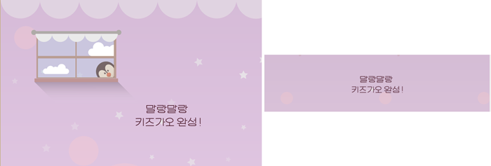
<div id="color1">
	<div class="penguin"></div>
	<img class="color1Bubble" src="img/color/color1/color1bubble.png"
		alt="말랑말랑 키즈가오 완성">

</div>
*style.css
#color1 {
	position: relative;

	width: 100%;
	height: 750px;
	background-image: url(../img/color/color1/color1_bg.png);
}

#color1 .penguin {
	position: relative;

	width: 356px;
	height: 244px;
	background-image: url(../img/color/color1/penguin.png);

	top: 100px;
	left: 100px;
}

#color1 .color1Bubble {
	float: right;

	margin: 100px 200px 0 0;
}- mobile.css
#color1 {
		height: 500px;
		background-image: url(../img/mobile/color/color1/mobile_color1_bg.png);
	}

	#color1 .penguin {
		display: none;
	}

	#color1 .color1Bubble {
		position: relative;
		float: initial;
		(pc버전 float: right;적용시키지 않겠다는 의미)

		width: 166px;
		height: 56px;

		left: 50%;
		margin: 100px 0 0 -83px;
	}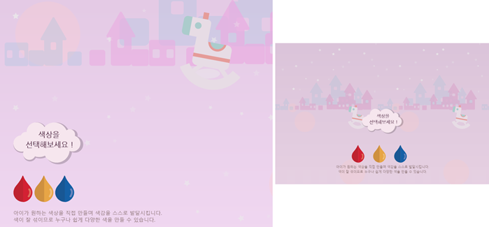
목마+ 3가지 색상 + 글씨
<div id="color2">
	<div class="horse"></div>

	<div class="color2wrap">

		<img class="color2Bubble" src="img/color/color2/color2bubble.png"
			alt="색상을 선택해 보세요" >

		<div class="btn-wrap">
			<button type="button" class="red"></button>
			<button type="button" class="yellow"></button>
			<button type="button" class="blue"></button>
	(type:button 클릭했을 때 서버에 데이터를 보내는 역할이 아니기때문에 button
	type:submit 클릭했으 때 서버에 데이터를 보낼 때)
		</div>

		<p class="color2Comment">
				아이가 원하는 색상을 직접 만들며 색감을 스스로 발달시킵니다.<br>
				색이 잘 섞이므로 누구나 쉽게 다양한 색을 만들 수 있습니다.
		</p>
	</div>
</div>- style.css
#color2 {
	position: relative;
	width: 100%;
	height: 800px;
	background-image: url(../img/color/color2/color2_bg.png);
}


#color2 .horse {
	float: right;
	width: 188px;
	height: 241px;
	background-image: url(../img/color/color2/horse.png);

	margin: 100px 100px 0 0;
}


#color2 .color2wrap {
	clear: both;
	position: relative;

	width: 500px;

	top: 100px;
	margin-left: 50px;
}


#color2 .color2wrap .color2Bubble {
	margin-bottom: 30px;
}

#color2 .color2wrap .btn-wrap {
	margin-bottom: 20px;
}

#color2 .color2wrap .btn-wrap .red,
#color2 .color2wrap .btn-wrap .yellow,
#color2 .color2wrap .btn-wrap .blue {
	width: 59px;
	height: 82px;
}

#color2 .color2wrap .btn-wrap .red {
	background-image: url(../img/color/color2/btn/btn_red.png);
}

#color2 .color2wrap .btn-wrap .yellow {
	background-image: url(../img/color/color2/btn/btn_yellow.png);
}

#color2 .color2wrap .btn-wrap .blue {
	background-image: url(../img/color/color2/btn/btn_blue.png);
}

#color2 .color2wrap .color2Comment {
color: #8e7577;- mobile.css
#color2 {
		height: 400px;
		background-image: url(../img/mobile/color/color2/mobile_color2_bg.png);
	}

	#color2 .horse {
		display: none;
	}

	#color2 .color2wrap {
		width: 320px;
		/*height: 200px;*/

		top: 0;
		left: 50%;
		margin-left: -160px;

		text-align: center;
	}


	#color2 .color2wrap .color2Bubble {
		width: 128px;
	}

	#color2 .color2wrap .btn-wrap {
		width: 300px;
		height: 60px;
		margin-bottom: 0;
	}

	#color2 .color2wrap .btn-wrap .red,
	#color2 .color2wrap .btn-wrap .yellow,
	#color2 .color2wrap .btn-wrap .blue {
		width: 40px;
		height: 56px;
	}

	#color2 .color2wrap .btn-wrap .red {
		background-image: url(../img/mobile/color/color2/btn/mobile_btn_red.png);
	}

	#color2 .color2wrap .btn-wrap .yellow {
		background-image: url(../img/mobile/color/color2/btn/mobile_btn_yellow.png);
		margin-left: 20px;
		margin-right: 20px;
	}

	#color2 .color2wrap .btn-wrap .blue {
		background-image: url(../img/mobile/color/color2/btn/mobile_btn_blue.png);
	}

	#color2 .color2wrap .color2Comment {
		color: #8e7577;
		line-height: 15px;
		font-size: 10px;
	}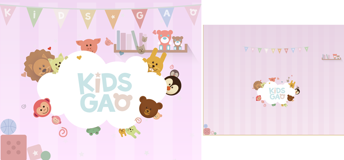
<div id="color3">
	<div class="flag"></div>
	<div class="book"></div>
	<img class="logo" src="img/color/color3/logo.png" alt="키즈가오 회사 로고">
	<div class="dice"></div>
</div>
*style.css
#color3 {
	position: relative;

	width: 100%;
	height: 800px;
	background-image: url(../img/color/color3/color3_bg.png);
}

#color3 .flag {
	position: relative;

	width: 1774px;
	height: 178px;
	background-image: url(../img/color/color3/flag.png);

	left: 50%;
	margin-left: -887px;
}

#color3 .book {
	float: right;

	width: 417px;
	height: 178px;
	background-image: url(../img/color/color3/book.png);
}

#color3 .logo {
	position: absolute;

	left: 50%;
	margin-left: -378.5px;
}

#color3 .dice {
	position: absolute;
	width: 239px;
	height: 200px;
	background-image: url(../img/color/color3/dice.png);

	left: 0;
	bottom: 0;
}- mobile.css
#color3 {
		height: 430px;
		background-image: url(../img/mobile/color/color3/mobile_color3_bg.png);
	}

	#color3 .flag {
		width: 320px;
		height: 46px;
		background-image: url(../img/mobile/color/color3/mobile_flag.png);

		margin-left: -160px;
	}


	#color3 .book {
		width: 107px;
		height: 46px;
		background-image: url(../img/mobile/color/color3/mobile_book.png);

		margin-right: 20px;
	}

	#color3 .logo {
		width: 225px;

		margin-top: 100px;
		margin-left: -112.5px;
	}

	#color3 .dice {
		width: 62px;
		height: 52px;
		background-image: url(../img/mobile/color/color3/mobile_dice.png);
	}
이로써 KIDSGAO홈페이지를 끝!
주의해야 할 점
강의를 따라하면서 class명, ID명 오류로 진행이 안됐던 적이 있었다. 대문자를 소문자로 적었던 적이 많았었다. 이런 문제를 방지하고자 일관성있게 작성할 필요가 있다! id, class명에 숫자위치나 '_', 대문자, 소문자 일관성있게 다시 처음부터 작성해봐야겠다.
2.어려웠던 내용
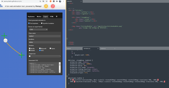
분명 복사해왔을 뿐인데 적용이 안돼서 한참 찾았다. 검사기능도 살펴봤지만 실패. 내가 작성한 거라면 오타 찾기에 힘을 쏟았겠지만, stylie이 오타를 냈을리가...
3.해결방법
위에 있는 css요소에 문제가 있었다. #kitchen {여기에서 여러 코드가 삽입되다 보니까 닫는 대괄호가 사라져있었다. '}'
그래서 별도의 css요소들도 다 위에 요소에 포함돼 있게 되면서 마무리 덜 된 코드 작성이 됐다.
4.학습소감
작업할 때는 반복되는 구조라고 생각됐는데 다 하고 보니까 조심해야 할 요소들, 문제 발생하지 않도록 넣어줘야하는 코드들이 복잡해보인다.
오늘도 다짐한다. 반복될 수록 오타 조심하자. 구조 마무리 신경쓰자.

예비 프론트엔드 개발자