[개발일지12일차]KIDGAO 홈페이지2
1.학습내용
어제 홈페이지 내용에 이어서 실습 작업을 했다.
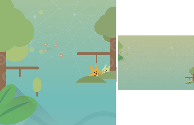
<div id="forest1">
		<div class="leftTree"></div>

		<div class="treeWrap">
			<div class="rightTree"></div>
			<div class="rabbit1"></div>
			<div class="rabbit2"></div>
		</div>
	</div>
*오른쪽 나무~물결까지 style.css
#forest1 .treeWrap {
	float: right;
	position: relative;

	width: 304px;
	height: 572px;

	top: 100px;
	(자기가 주도해서 움직이기 때문에 겹칠 수 있다)
}

#forest1 .treeWrap .rightTree {
	position: absolute;

	width: 304px;
	height: 572px;
	background-image: url(../img/forest/forest1/righttree.png);

	z-index: 10;
	/*나무가 토끼보다 앞쪽에 위치*/

}

(오른쪽 노란 토끼)
#forest1 .treeWrap .rabbit1 {
	position: absolute;

	width: 82px;
	height: 103px;
	background-image: url(../img/forest/forest1/rabbit1.png);

	margin: 435px 0 0 107px;
}
(초록토끼)
#forest1 .treeWrap .rabbit2 {
	position: absolute;

	width: 56px;
	height: 75px;
	background-image: url(../img/forest/forest1/rabbit2.png);

	margin: 435px 0 0 200px;
}- 오른쪽 토끼 고개 aniamation.css
#forest1 .treeWrap .rabbit1 {
	animation: spinRabbitOne 1000ms linear infinite alternate;
}

@keyframes spinRabbitOne {
	from { transform: rotate(0deg);  }
	to { transform: rotate(10deg);  }
}


#forest1 .treeWrap .rabbit2 {
	animation: spinRabbitTwo 1000ms linear infinite alternate;
}

@keyframes spinRabbitTwo {
	from { transform: rotate(10deg);  }
	to { transform: rotate(0deg);  }
}- mobile.css
#forest1 {
		position: relative;

		height: 400px;
		background-image: url(../img/mobile/forest/forest1/mobile_forest1_bg.png);
	}

	#forest1 .leftTree {
		width: 79px;
		height: 187px;
		background-image: url(../img/mobile/forest/forest1/mobile_lefttree.png);
	}

	#forest1 .treeWrap {
		width: 68px;
		height: 129px;

		top: 200px;
		(treeWrap 기본 포지션이 relative설정돼서 top사용 가능하다)
	}

	#forest1 .treeWrap .rabbit1,
	#forest1 .treeWrap .rabbit2 {
		display: none;
		(이미지 확인 해보면 이미 토끼가 삽입된 나무 이미지다. 그래서 pc버전에서 추가된 토끼들은 안보이게 처리)
	}

	#forest1 .treeWrap .rightTree {
		width: 68px;
		height: 129px;
		background-image: url(../img/mobile/forest/forest1/mobile_righttree.png);
	}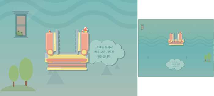
<div id="forest2">
		<div class="frog"></div>
		<div class="machineWrap2">
			<div class="machineBottom"></div>
			<div class="machineLeft"></div>
			<div class="machineRight"></div>
		</div>

		<img class="forestBubble" src="img/forest/forest2/forestbubble.png" alt="기계를 통해서 쌀을 고운 가루로 만든답니다.">

		<div class="forest2Tree"></div>
</div>- stlye.css
#forest2 {
	width: 100%;
	height: 750px;
	background-image: url(../img/forest/forest2/forest2_bg.png);
}

#forest2 .frog {
	position: absolute;

	width: 153px;
	height: 257px;
	background-image: url(../img/forest/forest2/frog.png);

	margin: 50px 0 0 100px;
}

#forest2 .machineWrap2 {
	position: relative;

	width: 400px;
	height: 400px;

	left: 50%;
	margin-left: -200px;
	top: 180px;
}

(그림자 영역도 이미지의 한 부분. 크기 신경쓰기)
#forest2 .machineWrap2 .machineBottom {
	position: absolute;

	width: 374px;
	height: 162px;
	background-image: url(../img/forest/forest2/machinebottom.png);

	margin-top: 220px;

	z-index: 200;
}

#forest2 .machineWrap2 .machineLeft {
	position: absolute;

	width: 123px;
	height: 228px;
	background-image: url(../img/forest/forest2/machineleft.png);

	margin-top: 30px;

	z-index: 200;
}

#forest2 .machineWrap2 .machineRight {
	position: absolute;

	width: 123px;
	height: 248px;
	background-image: url(../img/forest/forest2/machineright.png);

	margin: 10px 0 0 260px;

	z-index: 200;
}

#forest2 .forestBubble {
	position: relative;

	float: right;

	top: -100px;
	margin-right: 100px;
}

#forest2 .forest2Tree {
	float: left;
	position: relative;

	width: 304px;
	height: 282px;
	background-image: url(../img/forest/forest2/forest2tree.png);

	top: 50px;
}- 기계움직임 animation.css
#forest2 .machineWrap2 .machineLeft {
	animation: moveLeft 1s linear infinite alternate;
}

@keyframes moveLeft {
	from {left: 30px;}
	to {left: 0}
}


#forest2 .machineWrap2 .machineRight {
	animation: moveRight 1s linear infinite alternate;
}

@keyframes moveRight {
	from {left: -30px;}
	to {left: 0}
}
- mobile.css
#forest2 {
		position: relative;

		height: 400px;
		background-image: url(../img/mobile/forest/forest2/mobile_forest2_bg.png);
	}

	#forest2 .frog {
		width: 34px;
		height: 57px;
		background-image: url(../img/mobile/forest/forest2/mobile_frog.png);

		margin: 0 0 0 20px;
	}

	#forest2 .machineWrap2 {
		width: 200px;
		height: 110px;

		top: 70px;
		margin-left: -97px;
	}

	#forest2 .machineWrap2 .machineBottom {
		width: 141px;
		height: 60px;
		background-image: url(../img/mobile/forest/forest2/mobile_machinebottom.png);

		left: 50%;
		margin: 50px 0 0 -70.5px;
	}

	#forest2 .machineWrap2 .machineLeft {
		width: 46px;
		height: 85px;
		background-image: url(../img/mobile/forest/forest2/mobile_machineleft.png);

		margin: 0 0 0 20px;
	}

	#forest2 .machineWrap2 .machineRight {
		width: 46px;
		height: 93px;
		background-image: url(../img/mobile/forest/forest2/mobile_machineright.png);

		margin: -10px 0 0 130px;
	}

	#forest2 .forestBubble {
		position: absolute;

		width: 161px;

		top: 290px;
		left: 50%;
		margin-left: -83px;
	}


	#forest2 .forest2Tree {
		float: right;

		width: 69px;
		height: 76px;
		background-image: url(../img/mobile/forest/forest2/mobile_forest2tree.png);

		top: 130px;
		margin-right: 20px;
	}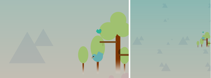
<div id="forest3">

		<div class="forest3Wrap">
			<div class="forest3Tree"></div>
			<div class="smallBird"></div>
			<div class="bigBird"></div>
		</div>

</div>- style.css
#forest3 {
	width: 100%;
	height: 600px;
	background-image: url(../img/forest/forest3/forest3_bg.png);
}

#forest3 .forest3Wrap {
	float: right;
	position: relative;

	width: 354px;
	height: 440px;

	top: 100px;
}

#forest3 .forest3Wrap .forest3Tree {
	position: absolute;

	width: 354px;
	height: 440px;
	background-image: url(../img/forest/forest3/forest3tree.png);
}

#forest3 .forest3Wrap .smallBird {
	position: absolute;

	width: 40px;
	height: 35px;
	background-image: url(../img/forest/forest3/bird_sm.png);

	top: 120px;
	left: 125px;
}


#forest3 .forest3Wrap .bigBird {
	position: absolute;

	width: 83px;
	height: 80px;
	background-image: url(../img/forest/forest3/bird_big.png);

	margin: 280px 0 0 94px;
}- 새 움직임 animation.css
#forest3 .forest3Wrap .bigBird {
	animation: spinBigBrid 1000ms linear infinite alternate;
}

@keyframes spinBigBrid {
	from {
		transform: rotate(-10deg);
	}

	to {
		transform: rotate(10deg);
	}
}- mobile.css
#forest3 {
		height: 630px;
		background-image: url(../img/mobile/forest/forest3/mobile_forest3_bg.png);
	}

	#forest3 .forest3Wrap {
		width: 99px;
		height: 127px;

		top: 300px;
	}

	#forest3 .forest3Wrap .forest3Tree {
		width: 99px;
		height: 127px;
		background-image: url(../img/mobile/forest/forest3/mobile_forest3tree.png);
	}

	#forest3 .forest3Wrap .smallBird,
	#forest3 .forest3Wrap .bigBird {
		display: none;
	}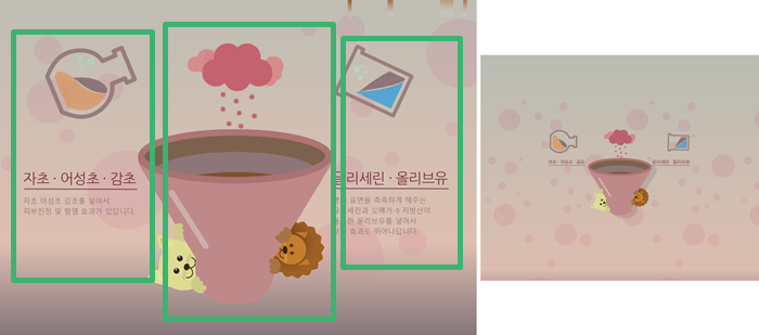
<div id="science">
		(서랍장1)
		<div class="scienceWrap">

			(세부 서랍장 :왼쪽 정보+이미지, 중앙 그릇, 오른쪽 정보+이미지 세 부분으로 나눠 작업)
			<div class="scienceLeftWrap">
				<div class="gly"></div>
				<img src="img/science/leftTitle.png" alt="자초, 어성초, 감초">

				<p>
					자초 어성초 감초를 넣어서<br>
					피부진정 및 함염 효과가 있답니다.
				</p>
			</div>

			<div class="scienceCenterWrap">

				<div class="purpleSteam"></div>
				<div class="funnelBack"></div>
				<div class="funnelFront"></div>

			</div>

			<div class="scienceRightWrap">

				<div class="water"></div>
				<img src="img/science/rightTitle.png" alt="글리세린, 올리브유">
				<p>
					빵의 표면을 촉촉하게 해주는<br>
					글리세린과 오메가-9 지방산이<br>
					풍부한 올리브유를 넣어서<br>
					보습 효과도 뛰어나답니다.
				</p>
			</div>
		</div>

</div>- style.css
#science {
	position: relative;

	width: 100%;
	height: 800px;
	background-image: url(../img/science/science_bg.png);
}

#science .scienceWrap{
	position: relative;

	width: 1068px;
	height: 655px;

	margin: 0 auto;
}

#science .scienceWrap .scienceLeftWrap {
	float: left;
	width: 288px;
	height: 100%;
}

#science .scienceWrap .scienceLeftWrap .gly {
	width: 230px;
	height: 192px;
	background-image: url(../img/science/gly.png);

	margin: 0 0 130px 55px;
}


#science .scienceWrap .scienceLeftWrap p,
#science .scienceWrap .scienceRightWrap p {
	color: #8e7577;
	font-size: 18px;
	line-height: 26px;

	padding-top: 10px;
	(p태그 글자 밑에 공백을 주기 위함)
}


#science .scienceWrap .scienceCenterWrap {
	position: relative;
	float: left;
	width: 488px;
	height: 100%;
}

#science .scienceWrap .scienceCenterWrap .purpleSteam {
	position: relative;

	width: 241px;
	height: 216px;
	background-image: url(../img/science/grape.png);

	left: 50%;
	margin-left: -120px;
}

#science .scienceWrap .scienceCenterWrap .funnelBack {
	position: absolute;

	width: 488px;
	height: 438px;
	background-image: url(../img/science/funnelback.png);
}

#science .scienceWrap .scienceCenterWrap .funnelFront {
	position: relative;
    (형제관계가 3차원이기 때문에 z-index사용하지 않아도 맨위에 겹쳐짐)

	width: 485px;
	height: 390px;
	background-image: url(../img/science/funnelfront.png);

	margin-top: 48px;
}


#science .scienceWrap .scienceRightWrap {
	float: left;
	width: 292px;
	height: 100%;
}


#science .scienceWrap .scienceRightWrap .water {
	width: 204px;
	height: 191px;
	background-image: url(../img/science/water.png);

	margin-bottom: 130px;
}- 양쪽 그릇 animation.css
#science .scienceWrap .gly {
	animation: spinGly 1500ms linear infinite alternate;
}

@keyframes spinGly {
	from { transform: rotate(0deg); }
	to { transform: rotate(50deg); }
}

#science .scienceWrap .water {
	animation: spinWater 1500ms linear infinite alternate;
}

@keyframes spinWater {
	from { transform: rotate(0deg); }
	to { transform: rotate(-50deg); }
}- 모바일.css(가운데 정렬 신경)
#science {
		height: 580px;
		background-image: url(../img/mobile/science/mobile_science_bg.png);
	}

	#science .scienceWrap {
		overflow: hidden;
		width: 360px;
		height: auto;

		top: 180px;
	}

	#science .scienceWrap .scienceLeftWrap {
		width: 100px;
	}

	#science .scienceWrap .scienceLeftWrap .gly {
		width: 76px;
		height: 63px;
		background-image: url(../img/mobile/science/mobile_gly.png);

		margin: 0 0 10px 0;
	}

	#science .scienceWrap .scienceLeftWrap img,
	#science .scienceWrap .scienceRightWrap img {
		height: 15px;
	}

	#science .scienceWrap .scienceLeftWrap p,
	#science .scienceWrap .scienceRightWrap p {
		display: none;
	}


	#science .scienceWrap .scienceCenterWrap {
		width: 160px;
		height: 222px;
	}

	#science .scienceWrap .scienceCenterWrap .purpleSteam {
		width: 80px;
		height: 71px;
		background-image: url(../img/mobile/science/mobile_grape.png);

		margin-left: -40px;
	}

	#science .scienceWrap .scienceCenterWrap .funnelBack {
		width: 173px;
		height: 151px;
		background-image: url(../img/mobile/science/mobile_hopperback.png);
	}

	#science .scienceWrap .scienceCenterWrap .funnelFront {
		width: 160px;
		height: 122px;
		background-image: url(../img/mobile/science/mobile_hopperfront.png);

		left: 50%;
		margin: 20px 0 0 -80px;
	}


	#science .scienceWrap .scienceRightWrap {
		width: 100px;
	}

	#science .scienceWrap .scienceRightWrap .water {
		width: 67px;
		height: 63px;
		background-image: url(../img/mobile/science/mobile_water.png);

		margin-bottom: 10px;
		margin-left: 32px;
	}
<div id="night1">
		<div class="owl"></div>
		<div class="starWrap">
			<div class="star1"></div>
			<div class="star2"></div>
			<div class="star3"></div>
</div>- style.css
#night1 {
	width: 100%;
	height: 700px;
	background-image: url(../img/oneday/night1/night1_bg.png);
}

#night1 .owl {
	position: absolute;

	width: 334px;
	height: 571px;
	background-image: url(../img/oneday/night1/owl.png);

	margin-top: 50px;
}

#night1 .starWrap {
	position: relative;

	width: 750px;
	height: 400px;

	top: 150px;
	margin-left: 600px;
}

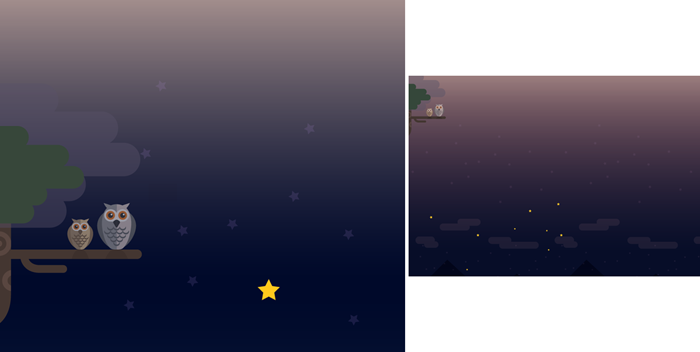
(원래 별 3개 나와야 하는데 왜 별이 하나밖에 안나오지?)
#night1 .starWrap .star1,
#night1 .starWrap .star2,
#night1 .starWrap .star3 {
	position: absolute;

	width: 53px;
	height: 50px;
	background-image: url(../img/oneday/night1/star1.png);
}

#night1 .starWrap .star1 {
	margin-top: 350px;
}

#night1 .starWrap .star2 {
	margin-left: 650px;
}

#night1 .starWrap .star3 {
	margin: 250px 0 0 500px;
}- pc버전 별 커졌다 작아졌다 animation.css
#night1 .starWrap .star1,
#night1 .starWrap .star2,
#night1 .starWrap .star3 {
	animation: pulseStar 1s linear infinite alternate;
}

@keyframes pulseStar {
	from {  transform: scale(1); }
	to { transform: scale(0.8); }
}- mobile.css
#night1 {
		position: relative;
		height: 500px;
		background-image: url(../img/mobile/oneday/night1/mobile_night1_bg.png);
	}

	#night1 .owl {
		width: 88px;
		height: 151px;
		background-image: url(../img/mobile/oneday/night1/mobile_owl.png);

		margin-top: 0;
	}

	#night1 .starWrap {
		position: absolute;

		width: 308px;
		height: 157px;
		background-image: url(../img/mobile/oneday/night1/mobile_star.png);

		top: 300px;
		margin-left: 50px;
	}


	#night1 .starWrap .star1,
	#night1 .starWrap .star2,
	#night1 .starWrap .star3 {
		display: none;
	}
2.어려운부분
잘 따라했는데 별 이미지가 1개만 나온다.
3.해결방법
어디가 문제인지 아직 발견하지 못했다..
4.학습소감
공간에 대한 감이 아직은 부족하지만 이제 태그들이 익숙해지는 게 느껴진다.

예비 프론트엔드 개발자