1.학습내용
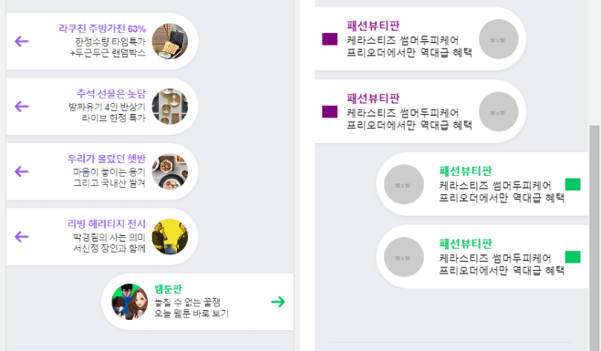 앞(네이버 페이지)/뒤(카피캣 페이지)
<div id="talk">
	<ul>
		<li class="left-list">
			<a href="#">
				<i class="icon-arrow icon-arrow-left"></i>
				<div class="content-wrap">
					<div class="txt-wrap">
						<h3>패션뷰티판</h3>
						<p>케라스티즈 썸머두피케어<br>
						프리오더에서만 역대급 혜택</p>
					</div>

					<img src="https://via.placeholder.com/52">
				</div>
			</a>
		</li>

		<li class="right-list">
			<a href="#">
				<img src="https://via.placeholder.com/52">
				<div class="content-wrap">
					<div class="txt-wrap">
						<h3>패션뷰티판</h3>
						<p>케라스티즈 썸머두피케어<br>
						프리오더에서만 역대급 혜택</p>
					</div>
				<i class="icon-arrow icon-arrow-right"></i>

				</div>
			</a>
		</li>
	</ul>
</div>
#talk {
padding: 20px 0;
}
#talk ul {
overflow: hidden;
}
#talk ul li {
position: relative;
width: 277px;
padding: 15px 0 15px;
box-shadow: 0 1px 6px 0 rgb(0 0 0 / 6%), 0 1px 0 0 rgb(0 0 0 /2%);
background-color: #ffffff;
margin-bottom: 12px;
}
#talk ul li:last-child {
margin-bottom: 0;
}
#talk ul li img {
width: 52px;
height: 52px;
border-radius: 50%;
}
#talk ul li .icon-arrow {
display: inline-block;
width: 20px;
height: 16px;
}
#talk ul li a {
display: flex;
flex-direction: row;
flex-wrap: wrap;
justify-content: space-between;
align-items: center;
align-content: center;
padding: 0 10px;
color: #000000;
}
#talk ul .content-wrap .txt-wrap h3 {
font-size: 14px;
font-weight: 600;
}
#talk ul .content-wrap .txt-wrap p {
font-size: 13px;
line-height: 16px;
margin-top: 3px;
}
#talk ul .left-list {
float: left;
border-top-right-radius: 80px;
border-bottom-right-radius: 80px;
}
#talk ul .left-list .icon-arrow-left {
background-color: purple;
}
#talk ul .left-list .content-wrap {
display: flex;
flex-direction: row;
flex-wrap: nowrap;
justify-content: flex-end;
align-items: center;
align-content: center;
}
#talk ul .left-list .content-wrap .txt-wrap h3 {
color: purple;
}
#talk ul .left-list .content-wrap img {
margin-left: 8px;
}#talk ul .right-list {
float: right;
border-top-left-radius: 80px;
border-bottom-left-radius: 80px;
}
#talk ul .right-list .icon-arrow-right {
background-color: #0ac666;
}
#talk ul .right-list .content-wrap {
display: flex;
flex-direction: row;
flex-wrap: wrap;
justify-content: flex-end;
align-items: center;
align-content: center;
}
#talk ul .right-list .content-wrap .txt-wrap h3 {
color: #0ac666;
}
#talk ul .right-list .content-wrap img {
margin-right: 8px;
}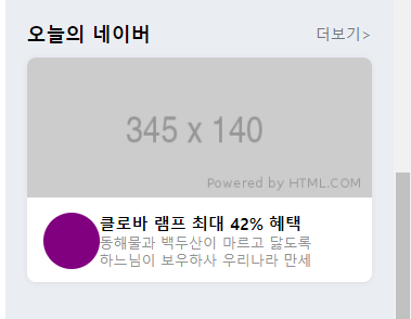
<div id="today">
	<div class="container">
		<div class="content-header">
			<h2>오늘의 네이버</h2>
			<a href="#">더보기></a>
		</div>

		<div class="content-body">
			<img class="banner" src="https://via.placeholder.com/345x140">
			<div class="bottom-wrap">
				<i class="icon"></i>
				<div class="txt-wrap">
					<h3>클로바 램프 최대 42% 혜택</h3>
					<p>동해물과 백두산이 마르고 닳도록<br>
					하느님이 보우하사 우리나라 만세</p>
				</div>
			</div>
		</div>
	</div>
</div>
#today {
padding: 50px 0;
}
#today .container {
padding: 0 20px;
}
#today .container .content-header {
display: flex;
flex-direction: row;
flex-wrap: wrap;
justify-content: space-between;
align-items: center;
align-content: center;
border-top: solid 1px #e0e4ea;
padding-top: 24px;
margin-bottom: 10px;
}
#today .container .content-header h2 {
font-size: 18px;
font-weight: bold;
}
#today .container .content-header a {
color: #767678;
font-size: 14px;
font-weight: 400;
}
#today .content-body {
overflow: hidden;
width: 100%;
background-color: #ffffff;
box-shadow: 0 1px 6px 0 rgb(0 0 0 / 6%), 0 1px 0 0 rgb(0 0 0 / 2%);
border-radius: 8px;
}
#today .content-body .banner {
width: 100%;
}
#today .content-body .bottom-wrap {
display: flex;
flex-direction: row;
flex-wrap: wrap;
justify-content: flex-start;
align-items: center;
align-content: center;
padding: 14px 13px 12px 15px;
}
#today .content-body .bottom-wrap i {
display: block;
width: 52px;
height: 52px;
background-color: purple;
border-radius: 50%;
}
#today .content-body .bottom-wrap .txt-wrap h3 {
font-size: 15px;
font-weight: 600;
}
#today .container .content-body .bottom-wrap .txt-wrap p {
font-size: 13px;
font-weight: 400;
line-height: 16px;
color: #929294;
}
<footer id="footer">
	<div class="txt-wrap">
		<div class="link">
			<a href="#">로그인</a>
			<a href="#">전체서비스</a>
			<a href="#">PC버전</a>
		</div>

		<div class="link">
			<a href="#">이용약관</a>
			<a href="#">개인정보처리방침</a>
			<a href="#">고객센터</a>
		</div>
	</div>

	<h1>
		<a href="#">
			<img src="https://via.placeholder.com/74x14">
		</a>
	</h1>
</footer>
#footer {
	padding: 35px 0 80px;
}

#footer .txt-wrap {
	text-align: center;
}

#footer .txt-wrap a {
	position: relative;
	display: inline-block;
	padding: 3px 9px;
	color: #929294;
	font-size: 13px;
	font-weight: 400;

	letter-spacing: -0.5px;
}

#footer .txt-wrap a:before {
	content: "";
	display: block;
	position: absolute;

	top: 7px;
	left: 0;

	width: 1px;
	height: 10px;
	background-color: #d7dfe7;
}

#footer .txt-wrap .link a:first-child:before {
	content: none;
}

#footer h1 {
	text-align: center;
}
2.어려운내용
nth-child에서 content: none; 동시 적용이 안된다.
첫번째 a태그 앞에는 적용이 됐지만 4번째 태그 앞에는 동시적용이 안되는 오류 발생.
왜냐??
br때문에 연속성이 깨졌기 때문이다.
#footer .txt-wrap a:nth-child(1):before,
#footer .txt-wrap a:nth-child(4):before {
	content: none;
}
3.해결방법
짝대기를 넣기 위해서 위,아래를 <br줄바뀜>이 아니라 아예 다른 그룹으로 묶어야 한다.
<변경 전>
	<a href="#">로그인</a>
	<a href="#">전체서비스</a>
	<a href="#">PC버전</a><br>
	<a href="#">이용약관</a>
	<a href="#">개인정보처리방침</a>
	<a href="#">고객센터</a>
<변경 후>
<div class="link">
	<a href="#">로그인</a>
	<a href="#">전체서비스</a>
	<a href="#">PC버전</a>
</div>

<div class="link">
	<a href="#">이용약관</a>
	<a href="#">개인정보처리방침</a>
	<a href="#">고객센터</a>
</div>
css코드도 nth-child로 순서 지정이 아니라, 각 link태그 안 첫번째 a태그로 지정하면서 해결.
#footer .txt-wrap .link a:first-child:before {
	content: none;
}
4.학습소감
아직 부족한 점은 많겠지만 일단 html/css 과정이 끝났다. 실제 웹페이지 기획, 제작하기 전까지 빨리 자바스크립트, jQuery, Lib 등 기본 과정을 공부해야겠다.

예비 프론트엔드 개발자