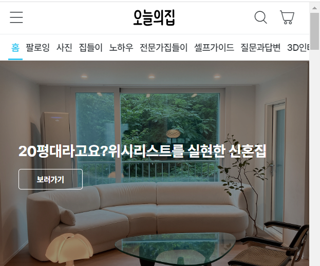
💻 오늘의집 clone coding
사이트명 : 오늘의집(mobile)
사용언어 : html / css / js
분류 : mobile
Check Point
- header scroll
- tab-menu
- menu-click-event
- 반응형 슬라이더 Swiper
- JSON
1. header scroll
스크롤에 반응하는 sticky header
: 스크롤을 내릴 때는 header를 숨기고, 스크롤을 올릴 때는 다시 header를 보여줌
🎈 기본원리
✍🏻 코드작성
.header{width: 100%; position: fixed; top: 0; left: 0; z-index: 10; background: #fff; transition: all .3s;}
.header.hide{transform: translateY(-100%);}
.header.active{background: #fff;}
function headerScroll(){
let lastScroll = 0;
$(window).on('scroll',onScroll);
function onScroll(){
var headerTop = $(window).scrollTop();
👉🏻 스크롤 세로좌표(맨 위 -> 0으로 시작)
if(headerTop > lastScroll){
$('.header').addClass('hide');
}else{
$('.header').removeClass('hide');
}
👉🏻 스크롤 내렸을때, .header에 .hide라는 클래스를 추가해서
{transform: translateY(-100%);}으로 숨김
if(headerTop >= $(window).height()){
$('.header').addClass('active');
}else{
$('.header').removeClass('active');
}
👉🏻 스크롤을 다시 올렸을때(background나 color를 변경할수있음)
lastScroll = headerTop;
}
}2. tab-menu
🎈 기본원리
✍🏻 코드작성
.header .header-bottom .gnb-item a.active{color: #35c5f0;}$('.header-bottom .gnb-item a').click(function(e){
e.preventDefault();
target = $(this).data('target');
👉🏻 data-class 가상의 클래스로 데이터를 넣어사용
$(this).addClass('active').parent().siblings().find('a').removeClass('active');
$(target).addClass('active').siblings().removeClass('active');
})
✔ a태그의 기능 -> #을 사용하여 각각의 위치로 이동시켜줌
✔ e.preventDefault() -> a태그는 새로고침 및 이동속성이있기때문에
클릭이벤트 사용시 넣어줘야 a 태그의 href 속성이 중단된다.
click(function(e){
    e.preventDefault();
🎈 다른방법
 <div class="tab-nav">
   <a href="#tab1" class="active">탭1</a>
   <a href="#tab2">탭2</a>
   <a href="#tab3">탭3</a>
 </div>
 <div class="tab-con">
   <div id="tab1" class="active">내용1</div>
   <div id="tab2">내용2</div>
   <div id="tab3">내용3</div>
 </div>
✔ tab이라는 name을 공통으로 넣어줌 -> 동시 컨트롤이 가능해짐
$(function(){

 $('.tab-nav a').click(function(e){
    e.preventDefault(); //새로고침X 이동을막아줌

    target = $(this).attr('href')👈🏻속성값을 가지고올수있음
    $(this).addClass('active').siblings().removeClass('active');
    $(target).addClass('active').siblings().removeClass('active');
    👉🏻$(바뀌어야되는값).addClass('active').siblings().removeClass('active');
 })

})
3. menu-click-event
🎈 기본원리
✍🏻 코드작성
.menu-inner .menu-area .depth{width: 100%; height: 40px; padding: 0 40px 0 14px; display: block; position: relative; font-weight: 700;}
.menu-inner .menu-area .depth.active{background: rgba(255,255,255);}
☝🏻 menu-slide
.menu-area .depth .close-arrow::before{content: "\e96c";}
.menu-area .depth .close-arrow.open::before{content: "\e978";}
☝🏻 arrow-updown
if($(this).siblings('.sub').css('display') === 'none'){ 👈🏻처음클릭
$('.depth1').removeClass('active');
$(this).addClass('active');
}else{ 👈🏻두번째클릭(열고닫힘 or 다른 depth클릭)
$('.depth1').removeClass('active');
}
$('.sub').stop().slideUp();
$(this).siblings('.sub').stop().slideToggle();
✔ Toggle -> 열고닫고
문제점: active가 안빠짐
$(this).siblings('.sub').stop().slideToggle();✔ Toggle+slideUp -> 열고닫고 + 다른메뉴클릭시 닫히고열리고
문제점: 열린지닫힌지 모르기때문에, 내가 원하는 특정모션(조건)을 주지못함 ex)화살표,alert
$('.sub').stop().slideUp();
$(this).siblings('.sub').stop().slideToggle();✔ Toggle+slideUp+if -> 열고닫고 + 닫히고열리고 + 조건문가능
if($(this).siblings('.sub').css('display') === 'none'){
   $('.depth1').removeClass('active');
   $(this).addClass('active');
}else{ //재클릭
 $('.depth1').removeClass('active');
}
5. 반응형 슬라이더 Swiper
🎈 기본원리
1.link , script 주소 가져오기(1번만)
2.마크업 구조짜기
3.스크립트 실행문 가져오기
4.옵션수정
🎈 주의사항
- 클래스명 swiepr,swiper-wrapper,swiper-slide 절대로 건드리지말것
(단, 코드 가져왔을때 mySwiper <- 클래스명 그대로 쓰지말것) - 스크립트 실행문의 타켓과 스와이퍼의 타겟이 일치한가
- .swiper는 높이가없음 -> 자식들은 높이를 상속받음
https://swiperjs.com/
Demos -> 원하는구현 > core > 스크립트 실행문 가져오기
✍🏻 navigation / pagination -> custom가능
navigation: {
  nextEl: ".next",
  prevEl: ".prev",
pagination: {
  el: ".swiper-pagination",
  clickable: true,
},
✔ swiper안에있을때, 위치 컨트롤하기쉽다.
✔ custom했다면, 스크립트에서 반드시 클래스명을 바꿔줘야 적용된다.
6. JSON
🎈 구현화면
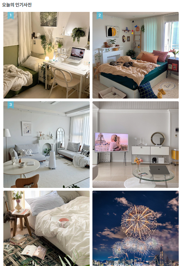
<section class="sc-photo">
  <h2 class="title">오늘의 인기사진</h2>
    <ul class="photo-list">
      <!-- todayphoto.json -->
    </ul>
</section><!-- photo -->
✍🏻 data만들기(배열)
{
    "items":[
        {
            "link":"경로",
            "thumbnail":"https://image.ohou.se/i/bucketplace-v2-development/uploads/cards/snapshots/166547727078651432.jpeg?gif=1&w=512&h=512&c=c&webp=1"
        },
        {
            "link":"경로",
            "thumbnail":"https://image.ohou.se/i/bucketplace-v2-development/uploads/cards/snapshots/166548234298947120.jpeg?gif=1&w=512&h=512&c=c&webp=1"
        },
        {
            "link":"경로",
            "thumbnail":"https://image.ohou.se/i/bucketplace-v2-development/uploads/cards/snapshots/166545882450511476.jpeg?gif=1&w=512&h=512&c=c&webp=1"
        },
        {
            "link":"경로",
            "thumbnail":"https://image.ohou.se/i/bucketplace-v2-development/uploads/cards/snapshots/166547509725909118.jpeg?gif=1&w=512&h=512&c=c&webp=1"
        },
        {
            "link":"경로",
            "thumbnail":"https://image.ohou.se/i/bucketplace-v2-development/uploads/cards/snapshots/166547819058852579.jpeg?gif=1&w=512&h=512&c=c&webp=1"
        },
        {
            "link":"경로",
            "thumbnail":"https://image.ohou.se/i/bucketplace-v2-development/uploads/cards/snapshots/166546278300246529.jpeg?gif=1&w=512&h=512&c=c&webp=1"
        }
    ]
}
✍🏻 fecth
fetch('./asset/data/todayphoto.json')
    .then((response) => response.json())
    .then((json) => {
            data = json.items;
            let html = '';
            isNumber = '<span class="num">${index++}</span>';
            index = 1;

            data.forEach(el => {

                if(index < 4){
                    isNumber = `<span class="num">${index++}</span>`;
                }else{
                    isNumber = '';
                }

                html+= `<li class="photo-item">
                         <a href="" class="link-photo">
                          <img src="${el.thumbnail}" alt="인기사진이미지">
                         </a>${isNumber}
                        </li>`;
            });
            $('.photo-list').html(html)
    })
Issue Point
- menu
- transiton 효과적용되는 대상에맞게적용
- flex로 영역쉽게잡기
- 가로/세로 스크롤컨트롤
- OhouseIcon
1. menu-dimmed 순차적으로 click-event주기
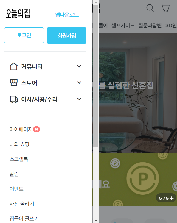
dimmed -> menu
.menu.active{left: 0; transition: all .3s;}
.dimmed.show{display: block;}
$('.header .btn-menu').click(function(e){
e.preventDefault()
$('.menu').addClass('active');
$('.dimmed').addClass('show');
})
$('.dimmed').click(function(e){
e.preventDefault()
$('.menu').removeClass('active');
$('.dimmed').removeClass('show');
})2. transiton 효과적용되는 대상에맞게적용
:animation이 부드럽게 작용하려면 hover가되는 대상에 transition을 정확히 적용해주어야 한다.
🙅🏻♀️ 틀린예시 - 뚝뚝끊김
🙆🏻♀️ 올바른예시 - 부드러움
3. flex로 영역쉽게잡기
🎈 구현화면
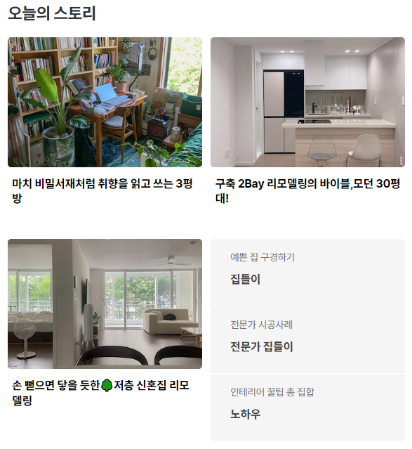
✍🏻 코드작성
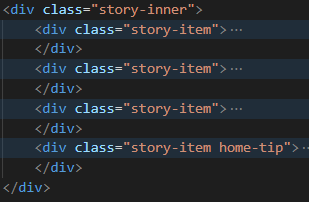
.sc-story .story-inner{display: flex; justify-content: space-between; flex-wrap: wrap;} 👈🏻 container
.sc-story .story-item{width: calc(50% - 5px); 👈🏻 container-item
.sc-story .story-item.home-tip{display: flex; flex-direction: column;} 👈🏻 container
-> 사이여백값만 알수있다면 flex로 영역을잡는게 편함(반응형)
4. 가로/세로 스크롤컨트롤
🎈 가로/세로 스크롤표시O
✍🏻 코드작성
overflow: hidden; overflow-x: auto; (가로)
overflow: hidden; overflow-y: auto; (세로)
단, 모바일화면에서는 스크롤표시가 없어져야함(touch)
🎈 가로/세로 스크롤표시X
✍🏻 코드작성
-ms-overflow-style: none; /* IE and Edge */ scrollbar-width: none; /* Firefox */ 👈🏻 해당영역에 추가
해당영역::-webkit-scrollbar { display: none; /* Chrome, Safari, Opera*/ }
5. OhouseIcon

'오늘의집'은 CSS 기법 중에 하나인 Image Sprite 방식을 사용하여 여러 이미지를 하나의 큰 이미지에 포함시킨 배경 이미지로 제작하여 단 한번의 HTTP 요청을 통해 문서에 삽입하는 방법을 사용하였다(아이콘폰트)
🎈장점
하나의 글꼴에 다양한 문자(아이콘)을 넣어 두고 이를 호출해 사용할수있음
font-family: OhouseIcon;
    vertical-align: top;
실제로 사용할때는 가상요소에 폰트번호만 적어주면됨
클래스명::before{content: "\ea05";}