(6) 피마 인디언 당뇨병 예측
https://www.kaggle.com/datasets/uciml/pima-indians-diabetes-database
필요한 모듈 임포트
import numpy as np
import pandas as pd
import matplotlib.pyplot as plt
from sklearn.model_selection import train_test_split
from sklearn.metrics import accuracy_score, precision_score, recall_score, roc_auc_score
from sklearn.metrics import f1_score, confusion_matrix, precision_recall_curve, roc_curve
from sklearn.preprocessing import StandardScaler
from sklearn.linear_model import LogisticRegression평가 지표 모음 함수
def get_clf_eval(y_test, pred, pred_proba=None):
    accuracy = accuracy_score(y_test, pred)
    confusion = confusion_matrix(y_test, pred)
    precision = precision_score(y_test, pred)
    recall = recall_score(y_test, pred)
    f1 = f1_score(y_test, pred)
    roc_auc = roc_auc_score(y_test, pred_proba)

    print(confusion)
    print()
    print(f" 정확도: {accuracy:.4f} \n 정밀도: {precision:.4f} \n 재현율: {recall:.4f} \n f1_스코어: {f1:.4f} \n AUC: {roc_auc:.4f}")
데이터 로딩
diabetes = pd.read_csv("diabetes.csv")
diabetes[:5]

diabetes.info()

diabetes.isna().sum()

diabetes['Outcome'].value_counts()
로지스틱 회귀로 예측 모델 생성
#피처 데이터 세트 X, 레이블 데이터 세트 y 생성
X = diabetes.iloc[:, :-1]
#y = diabetes.iloc[:, -1:]    #dataframe 형태
y = diabetes.iloc[:, -1]      #series 형태

X_train, X_test, y_train, y_test = train_test_split(X, y, test_size = 0.2, random_state=156)

#로지스틱 회귀로 학습, 예측 및 평가 수행
lr_clf = LogisticRegression(solver = 'liblinear')
lr_clf.fit(X_train, y_train)
pred = lr_clf.predict(X_test)
pred_proba = lr_clf.predict_proba(X_test)[:, 1]    #[:, 1] : 마지막 값만 보겠다는 의미

get_clf_eval(y_test, pred, pred_proba)
정밀도-재현율 변화 곡선
임계값 별 정밀도와 재현율 값의 변화 확인
from sklearn.metrics import precision_recall_curve
import matplotlib.pyplot as plt
import matplotlib.ticker as ticker
%matplotlib inline

#곡선을 그리는 사용자 정의 함수 생성
def precision_recall_curve_plot(y_test , pred_proba_c1):
    # threshold ndarray와 이 threshold에 따른 정밀도, 재현율 ndarray 추출.
    precisions, recalls, thresholds = precision_recall_curve( y_test, pred_proba_c1)

    # X축을 threshold값으로, Y축은 정밀도, 재현율 값으로 각각 Plot 수행. 정밀도는 점선으로 표시
    plt.figure(figsize=(8,6))
    threshold_boundary = thresholds.shape[0]
    plt.plot(thresholds, precisions[0:threshold_boundary], linestyle='--', label='precision')
    plt.plot(thresholds, recalls[0:threshold_boundary],label='recall')

    # threshold 값 X 축의 Scale을 0.1 단위로 변경
    start, end = plt.xlim()
    plt.xticks(np.round(np.arange(start, end, 0.1),2))

    # x축, y축 label과 legend, 그리고 grid 설정
    plt.xlabel('Threshold value'); plt.ylabel('Precision and Recall value')
    plt.legend(); plt.grid()
    plt.show()
lr_clf.predict_proba(X_test)
lr_clf.predict_proba(X_test)[:, 1] #두번째 값만 출력
#정밀도 재현율 곡선
pred_proba_c1 = lr_clf.predict_proba(X_test)[:, 1]
precision_recall_curve_plot(y_test, pred_proba_c1)
#피처 값의 분포 확인
diabetes.describe() #min 값이 0으로 되어있는 경우가 많다데이터 정제 (0 값을 각 칼럼의 평균으로 대체)
zero_features = ['Glucose', 'BloodPressure', 'SkinThickness', 'Insulin', 'BMI']

diabetes[zero_features]
diabetes[zero_features].mean()

diabetes[zero_features] = diabetes[zero_features].replace(0, diabetes[zero_features].mean())

diabetes
표준화(스케일링) 후 로지스틱 회귀로 평가
X = diabetes.iloc[:, :-1]
y = diabetes.iloc[:, -1]

#표준화
scaler = StandardScaler()
X = scaler.fit_transform(X)

X_train, X_test, y_train, y_test = train_test_split(X, y, test_size = 0.2, random_state=156)

#로지스틱 회귀로 학습, 예측 및 평가 수행
lr_clf = LogisticRegression(solver = 'liblinear')
lr_clf.fit(X_train, y_train)
pred = lr_clf.predict(X_test)
pred_proba = lr_clf.predict_proba(X_test)[:, 1]

get_clf_eval(y_test, pred, pred_proba)
분류 결정 임계값 변화
#여러 개의 분류 결정 임계값을 변경하면서 Binarizer를 이용하여 예측값 변환
from sklearn.preprocessing import Binarizer

#임계값에 따른 평가 수치 출력 함수
def get_eval_by_threshold(y_test , pred_proba_c1, thresholds):
    # thresholds list 객체 내의 값을 차례로 iteration하면서 Evaluation 수행
    for custom_threshold in thresholds:
        binarizer = Binarizer(threshold=custom_threshold).fit(pred_proba_c1)
        custom_predict = binarizer.transform(pred_proba_c1)
        print('임계값:',custom_threshold)
        get_clf_eval(y_test , custom_predict)
thresholds = [0.3, 0.33, 0.36, 0.39, 0.42, 0.45, 0.48, 0.50]
pred_proba = lr_clf.predict_proba(X_test)
get_eval_by_threshold(y_test, pred_proba[:, 1].reshape(-1,1), thresholds)변경된 임계값에 따른 예측
#임계값을 0.48로 설정한 Binarizer 생성
binarizer = Binarizer(threshold = 0.48)

pred_th_048 = binarizer.fit_transform(pred_proba[:,1].reshape(-1,1))

get_clf_eval(y_test, pred_th_048, pred_proba[:,1])
4. 분류
참고 ppt : http://naver.me/Gz1nmR5l
① 기존 데이터가 어떤 레이블에 속하는지 패턴을 알고리즘으로 인지
② 새롭게 관측된 데이터에 대한 레이블을 판별
지도학습의 대표 유형인 분류는 학습 데이터로 주어진 데이터의 피처와 레이블 값을 머신러닝 알고리즘으로 학습해 모델을 생성하고, 이렇게 생성된 모델(학습이 끝난 상태의 객체)에 새로운 데이터 값이 주어졌을 때 미지의 레이블 값을 예측하는 것이다
다양한 알고리즘 중에서 '앙상블 방법'을 집중적으로 다룬다
앙상블은 서로 다른 또는 같은 알고리즘을 단순히 결합한 형태가 있으나, 일반적으로는 '배깅(Bagging)' 과 '부스팅(Boosting)' 방식으로 나뉜다
랜덤 포레스트, 그래디언트 부스팅, XGBoost, LightGBM, 스태킹(Stacking) 기법 등이 있다
앙상블의 기본 알고리즘으로 사용하는 것은 '결정 트리(의사결정나무)' 이다
결정 트리는 매우 쉽고 유연하게 적용될 수 있는 알고리즘이지만 예측 성능을 향상시키기 위해 복잡한 규칙 구조를 가져야 하며, 이로 인해 과적합(overfitting)이 발생해 예측 성능이 저하될 수 있다
하지만 이러한 점이 앙상블 기법에서는 장점으로 작용한다
앙상블은 매우 많은 여러개의 약한 학습기(예측 성능이 상대적으로 떨어지는 학습 알고리즘)를 결합해 확률적 보완과 오류가 발생한 부분에 대한 가중치를 계속 업데이트 하면서 예측 성능을 향상시킨다
(1) 결정 트리 (Decision Tree, 의사결정나무)
* 정의
지도학습의 일종으로, 의사 결정 규칙을 '나무 구조'로 도표화하여 분류와 예측을 수행하는 기법
데이터의 특징에 대한 질문을 하며 응답에 따라 데이터를 분류해가는 알고리즘 이다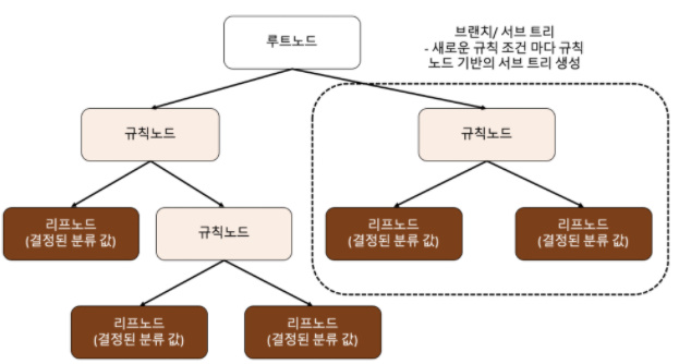 루트 노드(root) : 트리가 시작된 곳(뿌리)
규칙 노드 : 규칙 조건이 되는 곳
리프 노드 : 결정된 클래스 값
서브 트리 : 새로운 규칙 조건마다 생성
가능한 한 적은 결정 노드로 높은 예측 정확도를 가지려면 데이터를 분류할 때 '최대한 많은 데이터 세트가 해당 분류에 속할 수 있도록' 결정 노드의 규칙이 정해져야 한다
어떻게 트리를 분할할 것인가 -> 최대한 '균일한' 데이터 세트를 구성할 수 있도록 분할
데이터 세트의 균일도는 데이터를 구분하는 데 필요한 정보의 양에 영향을 미친다
결정 노드는 정보 균일도가 높은 데이터 세트를 먼저 선택할 수 있도록 규칙 조건을 만든다
정보의 균일도를 측정하는 대표적인 방법은 '엔트로피를 이용한 정보 이득 지수'와 '지니 계수'가 있다
* 불순도를 측정하는 방법
집합에 이질적인 것이 얼마나 섞였는지를 측정하는 지표로, '불순도' 를 측정한다
(즉 불순도를 통해 균일도를 파악하는 것)
① 지니 지수 (Gini Index)
불순도를 측정하는 하나의 지수로서 지니 지수를 가장 감소시켜주는 예측 변수와
그 때의 최적 분리에 의해서 자식 마디를 선택한다
지니 지수 값이 작을수록 데이터의 균일도가 높은 것으로 해석한다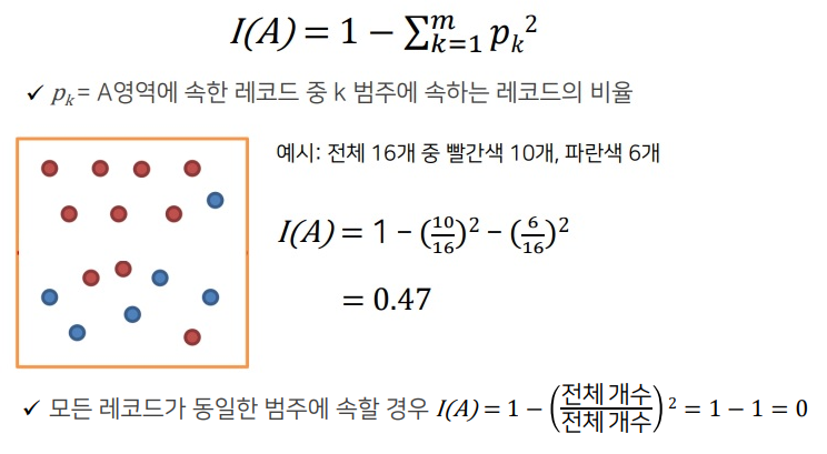
※ 두 개 이상의 영역에 대한 지니 지수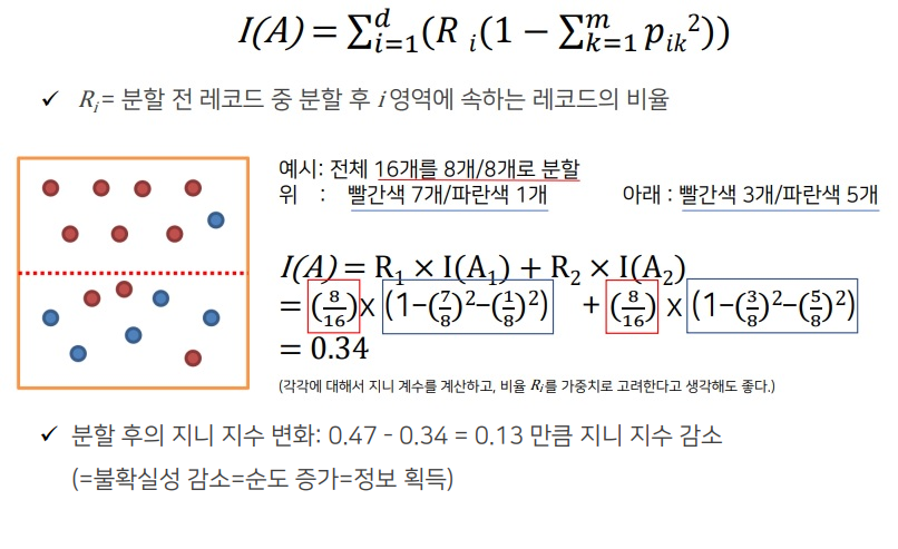
② 엔트로피 지수 (Entropy Index)
이 지수가 가장 작은 예측 변수와 그 때의 최적 분리에 의해서 자식 마디 형성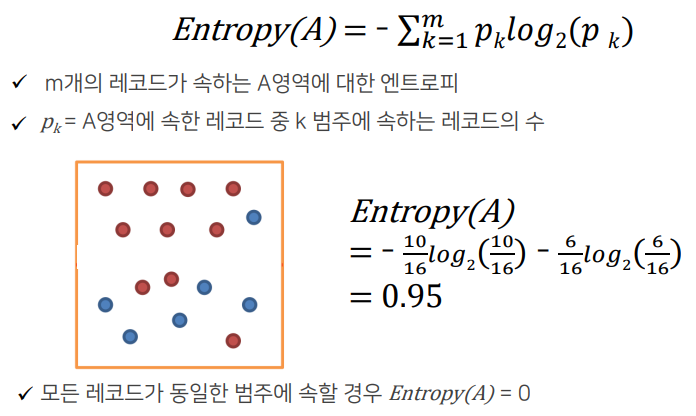
※ 두 개 이상의 영역에 대한 엔트로피 지수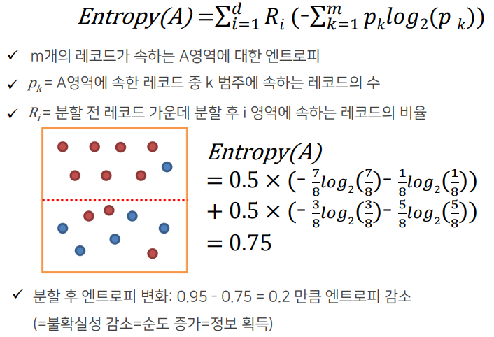
* 의사결정나무의 학습 과정
구분 뒤 각 영역의 순도가 증가 & 불확실성(엔트로피 지수 또는 지니 지수)이 최대한 감소
하는 방향으로 학습을 진행
※ 재귀적 분기
구분하기 전보다 구분된 뒤에 각 영역의 순도가 증가하도록 입력 변수의 영역을 2개로 구분한다
분기 횟수가 정해지지 않은 채로 사전에 설정한 기준을 만족할 때까지 분기를 반복하는 데서 재귀적 분기라는 이름이 붙었다
※ 가지 치기
과적합을 방지하기 위해서 너무 자세하게 구분된 영역을 통합한다 (하위 노드들을 상위 노드로 결합)
Full tree : 모든 Terminal node의 순도(homogeneity)가 100%인 상태
(100%가 될 때까지 재귀적 분기를 했던 것이다)
Full tree를 생성한 뒤 적절한 수준에서 Terminal node(각 나무줄기의 끝)를 결합한다.
의사결정나무의 분기 수가 증가할 때 처음에는 새로운 데이터에 대한 오분류율이 감소하나, 일정 수준 이상이 되면 오분류율이 되레 증가한다.
-> 검증데이터에 대한 오분류율이 증가하는 시점에서 적절히 가지치기를 수행해야 한다.
-> 가지치기는 데이터를 버리는 개념이 아니라 분기를 합치는 개념으로 이해해야 한다.
Pre-pruning : Tree를 생성하는 과정에서 최소 분기 기준을 이용하는 사전적 가지치기
Post-pruning : Full-tree 생성 후, 검증 데이터의 오분류율과 Tree의 복잡도 (끝 노드의 수)등을 고려하는 사후적 가지치기
* 의사결정나무의 장점과 단점
※ 장점
결과를 해석하고 이해하기 쉽다 (알고리즘이 직관적이다)
자료를 가공할 필요가 거의 없다
수치 자료와 범주 자료 모두에 적용할 수 있다
이상치 자체를 하나의 경우로 분류하므로 이상치에 안정적이다
대규모의 데이터 세트에서도 잘 동작한다
※ 단점
최적의 결정 트리를 알아낸다고 보장할 수는 없다.
과적합(overfitting) -> 훈련 데이터를 제대로 일반화하지 못할 경우 너무 복잡한 결정 트리를 만들 수 있다.
데이터의 특성이 특정 변수에 수직/수평적으로 구분되지 못할 때 분류율이 떨어지고, 트리가 복잡해지는 문제가 발생한다.
약간의 데이터 변화에 트리의 모양이 전혀 달라질 수 있다. 즉 분산이 큰 불안정한 방법이다.
* 결정 트리 모델의 시각화 -> Graphviz
Graphviz 설치
https://graphviz.org/download/ 접속
graphviz-5.0.1 (64-bit) EXE installer [sha256] 클릭
설치 후 명령 프롬프트에서 'pip install graphviz' 입력
from sklearn.tree import DecisionTreeClassifier
from sklearn.datasets import load_iris
from sklearn.model_selection import train_test_split
import warnings
warnings.filterwarnings('ignore')
dt_clf = DecisionTreeClassifier(random_state=156)
iris = load_iris()
X_train, X_test, y_train, y_test = train_test_split(iris.data, iris.target,
test_size = 0.2, random_state=11)
dt_clf.fit(X_train, y_train)
dt_clf.feature_importances_※ export_graphviz() 함수 : 시각화 출력 파일 생성
pip install graphviz
conda install graphviz

import graphviz
from graphviz import Source
from sklearn.tree import export_graphviz

#export_graphviz() 의 호출결과로 out_file로 지정된 tree.dot 파일을 생성함
export_graphviz(dt_clf, out_file = "tree.dot", class_names = iris.target_names, \
               feature_names = iris.feature_names, impurity=True, filled=True)
#위에서 생성된 tree.dot 파일을 Graphviz가 읽어서 주피터 노트북상에서 시각화
with open("tree.dot") as f:
dot_graph = f.read()
graphviz.Source(dot_graph)petal length(cm) <= 2.45 와 같은 피처 조건
-> 자식 노드를 만들기 위한 규칙 조건, 이 조건이 없으면 리프 노드
gini = ~~
-> 다음의 value = [] 로 주어진 데이터 분포에서의 지니 계수
samples = ~~
-> 현 규칙에 해당하는 데이터 건수
value = []
-> 클래스 값 기반의 데이터 건수
(붓꽃 데이터 세트는 클래스 값으로 0, 1, 2 를 가지고 있으며,
0 : Setosa, 1 : Versicolor, 2 : Virginica 품종을 가리킨다)
※ 피처별 중요도 추출 -> feature_importances_
dt_clf.feature_importances_

import seaborn as sns
import numpy as np
%matplotlib inline

# feature importance 추출
print("Feature importances:\n{0}".format(np.round(dt_clf.feature_importances_, 3)))

# feature별 importance 매핑
for name, value in zip(iris.feature_names , dt_clf.feature_importances_):
    print('{0} : {1:.3f}'.format(name, value))

# feature importance를 column 별로 시각화 하기
sns.barplot(x=dt_clf.feature_importances_ , y=iris.feature_names)
여러 피처들 중 petal length 가 가장 중요도가 높음을 알 수 있다
* 결정 트리 실습 - 사용자 행동 인식 데이터 세트
https://archive.ics.uci.edu/ml/datasets/human+activity+recognition+using+smartphones 접속
Data Folder 선택
UCI HAR Dataset.zip 다운
'UCI HAR Dataset' 폴더명을 'human_activity'로 변경
import pandas as pd
import matplotlib.pyplot as plt
%matplotlib inline

# features.txt 파일에는 피처 이름 index와 피처명이 공백으로 분리되어 있음. 이를 DataFrame으로 로드.
feature_name_df = pd.read_csv('./human_activity/features.txt',sep='\s+',
                        header=None,names=['column_index','column_name'])

# 피처명 index를 제거하고, 피처명만 리스트 객체로 생성한 뒤 샘플로 10개만 추출
feature_name = feature_name_df.iloc[:, 1].values.tolist()
print('전체 피처명에서 10개만 추출:', feature_name[:10])
※ 중복된 피처명 처리
#중복된 피처명의 개수 확인
feature_dup_df = feature_name_df.groupby('column_name').count()
print(feature_dup_df[feature_dup_df['column_index'] > 1].count())
feature_dup_df[feature_dup_df['column_index'] > 1].head(10)
#중복된 피처명에 새로운 피처명 부여
def get_new_feature_name_df(old_feature_name_df):
feature_dup_df = pd.DataFrame(data=old_feature_name_df.groupby('column_name').cumcount(),
columns=['dup_cnt'])
feature_dup_df = feature_dup_df.reset_index()
new_feature_name_df = pd.merge(old_feature_name_df.reset_index(), feature_dup_df, how='outer')
new_feature_name_df['column_name'] = new_feature_name_df[['column_name', 'dup_cnt']].apply(lambda x : x[0]+'_'+str(x[1])
if x[1] >0 else x[0], axis=1)
new_feature_name_df = new_feature_name_df.drop(['index'], axis=1)
return new_feature_name_df※ train, test DataFrame 생성
import pandas as pd

def get_human_dataset( ):

    # 각 데이터 파일들은 공백으로 분리되어 있으므로 read_csv에서 공백 문자를 sep으로 할당.
    feature_name_df = pd.read_csv('./human_activity/features.txt',sep='\s+',
                        header=None,names=['column_index','column_name'])

    # 중복된 피처명을 수정하는 get_new_feature_name_df()를 이용, 신규 피처명 DataFrame생성.
    new_feature_name_df = get_new_feature_name_df(feature_name_df)

    # DataFrame에 피처명을 컬럼으로 부여하기 위해 리스트 객체로 다시 변환
    feature_name = new_feature_name_df.iloc[:, 1].values.tolist()

    # 학습 피처 데이터 셋과 테스트 피처 데이터을 DataFrame으로 로딩. 컬럼명은 feature_name 적용
    X_train = pd.read_csv('./human_activity/train/X_train.txt',sep='\s+', names=feature_name )
    X_test = pd.read_csv('./human_activity/test/X_test.txt',sep='\s+', names=feature_name)

    # 학습 레이블과 테스트 레이블 데이터을 DataFrame으로 로딩하고 컬럼명은 action으로 부여
    y_train = pd.read_csv('./human_activity/train/y_train.txt',sep='\s+',header=None,names=['action'])
    y_test = pd.read_csv('./human_activity/test/y_test.txt',sep='\s+',header=None,names=['action'])

    # 로드된 학습/테스트용 DataFrame을 모두 반환
    return X_train, X_test, y_train, y_test

X_train, X_test, y_train, y_test = get_human_dataset()

#로드된 데이터 세트 확인
y_test
X_train.info()
※ 동작 예측 분류 수행
from sklearn.tree import DecisionTreeClassifier
from sklearn.metrics import accuracy_score

# 예제 반복 시 마다 동일한 예측 결과 도출을 위해 random_state 설정
dt_clf = DecisionTreeClassifier(random_state=156)
dt_clf.fit(X_train , y_train)
pred = dt_clf.predict(X_test)
accuracy = accuracy_score(y_test , pred)
print('결정 트리 예측 정확도: {0:.4f}'.format(accuracy))

# DecisionTreeClassifier의 하이퍼 파라미터 추출
print('DecisionTreeClassifier 기본 하이퍼 파라미터:\n', dt_clf.get_params())
※ 결정 트리의 트리 깊이(Tree Depth)가 예측 정확도에 주는 영향
from sklearn.model_selection import GridSearchCV

params = {
    'max_depth' : [6, 8, 10, 12, 16, 20, 24],
    'min_samples_split' : [8, 16]
}

grid_cv = GridSearchCV(dt_clf, param_grid = params, scoring = 'accuracy', cv=5, verbose=1)
grid_cv.fit(X_train, y_train)
print("GridSearchCV 최고 평균 정확도 수치: {0:.4f}".format(grid_cv.best_score_))
#print("GridSearchCV 최적 하이퍼 파라미터: , grid_cv.best_params_)
#최적 하이퍼 파라미터로 학습이 완료된 estimator 객체
best_df_clf = grid_cv.best_estimator_
#테스트 데이터 세트에 예측 수행
pred1 = best_df_clf.predict(X_test)
accuracy_score(y_test, pred1)※ 각 피처의 중요도 (top20) 막대 그래프
best_df_clf.feature_importances_

import seaborn as sns

ftr_importances_values = best_df_clf.feature_importances_

# Top 중요도로 정렬을 쉽게 하고, 시본(Seaborn)의 막대그래프로 쉽게 표현하기 위해 Series변환
ftr_importances = pd.Series(ftr_importances_values, index = X_train.columns)

# 중요도값 순으로 Series를 정렬
ftr_top20 = ftr_importances.sort_values(ascending=False)[:20]

plt.figure(figsize=(8,6))
plt.title('Feature importances Top 20')
sns.barplot(x = ftr_top20 , y = ftr_top20.index)
plt.show() 