Checkpoint 1
styled-component를 사용해서 색상이 다른 Box 두개를 만들어보겠다.
import styled from "styled-components";

const Father = styled.div`
  display: flex;
`;

const Box1 = styled.div`
  background-color: teal;
  width: 100px;
  height: 100px;
`;

const Box2 = styled.div`
  background-color: orange;
  width: 100px;
  height: 100px;
`;

function App() {
  return (
    <Father>
      <Box1 />
      <Box2 />
    </Father>
  );
}

export default App;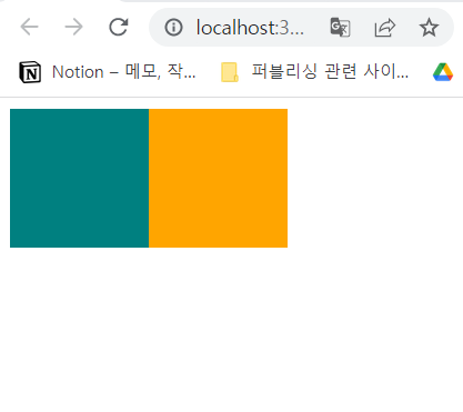
정상적으로 작동하지만, Box1과 Box2에서 background-color를 제외하고는 모든 코드가 일치하는 것을 볼 수 있다. 코드를 간결하게 하기 위한 방법이 필요하다.
${(props) => props.name}
props를 이용해서 코드를 더 간결하게 할 수 있다.
import styled from "styled-components";

const Father = styled.div`
  display: flex;
`;

const Box = styled.div`
background-color : ${(props) => props.bgColor};
width: 100px;
height: 100px;
`

function App() {
  return (
    <Father>
      <Box bgColor="teal" />
      <Box bgColor="orange" />
    </Father>
  );
}

export default App;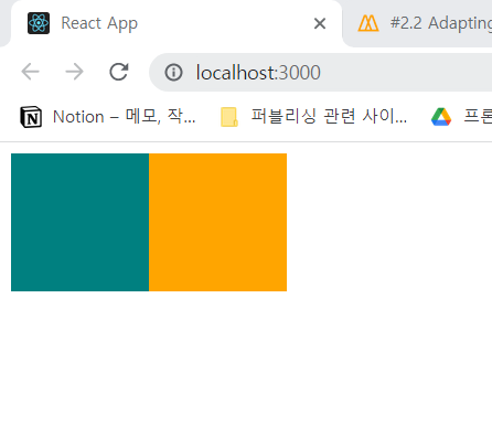
똑같이 정상적으로 동작하는 것을 확인할 수 있다.
Box라는 컴포넌트 안에 background-color : ${(props) => (props.bcColor}형식으로 props를 집어넣어 원하는 속성만 변경할 수 있다.
Checkpoint 2
Box와 다른 속성은 같고 border-radius가 다른 Circle 도형을 만들어보려고 한다.
import styled from "styled-components";

const Father = styled.div`
  display: flex;
`;

const Box = styled.div`
  background-color: ${(props) => props.bgColor};
  width: 100px;
  height: 100px;
`;

const Circle = styled.div`
  background-color: ${(props) => props.bgColor};
  width: 100px;
  height: 100px;
  border-radius: 50px;
`;

function App() {
  return (
    <Father>
      <Box bgColor="teal" />
      <Circle bgColor="gray" />
    </Father>
  );
}

export default App;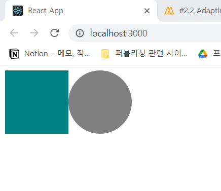
마찬가지로 정상적으로 동작하지만, 우리는 이 코드를 더 간결하게 만들 수 있지 않을까?
styled(Name)
Circle 컴포넌트 안에 Box 컴포넌트 속성을 담아줄 수 있다.
import styled from "styled-components";

const Father = styled.div`
  display: flex;
`;

const Box = styled.div`
  background-color: ${(props) => props.bgColor};
  width: 100px;
  height: 100px;
`;

const Circle = styled(Box)`
  border-radius: 50px;
`;

function App() {
  return (
    <Father>
      <Box bgColor="teal" />
      <Circle bgColor="orange" />
    </Father>
  );
}

export default App;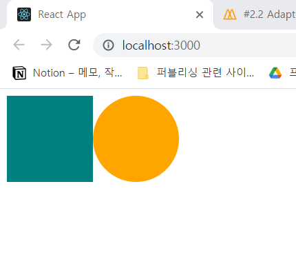
Circle에 styled.div를 입력하는 대신 styled(Box)처럼 가져올 컴포넌트를 입력하면 Box의 속성을 그대로 갖다 쓸 수 있다.

프론트엔드 개발자가 되고 싶은 선주입니다.💻아직 갈 길이 멀지만 내 자신 아자아자 화이팅! ٩( ᐛ )و