Checkpoint 1
만약 컴포넌트의 태그는 input에서 a태그로 바꾸고 싶은데 스타일은 input 컴포넌트의 속성을 그대로 유지하고 싶을 때 어떻게 하면 좋을까?
"As"
import styled from "styled-components";

const Father = styled.div`
  display: flex;
`;

const Btn = styled.button`
  color: white;
  background-color: tomato;
  border: 0;
  border-radius: 5px;
`;

function App() {
  return (
    <Father as="header">
      <Btn>Log in</Btn>
      <Btn as="a" href="/">
        Log in
      </Btn>
    </Father>
  );
}

export default App;
<Btn as="a" href="/" />처럼 컴포넌트 안에 as="tagname"을 입력해주면 Btn의 스타일은 유지하면서 태그를 원하는 태그로 바꿔줄 수 있다.
Checkpoint 2
컴포넌트를 이용해서 여러 개의 input을 삽입할 때, 모든 input에 required:true 속성을 주려고 한다.
import styled from "styled-components";

const Father = styled.div`
  padding: 30px;
`;

const Input = styled.input`
  display: block;
  margin-bottom: 10px;
  color: white;
  background-color: tomato;
  border: 0;
  font-size: 30px;
  border-radius: 5px;
`;

function App() {
  return (
    <Father as="header">
      <Input required />
      <Input required />
      <Input required />
      <Input required />
    </Father>
  );
}

export default App;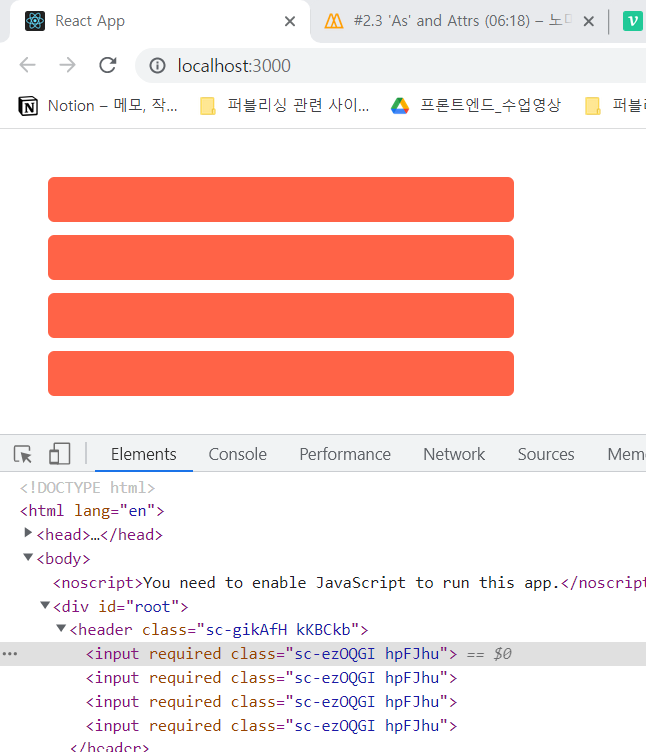
Input 컴포넌트를 넣을 때마다 일일이 required 속성을 작성해줘야하는 것일까?
Attrs
import styled from "styled-components";

const Father = styled.div`
  padding: 30px;
`;

const Input = styled.input.attrs({ required: true, minlength: 10 })`
  display: block;
  margin-bottom: 10px;
  color: white;
  background-color: teal;
  border: 0;
  font-size: 30px;
  border-radius: 5px;
`;

function App() {
  return (
    <Father as="header">
      <Input />
      <Input />
      <Input />
      <Input />
    </Father>
  );
}

export default App;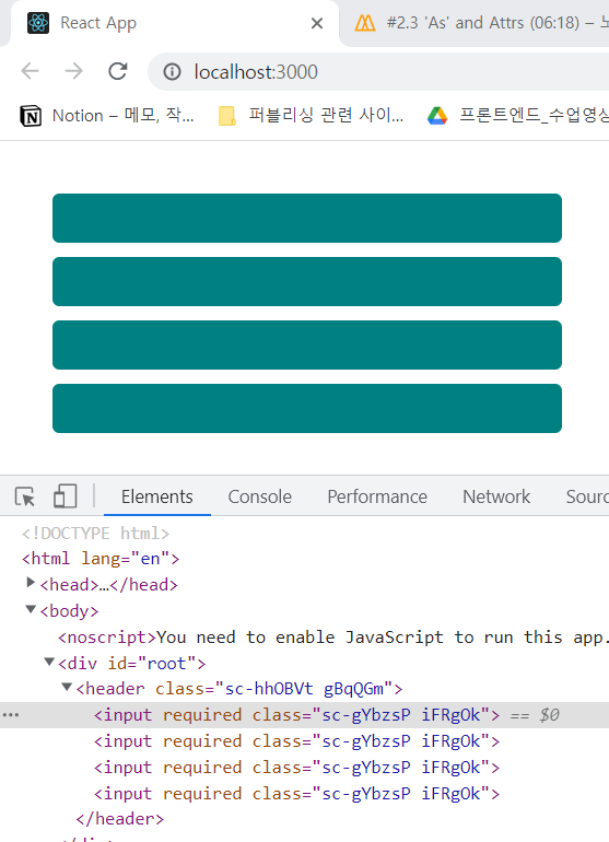
styled.input 뒤에 .attrs({required : true})를 입력했더니 잘 동작하는 것을 보았다. .attrs({required : true, minlength:10 })처럼 배열 형식으로 input태그에 공통적으로 들어갈 속성들을 지정해줄 수 있다.

프론트엔드 개발자가 되고 싶은 선주입니다.💻아직 갈 길이 멀지만 내 자신 아자아자 화이팅! ٩( ᐛ )و